Collection Pie PowerPoint Charts Template


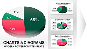
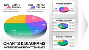
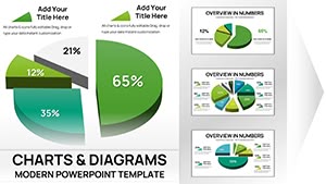
Visualizing proportions has never been more intuitive or impactful than with the Collection Pie PowerPoint Charts Template. This comprehensive set of 24 editable slides offers a treasure trove of pie chart variations, designed to make your data sing. Aimed at business pros, marketers, and educators who need to break down wholes into parts effectively, it simplifies complex distributions like market shares or budget allocations. With sleek, modern designs and effortless customization, you can tweak every slice to fit your story. Compatible with PowerPoint, this template saves you from design drudgery, letting you focus on analysis. Whether dissecting architectural project costs or teaching statistical concepts, it delivers clarity that drives home your points, turning viewers into believers.
Mastering Data Proportions with Versatile Pie Designs
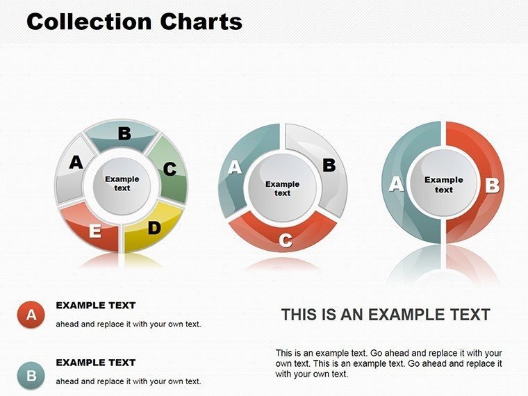
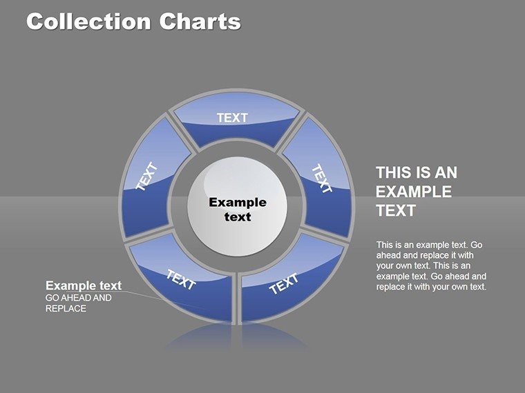
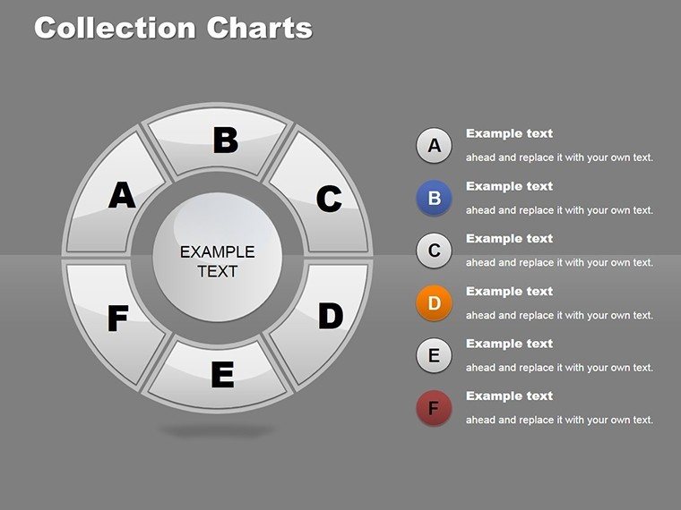
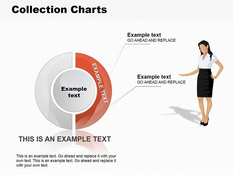
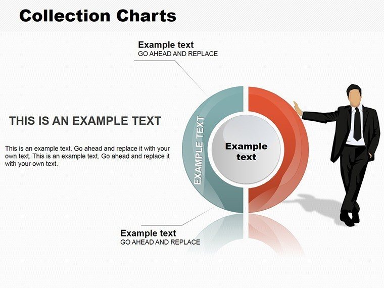
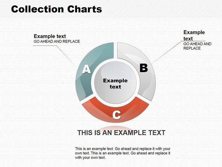
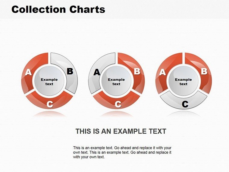
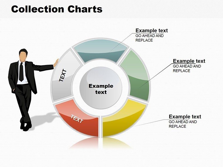
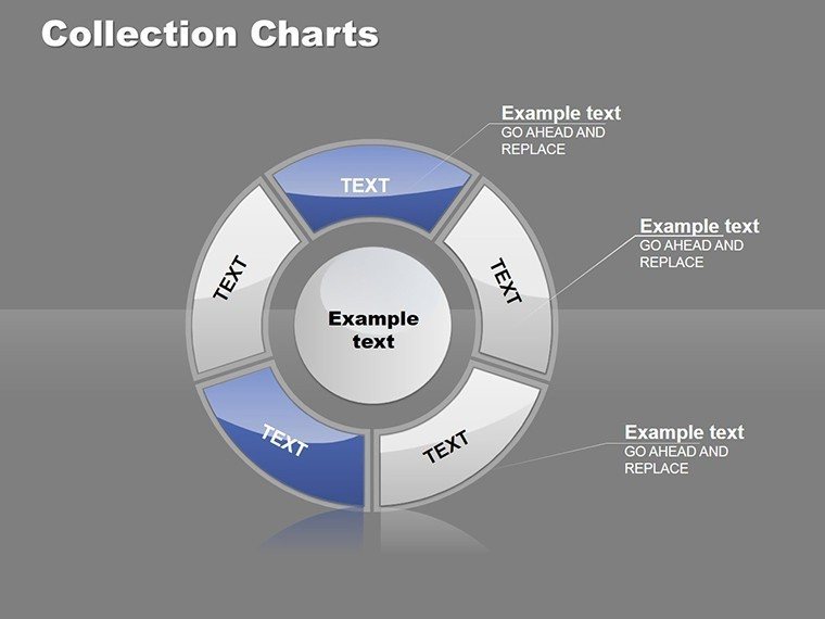
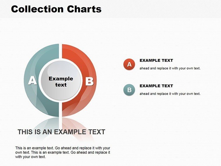
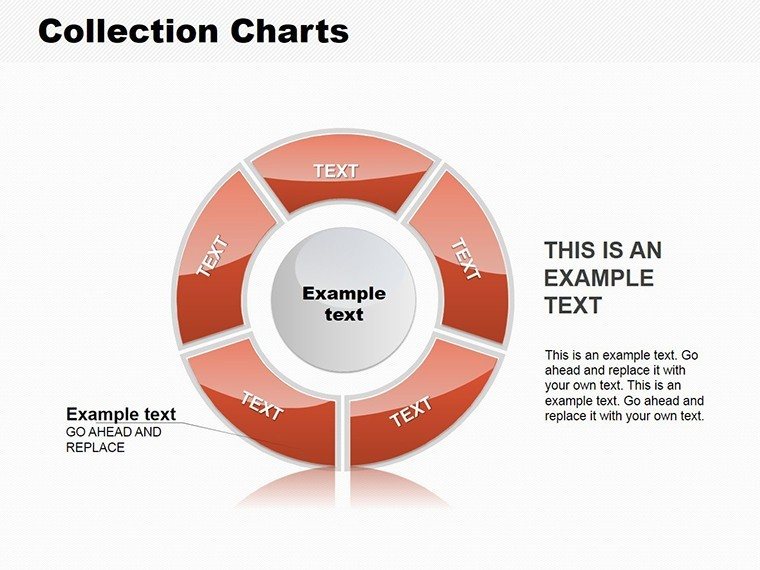
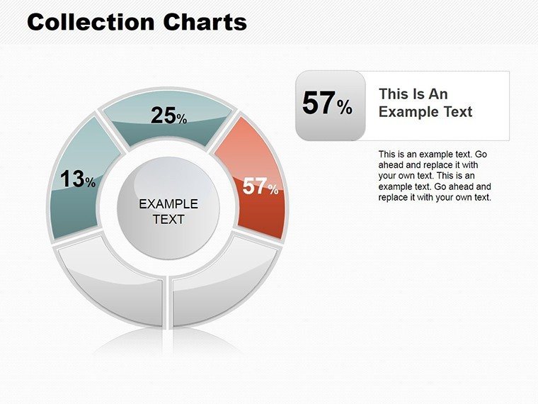
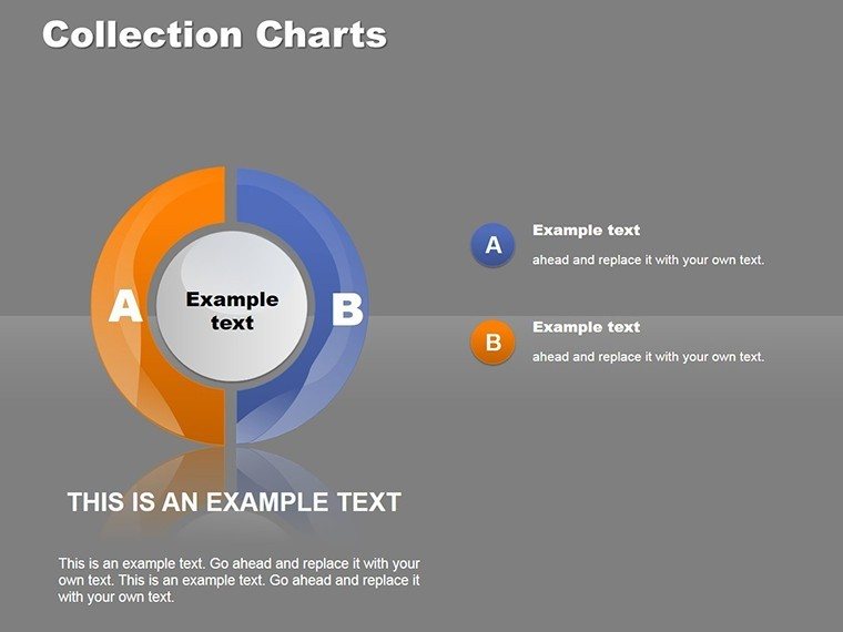
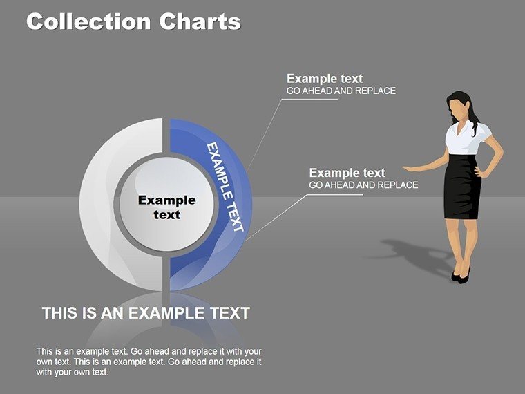
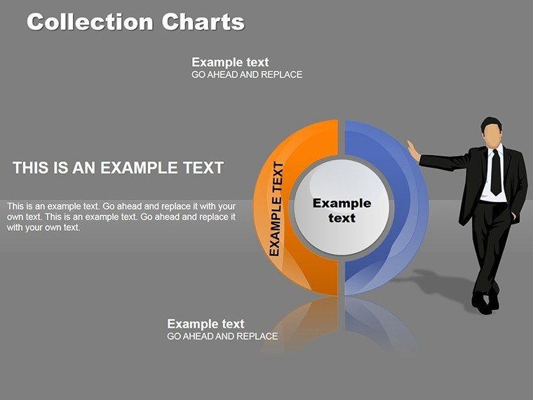
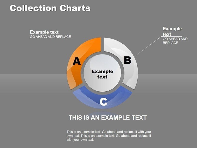
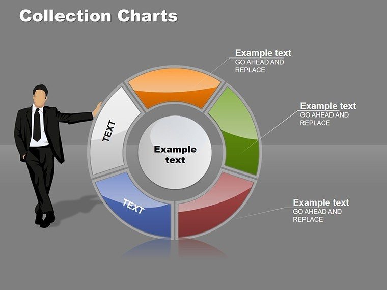
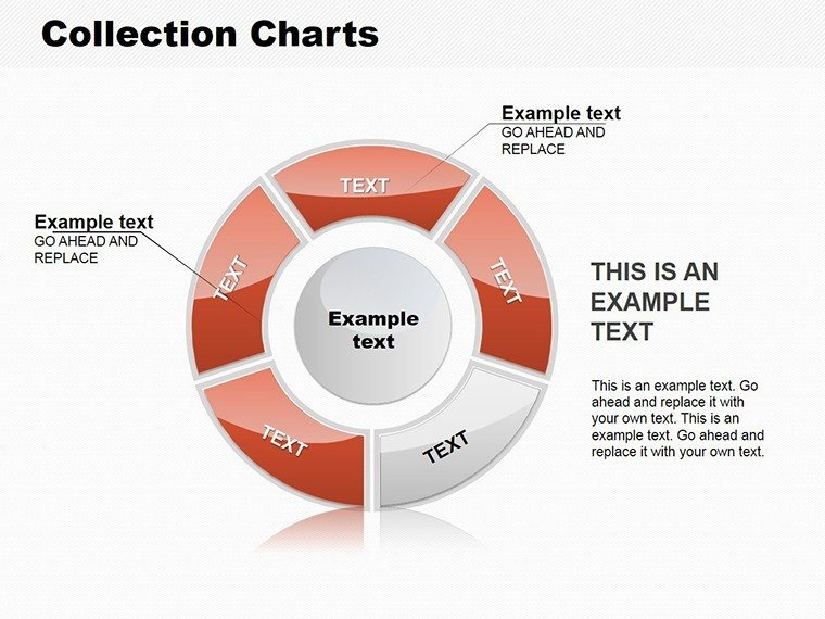
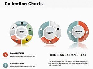
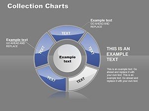
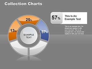
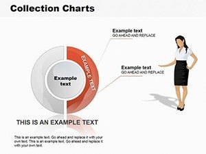
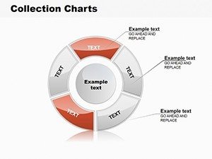
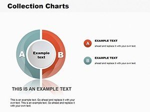
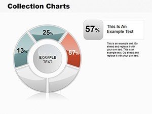
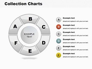
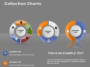
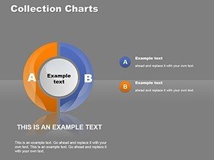
Pie charts excel at showing relationships within a dataset, and this collection amplifies that strength with diverse styles - from classic 2D to exploded 3D views. For an urban planner, envision a pie depicting zoning distributions in a city master plan, with customizable labels for precise AIA-compliant reporting. The template's cycle integrations add flow, ideal for sequential data like project phases. Marketers can showcase audience demographics, adjusting colors to brand palettes for cohesion. Easy data entry via placeholders ensures updates are a breeze, while variety in layouts prevents monotony. Drawing from design best practices, these charts avoid common pitfalls like overcrowded slices, promoting readability and engagement.
Essential Features for Pro-Level Presentations
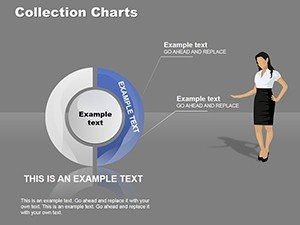
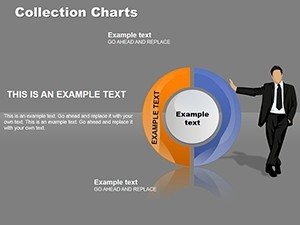
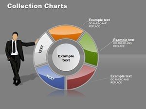
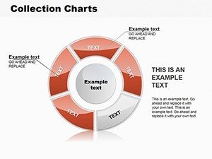
- Extensive Style Variety: Multiple pie formats to suit any theme or complexity.
- Effortless Customization: Change colors, data, and labels with simple clicks.
- Data Clarity Focus: Tools to highlight key segments for emphasis.
- Time-Efficient Design: Pre-built slides ready for your content.
- Broad Compatibility: Seamless with PowerPoint for reliable use.
In a real-world example, a firm used analogous pies to visualize sustainable material breakdowns, aligning with LEED standards and winning client approval.
Application Scenarios: Pie Charts in Action
Put this template to work in varied contexts. Project managers track resource allocation with pies showing team hours; educators illustrate probability distributions. Step-by-step use: Import data, select style, customize visuals, add annotations. Tips: Use doughnut variations for sub-categories, ensure color accessibility. Versus standard PowerPoint, this offers refined aesthetics and efficiency. Integrate into reports for holistic views, as one educator noted improved student comprehension in design courses.
Guide to Pie Perfection
- Launch in PowerPoint and choose a slide.
- Enter percentages or values.
- Customize aesthetics via format options.
- Enhance with legends or callouts.
- Review and present.
This method streamlines creation, yielding insightful visuals.
The Edge of Specialized Pie Visualization
Stand out with this collection's depth, surpassing basics by offering thematic consistency. For architecture, it's like slicing a building model - revealing layers. Benefits: Insight acceleration, professional polish. CTAs: "Visualize your data now." LSI: pie graph designs, data segmentation tools.
Seize the opportunity - download the Collection Pie PowerPoint Charts Template and slice through data challenges today.
Frequently Asked Questions
How many pie chart styles are there?
Multiple variations including 2D, 3D, and doughnut for diverse needs.
Can I import data from Excel?
Yes, copy-paste or link for dynamic updates.
Is it suitable for large datasets?
Best for up to 8-10 segments; use groupings for more.
What if I need cycle elements?
Included integrations for hybrid visuals.
Any animation options?
PowerPoint's built-ins work seamlessly.