Integration PowerPoint Charts Template


Connecting disparate ideas into a unified whole is the hallmark of great presentations, and the Integration PowerPoint Charts Template makes it effortless. Boasting 14 editable slides with 3D cycle elements, this tool is perfect for illustrating interconnections in business, education, or design. Architects can map out system integrations in smart buildings, while educators explain ecosystem cycles. Fully customizable in PowerPoint or compatible software, it offers flexibility to reshape layouts, colors, and fonts. This isn't mere charting - it's a bridge to clearer communication, helping you weave narratives that resonate and persuade.
Weaving Connections: The Art of Integration Charts
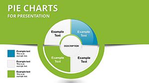
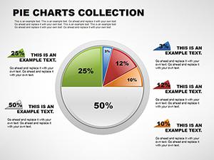
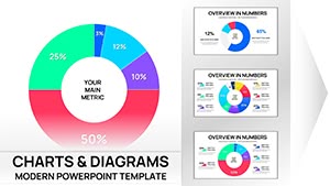
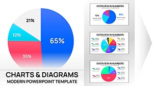
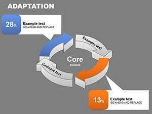
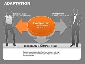
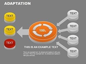
Integration charts shine in showing how parts form a whole, and this template's 3D designs add depth for immersive visuals. For a project manager in architecture, depict building system flows - HVAC to structural - with cycle charts highlighting synergies. Customization allows precise tailoring, ensuring compliance with standards like those from the AIA. Business users integrate market data streams, educators link curriculum modules. The template's ease fosters creativity without complexity.
Core Features for Integrated Excellence
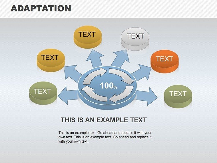
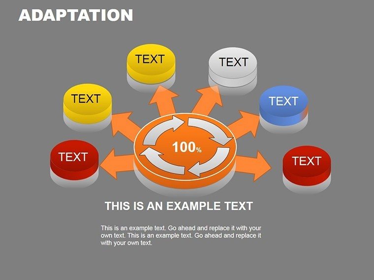
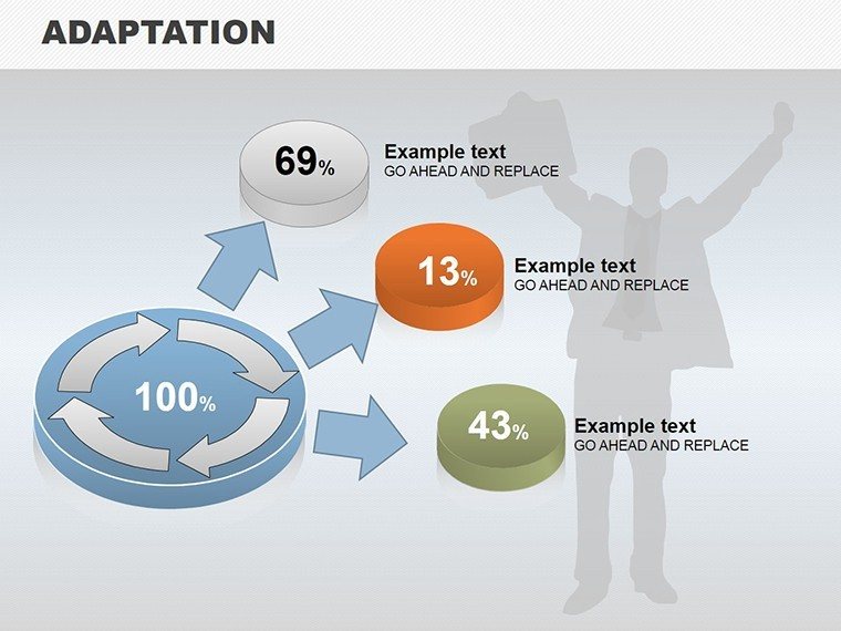
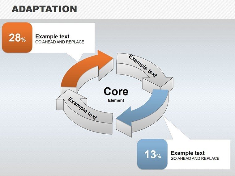
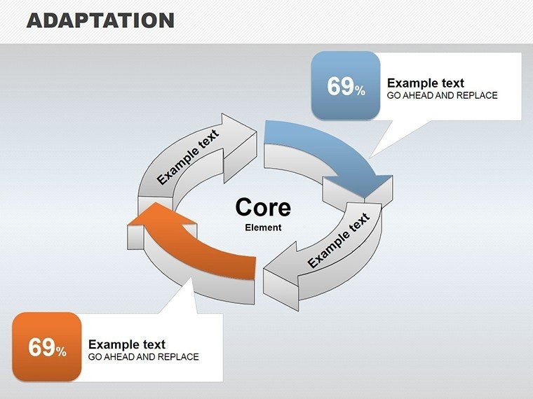
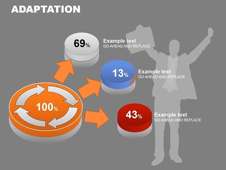
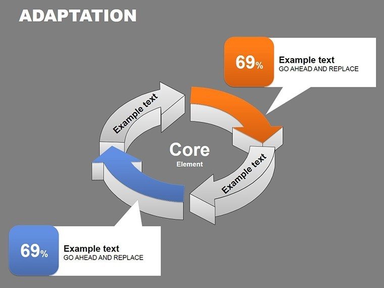
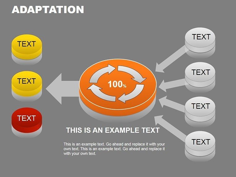
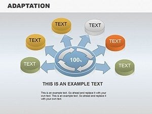
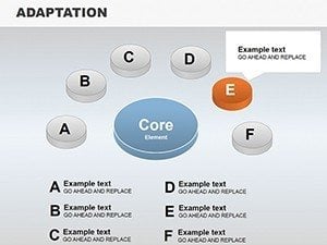
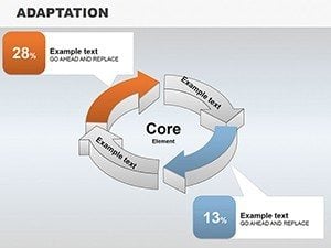
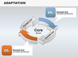
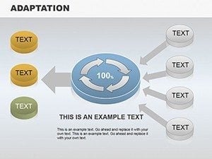
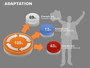
- 3D Cycle Visuals: Dynamic representations for process flows.
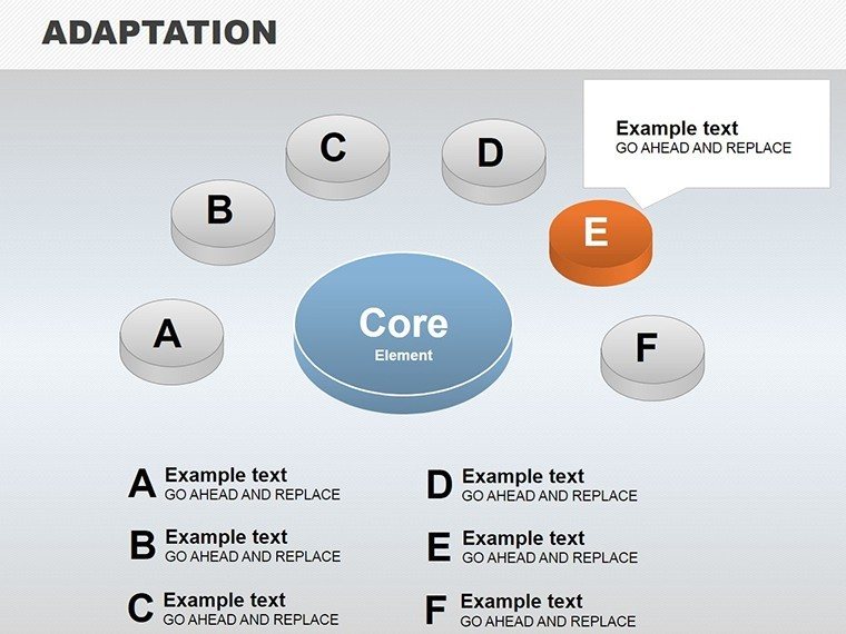
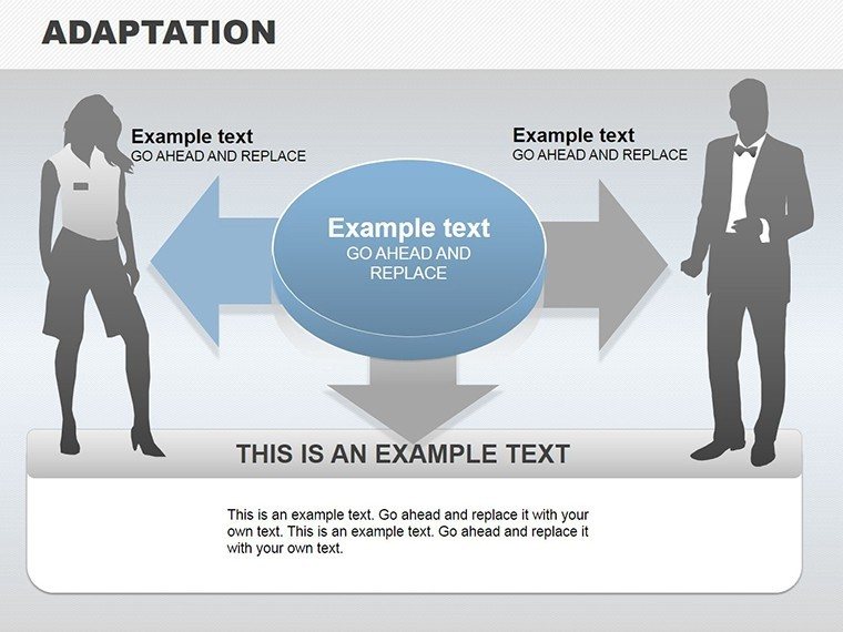
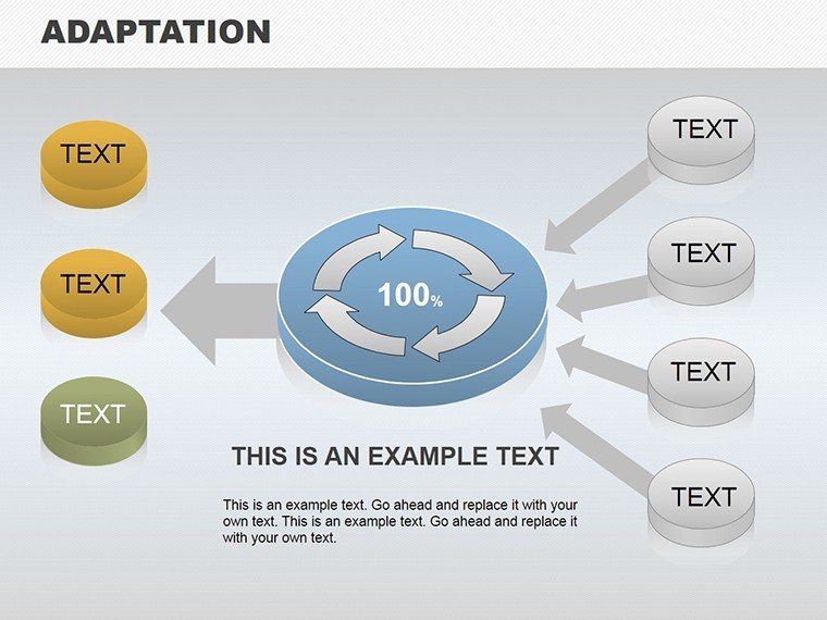
- Customization Depth: Full control over elements.
- Versatile Compatibility: Works across presentation platforms.
- Engaging Designs: Professional yet approachable aesthetics.
A case: An engineering firm used similar integrations to showcase sustainable designs, securing grants.
From Concept to Connection: Use Cases
Apply in pitches: Cycle through integration phases. Steps: Edit data, adjust 3D, present. Tips: Layer for complexity. Superior to basics for depth.
Integration Customization Steps
- Open and select chart.
- Input connections.
- Tweak visuals.
- Add details.
- Finalize.
Efficient for impactful results.
Superior Integration for Lasting Impressions
Outperforms by emphasizing links. Benefits: Clarity, engagement. CTA: "Integrate your ideas now."
Download and integrate success into your presentations.
Frequently Asked Questions
How 3D are the charts?
Fully rotatable for perspective.
Compatible with Mac?
Yes, via PowerPoint.
Can I animate integrations?
Yes, built-in options.
Expand slides?
Duplicate as needed.