Professional Six Sigma PowerPoint Charts Template


Type: PowerPoint Charts template
Category: Business Models, Pie
Sources Available: .pptx
Product ID: PC00122
Template incl.: 20 editable slides
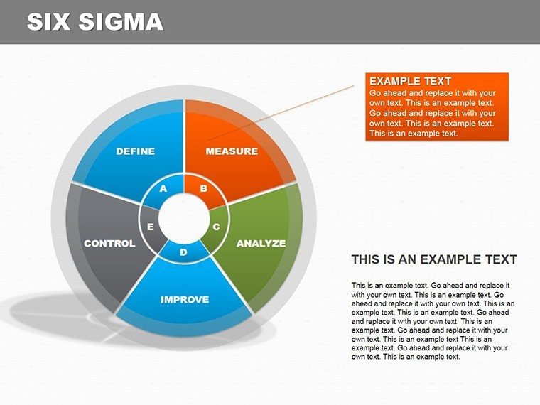
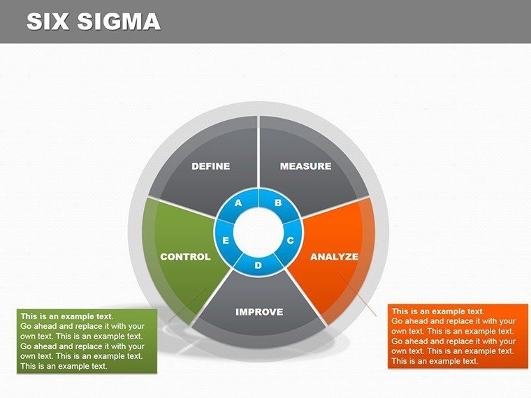
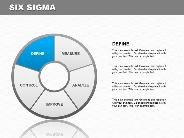
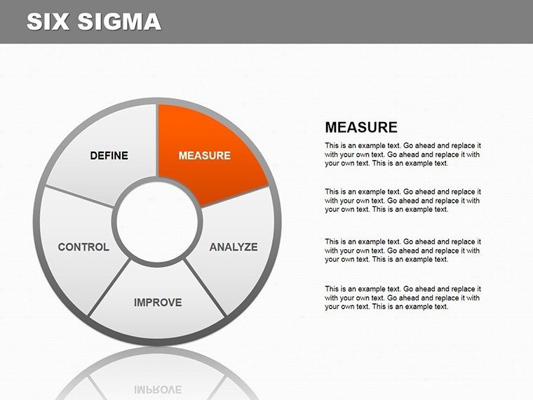
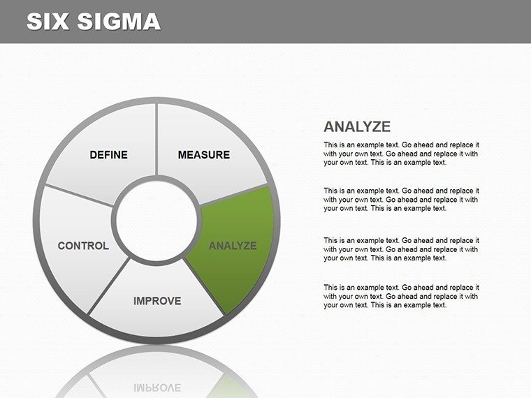
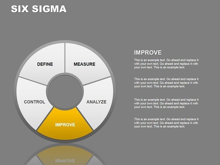
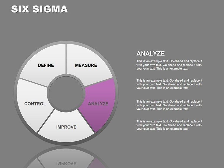
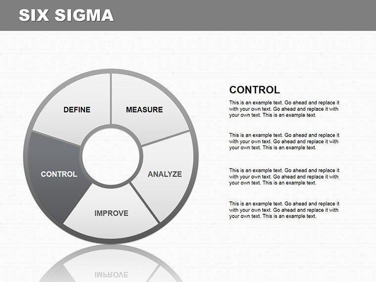
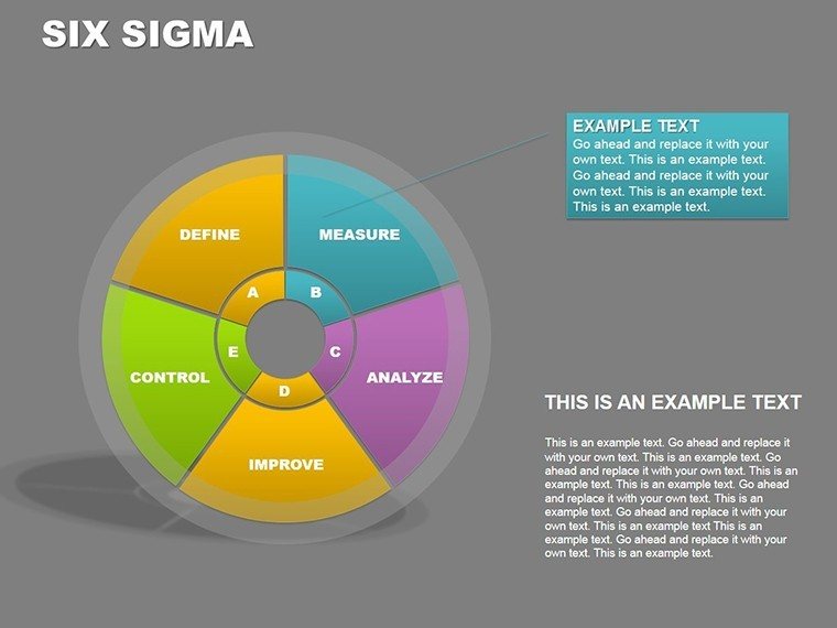
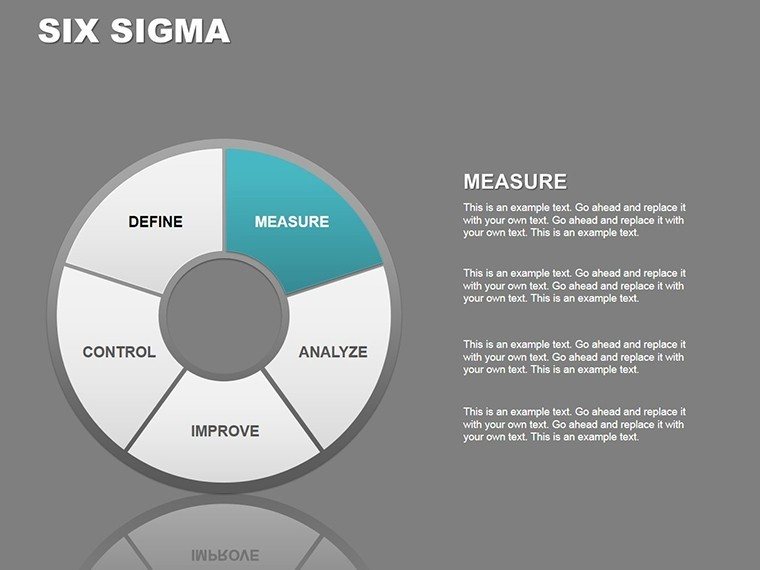
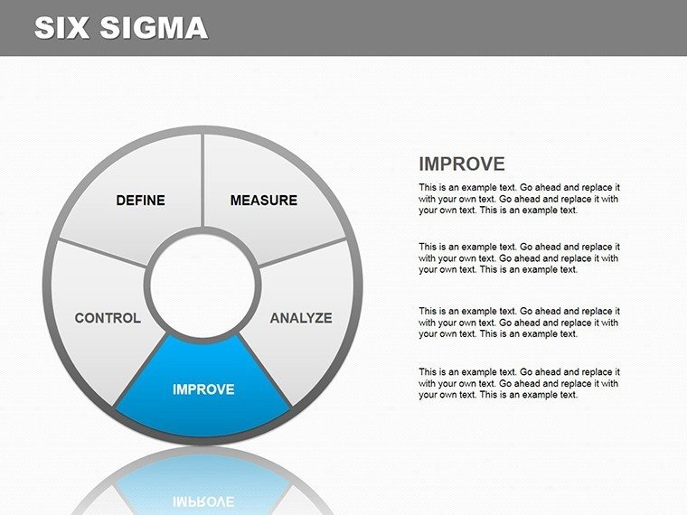
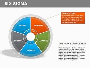
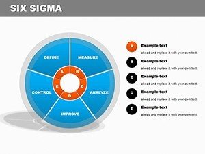
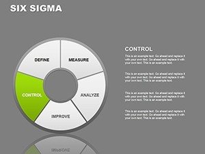
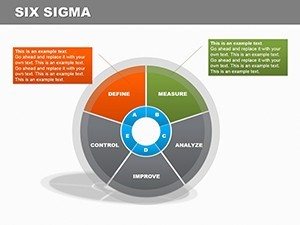
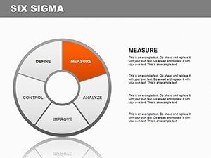
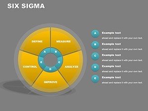
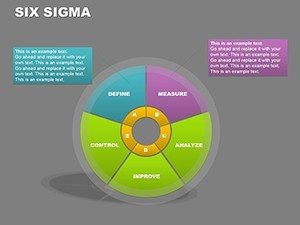
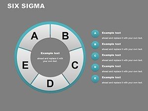
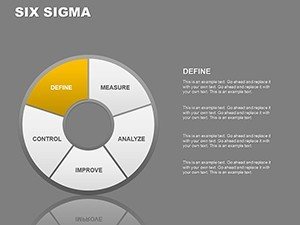
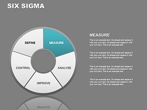
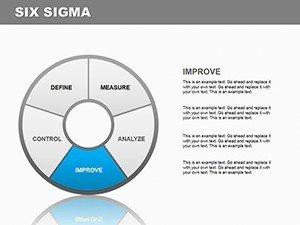
When precision meets presentation, magic happens in boardrooms and classrooms alike. Our Six Sigma PowerPoint Charts Template, with 20 editable slides, is crafted for those who demand accuracy in data storytelling. Whether you're a project manager dissecting process inefficiencies or a healthcare administrator tracking patient outcomes, this template turns raw data into polished visuals that drive improvements. Drawing from methodologies like DMAIC, it helps you visualize defects per million opportunities, making abstract concepts concrete and actionable.
Consider General Electric's legendary adoption of Six Sigma, where they saved billions by optimizing processes - now, you can mirror that in your presentations. Compatible with PowerPoint and Google Slides, the template offers a range of chart types, from bar graphs for variance analysis to pie charts for defect categorization. Customize styles to fit your brand, ensuring your message resonates without distraction. This isn't mere decoration; it's a tool for fostering a culture of continuous improvement, as seen in case studies from firms like Motorola and Honeywell.
Essential Features for Data-Driven Success
At its core, this template excels in data-driven accuracy. Each chart is engineered to represent metrics faithfully, avoiding common pitfalls like misleading scales. For instance, line graphs track process capability over time, perfect for manufacturing reports where sigma levels indicate quality. The user-friendly interface means even novices can create compelling visuals quickly, focusing energy on analysis rather than formatting.
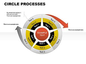
Variety is key: choose from pie charts to show proportional defects, bar charts for comparative studies, or scatter plots for correlation insights. In healthcare, use them to present readmission rates; in finance, for risk assessments. Benefits abound - clear communication reduces misunderstandings, boosts stakeholder buy-in, and accelerates decision-making. Unlike standard PowerPoint defaults, our designs incorporate Six Sigma best practices, ensuring your presentations align with industry standards.
Practical Use Cases Inspired by Real Successes
Real-world applications amplify this template's value. In a Lean Six Sigma project at a hospital, charts visualized wait times, leading to a 30% efficiency gain, as detailed in industry case studies. Educators can adapt it for teaching statistical process control, breaking down concepts like control limits with engaging visuals. Consultants rely on it for client pitches, demonstrating potential ROI through simulated before-and-after scenarios.
To integrate seamlessly, start with your data set - import from Excel for automatic updates. Customize the color schemes: muted tones for professional settings or vibrant hues for motivational workshops. Add icons for context, like stethoscopes for healthcare or gears for manufacturing, enhancing relatability. This workflow not only saves time but ensures compliance with standards like ISO 13053 for Six Sigma implementation.
Workflow Integration and Expert Tips
- Identify Key Metrics: Pinpoint sigma levels or defect rates relevant to your process.
- Select Chart Type: Match visuals to data - pies for parts, lines for trends.
- Customize for Audience: Tailor complexity; simplify for executives, detail for teams.
- Incorporate Narratives: Use annotations to explain insights, like root cause analysis.
- Test and Iterate: Review for clarity, refining based on feedback.
These steps, drawn from successful implementations at companies like Amazon, ensure your presentations deliver impact. For educators, weave in examples from real Six Sigma certifications, fostering deeper understanding.
Unlocking Potential with Six Sigma Visuals
Beyond features, this template builds authority. In competitive fields, visually superior presentations differentiate you, as evidenced by consulting decks from Bain or BCG. For manufacturing, it means clearer defect tracking; for finance, sharper forecasting. Trust stems from precision - our designs minimize errors, aligning with Six Sigma's core ethos.
Ready to refine your processes visually? Embrace the Six Sigma PowerPoint Charts Template and propel your presentations forward. Start customizing and see transformative results!
FAQ
- What chart types are included?
- A variety including bar, pie, line, and more, all tailored for Six Sigma analysis.
- Is it suitable for beginners?
- Yes, the easy-to-use design makes it accessible for all skill levels.
- Can I apply it to healthcare presentations?
- Definitely - ideal for tracking metrics like patient satisfaction or process efficiencies.
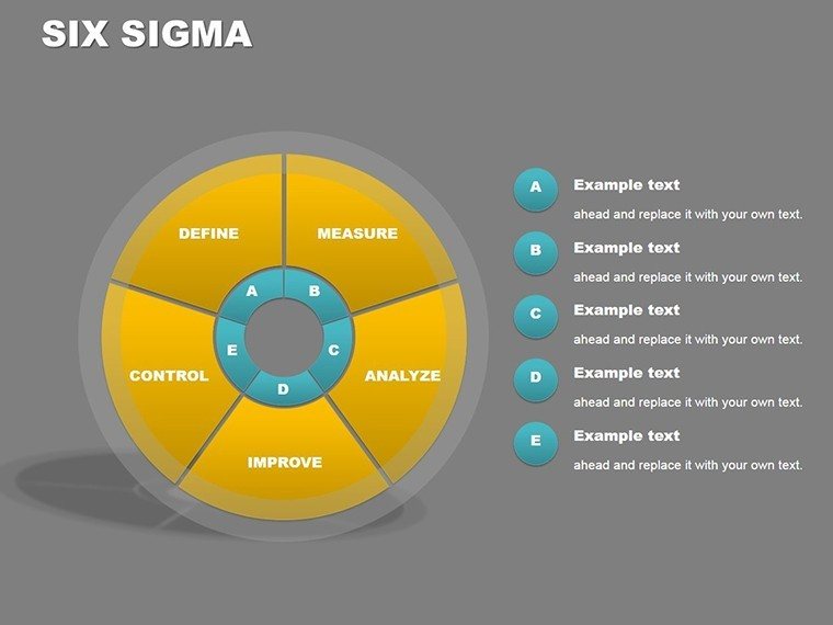
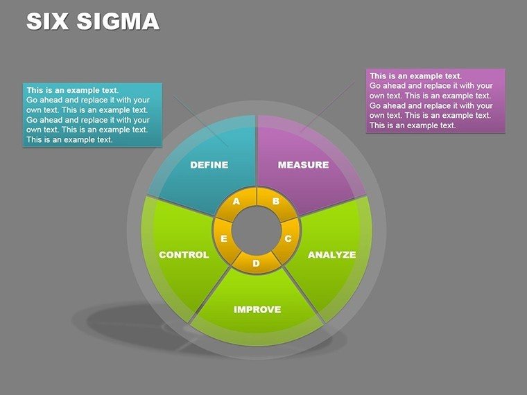
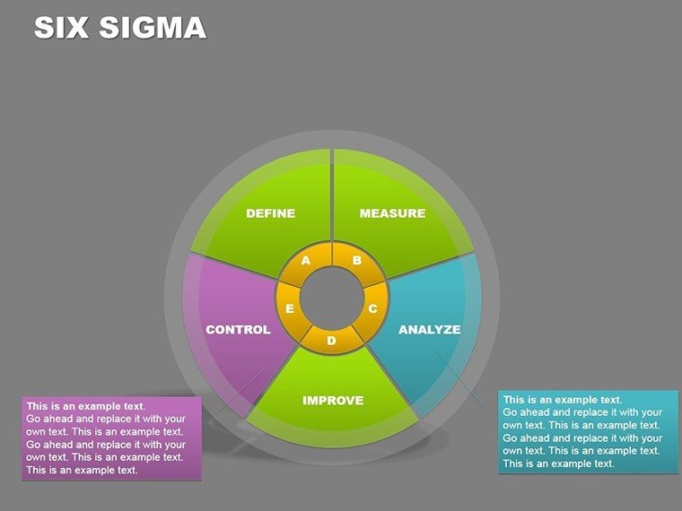
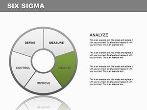
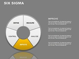
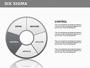
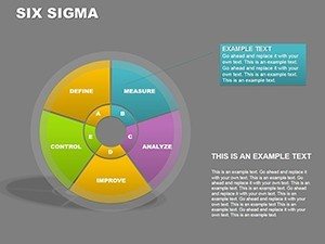
- How does it support DMAIC?
- Charts visualize each phase, from define to control, enhancing project flow.
- Are updates automatic?
- Yes, link to Excel for real-time data refreshes.
- Compatible with older PowerPoint versions?
- Works with recent versions; check compatibility for specifics.