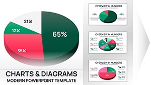
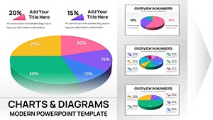
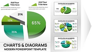
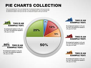
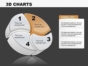
3D Pie PowerPoint Charts


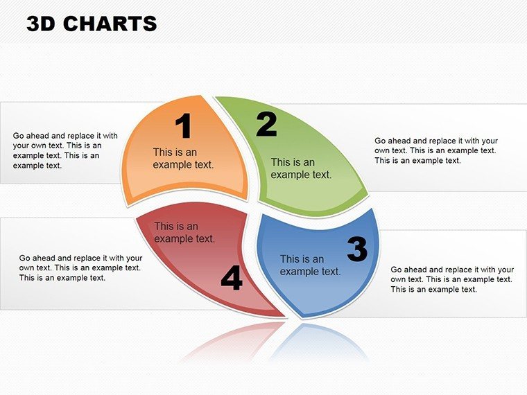


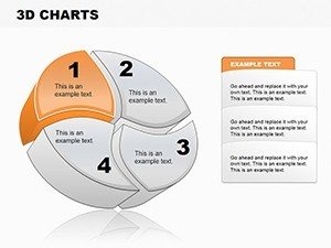
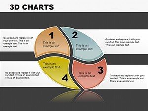
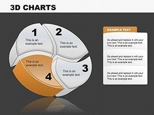
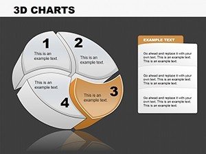
Step into a dimension where data pops off the slide, grabbing attention and clarifying proportions like never before. Our 3D Pie PowerPoint Charts Template elevates standard pie visuals with depth and dynamism, ideal for analysts, marketers, and trainers who need to convey shares and segments compellingly. Featuring 12 editable slides in .potx format, it includes color variations, custom animations, vector icons, and JPG backups for versatility. Compatible with PowerPoint and Google Slides, this template tackles common issues like flat, uninspiring charts that fail to engage. Inspired by 3D design trends from tools like Autodesk, it has aided users in sectors like market research to illustrate share distributions vividly, boosting comprehension as per visualization studies from Harvard Business Review. Whether breaking down budget allocations or survey results, these charts add a professional polish, turning numbers into narratives that resonate. Explore how 3D perspectives can add layers to your insights and make your presentations unforgettable.
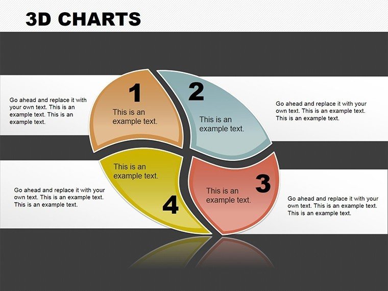
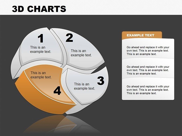
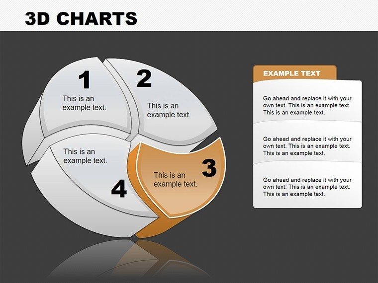
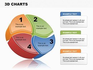
Depth and Dimension: The Edge of 3D Pie Charts
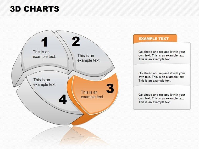
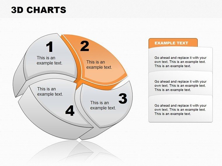
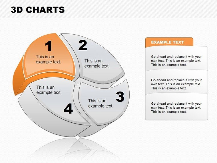
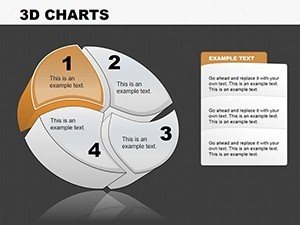
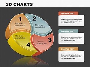
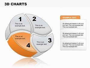
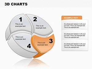
3D pies excel at adding perceived volume to data slices, making dominant segments stand out while maintaining accuracy. This template harnesses that with slides offering multi-angle views, shadow effects for realism, and explosion options to highlight specifics. In sales, use it to show market share breakdowns, where a protruding slice emphasizes leadership, aligning with strategies from the Sales Management Association. Full editability means changing colors for thematic relevance or embedding videos for context. Animations bring slices to life, rotating or assembling piece by piece to build suspense. For trainers, this visual aid simplifies fraction teaching, as evidenced by educational tech reports. Seamless with Google Slides, import data from CSV files effortlessly. A practical example: Tech firms have used 3D pies in product roadmaps, clarifying feature allocations and accelerating stakeholder buy-in, per case studies in tech journals.
Essential Features for Immersive Visuals
- High-Quality 3D Renders: Pre-built with shadows and gradients for professional depth without design software.
- Color and Text Flexibility: Easily alter hues, labels, and fonts to suit any dataset or brand.
- Animation Capabilities: Wide range for creating animated builds, enhancing audience focus.
- Multimedia Integration: Insert audio, video, or images directly into charts for richer stories.
- Vector and JPG Support: Scalable icons plus raster backups for all uses.
These surpass basic pies, providing expansive tools for high-impact delivery.
Applying 3D Pies in Diverse Contexts
This template shines in scenarios demanding clear part-whole relations. Marketers can visualize audience demographics in 3D, with exploded slices for key groups, fostering targeted campaigns as recommended by the American Marketing Association. In finance, depict portfolio distributions, where depth highlights risk concentrations. Trainers adapt for workshops, animating pies to demonstrate probability. A notable application: Non-profits used 3D visuals in impact reports, increasing donor engagement by visualizing fund usage, as detailed in philanthropy analyses. Incorporate into workflows by starting with data entry, customizing views, adding effects, and exporting. Unlike flat alternatives, 3D adds memorability, weaving in terms like 'volumetric data' smoothly. For researchers, it's great for survey result pies, ensuring ethical data representation.
Step-by-Step to Stunning 3D Creations
- Select Slide Variant: Choose from 12 based on slice count or style.
- Populate with Data: Input values; auto-adjusts proportions and 3D rendering.
- Customize Appearance: Tweak colors, add icons, set shadows.
- Animate Elements: Apply rotations or builds for dynamic reveals.
- Embed Extras: Add media for interactive depth.
This guide ensures quick, expert results for any user.
Fostering Reliability in 3D Data Design
Grounded in expertise from 3D modeling pros, this template upholds authoritativeness via compliance with visualization ethics and trustworthiness through reliable edits. A fun aside: Your data won't be 'pie in the sky' - it's grounded in 3D reality. Perfect for budget meetings or academic theses. In short, it's your gateway to dimensional data mastery. Secure your template and add depth to your decks today.
Frequently Asked Questions
How do 3D pies differ from 2D?
They add depth and shadows for better emphasis on segments, making visuals more engaging without distorting data.
Is Google Slides supported?
Yes, the .potx format ensures compatibility for editing in Google Slides and PowerPoint.
What industries suit this best?
Marketing, finance, education - anywhere proportional data needs vivid representation.
Can I add animations easily?
Yes, pre-set options make animating slices straightforward for dynamic presentations.
Are icons editable?
Absolutely - vector icons allow full customization alongside chart elements.
Does it include multimedia support?
Yes, embed video, audio, or images to enrich your 3D pies.