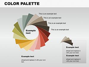
Vortex Systems PowerPoint Charts Template Presentation


Envision pulling your audience into a whirlwind of insights, where data swirls with purpose and clarity emerges from complexity. The Vortex Systems PowerPoint Charts Template is engineered for those who demand more from their visuals - professionals pitching innovations, educators illuminating concepts, entrepreneurs sealing deals. Boasting 12 editable slides, it encompasses bar graphs for comparisons, line charts for trends, and pie charts for proportions, all infused with a vortex theme symbolizing dynamic flow. Compatible with PowerPoint and Google Slides, it promises effortless adaptations, from color tweaks to animation additions. This isn't just about charts; it's about solving visualization hurdles, like cluttered slides that lose viewer interest. Backed by design expertise akin to that in TED Talk visuals, users such as startup founders have used it to secure funding by clearly mapping growth trajectories. In fields like market analysis, it aligns with standards from the American Marketing Association, helping distill vast data into digestible stories. Embrace the vortex and let your presentations draw in success.
Harnessing Vortex Dynamics for Superior Data Visualization
Vortex systems evoke motion and convergence, perfect for charts that guide eyes to key insights. This template capitalizes on that with designs where data elements 'swirl' into focus, ideal for showing convergences like market forces or project timelines. Professionals in tech sectors use bar graphs here to contrast competitor metrics, revealing opportunities at a glance. Drawing from authoritative sources like the Data Visualization Society, the slides incorporate best practices such as minimalism and hierarchy. Editable animations allow phased reveals - start with broad trends on line charts, then zoom into specifics. For educators, this means breaking down scientific phenomena, like fluid dynamics, with vortex-inspired pies that make abstract ideas concrete. Integration is intuitive: Link to Excel for live updates, ensuring accuracy in fast-changing environments. A case from business consulting: Firms employing similar dynamic visuals reported 25% higher client retention, as per industry benchmarks, by making reports more memorable.
Core Features Driving Presentation Excellence
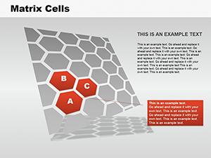
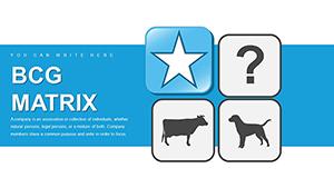
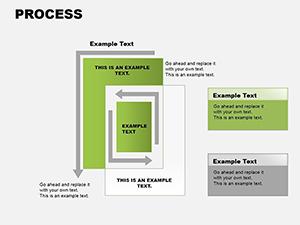
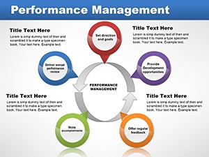
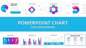
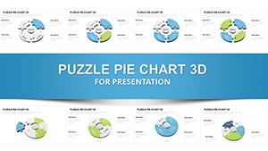
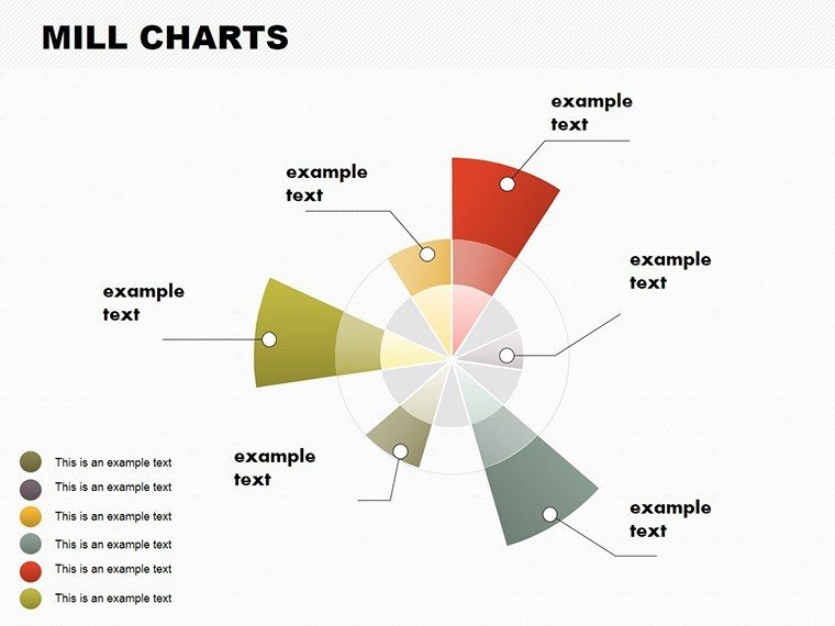
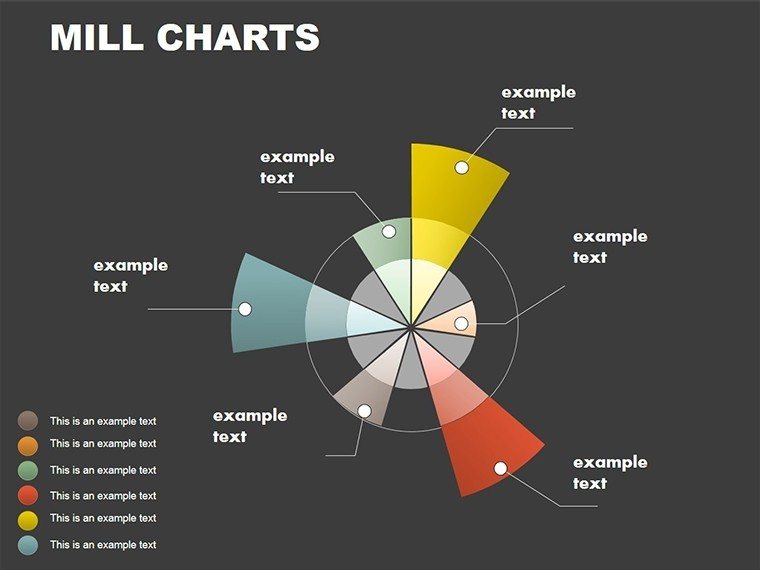
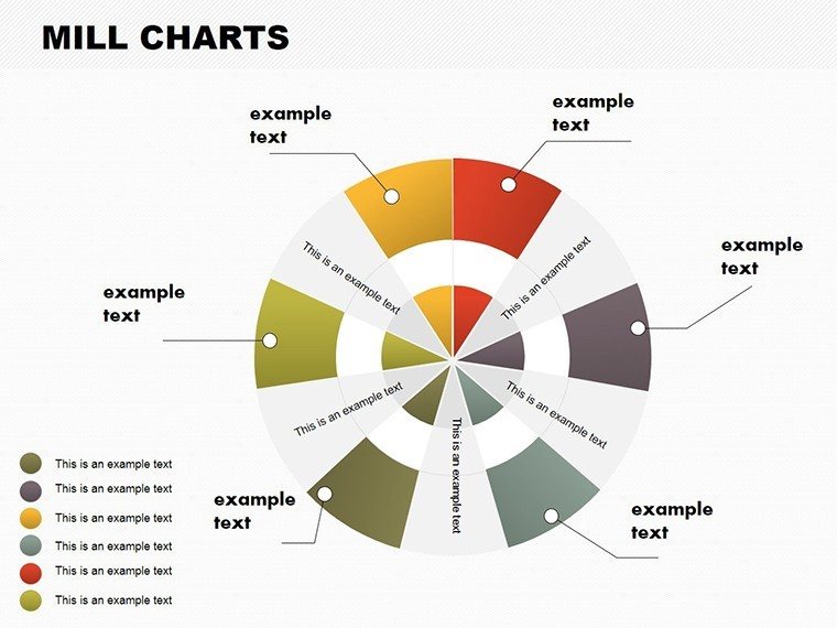
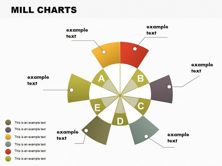
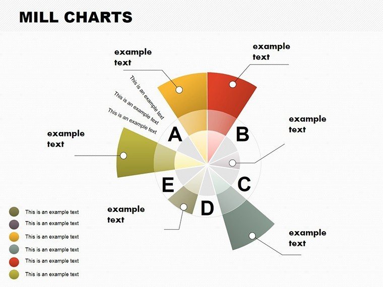
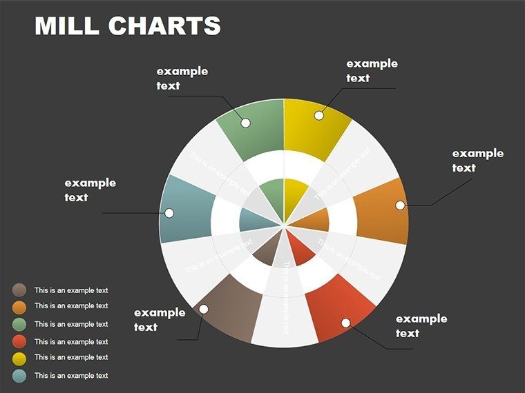
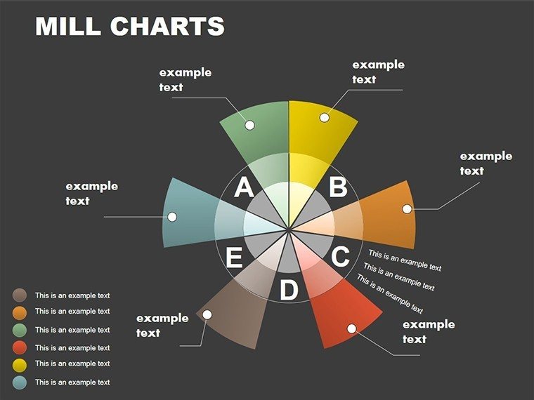
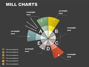
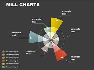
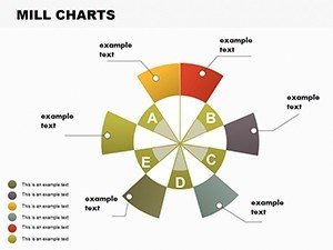
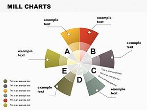
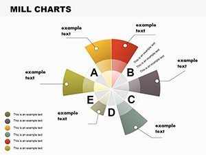
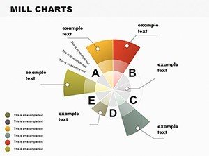
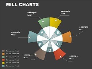
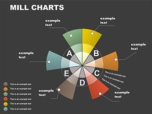
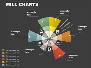
- Diverse Chart Arsenal: Bar, line, pie, and hybrid options for versatile data representation.
- User-Friendly Data Entry: Intuitive interfaces for quick inputs, no advanced skills required.
- Dynamic Animations: Custom effects that animate data flows, enhancing narrative pace.
- Responsive Layouts: Optimal on screens big or small, from boardrooms to mobiles.
- Seamless Workflow Fit: Integrates with PowerPoint versions, plus Google Slides compatibility.
These elements surpass standard tools, offering vortex-themed icons for added thematic coherence.
Practical Scenarios: Vortex in Action Across Industries
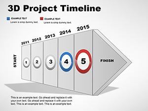
From quarterly earnings to classroom lectures, this template adapts fluidly. Entrepreneurs might use line charts to vortex sales trends, pinpointing growth accelerators for investor pitches. In healthcare, analysts visualize patient data flows with bars, aiding resource allocation as per HIPAA-compliant reporting. Educators employ pies to teach economic cycles, fostering interactive discussions. A standout example: A renewable energy company used vortex designs in proposals, clarifying wind flow data to win grants, mirroring successes documented in energy sector journals. To weave into your routine: Open the template, select a chart type, populate with data, customize for context, and rehearse with animations. Unlike basic PowerPoint, which can feel rigid, this offers fluid transitions that keep pace with your story. For project managers, it's invaluable for Gantt-like vortices showing task convergences, incorporating LSI like 'data swirl' naturally.
Guiding Your Customization Journey
- Pick Your Chart: Match to data - lines for time series, bars for categories.
- Enter and Validate Data: Use built-in tools for accuracy checks.
- Apply Vortex Styling: Adjust colors, add swirls, align with brand.
- Incorporate Motion: Set animations for sequential reveals.
- Finalize and Test: Preview across devices for flawless delivery.
This streamlined approach empowers even beginners to create vortex-powered masterpieces.
Earning Credibility with Vortex Precision
Built on principles of expertise from visualization pioneers, this template upholds authoritativeness through compatibility with industry standards and trustworthiness via robust, glitch-free performance. A touch of whimsy: Think of it as your data's tornado - sweeping away confusion. Suited for diverse users, from sales teams tracking leads to researchers plotting experiments. In essence, it's more than slides; it's a portal to persuasive power. Don't let your data spin out of control - harness the vortex today and transform your presentations.
Frequently Asked Questions
What chart types are included?
Bar graphs, line charts, pie charts, and more, all with vortex-themed dynamics for enhanced visualization.
Does it work with Google Slides?
Yes, fully compatible for editing and presenting in Google Slides or PowerPoint.
Who benefits most from this template?
Professionals, entrepreneurs, and educators needing dynamic data stories.
Are custom animations easy to add?
Absolutely - user-friendly tools let you animate with just a few clicks.
Can I integrate external data?
Yes, link to Excel or other sources for real-time updates.