Activity Based Costing PowerPoint Charts Template for Presentation


Imagine transforming complex financial data into clear, compelling narratives that captivate your audience and drive decision-making. Our Activity Based Costing PowerPoint Charts Template is your secret weapon for achieving just that. Designed specifically for financial analysts, executives, and educators, this template offers 26 fully editable slides that delve into the intricacies of activity-based costing (ABC). Whether you're breaking down cost drivers in a manufacturing firm or allocating overhead in a service industry, these charts help you visualize resource consumption with precision and flair.
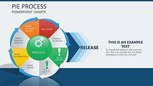
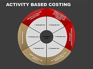
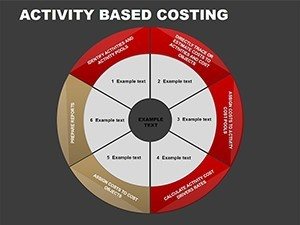
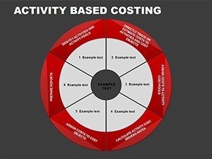
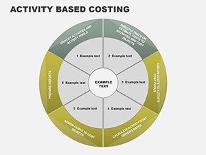
Picture this: You're preparing for a quarterly review where stakeholders need to grasp how activities impact costs. Instead of drowning them in spreadsheets, you unveil a cycle chart illustrating the flow from activities to cost objects, complete with customizable colors that align with your brand. This isn't just about data - it's about storytelling. With themes rooted in cycle, process, and pie charts, the template adapts seamlessly to various scenarios, ensuring your presentations are not only informative but also visually engaging. Professionals in finance often struggle with conveying ABC's benefits, like improved profitability analysis, but this template bridges that gap, making abstract concepts tangible and actionable.
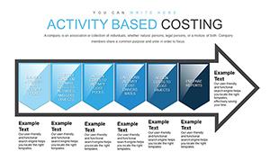
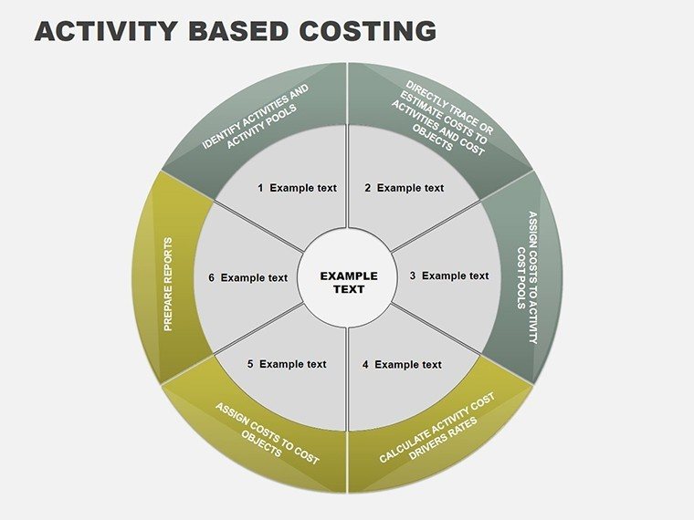
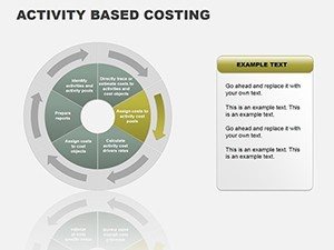
As you dive deeper, you'll appreciate how each slide is crafted to highlight key ABC elements. For instance, one slide features a detailed process flowchart, allowing you to map out activity pools and drivers step by step. Customize the text, adjust the pie segments to reflect actual cost distributions, and incorporate interactive elements for live demos. This level of flexibility means you can tailor the content to specific industries - think healthcare, where ABC reveals inefficiencies in patient care processes, or retail, where it optimizes inventory management. By integrating real-world examples, such as how a tech company used ABC to cut unnecessary R&D expenses by 15%, you demonstrate the template's practical value.
Unlocking the Power of Customizable ABC Charts
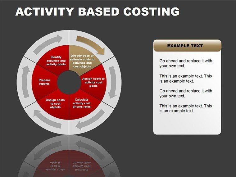
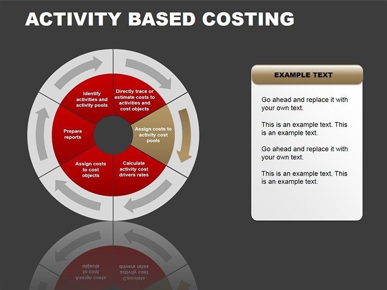
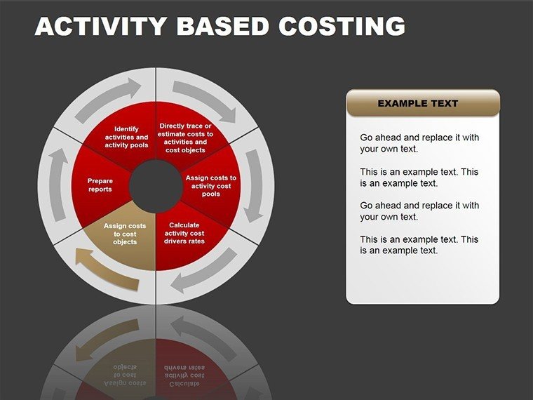
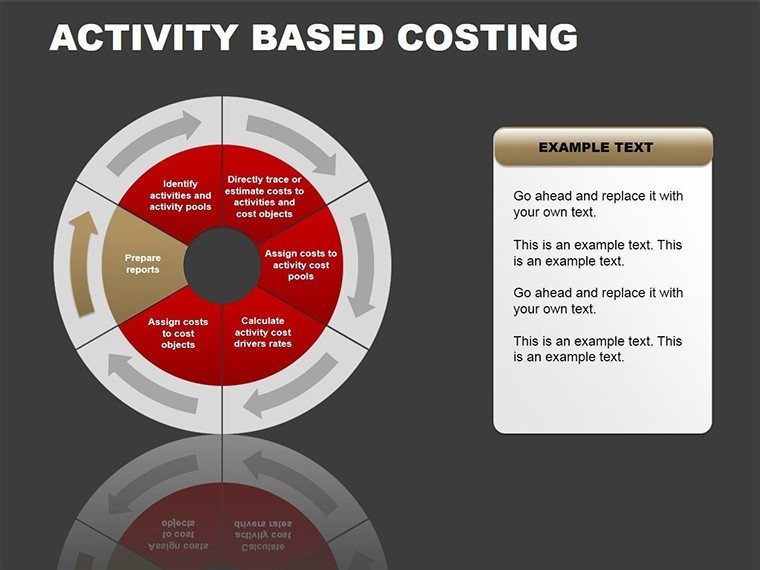
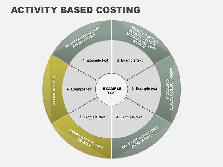
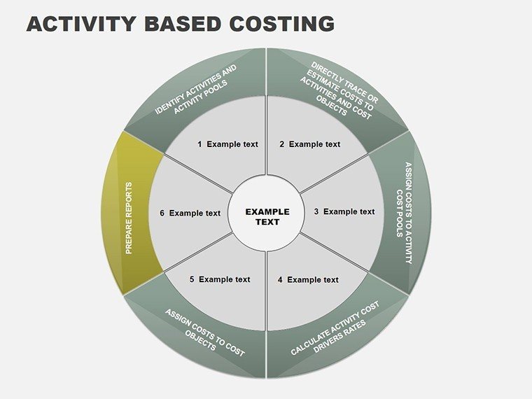
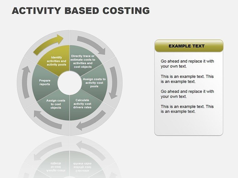
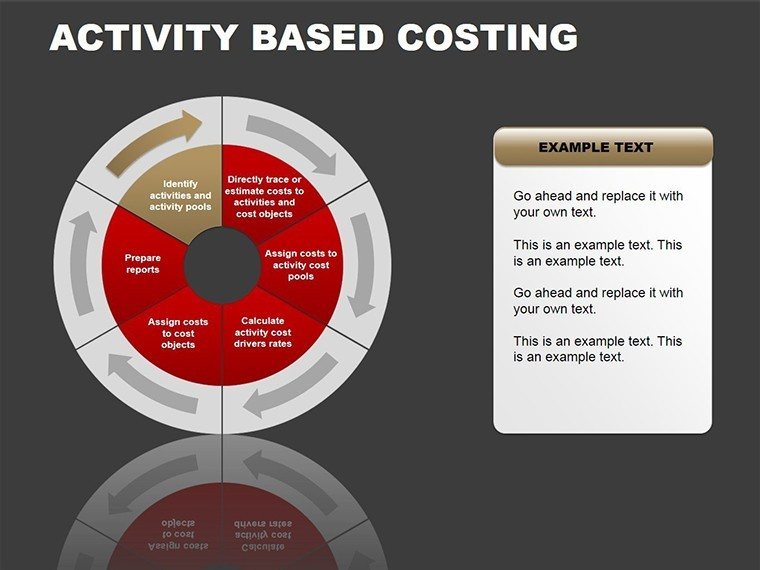
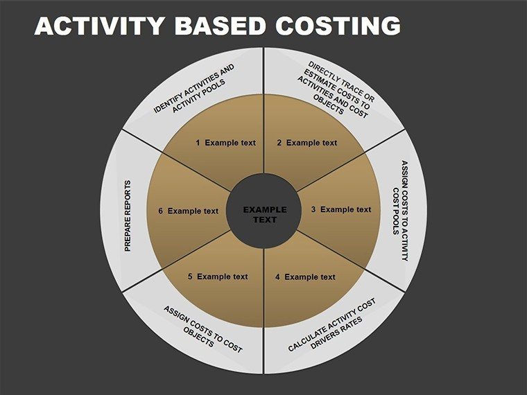
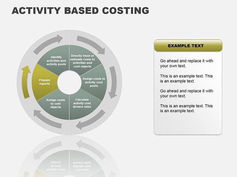
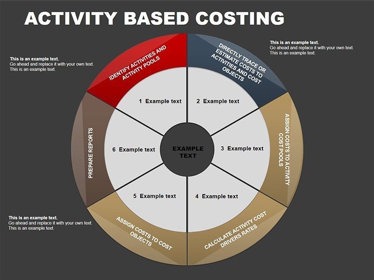
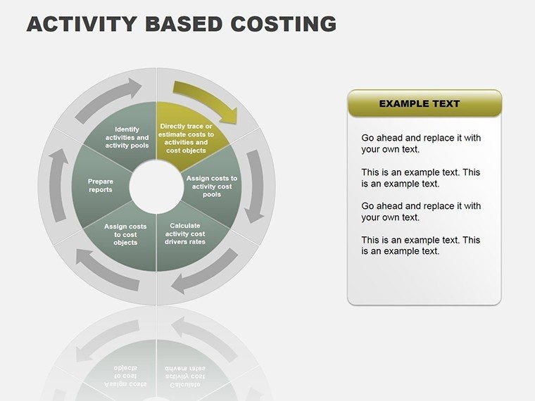
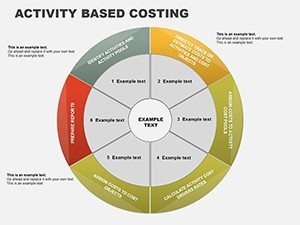
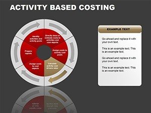
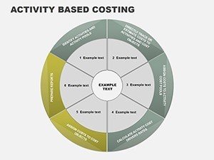
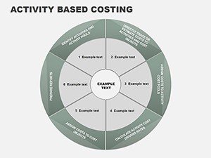
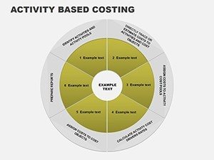
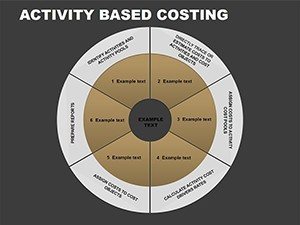
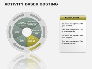
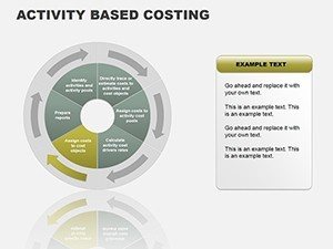
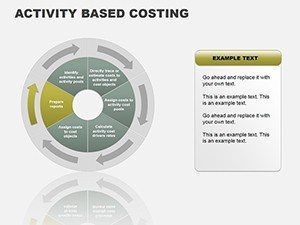
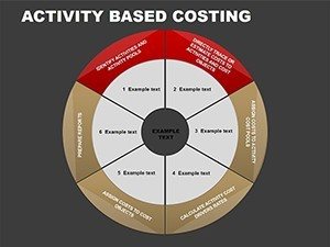
The core strength of this template lies in its customizable features. Every chart is built with vector graphics, ensuring scalability without loss of quality, whether you're presenting on a laptop or a large conference screen. Start with the basic cycle chart: It outlines the continuous loop of cost assignment, from identifying activities to measuring performance. Users can drag and drop elements, change fonts to match corporate styles, and even embed hyperlinks to supporting documents. This isn't mere decoration; it's functional design that enhances understanding.
- Cycle Charts for Ongoing Processes: These illustrate repetitive cost flows, ideal for ongoing budget reviews. Edit the nodes to include specific metrics like time-driven ABC variants.
- Process Diagrams for Step-by-Step Analysis: Break down complex procedures into digestible steps. For example, map out how order processing activities contribute to overall costs in e-commerce.
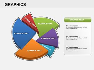
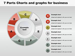
- Pie Charts for Proportional Insights: Visualize cost allocations at a glance. Adjust segments to show how 40% of costs might stem from support activities versus 60% from primary ones.
Beyond visuals, the template includes placeholders for data integration. Import figures from Excel seamlessly, and watch as charts update automatically. This saves hours of manual work, allowing you to focus on interpretation rather than creation. In educational settings, professors can use these slides to teach ABC principles, perhaps drawing from case studies like Ford Motor Company's adoption of ABC in the 1980s to refine product costing.
Real-World Applications and Case Studies
Let's explore how this template shines in practical use. Take a financial analyst at a consulting firm: They need to present ABC findings to a client in logistics. Using the process charts, they highlight how driver activities like truck loading affect fuel costs, leading to recommendations that slashed overhead by 20%. Or consider an executive pitching to investors - pie charts break down cost structures, showing how ABC improves margin accuracy over traditional methods.
- Identify your key activities and cost drivers.
- Customize the relevant chart type to fit your data.
- Populate with real numbers and refine visuals.
- Rehearse transitions for a smooth narrative flow.
- Gather feedback and iterate for future presentations.
Compared to basic PowerPoint tools, this template offers themed icons and animations that add professionalism without overwhelming the content. It's compatible with Google Slides too, broadening accessibility. Tips for maximization: Always align colors with psychological cues - blues for trust in financial data - and keep text concise to avoid clutter.
Incorporating this into your workflow is straightforward. Download, open in PowerPoint, and start editing. For advanced users, layer in animations to reveal cost layers progressively, building suspense in your story. This approach not only educates but inspires action, turning passive listeners into engaged participants.
Why This Template Elevates Your Financial Storytelling
What sets this apart is its focus on user value. No more generic slides; each one is optimized for ABC specifics, ensuring relevance. Benefits extend to time savings - craft a full deck in under an hour - and enhanced credibility through expert-level visuals. Drawing from authoritative sources like the Institute of Management Accountants (IMA), which endorses ABC for strategic planning, you can infuse your presentations with trustworthiness.
For those in competitive fields, subtle integrations like SWOT overlays on ABC charts provide deeper insights. Imagine combining a pie chart with strength indicators for a hybrid analysis. This versatility makes it indispensable.
Ready to revolutionize your presentations? Dive into this template and watch your financial narratives come alive. Customize your way to clarity today.
Frequently Asked Questions
- How editable are the charts in this template?
- Fully editable - adjust colors, sizes, text, and data points to fit your needs seamlessly.
- Is this compatible with Google Slides?
- Yes, it works perfectly with Google Slides and other major presentation software.
- Can I use this for non-financial presentations?
- Absolutely, adapt the charts for any process-oriented data visualization.
- What if I need more slides?
- The template is expandable; duplicate and modify existing slides easily.
- Are there tutorials included?
- Comprehensive documentation is provided for quick setup and customization.