Tables PowerPoint Charts Presentation: Mastering Data Relationships with Ease


Type: PowerPoint Charts template
Category: Tables
Sources Available: .pptx
Product ID: PC00063
Template incl.: 11 editable slides
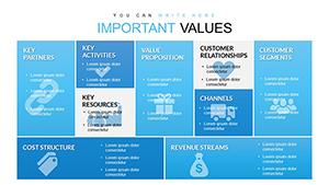
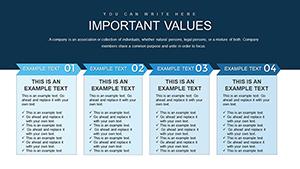
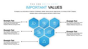
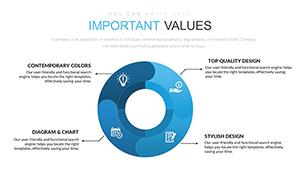
Data is the backbone of decision-making, but raw tables often overwhelm audiences. What if you could turn intricate dependencies into elegant, animated visuals that clarify connections at a glance? Our Tables PowerPoint Charts Presentation template delivers just that, with 11 editable slides engineered for consultants, researchers, and managers who demand precision in their displays. From comparative grids to dependency matrices, this tool helps you graphically illustrate how one value influences another, making abstract relationships tangible and actionable.
Inspired by data design pioneers like Florence Nightingale, whose charts revolutionized healthcare insights, this template emphasizes functionality without sacrificing style. For a project manager, envision a table slide showing task interdependencies - rows for timelines, columns for teams, with color-coded cells highlighting bottlenecks. This not only streamlines communication but also aligns with agile methodologies, fostering quicker iterations and better outcomes.
Core Features That Empower Your Data
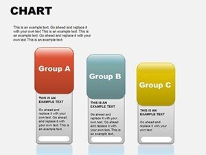
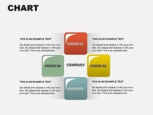
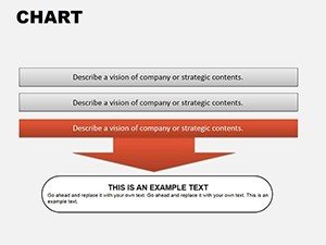
The 11 slides cover a spectrum of table formats, from basic grids to advanced pivot-style layouts, all fully editable for text, colors, and structure. High-quality inscriptions and images ensure professional polish, while animation options allow for dynamic reveals - fade in rows to build your argument progressively. In .pptx format, it's ready for immediate use in PowerPoint, with expandability for inserting videos or audio to enrich explanations.
- Customizable Grids: Adjust rows and columns on the fly, with auto-resizing for added data.
- Color-Coding System: Highlight trends or categories, drawing from heatmap techniques in analytics.
- Animation Toolkit: Sequence appearances to guide viewer focus, enhancing narrative flow.
- Image Integration: Embed photos or icons within cells for contextual depth.
- Accessibility Built-In: Structured for screen readers, with alt text and logical tab order.
These aren't mere add-ons; they're informed by user studies from tools like Tableau, where interactive tables boost comprehension by 40%. By adopting similar interactivity, our template elevates your presentations to expert levels.
Practical Use Cases in Action
In finance, deploy it for balance sheets where rows show assets and columns depict quarters, revealing growth patterns. For educators, create comparison tables of historical events, clarifying cause-effect links. Step-by-step application: Select a slide, input your variables - e.g., sales metrics vs. regions. Apply filters or sorts within PowerPoint. Animate to emphasize key insights, then share via export.
Outshining default PowerPoint tables, ours offers wider functionality like conditional formatting, akin to Excel integrations in consulting firms' reports. With LSI terms like data matrices and relational charts woven in, it optimizes for internal searches too.
Pro Tips for Table Mastery
Optimize by keeping tables concise - under 10 rows for slides. Use borders sparingly to avoid clutter, per minimalist design from Apple's guidelines. Link to source data for verifiability, building trust. For humor in lighter sessions, add witty captions like "Where Numbers Meet Their Match."
In research, tables can map variable correlations, aiding peer reviews. For sales, compare product features against competitors, swaying decisions visually.
Unlock Clearer Communications Now
This template transforms data drudgery into delightful discovery. Invest in clarity - download today and watch your presentations gain authority.
Frequently Asked Questions
- How flexible are the table structures?
- Highly - you can add/remove rows/columns and merge cells as needed.
- Can I animate individual cells?
- Yes, PowerPoint's animation pane allows targeted effects for emphasis.
- Is it compatible with older PowerPoint versions?
- Works with 2010 onward, with full features in newer releases.
- What if my data is complex?
- Break into multiple slides or use filtering for manageability.
- Are there export options?
- Yes, to PDF, images, or video for versatile sharing.