Business Bar PowerPoint Charts Template for Presentations


Type: PowerPoint Charts template
Category: Matrix, Business Models, Tables
Sources Available: .potx
Product ID: PC00055
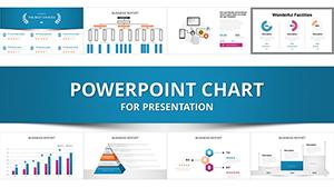
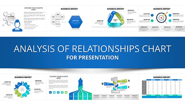
Template incl.: 14 editable slides
Step into a realm where your business data doesn't just sit on a slide - it leaps out, commanding attention and driving decisions. The Business Bar PowerPoint Charts Template is your secret weapon for turning mundane metrics into mesmerizing visuals. With 14 editable slides at your disposal, this template caters to the savvy professional who knows that a well-crafted bar chart can seal a deal or spark innovation. Envision presenting sales forecasts where bars rise dynamically to reflect growth trajectories, or comparing departmental performances with color-coded clarity that highlights strengths at a glance. Designed for entrepreneurs pitching to investors, consultants advising clients, or educators simplifying complex theories, it tackles the frustration of outdated, rigid charts by offering fluid, brand-aligned designs that evolve with your narrative.
Unlocking Potential with Business Bar Charts
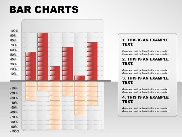
At its core, this template redefines data presentation by merging matrix structures with business model visuals and tabular integrations. Unlike standard PowerPoint bars that feel flat and uninspiring, these charts incorporate layered comparisons, allowing you to overlay trends or benchmarks seamlessly. For a financial analyst, this means illustrating revenue streams against expenses in a single, cohesive view, revealing insights that might otherwise hide in spreadsheets. Drawing from principles in data journalism, where clarity trumps complexity, the template ensures your visuals adhere to best practices - balanced axes, legible labels, and subtle animations that guide the eye without overwhelming.
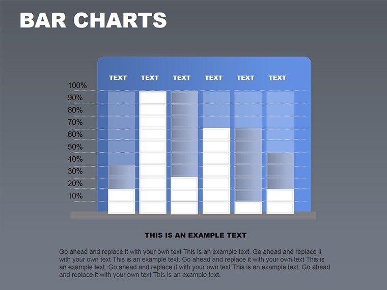
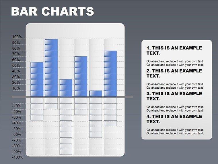
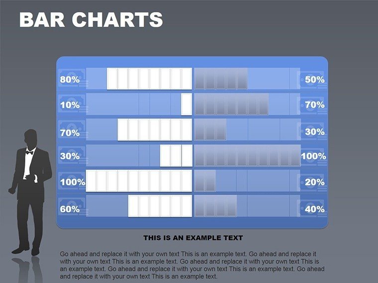
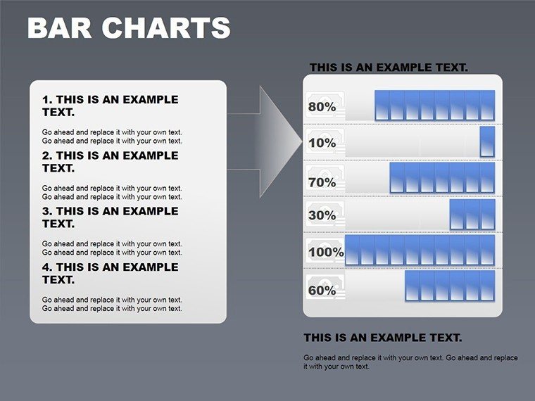
Versatile Data Visualization Styles
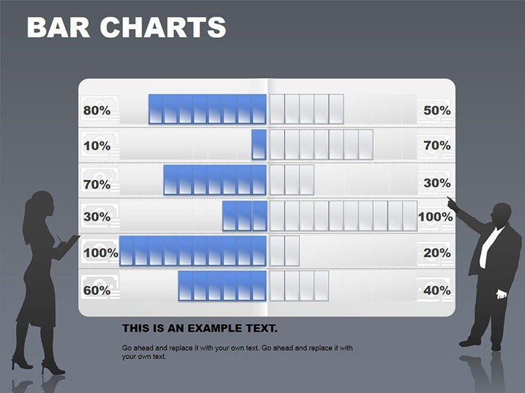
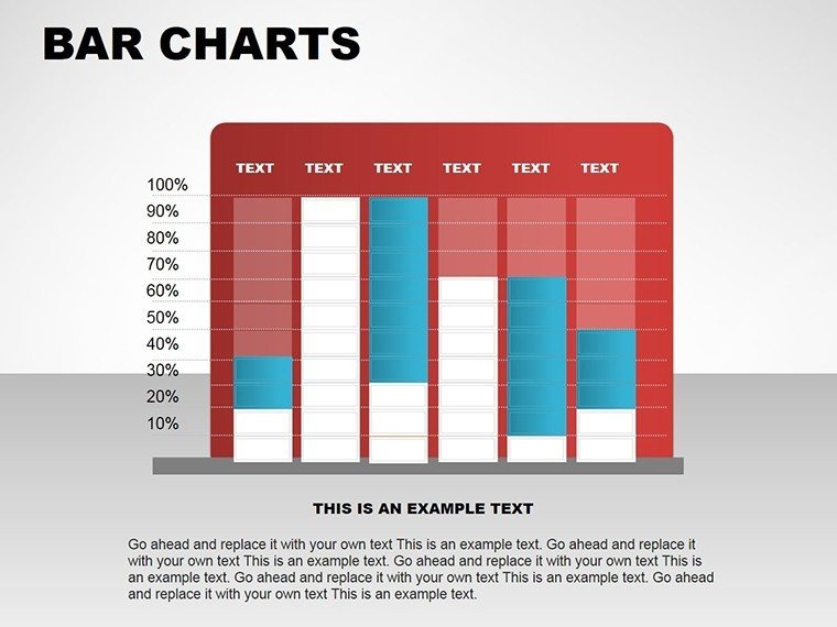
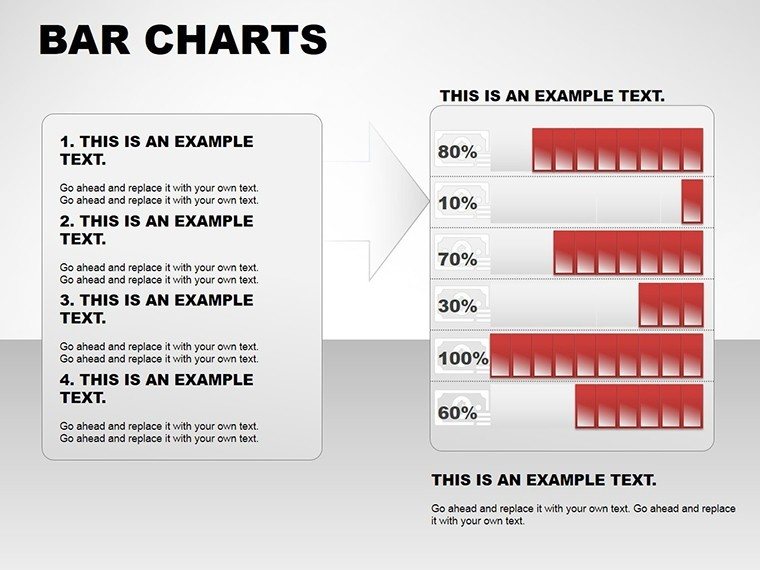
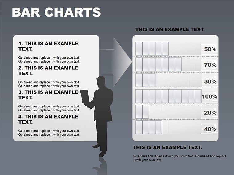
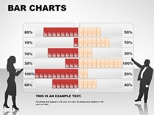
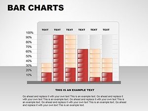
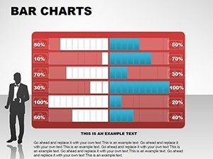
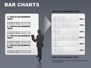
Explore a spectrum of bar chart variations, from stacked bars showing composition to clustered ones for side-by-side analyses. Each slide is prepped for quick adaptations: input your dataset, and watch as the bars adjust proportionally. In a marketing context, use clustered bars to compare campaign ROI across platforms, with tooltips revealing exact figures on hover. This versatility extends to hybrid formats, blending bars with tables for detailed breakdowns, perfect for annual reports where executives need both overview and specifics.
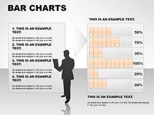
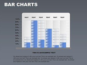
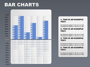
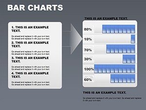
- Stacked Bars: Ideal for part-to-whole relationships, like budget allocations.
- Clustered Bars: Great for multi-series comparisons, such as quarterly sales by region.
- Horizontal Bars: Useful for longer labels, enhancing readability in dense data sets.
Extensive Customization for Brand Fit
Customization is where this template truly shines, offering an array of color schemes that go beyond basics - think gradient fills for modern appeal or monochromatic for corporate sobriety. Fonts and layouts bend to your will, ensuring every chart echoes your organization's voice. A consultant might customize bars to match client branding during a strategy session, fostering a sense of ownership. With time-saving features like auto-updating, changes in data propagate instantly, eliminating manual tweaks and reducing errors in high-stakes environments.
Time-Saving Efficiency in Action
Efficiency isn't an afterthought; it's baked in. The template's smart features mean you spend less time formatting and more on analysis. For instance, link charts to Excel for live updates, ensuring your presentation reflects the latest figures during a live demo. Entrepreneurs bootstrapping their startups appreciate this, as it allows focus on content over cosmetics. Real-life applications abound: a researcher presenting survey results can auto-populate bars from raw data, transforming hours of work into minutes.
Audience Engagement Through Visuals
Engagement skyrockets when visuals tell a story. These bar charts aren't static; subtle animations bring them to life, like bars growing to reveal progress. In educational settings, this captivates students, making abstract concepts concrete - think history classes comparing economic eras via bar heights. For business meetings, it means stakeholders grasp implications faster, leading to more productive discussions. The professional polish elevates your credibility, positioning you as a thought leader who masters both data and delivery.
Who Thrives with Business Bar Charts?
This template serves a wide swath of users, from C-suite executives distilling KPIs to educators demystifying statistics. Consultants use it to package recommendations visually, while researchers highlight trends in publications. In a case study from a mid-sized firm, adopting similar bar visuals streamlined their quarterly reviews, cutting presentation time by 30% and boosting team alignment. Tips for optimal use include starting with clean data, using contrasting colors for emphasis, and incorporating legends sparingly to avoid clutter. Integrate into workflows by templatizing common reports, ensuring consistency across departments.
Consider an urban development scenario: planners could use bar charts to compare infrastructure costs across projects, with matrices overlaying timelines. This not only aids decision-making but visually advocates for efficient resource use. As you build your arsenal of presentation tools, this template stands out for its balance of simplicity and sophistication. Don't settle for average - elevate your bar today and see the difference in audience response.
FAQ
- What makes these bar charts different from default PowerPoint ones?
- They offer advanced customization, auto-updates, and hybrid integrations for more dynamic, professional results.
- Can I use this for educational purposes?
- Yes, it's perfect for simplifying complex data in classrooms, with engaging visuals that aid learning.
- How do I update data in the charts?
- Simply edit the linked data table, and bars adjust automatically for real-time accuracy.
- Is customization beginner-friendly?
- Absolutely, with intuitive drag-and-drop and pre-set options guiding you through.
- What file formats are supported?
- Compatible with .potx and Google Slides for versatile use.