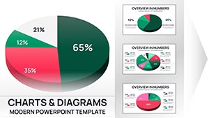
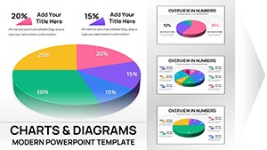
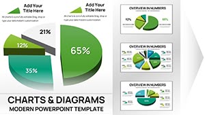
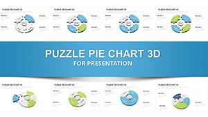
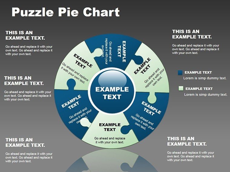
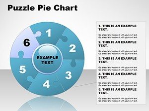
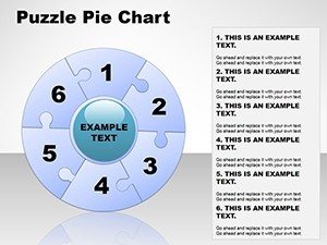
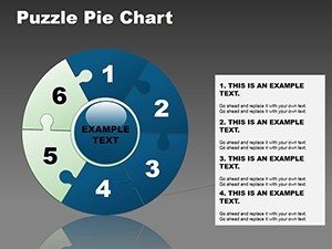
Presentations with Puzzle Pie PowerPoint Chart Template


In the fast-paced world of professional communication, where data overload can drown even the most compelling messages, the Puzzle Pie PowerPoint Chart Template emerges as a game-changer. Imagine transforming intricate market shares or project breakdowns into visually intuitive puzzles that click together seamlessly, drawing your audience in like a well-crafted story. This template, with its 13 fully editable slides, is tailored for professionals who need to convey proportions, relationships, and segments without losing the big picture. Whether you're a marketer illustrating consumer trends, an educator breaking down historical events, or a business analyst presenting quarterly results, this tool empowers you to create presentations that not only inform but inspire action. By blending pie chart precision with puzzle interactivity, it addresses the common pain point of static data visuals, turning them into dynamic narratives that resonate long after the meeting ends.
Elevate Your Presentations with Puzzle Pie PowerPoint Chart Template
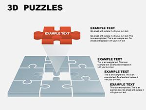
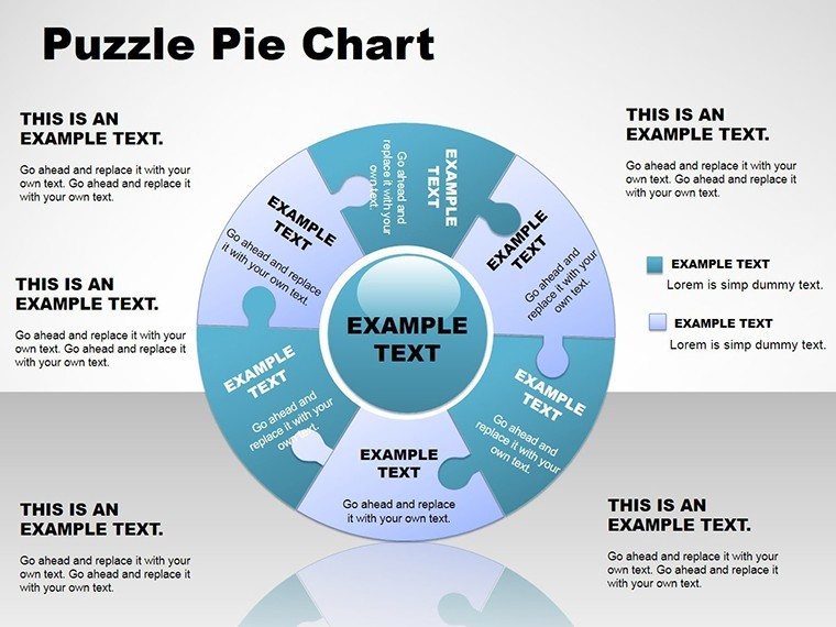
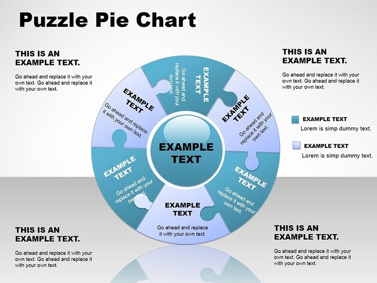
Diving deeper into what makes this template indispensable, consider how it solves real-world challenges in data presentation. Traditional pie charts often fall flat, appearing too simplistic or cluttered when dealing with multifaceted data. The Puzzle Pie approach innovates by incorporating spherical elements and puzzle pieces, allowing you to represent overlapping categories or interconnected segments with elegance. For instance, in a sales report, you could use puzzle pieces to show how regional contributions fit into the overall revenue pie, with spheres adding a 3D depth that highlights key performers. This isn't just about aesthetics; it's about enhancing comprehension. Studies from visualization experts like Edward Tufte emphasize that layered visuals reduce cognitive load, making your audience grasp concepts faster. With compatibility across PowerPoint and Google Slides, you can edit on the fly, ensuring your charts align perfectly with your brand's palette - think swapping out default blues for your company's vibrant greens to maintain consistency.
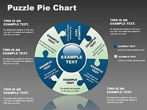
Variety of Customization Options
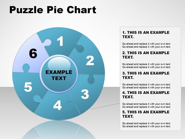
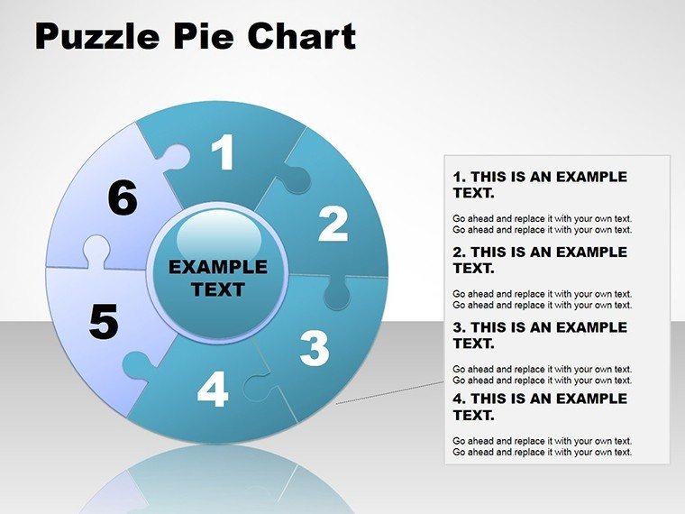
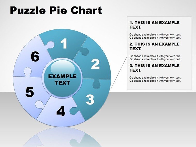
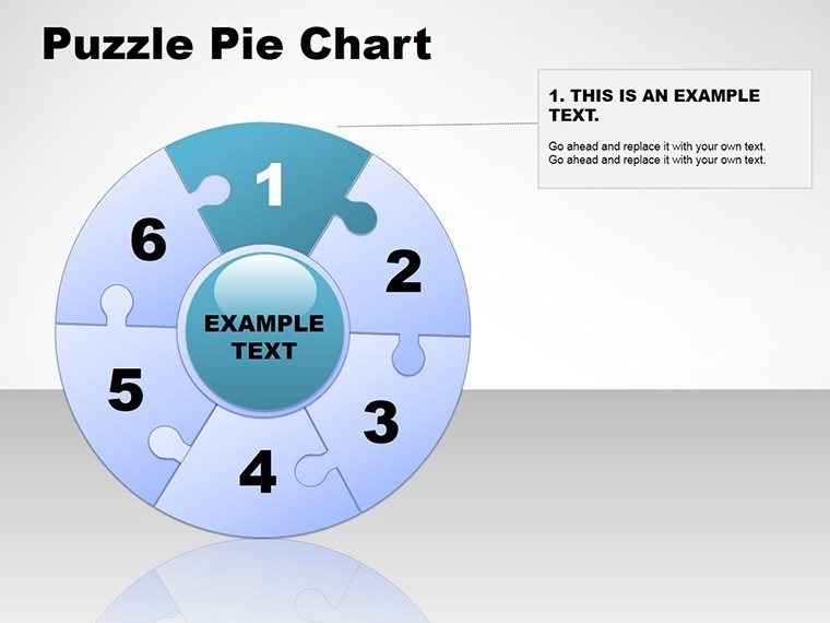
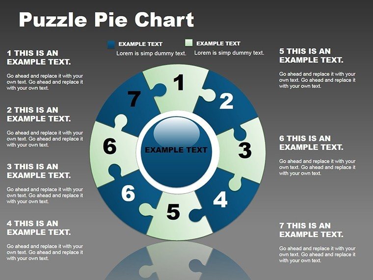
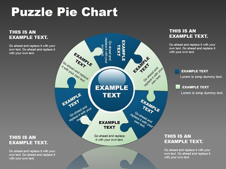
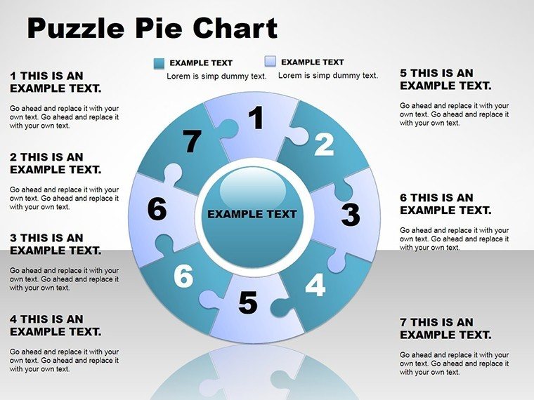
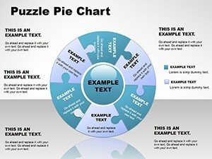
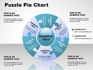
One standout feature is the sheer flexibility in customization. Each of the 13 slides offers a canvas where you can tweak every element: adjust pie slice sizes with simple data inputs, rearrange puzzle components via drag-and-drop, or infuse animations that reveal pieces one by one for dramatic effect. This level of control means no two presentations need look alike. Picture a scenario in product development where you use the template to map out feature integrations - the puzzle metaphor perfectly illustrates how individual components form a cohesive whole. Users rave about the time savings; instead of spending hours in design software, you plug in your numbers, select from predefined color schemes, and voila - professional-grade visuals ready for your next pitch.
- Color Palettes: Choose from harmonious schemes or upload your own for brand alignment.
- Font Styles: Integrate modern sans-serifs or classic serifs to match your tone.
- Layout Variations: From compact overviews to expanded breakdowns, adapt to your content's depth.
Dynamic Data Visualization
The heart of this template lies in its ability to bring data to life. Dynamic elements like animated transitions between puzzle states allow you to simulate scenarios, such as market shifts over time. This is particularly useful in fields like finance, where showing proportional changes can sway investment decisions. By integrating spheres, the template adds a volumetric layer, making abstract percentages feel tangible. For example, in an environmental report, puzzle pies could depict resource allocation, with spheres representing volume metrics like water usage - visually emphasizing sustainability goals. The result? Audiences not only see the data but feel its implications, fostering deeper engagement and better retention.
Versatility Across Industries
What sets the Puzzle Pie Template apart is its broad applicability. In marketing, use it to dissect campaign performance, with puzzle pieces symbolizing channels like social media, email, and ads fitting into the overall ROI pie. Educators might employ it to teach fractions or historical alliances, turning lessons into interactive puzzles that students solve mentally. Even in non-profits, it shines by illustrating funding distributions, helping donors visualize impact. This versatility stems from its core design philosophy: data as a puzzle waiting to be assembled, adaptable to any narrative. Real-world case studies, such as a tech startup using it to pitch to venture capitalists, show how it can turn complex funding breakdowns into compelling stories that secure investments.
Simple to Implement
Getting started couldn't be easier. Download the .potx file, open in PowerPoint, and input your data - the template handles the rest with intuitive tools. Step-by-step guides embedded in the slides walk you through advanced features, like linking to external data sources for real-time updates. This user-friendliness democratizes high-quality design, allowing even novices to produce outputs that rival professional agencies. Integrate it into your workflow by starting with a blank slide, populating the puzzle pie with your metrics, and previewing animations to ensure smooth delivery. For teams, collaborative editing in Google Slides means seamless handoffs, keeping projects on track.
Designed for Success: Who Benefits from Puzzle Pie?
This template is a boon for a diverse audience. Seasoned executives leverage it to streamline boardroom discussions, where clear visuals can mean the difference between approval and rejection. Entrepreneurs find it invaluable for investor decks, using puzzle elements to demonstrate how business pieces interconnect. In academia, professors transform dense research into accessible overviews, aiding student comprehension. Marketers, too, appreciate how it elevates client reports, turning data dumps into strategic insights. By focusing on user pain points - like the tedium of manual chart creation - it delivers tangible value, saving hours while amplifying impact. Compared to basic PowerPoint tools, which lack this thematic depth, Puzzle Pie offers themed icons and pre-built animations that add polish without extra effort.
To illustrate, consider a hypothetical urban planning firm presenting community development plans. The puzzle pie could represent land use allocations - residential, commercial, green spaces - fitting together to show a balanced ecosystem. This not only clarifies proposals but engages stakeholders emotionally, fostering buy-in. Tips for maximization include starting with high-level overviews before drilling into details, using consistent legends for clarity, and testing on different devices for responsiveness. Workflow integration is straightforward: export slides as images for reports or embed in emails for quick shares.
As you refine your presentation skills, remember that effective communication hinges on visuals that tell a story. The Puzzle Pie Template equips you with the tools to do just that, blending creativity with functionality. Ready to piece together your next success? Customize now and watch your ideas click into place.
FAQ
- How editable are the charts in the Puzzle Pie Template?
- Every element is fully editable, from data inputs to colors and animations, allowing complete customization to fit your needs.
- Is this template compatible with Google Slides?
- Yes, it works seamlessly with Google Slides, enabling easy collaboration and edits on any device.
- What industries benefit most from this template?
- It's versatile for marketing, education, finance, and more, ideal for any field requiring data segmentation.
- Can I add my own data to the puzzles?
- Absolutely - simply input your figures, and the template auto-adjusts the pie and puzzle elements.
- How do animations enhance presentations?
- Animations reveal pieces gradually, building suspense and aiding audience focus on key insights.