Stacked Column PowerPoint Charts Template - Fully Editable | Instant Download


Type: PowerPoint Charts template
Category: Analysis
Sources Available: .potx
Product ID: PC00053
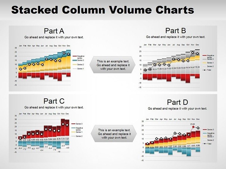
Template incl.: 13 editable slides
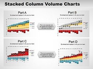
The Stacked Column PowerPoint Charts Template includes 13 editable slides with layered data visualization for Microsoft PowerPoint. Show cumulative impacts and breakdowns instantly in business education or project reports. Instant download with theme variety animations and full customization for professional results.
What's Included
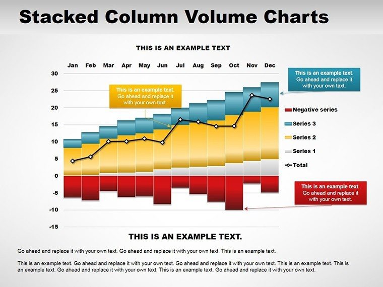
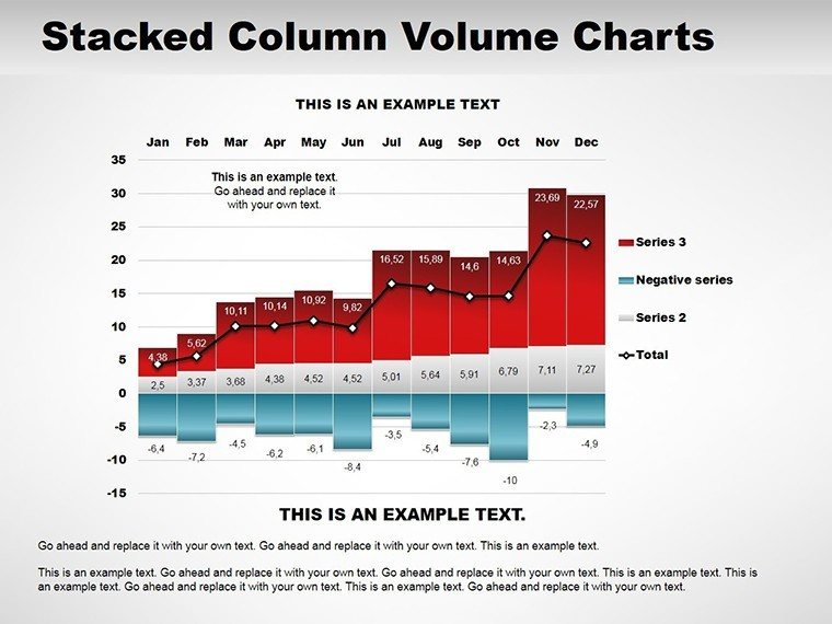
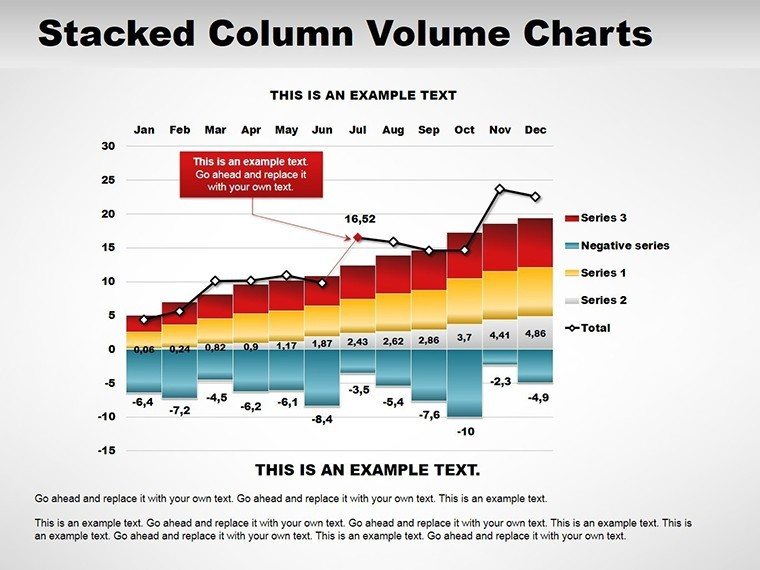
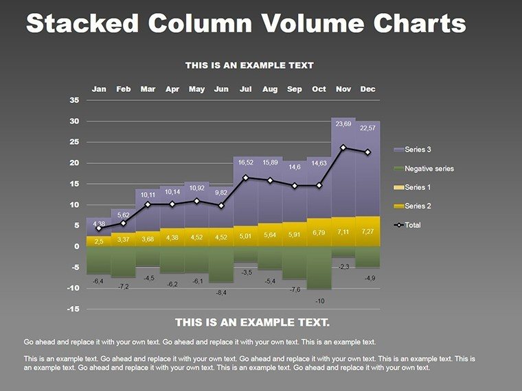
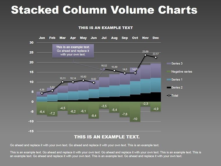
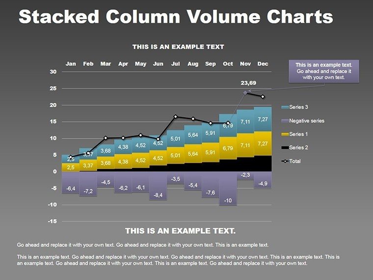
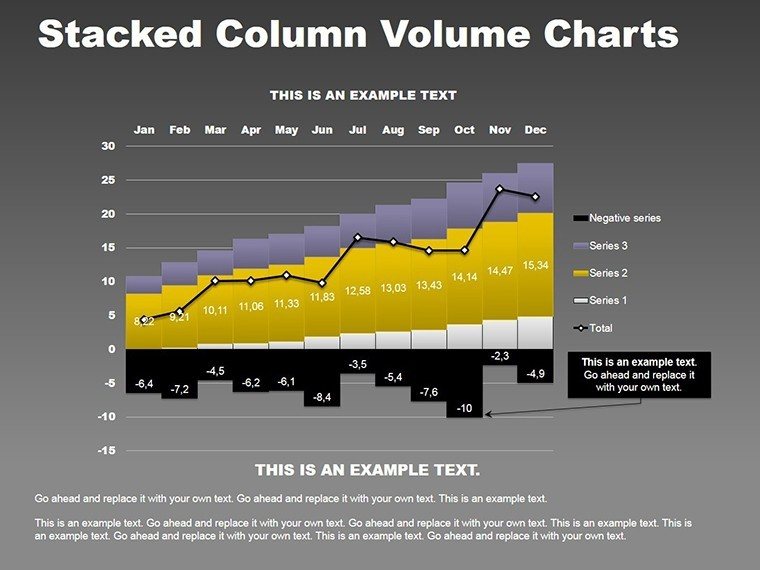
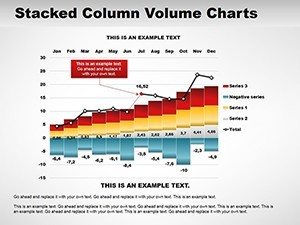
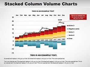
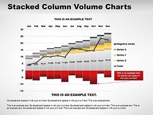
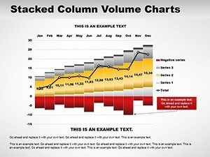
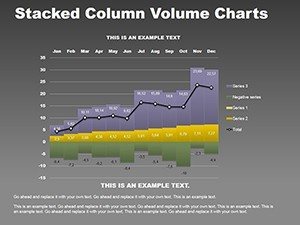
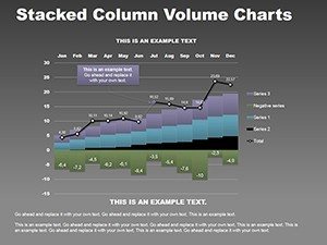
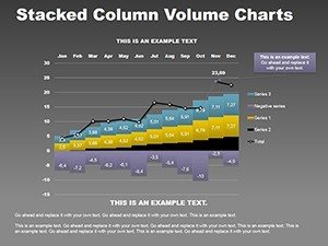
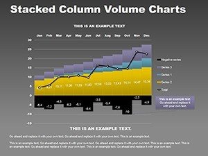
Imagine layering data like building blocks each stack revealing cumulative impacts and individual contributions in one glance. The Stacked Column PowerPoint Charts Template brings this vision to reality offering 13 editable slides for professionals in business education and project management. From aggregating departmental budgets to tracking multi-phase project progress these charts simplify multifaceted data helping audiences discern totals and breakdowns intuitively. The download includes both .pot and .potx files for full theme compatibility in Microsoft PowerPoint. Product code references PC00053 internally while the page ID is 2775 and the current price is $10.00 under the Analysis category. All slides feature layered customization proportional accuracy annotation tools theme variety export versatility and animations ready for immediate use.
File and Specification Details
The template provides everything needed in native PowerPoint formats so you can start building stacked column visuals without extra setup steps.
Key Features
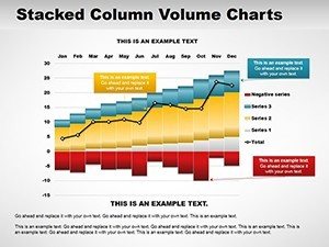
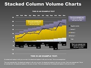
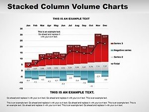
The Stacked Column PowerPoint Charts Template stands out with 13 editable slides that include layered customization proportional accuracy annotation tools theme variety export versatility and built-in animations. Each slide allows you to adjust stack heights data labels and colors to reflect exact cumulative totals and component contributions. The stacked column design specifically shows how individual parts add up to a whole which is ideal for budget tracking or progress reporting in PowerPoint. Theme variety ensures the charts adapt to any corporate color scheme while export versatility lets you save as PDF images or video. Animations bring the layers into view sequentially for maximum audience engagement during presentations.
Advanced Editing Options
These features combine to deliver professional stacked column charts that go beyond basic PowerPoint defaults and differentiate this template from related line graph or cyclic chart packs on the site.
Professional Use Cases
A finance manager at a manufacturing firm used the Stacked Column PowerPoint Charts Template to present departmental budget breakdowns to executives. By stacking personnel marketing and operations costs on the 13 slides the manager clearly showed how each category contributed to the annual total leading to immediate approval of reallocation proposals. An education coordinator in a university setting applied the template to display enrollment trends across multiple programs where cumulative stacks highlighted overall growth while revealing shifts in specific departments resulting in data-backed curriculum adjustments. A project manager at a software company leveraged the slides during sprint reviews to track progress across development testing and deployment phases with stacked columns illustrating completed versus remaining work which accelerated stakeholder buy-in and kept the project timeline on target. These scenarios prove how the editable stacked column slides turn complex cumulative data into actionable insights for diverse professional environments.
Scenario Outcomes
Each example directly references the layered stacking capability described in the template making the 13 slides highly effective for real business education and project management needs.
How to Customize
Customizing the Stacked Column PowerPoint Charts Template begins with downloading the .pot or .potx file and opening it in Microsoft PowerPoint. Choose any of the 13 slides then click the chart to enter the data sheet and replace placeholder values with your own cumulative and component figures. Use the design tab to apply theme variety or manually adjust colors for each stack layer ensuring proportional accuracy. Add annotation tools such as data labels or callouts via the chart elements menu and enable animations to build layers sequentially. Finally export the presentation using the versatile options to PDF or video for sharing. This complete workflow ensures your stacked column charts match any presentation style while maintaining the original layered structure.
Workflow Efficiency
The process is fully native to PowerPoint so no external software is required and all 13 slides update consistently across the deck.
Why Choose This Template
Choose the Stacked Column PowerPoint Charts Template because its 13 editable slides with layered customization and animations provide cumulative impact visuals that generic PowerPoint charts cannot replicate quickly. The design decision to emphasize stacking helps audiences instantly understand totals and breakdowns which is why the template excels in business education and project management presentations. Compared to building stacked columns from scratch the pre-built structure saves hours while delivering proportional accuracy and theme variety that looks polished immediately. Unlike related column line or 3-D cyclic templates on the page this one focuses exclusively on stacked composition making it the targeted solution for data aggregation needs. The included export versatility and annotation tools further enhance usability for professional users seeking high-impact slides.
Design Rationale
The specific layout choices in the template directly support intuitive data storytelling which is why professionals consistently prefer it over manual creation.
| Feature | Details |
|---|---|
| Number of Slides | 13 editable stacked column charts |
| File Formats | .pot and .potx for PowerPoint |
| Product Reference | 2775 (PC00053 internal) |
| Price | $10.00 |
| Category | Analysis |
| Key Capabilities | Layered customization animations theme variety |
| Use Scenarios | Budget tracking project progress reporting |
Ready to layer your data into compelling stacked column stories? Download the template today and elevate every presentation.
Is this Stacked Column PowerPoint Charts Template compatible with current Microsoft PowerPoint versions?
Yes the 13 editable slides work seamlessly with the latest Microsoft PowerPoint on both Windows and Mac. The .pot and .potx files load as native templates so all stacked column charts open without conversion errors. You can apply updates animations and theme variety using standard PowerPoint tools across recent versions. This ensures long-term reliability for business education and project management presentations regardless of your specific Office subscription. The design maintains proportional accuracy and layered customization even after software updates.
How do I add my own data to the stacked columns?
Adding data is straightforward in the Stacked Column PowerPoint Charts Template. Open either .pot or .potx file select one of the 13 slides click the chart to reveal the datasheet and enter your cumulative totals and component values directly. PowerPoint automatically recalculates stack heights preserving proportional accuracy. You can then use annotation tools to add labels or callouts for extra clarity. Repeat for any slides needed and the layered design stays intact throughout. This method supports quick edits for budget or progress presentations without rebuilding charts.
What licensing options are provided with the download?
The license allows unlimited personal and commercial use of the 13 editable slides in your own PowerPoint presentations after purchase. You may incorporate the stacked column charts into client deliverables or internal reports without extra royalties. The original template files cannot be resold or redistributed but exported versions are yours to share freely. This covers all standard business education and project management scenarios described on the page. The terms are straightforward and focused on professional users who need reliable stacked visualization tools.
Can the template be rethemed to match my company colors?
Absolutely the theme variety in the Stacked Column PowerPoint Charts Template lets you apply any company color scheme instantly. Open the file go to the design tab and select or create a new theme that updates all 13 slides simultaneously. Alternatively edit individual stack colors using the format pane while keeping proportional accuracy. Animation builds and annotation tools remain fully functional after retheming. This flexibility ensures the stacked column charts integrate perfectly into existing PowerPoint decks for consistent branding across business presentations.
What file formats will I receive upon instant download?
You receive both .pot and .potx files immediately after purchase of the Stacked Column PowerPoint Charts Template. These formats are fully compatible with Microsoft PowerPoint and contain all 13 editable slides with layered stacked columns animations and theme elements. The download is direct with no additional steps or accounts required. Both versions support export versatility to PDF images or video so you can use the template across different presentation delivery methods. The files are lightweight and open instantly for fast workflow integration.