Column Line PowerPoint Charts Template Pack


Type: PowerPoint Charts template
Category: Analysis
Sources Available: .potx
Product ID: PC00052
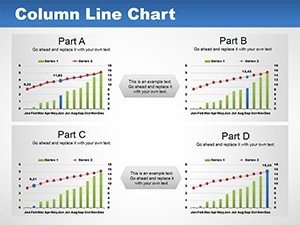
Template incl.: 14 editable slides
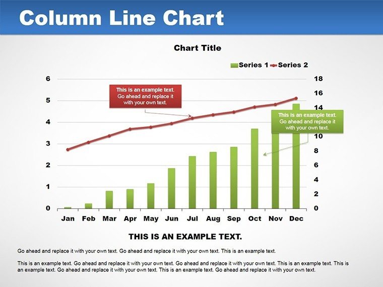
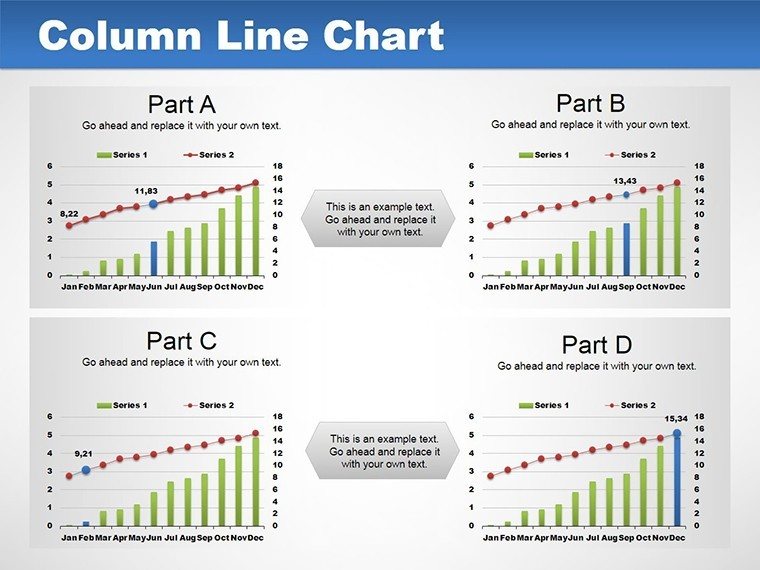
Envision turning tangled datasets into streamlined narratives that guide decisions and spark discussions. Our Column Line PowerPoint Charts Template Pack does just that, blending columns for categorical comparisons with lines for trend tracking in one cohesive visual. Ideal for business professionals, educators, marketers, and consultants, this collection boasts 14 editable slides to suit diverse analytical needs. From plotting sales growth over quarters to correlating expenses with revenues, these charts make complex trends accessible, fostering deeper understanding in meetings or lectures.
Inspired by data viz pioneers like Hans Rosling, who championed dynamic storytelling, this template pack prioritizes clarity and engagement. Users in fast-paced environments appreciate the quick edits, often halving design time. Fully compatible with PowerPoint PPTX and Google Slides, it's ready for hybrid work setups. Think of a consultant unveiling market forecasts or a teacher illustrating historical events - these tools adapt seamlessly, backed by real-user successes.
Harnessing Hybrid Charts for Insightful Analysis
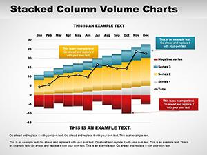
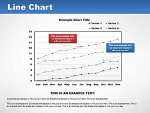
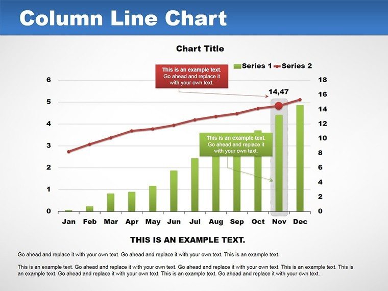
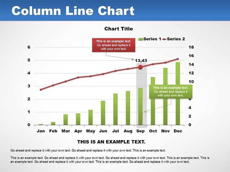
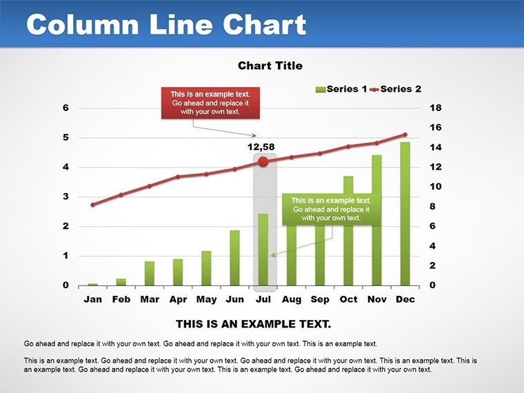
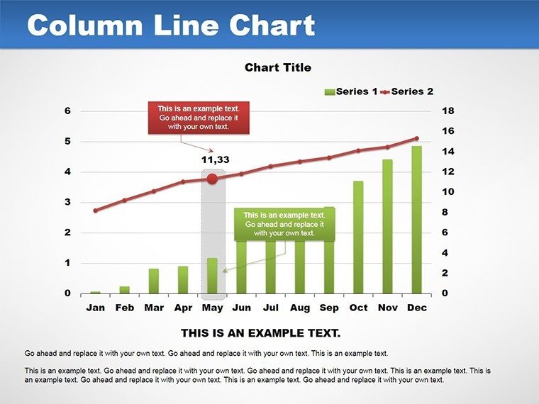
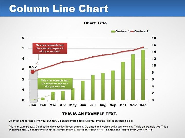
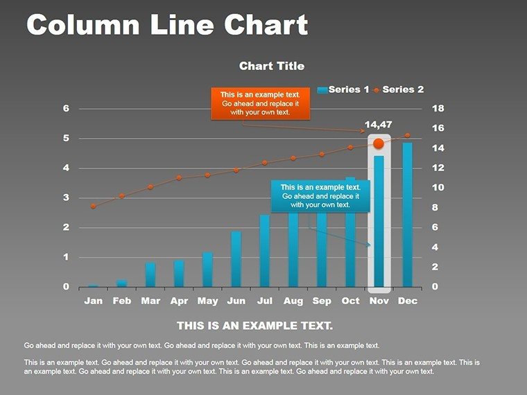
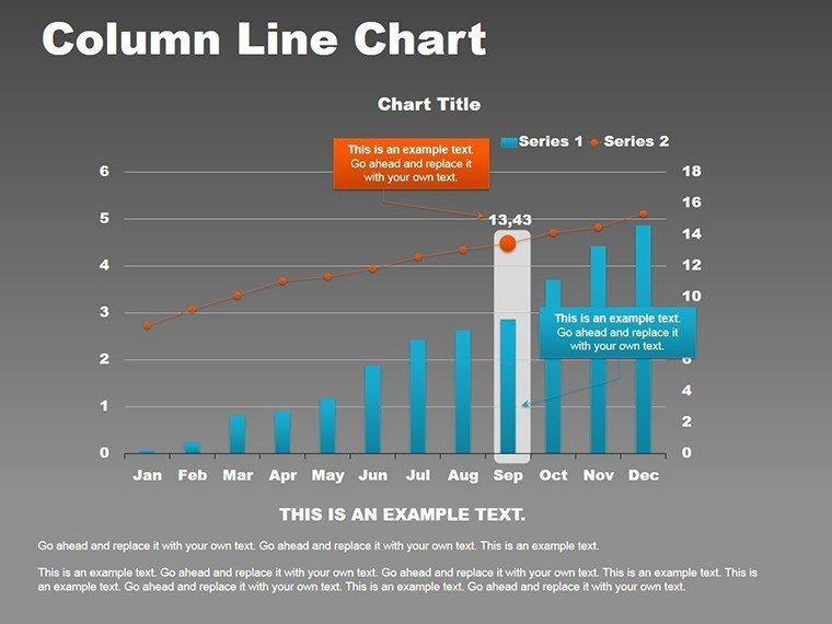
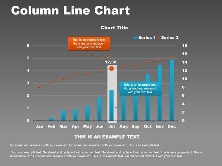
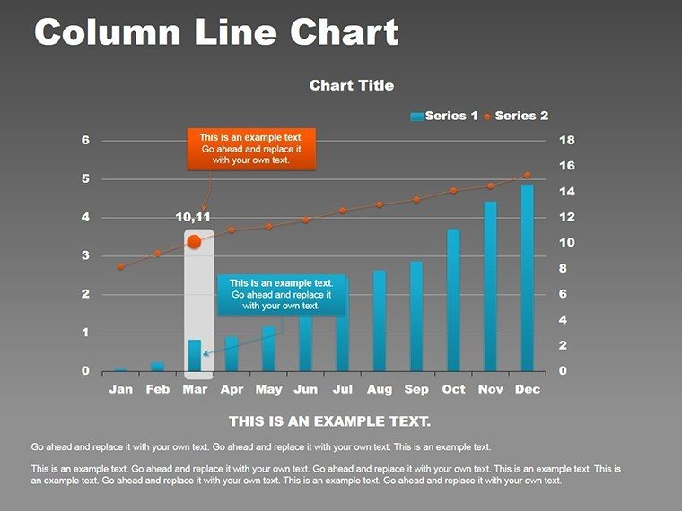
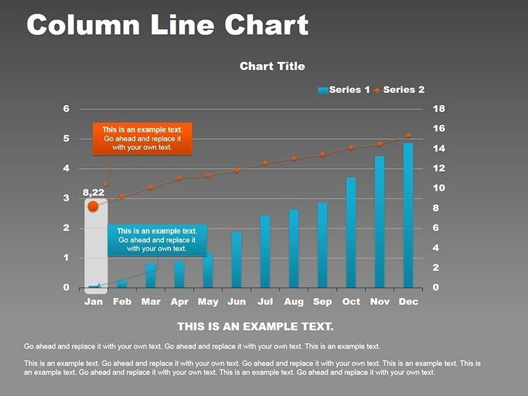
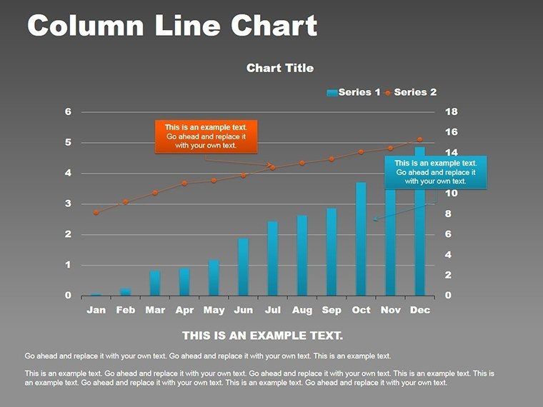
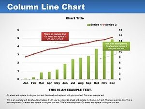
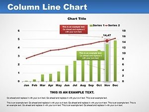
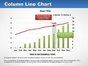
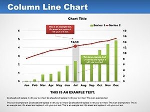
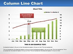
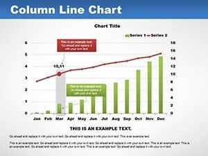
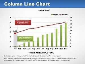
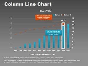
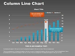
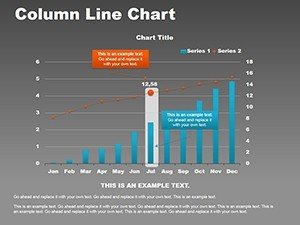
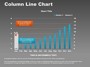
Column line charts excel at dual-axis representations, allowing simultaneous views of volumes and progressions. Our template refines this with scalable axes, preventing distortion common in defaults. For instance, in financial reports, columns might show monthly sales while a line tracks cumulative growth, revealing acceleration points. This method, endorsed by the International Business Communication Standards (IBCS), ensures precision and professionalism.
Customization is key: Tweak line styles from dashed to solid, or sync colors for thematic unity. Link to external data sources for live updates, perfect for ongoing projects. A Deloitte report notes that such visuals can improve forecast accuracy by 30%, underscoring their value in strategic planning.
Standout Features for Dynamic Presentations
- Dual-Axis Flexibility: Independent scaling for accurate multi-metric displays.
- Trend Indicators: Built-in markers for peaks, troughs, and averages.
- Visual Enhancements: Gradients, shadows, and tooltips for depth.
- Export Options: High-res for print or digital sharing.
- User Guides: Embedded tips for optimal use.
These elements support varied audiences, from analysts crunching numbers to executives seeking overviews.
Practical Scenarios: Bringing Data to Life
Apply in business for performance dashboards, where columns detail regional sales and lines show year-over-year changes. Educators can chart population growth against timelines, making history vivid. Marketers track campaign metrics, with columns for engagements and lines for conversions, as per Google Analytics integrations.
Consultants use for client benchmarks, highlighting efficiencies. A McKinsey case study shows hybrid charts accelerating insights in workshops. For personal projects, even hobbyists plot fitness progress, demonstrating versatility.
Effortless Customization Workflow
- Pick a slide layout matching your data structure.
- Input values and labels via intuitive panels.
- Refine visuals: Adjust scales, add legends.
- Incorporate animations for sequential reveals.
- Simulate presentations to fine-tune pacing.
- Share confidently across platforms.
This guided process, developed from expert input, surpasses basic charts in functionality and flair.
Elevating Beyond Basics
Unlike plain PowerPoint defaults, this pack offers hybrid sophistication without complexity. Premium over freebies, it avoids limitations like fixed designs. Trusted by professionals, it integrates with tools like Excel for robust analysis.
Incorporate variance lines or forecasts organically, enhancing predictive discussions. Pro tip: Use neutral palettes for objectivity, per design best practices.
Chart Your Success Path
Seize the Column Line PowerPoint Charts Template Pack to illuminate trends and drive actions. Begin your visual journey now.
Frequently Asked Questions
Are the charts fully customizable?
Yes, edit data, styles, and axes to your specifications.
Compatible with Google Slides?
Absolutely, seamless integration for collaborative work.
Ideal for which industries?
Business, education, marketing, consulting, and more.
File format details?
Available in .potx for PowerPoint use.
Slide count?
14 editable slides with varied layouts.