3D Blob Chart PowerPoint Template


Type: PowerPoint Charts template
Category: Cycle, 3D, Illustrations, Pyramids
Sources Available: .pot, .potx
Product ID: PC00049
Template incl.: 9 editable slides
As someone who`s spent years crafting presentations for fast-paced teams - from marketing agencies chasing viral campaigns to urban planners pitching city renewals - I`ve learned one thing: data doesn`t win hearts unless it looks alive. That`s where this 3D Blob Chart PowerPoint Template steps in. Forget the stiff bars and pies that put people to sleep. These organic, fluid shapes let your numbers breathe, morphing complex info into something intuitive and memorable. I`ve used it to turn a jumble of sales metrics into a pulsing funnel that had clients nodding along, or to map neighborhood growth patterns that made stakeholders see the big picture at a glance.
Why Fluid Shapes Beat Traditional Charts Every Time
In my line of work, presentations aren`t just slides - they`re conversations. And nothing kills a dialogue faster than a grid of numbers screaming for attention. This template draws from parametric design principles, those same ones powering modern architecture, to create blob-like forms that mimic real-world flows. Imagine a slide where customer sentiment data clusters into soft, overlapping volumes: positive vibes swell in warm hues, while concerns dip into cooler tones. It`s not just pretty - it`s practical. Viewers grasp variances and connections faster, turning "what does this mean?" into "I get it, let`s move."
For project managers juggling timelines, picture hierarchical layers as pyramid-blob hybrids. Each level represents a phase, with blobs expanding or contracting based on resource allocation. I`ve dropped this into a construction update deck, and suddenly, delays weren`t abstract - they were visible ripples in the form. Or take educators explaining ecosystems: evolutionary branches fan out like natural clusters, making abstract concepts tangible without overwhelming the screen.
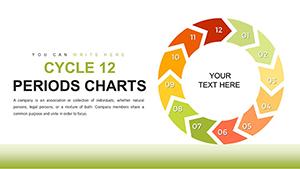
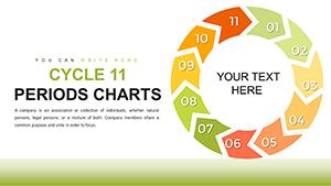
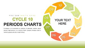
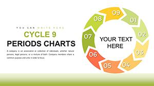
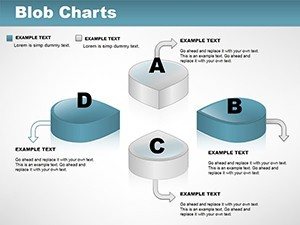
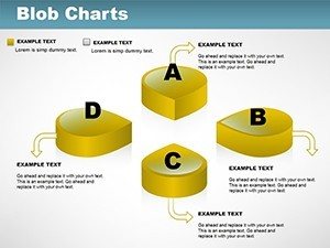
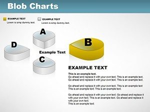
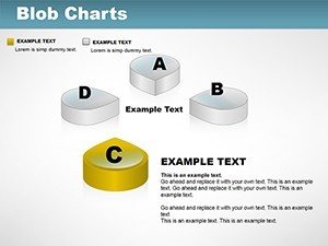
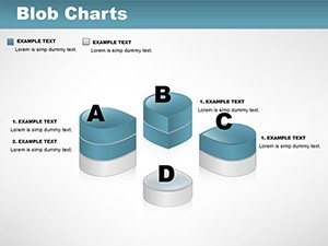
Unlock the 9 Slides That Make Data Dance
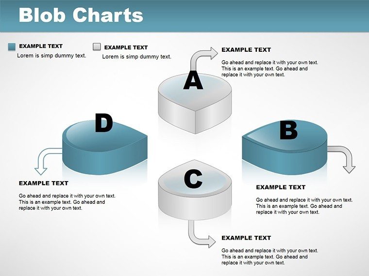
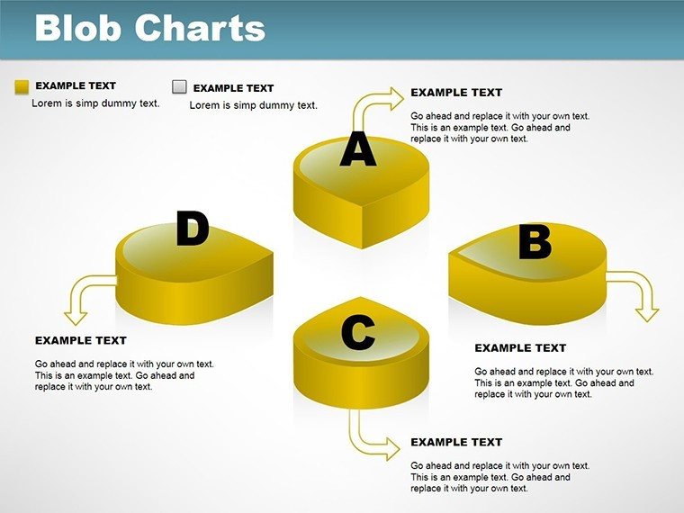
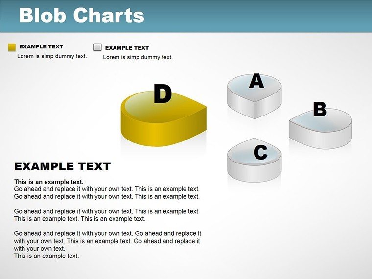
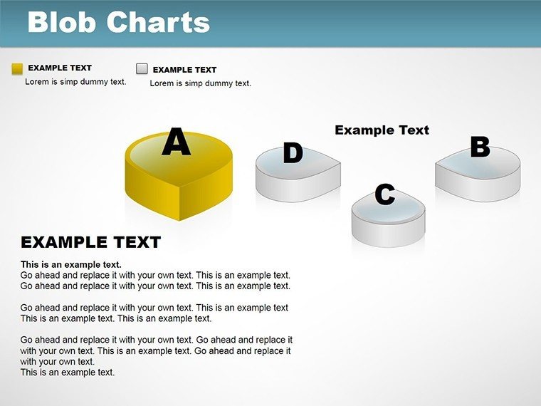
This template packs nine fully editable slides, each built to handle real workloads without breaking a sweat. Start with the base layout on Slide 1, where you drop in your dataset and watch the core blob take shape - perfect for an overview of uneven distributions like quarterly revenue spikes. Slide 2 builds on that with morphing capabilities, ideal for sales funnels where leads cluster at entry points and taper organically toward conversions.
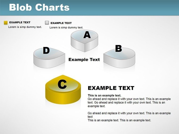
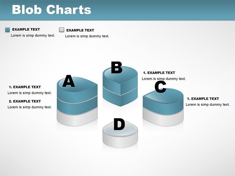
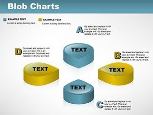
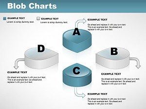
Move to Slide 3 for multi-blob setups, showing correlations side by side - think market segments bleeding into each other, revealing overlaps no bar chart could touch. Slide 4 introduces those pyramid hybrids for layered info, like team structures where departments balloon based on headcount. Then Slides 5 through 8 layer in variations: one blends blobs with subtle bar accents for hybrid metrics, another cycles them into loops for recurring processes, and the rest weave in illustrative edges for emphasis. Every slide supports up to nine interactive points, so you can hover over a cluster in presentation mode and pull up tooltips with specifics.
What ties it all together? Volumetric depth with soft shadows that give a true 3D feel, even on flat screens. Switch between isometric and orthographic views to fit your story - birds-eye for broad trends, detailed angles for deep dives. And the animations? Subtle fades that simulate changes, like wind reshaping dunes, keeping eyes glued without distracting from your words.
Tailor It to Your World in Minutes
Customization here isn`t a chore - it`s empowering. Link your blobs directly to CSV files or Excel sheets, and updates ripple through instantly. No more manual redraws after that last-minute data tweak. Apply textures to match your brand: a metallic sheen for tech pitches, organic grains for environmental reports. Dial transparency to layer insights without clutter, and tweak colors to align with your palette - I`ve swapped neutrals for vibrant pops when briefing creative directors, and it always lands.
For data pros, there`s even room to nod toward scripting: export parameters for Python tweaks if you`re generating blobs algorithmically. But for most of us - consultants prepping boardroom battles or founders road-testing ideas - it`s drag-and-drop simple. Fonts stay crisp with sans-serif defaults, and the whole thing runs smooth on standard laptops, exporting cleanly to 4K or mobile for on-the-go reviews.
Real Wins from the Trenches
I`ve leaned on this template across industries, and the feedback loops back the same truth: it cuts through noise. A marketing lead I worked with used the central morphing slide to visualize social tones during a Spotify-style campaign brainstorm - clusters of "excited" and "curious" formed a vibrant core, while "skeptical" edges prompted quick fixes. The result? A deck that not only informed but inspired tweaks on the spot.
In urban planning sessions, those density maps turned zoning debates from dry stats to dynamic stories. One planner layered population blobs over infrastructure hybrids, showing how green spaces could balance growth - stakeholders left energized, not exhausted. Even in education, a professor swapped linear timelines for cyclic blob flows to trace historical events, making lectures feel like explorations rather than recitals.
The secret sauce? It respects attention spans. By limiting to five or seven blobs per view and pairing shapes with light anecdotes - "see how this swell mirrors last quarter`s surge?" - you guide without overwhelming. Open it in PowerPoint and make it yours in minutes, then watch your data tell stories that stick.
Frequently Asked Questions
What makes 3D blob charts better for showing data correlations?
Unlike straight lines or blocks, blobs use organic overlaps to highlight natural connections, making patterns pop intuitively for quicker audience buy-in during pitches or reports.
Can I use this template for non-business presentations, like academic or creative ones?
Absolutely - it`s versatile for anything from ecological models in class to artistic form explorations in design reviews, with easy tweaks for thematic fits.
How do I add my own data to the blob shapes?
Simply paste values into the linked Excel or CSV spots; the shapes reshape automatically, with options to adjust scales for precision without redesigning.
Does it work with Google Slides or just PowerPoint?
It`s native to PowerPoint but fully compatible with Google Slides - import the .potx file, and interactions like hovers carry over seamlessly for collaborative edits.
Are there limits to how many data points I can visualize per slide?
Aim for 5-7 blobs to keep clarity high, but each supports up to nine interactive elements, scaling well for mid-sized datasets without lag.
How customizable are the colors and textures in this template?
From base hues to advanced textures like gradients or patterns, you can swap everything via the color picker or import branding files for a tailored look.