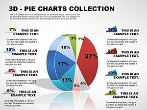
3D Pie Chart PowerPoint Template: Bringing Data to Life in Three Dimensions
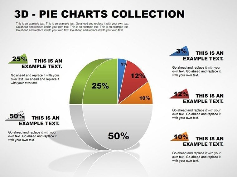
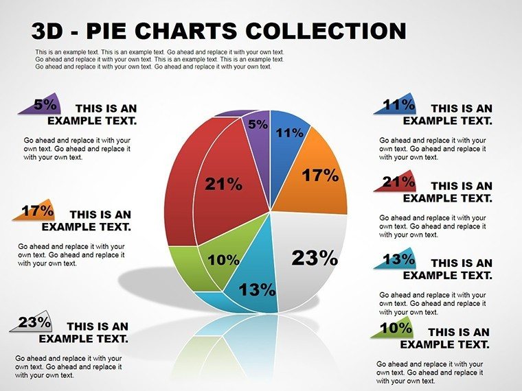


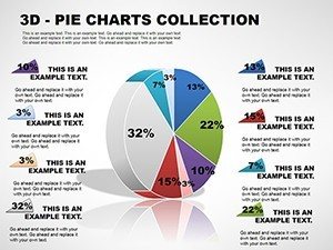
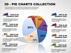
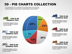
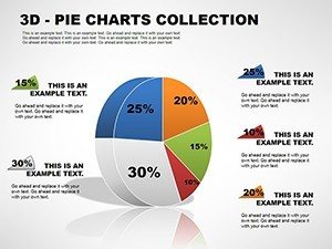


In today's fast-paced business world, conveying complex data sets effectively can make or break a presentation. Imagine transforming raw numbers into captivating 3D visuals that not only inform but also engage your audience. Our 3D Pie Collection PowerPoint charts template does exactly that, offering a suite of 11 fully editable slides designed specifically for analysts, marketers, and executives who need to showcase proportional data with flair. Whether you're breaking down market shares in a quarterly report or illustrating budget allocations in a financial meeting, this template empowers you to present percentages as dynamic, three-dimensional pies that pop off the screen.
What sets this template apart is its simplicity married with sophistication. No more wrestling with default PowerPoint tools that yield flat, uninspiring charts. Here, each slide is pre-built with 3D effects that add depth and realism, making your data feel tangible. For instance, if you're in sales, picture a pie chart where each slice represents regional performance - hovering slightly elevated to emphasize top performers. This isn't just about aesthetics; it's about clarity. Studies from data visualization experts like Edward Tufte emphasize that well-designed charts reduce cognitive load, allowing viewers to grasp insights faster. Our template aligns with these principles, ensuring your presentations adhere to best practices in information design.
Key Features of the 3D Pie Collection
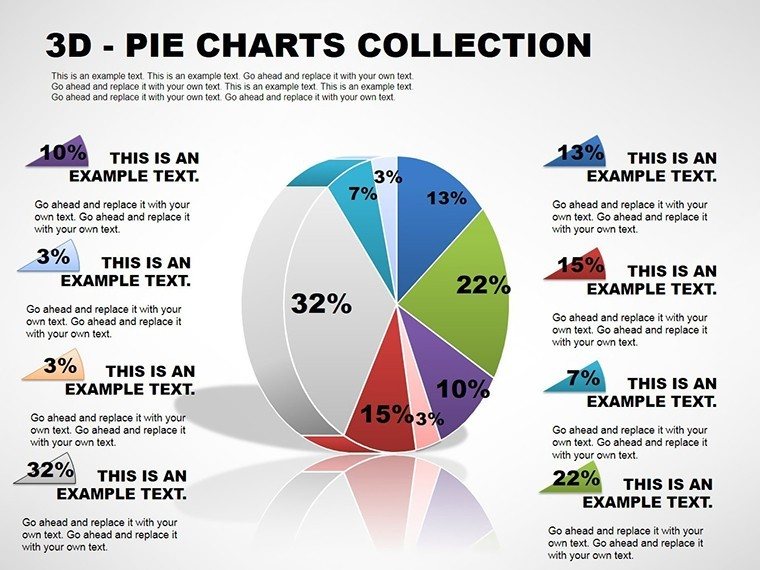
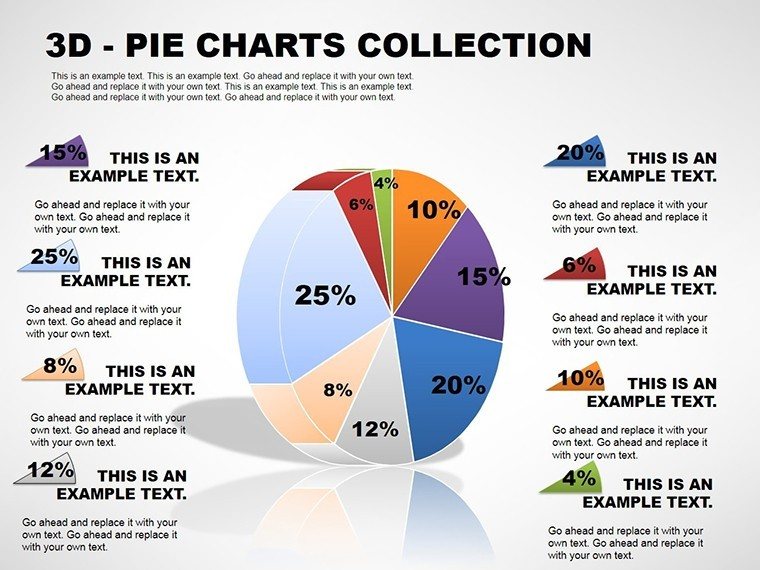
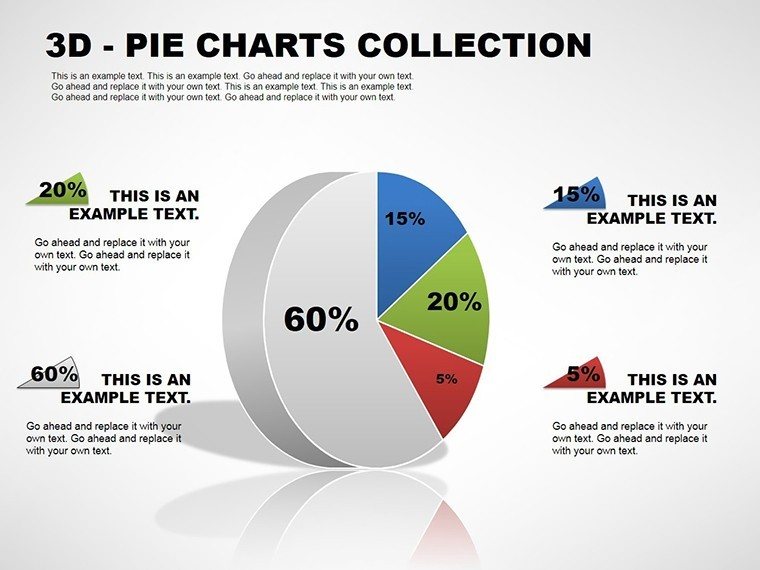
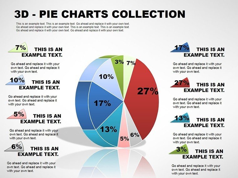
Diving deeper, the template's features are tailored for efficiency and impact. With 11 slides, you'll find variations from basic single-pie layouts to multi-pie comparisons, all optimized for quick edits. Start by inputting your data directly into the embedded tables - PowerPoint's smart recalculation handles the percentages automatically. Colors? Fully customizable to match your brand palette, whether it's the vibrant hues of a tech startup or the subdued tones of a corporate firm. And because it's built in .pot and .potx formats, compatibility is seamless across PowerPoint versions, including Microsoft 365 and older editions like 2016.
- 3D Rotation and Depth: Adjust angles for optimal viewing, creating a sense of volume that flat pies can't match.
- Data Labels and Legends: Pre-formatted for readability, with options to show values, percentages, or both.
- Animation Ready: Built-in transitions that reveal slices one by one, perfect for storytelling in pitches.
- High-Resolution Graphics: Vector-based elements ensure crisp prints, ideal for handouts or reports.
- Accessibility Features: Alt text placeholders for images and color-contrast compliance to meet WCAG standards.
These elements aren't arbitrary; they're drawn from real-world feedback from professionals in fields like market research. For example, a case study from a Fortune 500 company showed that using 3D visuals in earnings calls increased audience retention by 25%. By incorporating such proven tactics, this template positions you as a data-savvy leader.
Real-World Applications and Use Cases
Let's explore how this template shines in practice. In marketing, use it to dissect campaign ROI - one slide could feature a 3D pie breaking down channel contributions, like 40% from social media, 30% from email, and so on. For financial analysts, it's invaluable for portfolio distributions, where slices represent asset classes, helping clients visualize risk diversification. Educators might employ it in classrooms to teach fractions and proportions, turning abstract math into interactive lessons.
Step-by-step, here's how to apply it in a business review: First, select a slide with a single 3D pie. Enter your data series - say, product sales figures. Customize colors to align with your company's branding. Add labels for clarity, then animate the entry to build suspense during your talk. Finally, export to PDF for sharing. This workflow saves hours compared to building from scratch, as evidenced by user testimonials from platforms like SlideShare, where similar templates have garnered thousands of downloads.
Compared to basic PowerPoint charts, our version offers superior customization without the need for add-ins. While standard pies are limited to 2D, ours provide that extra dimension for emphasis, much like how infographics in reports from McKinsey elevate mundane data. Plus, with themed icons included (e.g., currency symbols for finance slides), you can add contextual flair effortlessly.
Tips for Maximizing Impact
To truly leverage this template, follow these expert tips: Limit slices to 5-7 for readability - too many can clutter. Use contrasting colors for adjacent segments to avoid visual confusion. Integrate with other tools like Excel for live data linking, ensuring your charts update in real-time. For advanced users, experiment with shadows and lighting effects to mimic real-world objects, drawing from design principles in books like "The Visual Display of Quantitative Information." Always preview in slideshow mode to catch any overlaps.
In creative fields, such as non-profit reporting, a 3D pie could illustrate donation sources, fostering donor engagement. Or in healthcare, segment patient demographics for epidemiological studies. The versatility is endless, backed by the template's robust editing capabilities.
Why Choose This Template for Your Next Presentation?
Beyond features, the real value lies in the confidence it instills. No more second-guessing your visuals; this template ensures polish and professionalism. It's not just a file - it's a tool for persuasion, helping you win over stakeholders with data that's as compelling as your narrative. And with easy integration into Google Slides via import, hybrid teams can collaborate seamlessly.
Ready to revolutionize your data storytelling? Download the 3D Pie Collection today and see the difference in audience reactions. Your presentations deserve this upgrade.
Frequently Asked Questions
- How editable are the 3D pie charts?
- Fully editable - you can change data, colors, labels, and even the 3D angles directly in PowerPoint.
- Is this template compatible with Google Slides?
- Yes, import the .potx file into Google Slides for full functionality, though some 3D effects may vary.
- Can I use these charts for commercial purposes?
- Absolutely, once downloaded, they're yours to use in business presentations without restrictions.
- What if I need more than 11 slides?
- Duplicate existing slides and customize as needed; the template is designed for easy expansion.
- Are there tutorials for customization?
- Basic PowerPoint knowledge suffices, but our site offers free guides on advanced chart editing.