PowerPoint Cycle Charts Template - 57 Slides


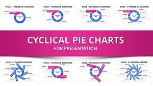
As someone who builds presentation decks every week for C-level executives and investor groups, I understand the challenge of conveying recurring business processes without losing audience attention. This cycle chart template changes that by providing 57 fully editable slides designed specifically for depicting periods and incoming elements. With integrated arrows for direction and nested pies for layered data, it turns complex information into digestible visuals that drive decisions forward.
Professionals rely on these charts to highlight ongoing cycles in reports, making abstract concepts tangible. Whether you're mapping quarterly revenue patterns or operational inflows, the template ensures your narrative flows seamlessly. It's not just about aesthetics—it's about delivering insights that stick with your audience long after the meeting ends.
In my experience consulting for enterprise teams, templates like this save hours of design work, allowing focus on content that matters. They support a range of scenarios, from government briefings to educational workshops, ensuring clarity in every slide.
Slide-by-Slide Description
This template's 57 slides are organized to build from foundational to advanced visuals, giving you flexibility for any presentation length.
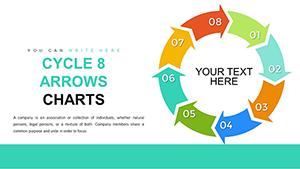
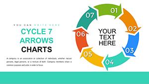
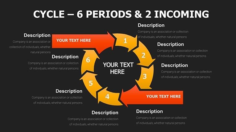
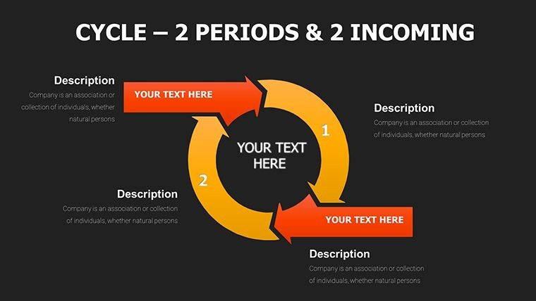
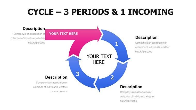
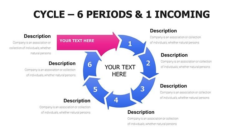
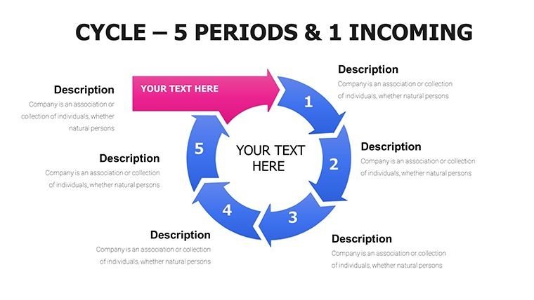
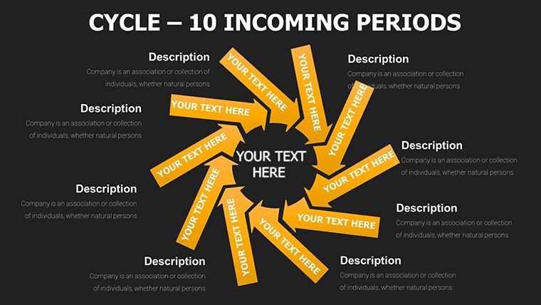
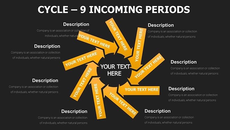
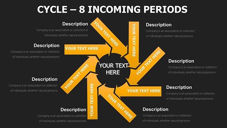
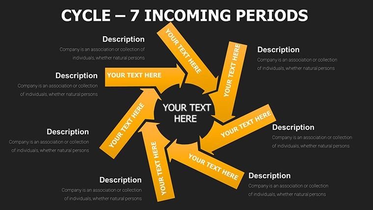
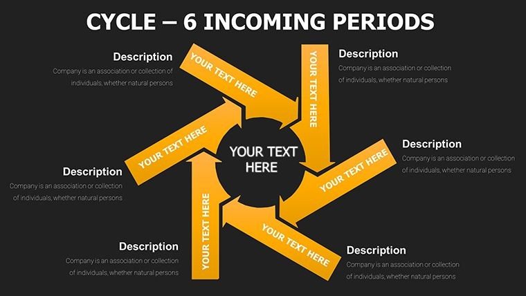
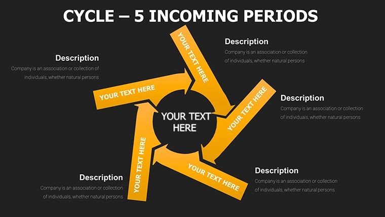
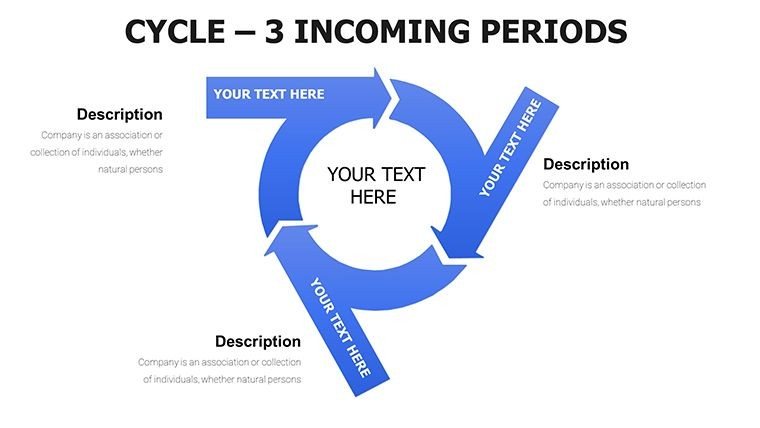
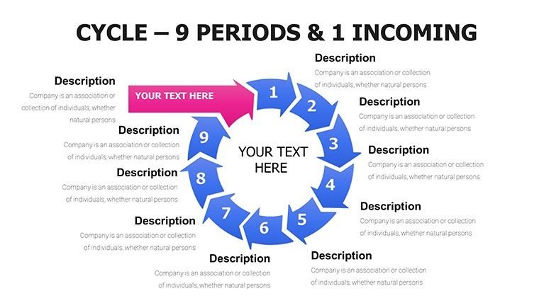
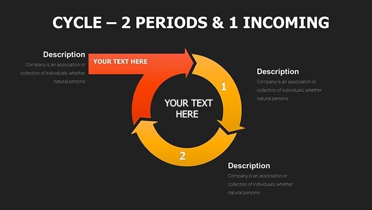
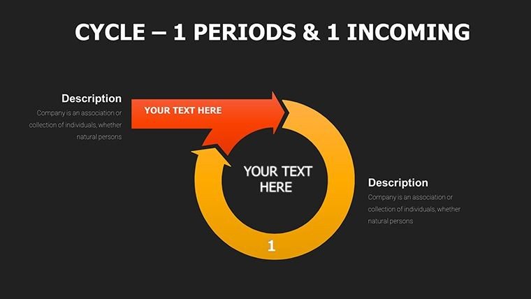
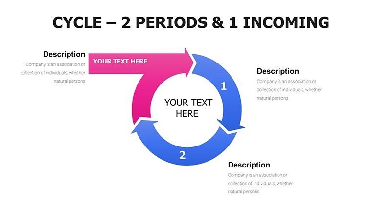
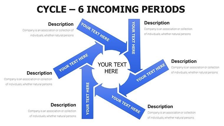
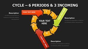
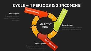
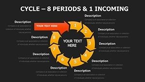
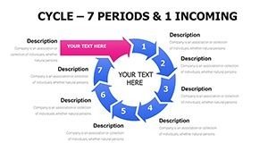
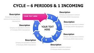
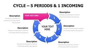
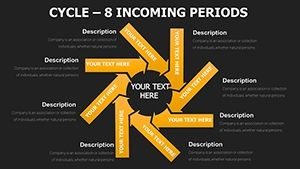
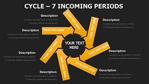
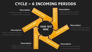
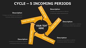
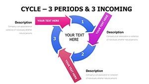
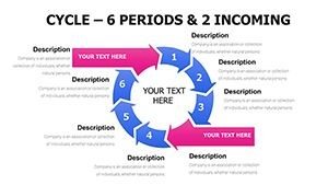
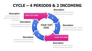
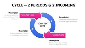
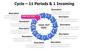
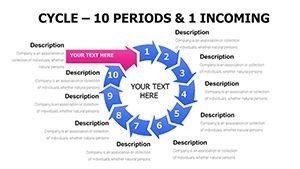
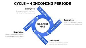
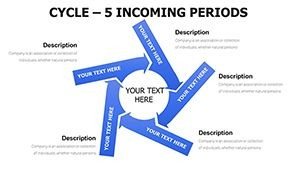
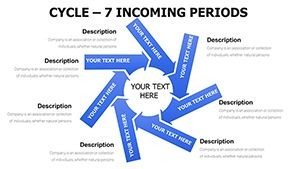
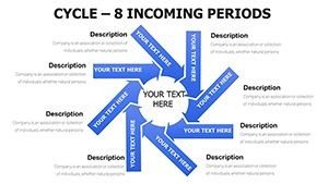
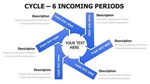
Slides 1-20: Core Cycle Structures for Periods
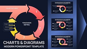
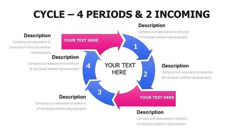
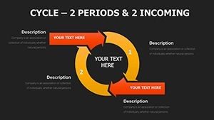
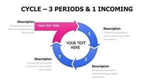
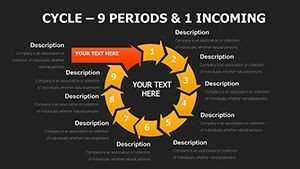
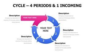
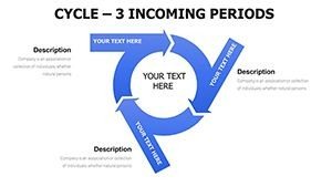
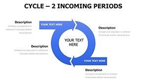
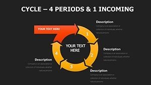
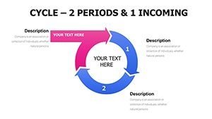
These initial slides focus on basic to intricate cycle layouts with period markers. For instance, slide 5 features a four-phase cycle with timeline arrows, ideal for plotting fiscal quarters. You can insert your data into placeholders for stages like planning, execution, review, and optimization. Design elements include smooth curves and color-coded segments for easy comprehension.
Slide 12 introduces multi-layered periods, allowing you to overlay historical data on current cycles. Customization is straightforward—adjust radii, add icons, or change fonts to match your branding.
In practice, these slides help break down long-term projects, showing how periods interconnect without overwhelming viewers.
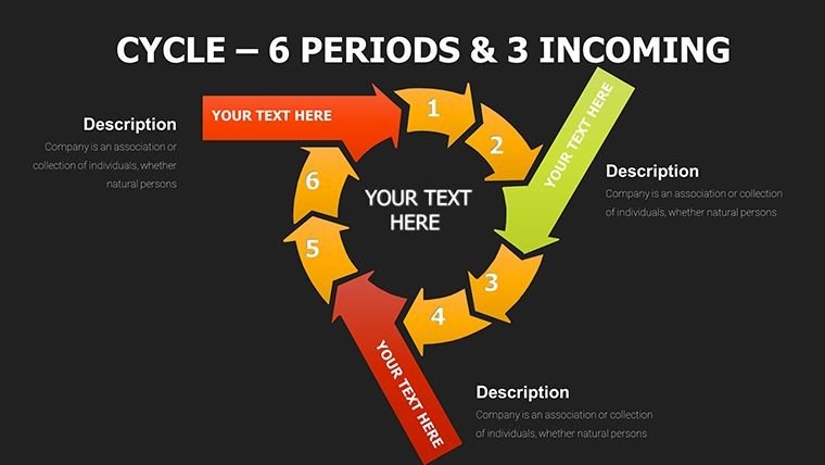
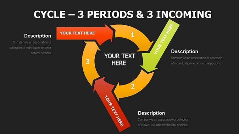
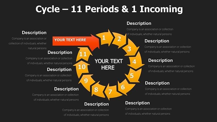
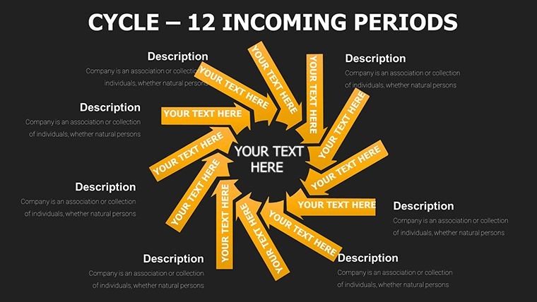
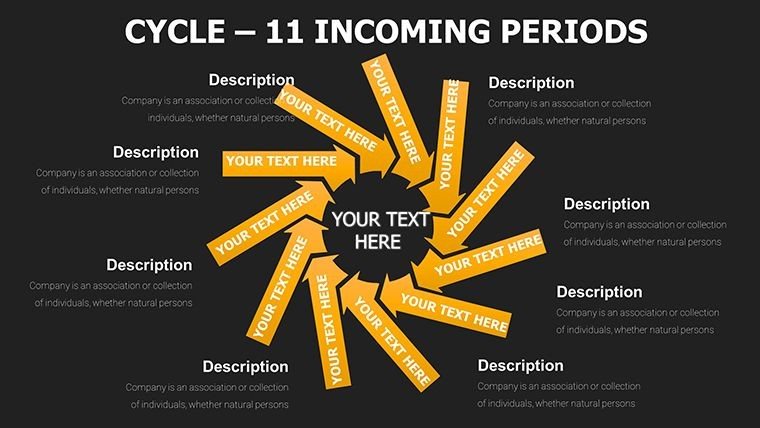
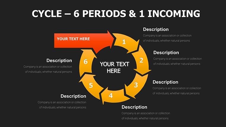
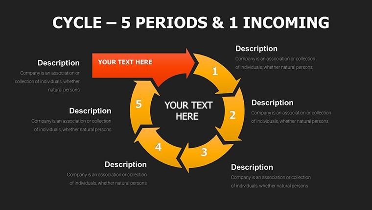
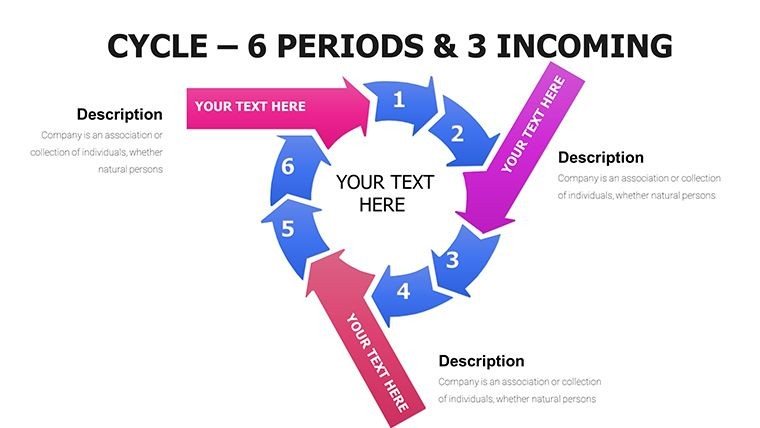
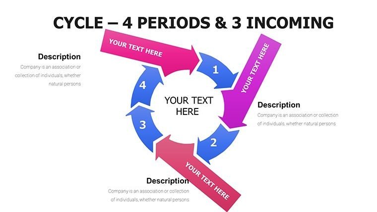
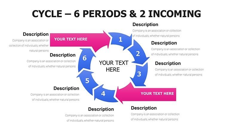
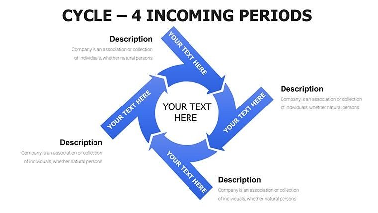
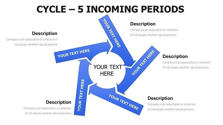
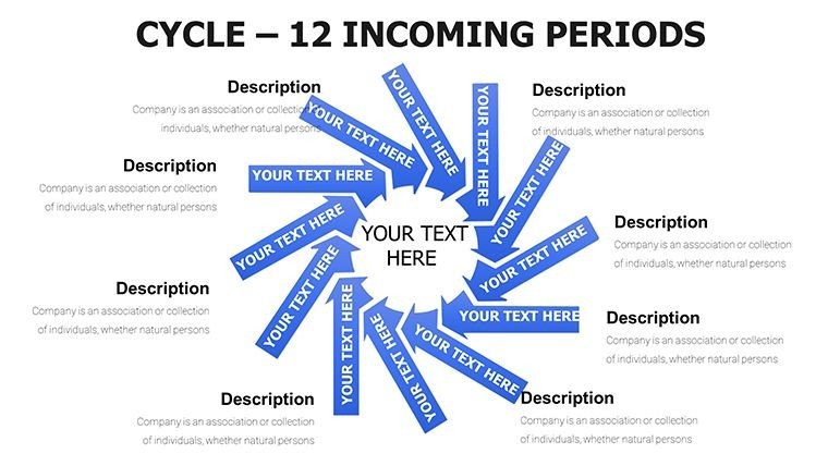
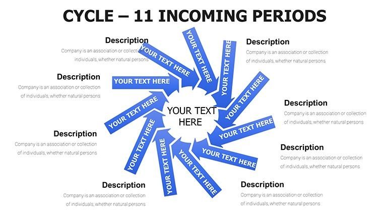
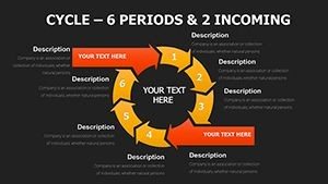
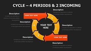
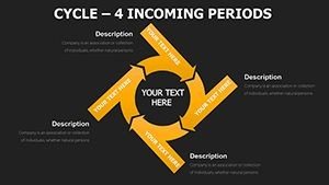
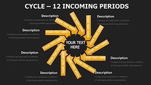
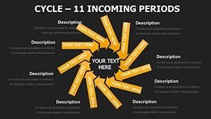
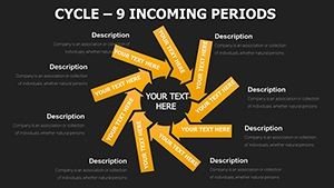
Slides 21-40: Incoming-Focused Arrow Integrations
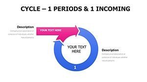
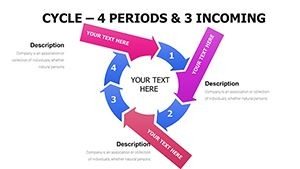
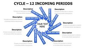
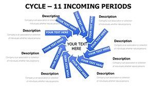
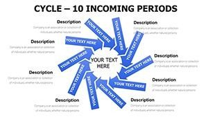
Here, the emphasis shifts to arrows directing inputs into cycles. Slide 25, for example, uses converging arrows to illustrate resource inflows, perfect for supply chain overviews. Data points go into arrow tails, with cycle centers summarizing impacts.
Slide 33 combines dashed arrows for variable inputs, enabling dynamic scenarios like market fluctuations. Edit arrow thickness or direction to emphasize key inflows, ensuring your story highlights critical dependencies.
These slides excel in presentations where showing external influences on internal cycles is key, like in risk assessments.
Slides 41-57: Hybrid Pie and Arrow Configurations
The final group merges pies within cycles for multifaceted analysis. Slide 45 nests a pie chart inside a cycle, great for revenue breakdowns by period. Insert percentages into pie slices and label cycle phases around them.
Slide 52 adds arrows piercing pies, visualizing incoming contributions to segmented data. Customization options include exploding slices or animating arrows for emphasis during delivery.
These advanced slides handle complex datasets, such as multi-department budgets, with visual precision.
Where and How Professionals Use This Template
In board meetings, executives use these cycles to demonstrate sales pipelines, clarifying how leads inflow over periods.
For investor pitches, founders map startup growth phases, using arrows to show funding injections.
Quarterly reviews benefit from pie hybrids to dissect performance metrics, fostering data-driven discussions.
Educators incorporate them in lectures to teach economic models, with periods marking historical eras.
Training sessions leverage incoming arrows to explain workflow inputs, aiding team onboarding.
Consultants apply them in strategy sessions, illustrating process optimizations for clients.
Data reporting uses hybrids for insight presentations, making trends accessible to non-experts.
Workflow Integration
This template slots seamlessly into your existing PowerPoint routine, compatible with versions 2016 and later, plus Keynote and Google Slides for cross-platform work.
Start by selecting relevant slides, then populate placeholders with your data—no advanced skills needed. Adjust colors via theme tools or resize elements with drag-and-drop for quick tweaks.
The time-saving aspect is huge; what once took days now wraps in minutes, freeing you for rehearsal and refinement.
With a one-time license, it's yours for lifetime use, including updates, ensuring long-term value in your presentation arsenal.
Real Presentation Examples
In a recent consulting gig, I used slide 15 to map a client's inventory cycle, highlighting seasonal inflows that secured a process overhaul contract.
Managers in my network apply slide 28 for team updates, arrowing project inputs to clarify delays and accelerate resolutions.
Educators I've advised employ slide 48 in courses, nesting pies to show demographic shifts over educational periods.
Founders leverage slide 50 in pitches, using hybrids to project revenue cycles influenced by market inflows.
Analysts favor slide 55 for reports, integrating arrows and pies to unveil hidden patterns in data streams.
Template Comparison
| Feature | This Template | Default PowerPoint | From Scratch | Alternatives |
|---|---|---|---|---|
| Ease of Use | Plug-and-play edits | Basic shapes only | Manual drawing | Varies, often clunky |
| Customization Depth | Full shape/color control | Limited options | Unlimited but time-consuming | Partial in free versions |
| Time Efficiency | Under 30 minutes | 1-2 hours | Several hours | 45-90 minutes |
| Professional Polish | High-end designs | Generic look | Depends on skill | Inconsistent |
Seeing these differences, it's clear why I recommend this for tight deadlines.
Ready to transform your cycle visuals? Download this template and start customizing in moments.
Use Cases Across Industries
In finance, depict investment return cycles with incoming market factors using arrow-pie hybrids.
Technology teams show software update periods, arrowing bug reports and feature requests.
Healthcare professionals map patient recovery cycles, integrating incoming treatment data.
Education sectors illustrate curriculum development periods with resource inflows.
Marketing experts visualize campaign lifecycles, highlighting lead generation arrows.
Consulting firms use them for client engagement cycles, nesting pies for phase metrics.
Frequently Asked Questions
Can I adjust the number of cycle phases in these slides?
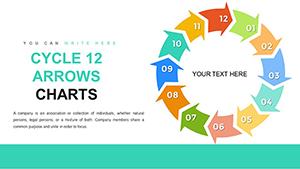
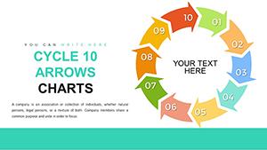
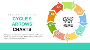
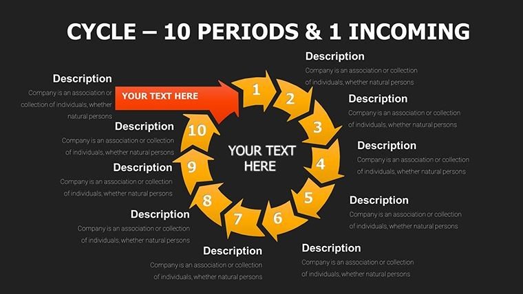
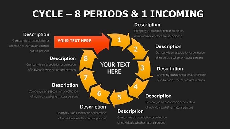
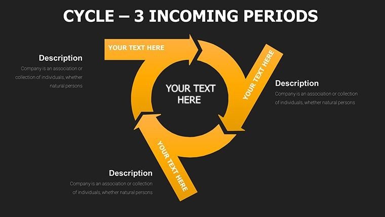
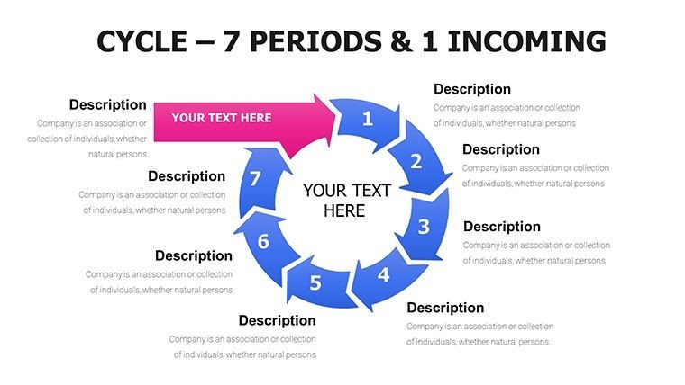
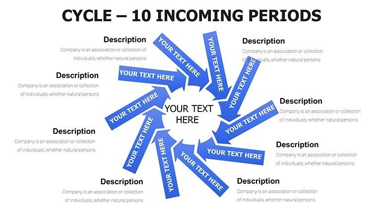
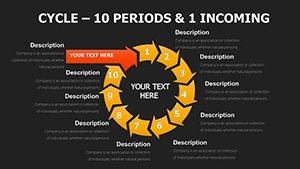
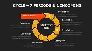
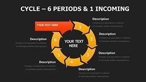
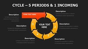
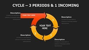
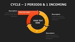
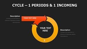
Yes, each slide allows you to add or remove segments easily. Select the shape, duplicate or delete parts, and realign arrows accordingly. This flexibility suits varying process complexities, from simple three-stage overviews to detailed ten-period analyses, all while maintaining design integrity.
Is this template compatible with older PowerPoint versions?
It's optimized for PowerPoint 2016 and newer, but basic elements work in 2013. For full editability, update your software. It also integrates smoothly with Keynote and Google Slides, preserving animations and layouts during imports.
How do I incorporate my company's branding into the charts?
Use the color picker to match your palette, replace fonts via the theme editor, and insert logos into placeholders. This ensures the cycles align with your visual identity, enhancing professionalism in client-facing decks.
What data types best fit the hybrid pie slides?
Percentages for pies and sequential steps for cycles work ideally, like breaking down budget allocations over fiscal periods. Input numbers directly, and the visuals auto-adjust for accuracy.
Can I animate the arrows for incoming elements?
Absolutely, apply entrance effects to arrows for sequential reveals. This builds suspense in presentations, guiding audiences through inflows step by step.
Does the template include sample data?
Yes, placeholders come with dummy text and figures to guide your customization, speeding up the adaptation process for real scenarios.