Infographic PowerPoint Template Ripple Effects - 22 Editable Slides


As a presentation consultant who's built hundreds of decks for Fortune 500 executives and startup founders alike, I know the frustration of flat charts that fail to capture attention in high-stakes meetings. This infographic ripple effects template transforms that by layering visual dynamics into your data stories, making complex information accessible and memorable. With its focus on creating a sense of expansion and interconnection, it's a tool I reach for when clients need to illustrate growth patterns or cascading influences without overwhelming their audience.
Imagine presenting quarterly metrics where each data point ripples outward, drawing eyes to key insights. This template delivers exactly that, saving you hours of design work while ensuring your slides align with modern visual standards. It's not just about aesthetics - it's about driving understanding and decision-making in boardrooms and beyond.
Detailed Breakdown of Template Slides
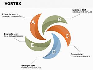
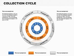
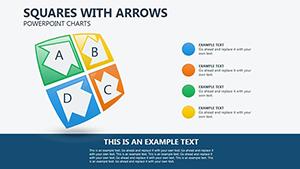
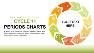
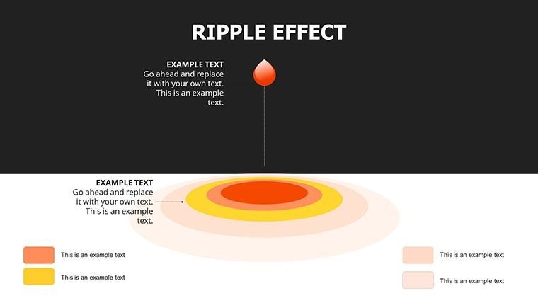
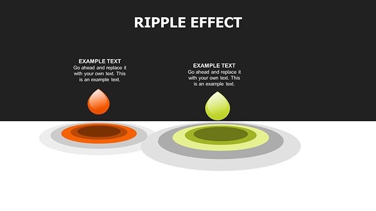
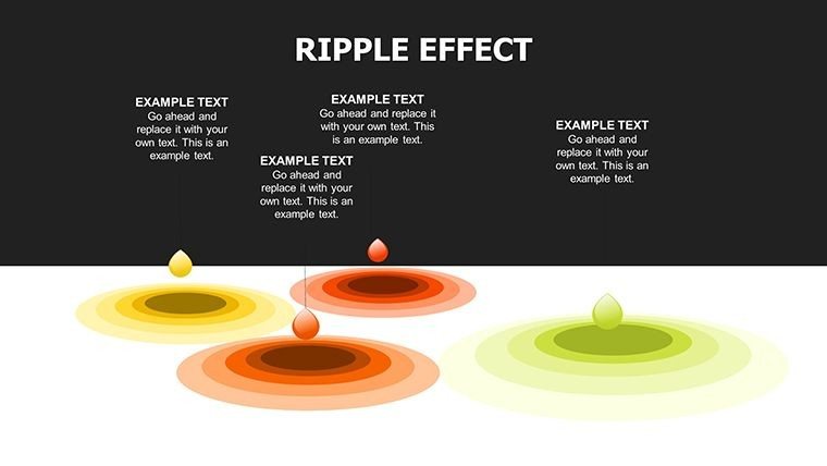
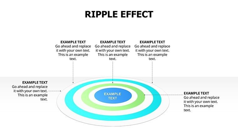
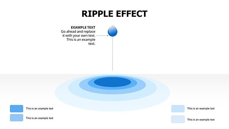
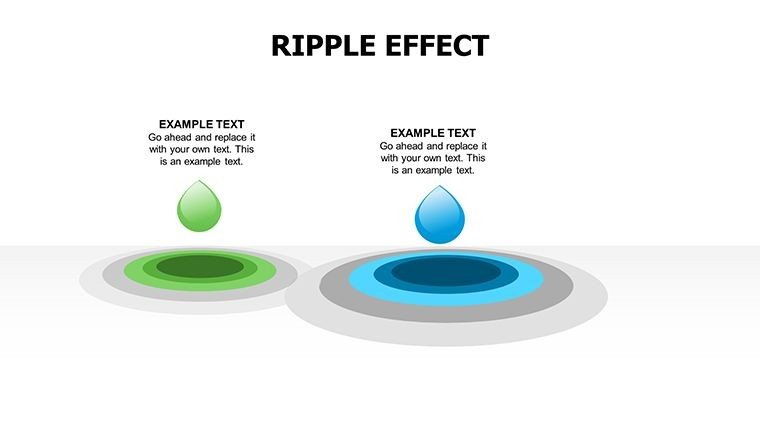
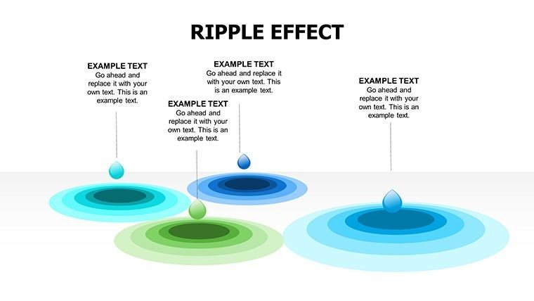
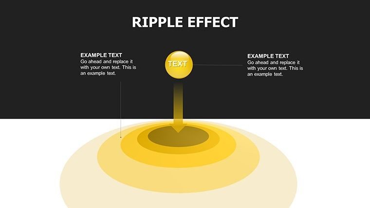
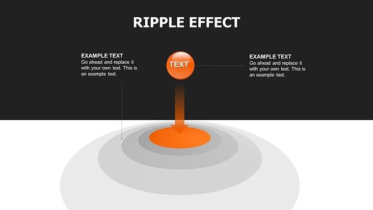
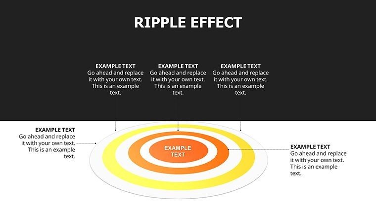
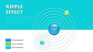
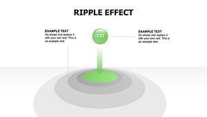
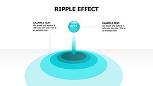
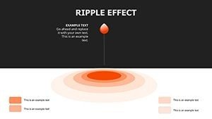
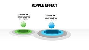
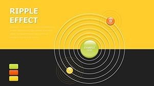
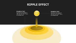
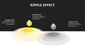
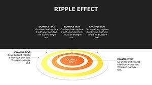
The template organizes its 22 slides into thematic groups, each optimized for specific data narratives. Slides 1 through 7 center on cycle charts enhanced with ripple layers, perfect for depicting recurring processes like market trends or operational loops. These include customizable rings that expand from a core idea, allowing you to input stages, timelines, and metrics directly.
Moving to slides 8 to 14, the pie chart variations incorporate subtle effect overlays to highlight segments dynamically. Think of adjusting glow intensities to emphasize revenue shares or resource allocations, with placeholders for labels, percentages, and supporting text. The design ensures balance, preventing visual clutter while amplifying focal points.
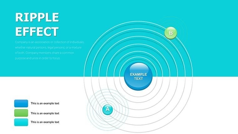
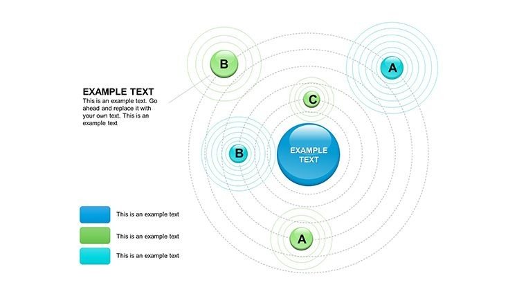
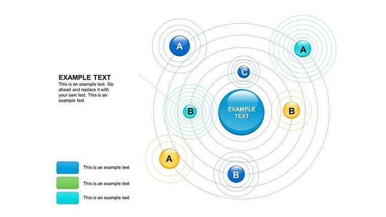
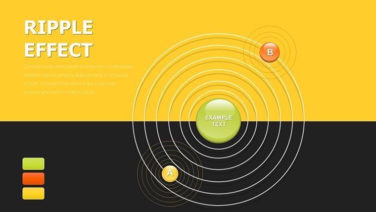
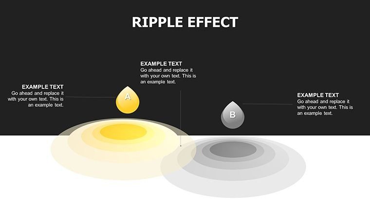
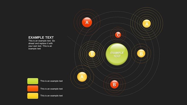
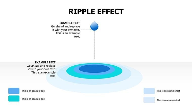
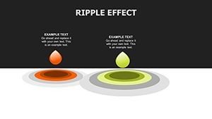
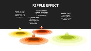
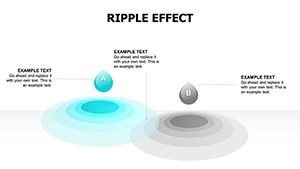
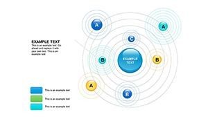
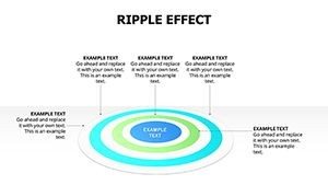
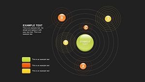
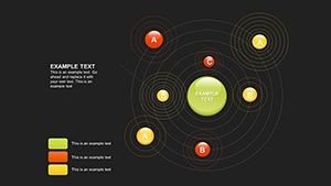
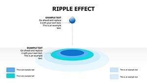
Slides 15 to 22 shift to sphere charts, ideal for multidimensional views such as global reach or hierarchical structures. Here, gradients and shadows create a 3D illusion, with editable spheres that can nest data layers - great for showing interconnected impacts like policy changes rippling through departments.
Professional Applications in Daily Workflows
In corporate settings, I've used similar layouts to streamline board meeting agendas, where cycle charts map out strategic initiatives with rippling phases to show progression. For investor pitches, pie charts with effects clarify funding distributions, making proposals more persuasive. Educators leverage sphere designs in lectures to visualize ecosystem interactions, fostering deeper student engagement.
Government teams apply these in policy briefings, illustrating how decisions create widespread effects across sectors. Enterprise analysts find them invaluable for internal reviews, turning raw data into narratives that highlight efficiencies or risks. The versatility ensures it fits seamlessly into diverse professional environments.
Seamless Integration into Your Presentation Process
This template slots right into your existing workflow, compatible with PowerPoint 2016 and later, Keynote, and Google Slides for collaborative editing. Start by importing your data via Excel links for automatic updates, then tweak effects like shadow depth or gradient colors to match your branding. The drag-and-drop interface means you can assemble a full deck in under an hour, focusing on content rather than formatting.
Customization is straightforward: resize elements, change fonts, or add animations without losing the ripple coherence. It's designed for quick iterations, which is crucial when prepping for last-minute client calls or team huddles. With lifetime access post-download, it's a one-time investment that pays off in repeated use.
Actual Client Scenarios Where It Shines
For a tech consultant, I customized cycle slides to depict software development lifecycles, with ripples showing iteration impacts - resulting in clearer project roadmaps. Managers in manufacturing use pie effects to break down production costs, facilitating budget discussions. Educators adapt sphere charts for biology lessons on cellular processes, enhancing visual learning.
Founders pitching to VCs employ the template to illustrate market expansion ripples, securing funding faster. Analysts in finance layer effects on spheres for portfolio overviews, spotting trends at a glance. These real applications demonstrate its practicality across roles.
Template Advantages Over Alternatives
| Aspect | This Template | Default PowerPoint | From Scratch | Other Solutions |
|---|---|---|---|---|
| Design Quality | Professional ripple effects for depth | Basic flat charts | Time-consuming custom builds | Often generic without effects |
| Customization Time | Minutes with editable layers | Hours for basic tweaks | Days for full design | Varies, but less intuitive |
| Visual Impact | High with 3D illusions | Low engagement | Dependent on skill | Moderate without ripples |
| Cost Efficiency | One-time license, lifetime use | Free but uninspiring | High effort cost | Subscription models common |
Industry-Specific Use Cases
In finance, ripple pie charts map investment returns spreading across assets. Tech firms use cycle designs for product roadmap evolutions. Healthcare professionals visualize treatment outcomes rippling through patient populations. Marketers track campaign influences with sphere layers, measuring reach.
Consultants deploy it for strategy sessions, showing change propagation. Educators in academia illustrate historical events' cascading effects. The template's adaptability makes it a staple in varied fields.
Ready to make your data ripple with meaning? Download this template and start crafting impactful slides today.
Frequently Asked Questions
How do I apply ripple effects to my data in this template?
Select the chart element, navigate to the effects pane in PowerPoint, and adjust gradients or shadows via the provided layers. Input your data into placeholders, and the ripples automatically scale for a professional look. It's intuitive for quick edits.
Is this compatible with Google Slides for team collaboration?
Yes, upload directly to Google Slides where effects render smoothly. Minor adjustments might be needed for animations, but core designs remain intact for shared editing.
Can I use this for non-business presentations like educational workshops?
Absolutely, sphere charts are excellent for showing interconnected concepts in workshops. Customize colors to fit themes, enhancing participant retention.
What if my data changes - how easy is updating?
Link to Excel for dynamic updates; ripples adjust automatically. This keeps your deck current without redesigning.
Are there limits on customizing the sphere dimensions?
No limits - resize, recolor, or layer additional effects freely to match your narrative needs.