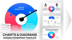
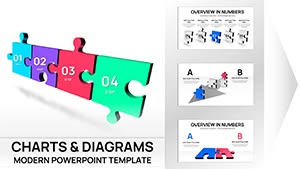
Interlocking Puzzle Pie Charts PPT Template


Standard pie charts show proportions effectively, but when you need to emphasize how those proportions rely on each other, nothing beats the interlocking puzzle design. This 33-slide template transforms ordinary data breakdowns into visual narratives that highlight synergy and mutual dependence, ensuring your audience grasps the bigger picture immediately.
I`ve relied on these layouts in countless client sessions to make abstract relationships concrete, from resource interdependencies in operations reviews to partnership ecosystems in growth strategies.
Detailed Layout Breakdown and Customization Features
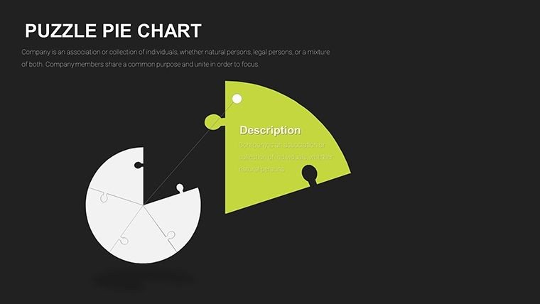
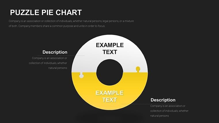
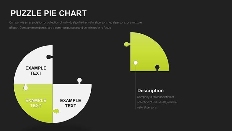
The core strength lies in the precise puzzle integration within pie structures.
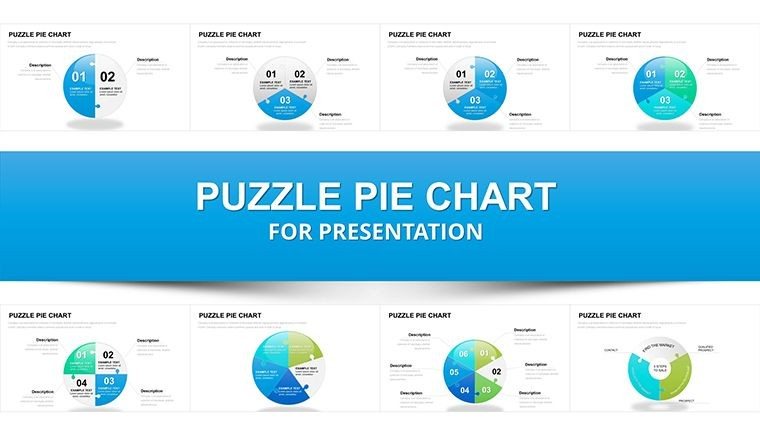
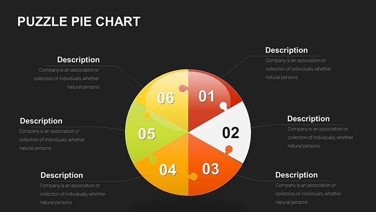
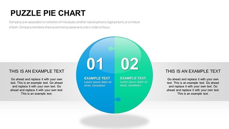
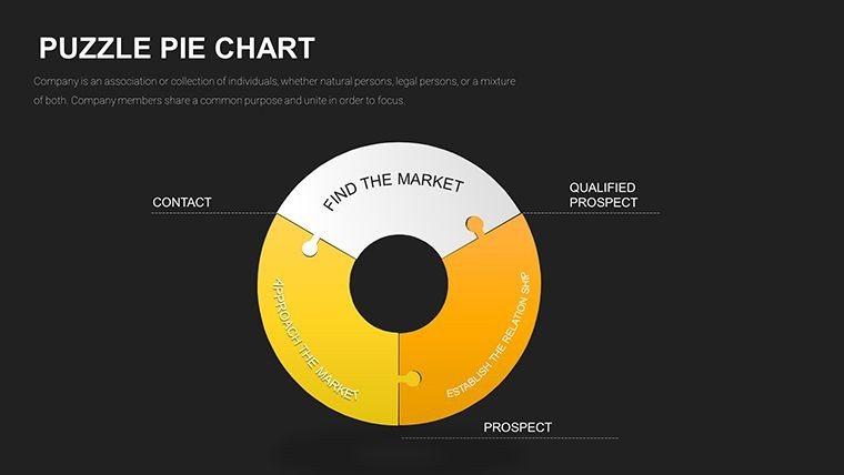
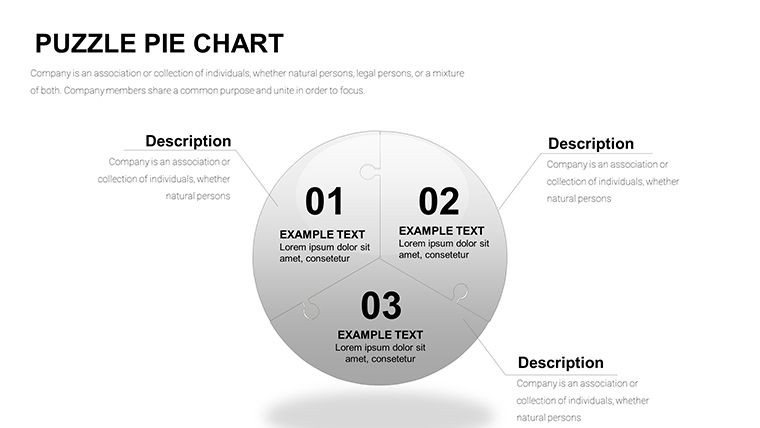
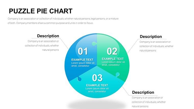
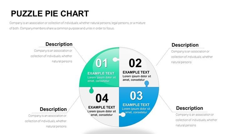
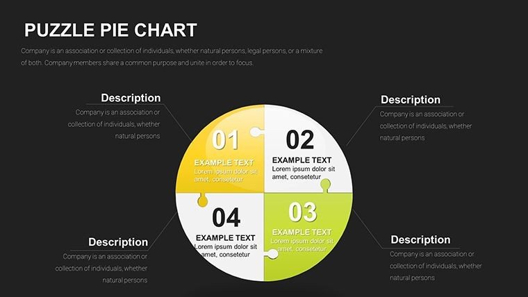
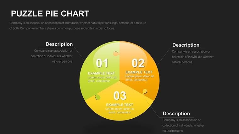
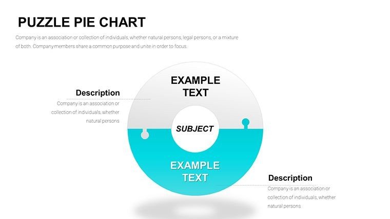
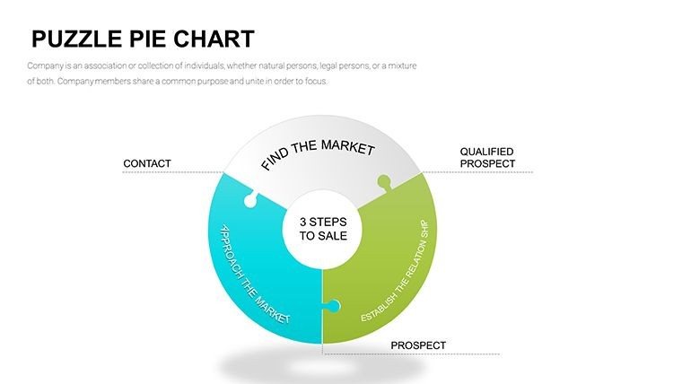
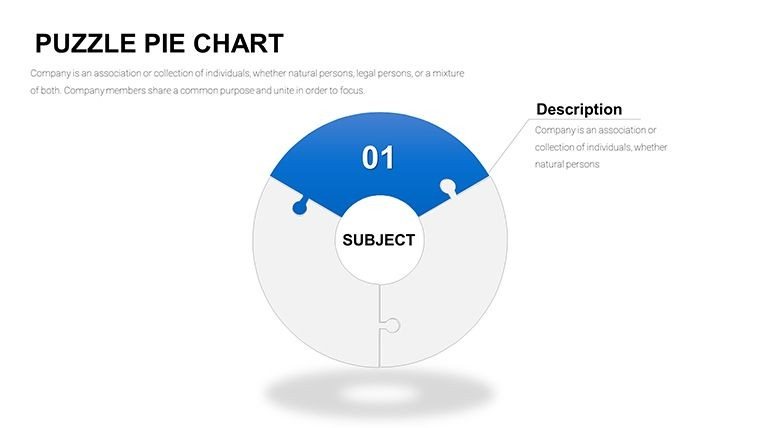
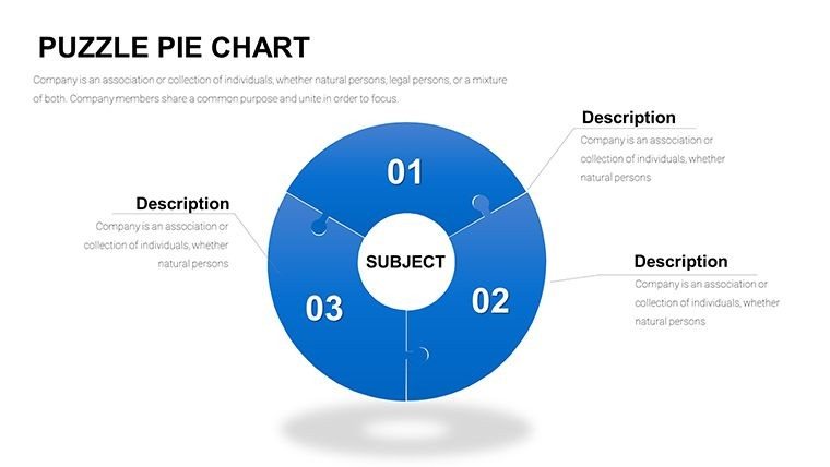
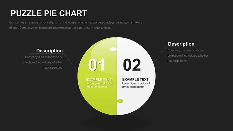
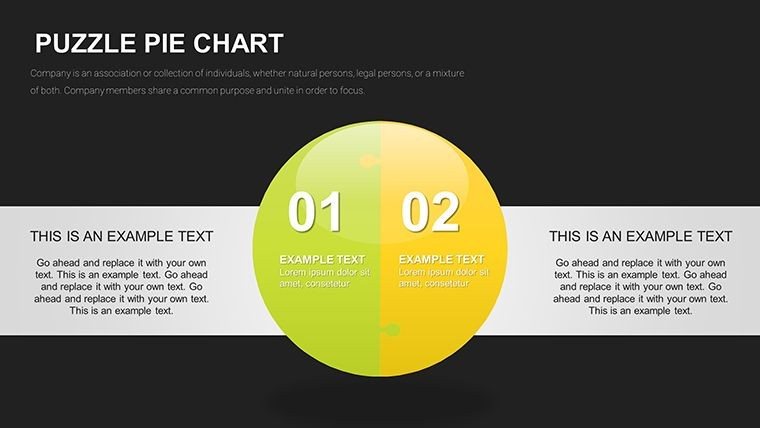
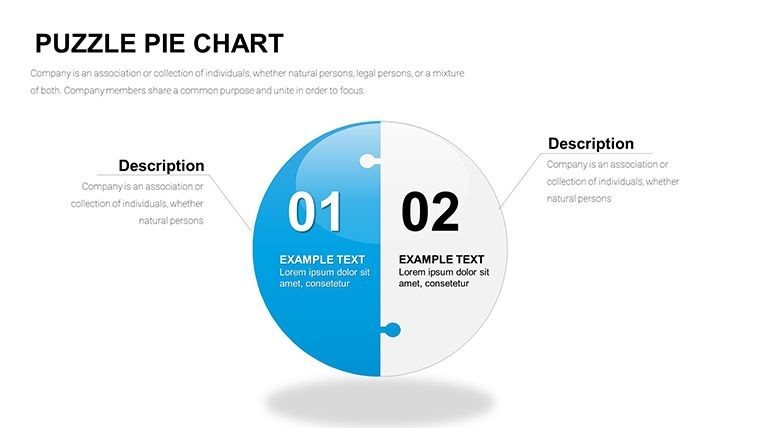
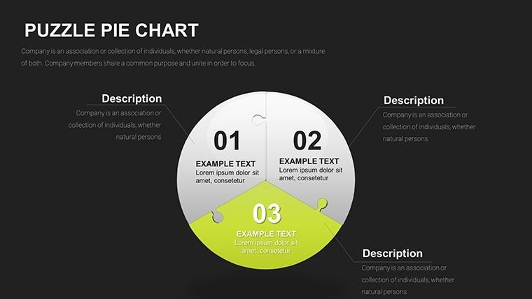
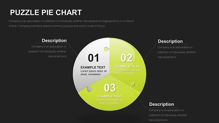
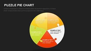
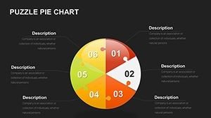
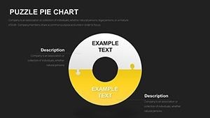
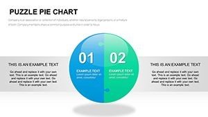
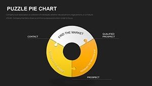
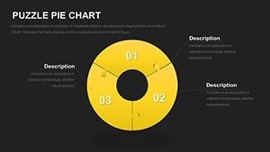
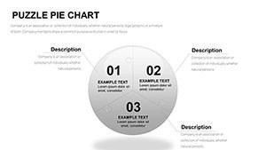
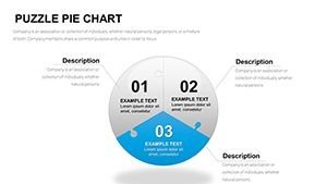
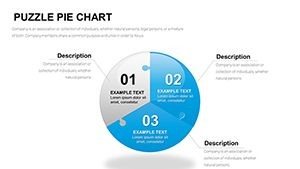
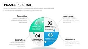
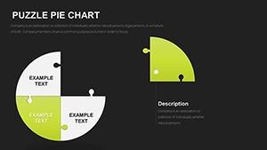
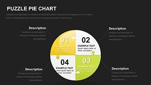
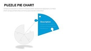
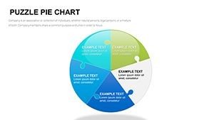
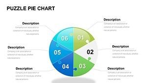
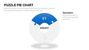
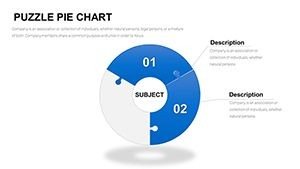
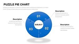
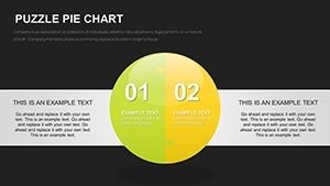
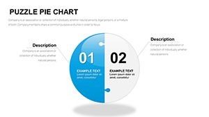
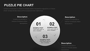
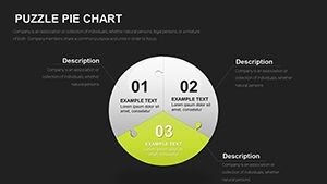
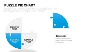
- Varied segment counts: Clean designs for 4 to 7 pieces, keeping visuals uncluttered per best practices.
- Interactive assembly options: Slides with drag-and-drop elements or animated locking sequences.
- Multi-scheme colors: Vibrant sets for creative fields and subdued corporate palettes.
- Depth enhancements: Subtle textures and sphere overlays for premium polish.
Data linking ensures seamless updates, with puzzle fits preserved automatically.
Strategic Applications in Professional Settings
In marketing reviews, these charts map campaign channel contributions, showing how digital and traditional efforts must align for optimal ROI. Analysts use them for demographic breakdowns where segments represent interdependent factors influencing outcomes.
Educators bring abstract concepts to life, like ecosystem balances or historical event interconnections during lectures.
Effortless Workflow Incorporation
Fully compatible with PowerPoint 2016 onward, these slides blend into any deck without issues. Quick edits via data tables or master slides mean you spend less time designing and more on refining your message.
Client Scenarios I`ve Delivered
For a non-profit annual report, puzzle pies illustrated fund allocation across programs, emphasizing how each initiative supports the mission`s completeness. In product portfolio discussions, segments highlighted feature interdependencies critical for roadmap decisions.
Merger integration sessions featured these visuals to outline cultural and operational alignments needed for success.
Comparison to Alternative Methods
| Feature | Basic Pie Charts | Custom-Built Puzzles | This 33-Slide Template |
|---|---|---|---|
| Interdependence Visualization | Proportions only | Labor-intensive alignment | Seamless interlocking mechanics |
| Retention Impact | Standard recall | Inconsistent quality | Memorable puzzle metaphor |
| Setup Time | Quick but plain | Hours of work | Minutes to professional results |
| Customization Depth | Limited | Full but tedious | Extensive with ease |
Transform your data stories today - download this interlocking puzzle pie chart template and deliver presentations that truly resonate.
Sector-Specific Implementations
Strategic planners visualize initiative portfolios. Innovation workshops map idea component connections. Public sector reports show program funding synergies.
Frequently Asked Questions
How many segments work best with the puzzle design?
Five to seven pieces provide optimal clarity - beyond that risks clutter, as supported by visualization research. The template includes focused layouts adhering to this guideline.
Can I add textures or custom backgrounds?
Yes, subtle textures enhance tactile feel without distracting; apply via format options while preserving puzzle integrity.
Are animation sequences included?
Multiple slides feature piece-by-piece reveals that simulate assembly, ideal for building arguments progressively.
How does this handle data from Excel?
Direct linking allows real-time updates; changes reflect instantly in segment sizes and labels.
Is it suitable for non-profit donor presentations?
Absolutely - the metaphor powerfully conveys how contributions complete the mission puzzle.