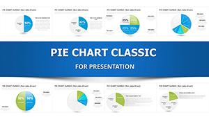
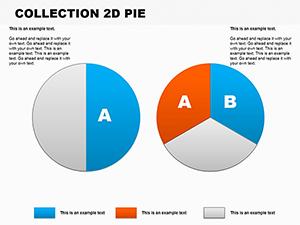
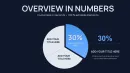
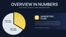
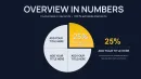
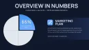
Pie Charts PowerPoint Template - 26 Editable Slides


Type: PowerPoint Charts template
Category: Pie
Sources Available: .pptx
Product ID: PC01094
Template incl.: 26 editable slides
Presenting market share analysis to a board that expects clarity in under three minutes. You have seven data segments, budget allocations across departments, or survey responses that need immediate visual comprehension. Generic PowerPoint pie charts feel flat and uninspired. Building custom circular diagrams from scratch consumes hours you don't have before tomorrow's investor meeting. This 26-slide pie chart template collection solves that exact pressure point.
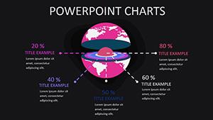
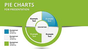
Each slide delivers a distinct approach to circular data visualization. You get segmented rings for hierarchical breakdowns, exploded slices that emphasize critical percentages, concentric circles for comparing multiple datasets simultaneously, and hybrid layouts combining pie segments with supporting text blocks. The designs handle three-segment simplicity through twelve-part complexity without visual chaos. Color schemes adapt instantly to match corporate guidelines while maintaining the contrast needed for rear-projection screens and PDF distribution.
What separates functional pie charts from forgettable ones? Readability at distance. When a CFO reviews your quarterly expense breakdown from twenty feet away during a standing presentation, every percentage label must register immediately. These templates position data callouts outside the circle perimeter, eliminating the overlap problems that plague default PowerPoint charts. Slice angles follow cognitive design principles where human eyes naturally track clockwise information flow starting from the twelve o'clock position.
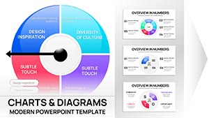
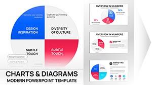
Complete Design Inventory Across Twenty-Six Layouts
The template library divides into six functional categories. Standard pie configurations cover straightforward percentage splits with two through eight segments. Each variation includes a title placeholder, legend positioning options, and editable percentage callouts. The color palette uses professionally tested combinations that work equally well in both light and dark presentation themes.
Donut chart variations create space in the circle center for displaying totals, summary statistics, or focal imagery. A sales director presenting regional performance can place the total revenue figure prominently within the ring while outer segments show geographic distribution. Healthcare administrators use this center space for patient volume totals while the donut segments break down treatment categories or department utilization rates.
Multi-level circular diagrams nest smaller pies within larger contexts. The outer ring might represent total company revenue while the inner circle details profit margins. Product managers presenting feature adoption rates place the overall user base in the primary circle with secondary rings showing engagement depth across different customer tiers. These nested structures communicate hierarchical relationships that flat pie charts cannot express.
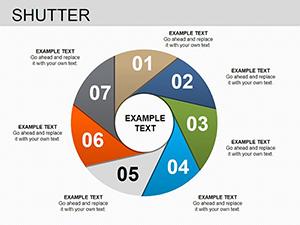
Process-oriented pie designs integrate directional arrows and sequential numbering. Quality assurance teams documenting audit cycles use these layouts to show time allocation across inspection phases. Project managers breaking down sprint activities appreciate the visual flow that connects percentage allocations with chronological progression. The arrows guide audience attention through the circular narrative rather than leaving viewers to interpret segment relationships independently.
Comparison layouts position multiple pie charts side by side with alignment guides ensuring visual consistency. Budget analysts contrasting current year versus prior year expenditures benefit from this parallel structure. Marketing teams showing demographic shifts across campaign periods use dual pies to make percentage changes immediately apparent. The templates maintain identical sizing and positioning so audience focus stays on data differences rather than fighting layout inconsistencies.
Specialty formats include semi-circular gauges for displaying performance against targets, quarter-circle designs for space-constrained slides, and segmented rings with icon integration for thematic presentations. A human resources director might use the semi-circle layout to show employee satisfaction scores against benchmark goals. Environmental consultants presenting sustainability metrics utilize icon-enabled segments where recycling symbols, energy indicators, or water conservation graphics reinforce the data message.
Where Finance Teams Deploy These Circular Data Tools
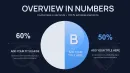
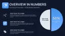
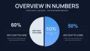
Controllers preparing monthly variance reports rely on pie chart clarity when explaining budget deviations to executive committees. The visual instantly communicates which expense categories consumed larger-than-planned allocations. Rather than presenting spreadsheet rows that require mental calculation, the pie chart delivers proportional understanding in seconds. Stakeholders grasp that marketing expenses expanded from eighteen to twenty-seven percent of total spend without parsing through numerical tables.
Investment advisors building client portfolio reviews use these templates to show asset allocation across equities, fixed income, real estate, and alternative investments. During annual planning sessions, the pie chart demonstrates current positioning while a second adjacent chart illustrates recommended rebalancing targets. Clients immediately understand the proposed shifts without needing financial expertise to interpret percentage point movements.
Revenue breakdowns by product line, customer segment, or geographic region become leadership dashboard standards. When a SaaS company presents quarterly business reviews, pie charts show subscription revenue sources across enterprise, mid-market, and small business tiers. The executive team assesses concentration risk at a glance, identifying whether the business depends too heavily on any single segment.
Strategic Applications Beyond Standard Business Reporting
Management consultants delivering operational assessments use these slides to present time allocation studies. After observing warehouse workflows for two weeks, the consultant shows supervisors exactly how employee hours distribute across receiving, inventory management, order fulfillment, and administrative tasks. The pie chart reveals that administrative work consumes thirty-two percent of labor hours, triggering discussions about process automation opportunities that spreadsheets alone wouldn't provoke.
Nonprofit organizations preparing grant applications visualize program spending to satisfy funder requirements. Foundation reviewers expect clear documentation showing how donated dollars allocate across direct services, administrative overhead, and fundraising activities. The pie chart template helps development directors present this information professionally, building donor confidence that resources flow primarily toward mission-critical programming.
University departments analyzing enrollment trends segment student populations by major, admission pathway, or demographic characteristics. The dean presenting to faculty senate uses pie charts to show shifting major selections over five-year periods. When computer science enrollment grows from twelve to twenty-three percent of departmental total, that visual proportion communicates resource allocation implications more effectively than enrollment tables.
Healthcare administrators presenting to medical staff committees break down patient volume by service line, payer mix, or diagnosis category. A hospital CFO explaining revenue pressures shows how Medicare patients constitute forty-one percent of volume while generating only thirty-two percent of revenue. The paired pie charts make the reimbursement challenge visible to clinical leaders who focus primarily on patient care rather than financial dynamics.
Workflow Integration From Data Source to Final Delivery
The template works directly within PowerPoint 2016 and newer versions, requiring no third-party plugins or specialized software. After downloading the PPTX file, designers open it alongside their primary presentation deck. Selecting the appropriate pie chart layout involves reviewing thumbnail previews, then copying the chosen slide into the working presentation.
Data entry follows PowerPoint's standard chart editing process. Right-clicking the pie chart opens the underlying Excel datasheet where users replace placeholder values with actual figures. The chart updates automatically as numbers change, maintaining the design formatting while reflecting new percentages. Users can add or remove data series by inserting or deleting spreadsheet rows, with the pie chart adjusting segment counts accordingly.
Color customization takes seconds using PowerPoint's format tools. Selecting any pie segment and choosing a new fill color updates that specific slice while preserving label positioning and percentage callouts. For comprehensive rebranding, the entire chart accepts theme color changes that propagate across all segments simultaneously. This flexibility means a single template purchase serves organizations with multiple brand identities or clients requiring different visual standards.
Typography adjustments follow standard PowerPoint text editing. All percentage labels, legends, and title blocks use editable text boxes that accept any installed font. Presenters working within strict brand guidelines simply select the text elements and apply their corporate typeface. Font sizing scales appropriately for different screen contexts whether projecting in a large auditorium, sharing via video conference, or printing as handout materials.
The slides export cleanly to PDF for distribution, convert to Google Slides when teams collaborate through browser-based tools, and import into Keynote for Mac-based presenters. Format compatibility ensures that template investments remain useful regardless of software transitions or cross-platform collaboration requirements that emerge across project lifecycles.
Real Presentation Scenarios From Actual Consulting Engagements
A private equity firm conducting due diligence on an acquisition target needs rapid understanding of revenue concentration. The investment analyst builds a presentation showing that the target company generates sixty-three percent of revenue from just two customers. The pie chart makes this concentration risk immediately apparent during partner meetings, influencing valuation discussions and deal structure negotiations.
A sustainability director presenting annual environmental progress to the corporate board uses pie charts to show waste stream composition. The visual demonstrates that cardboard packaging represents forty-seven percent of total waste volume, justifying capital investment in a baling system that creates new recycling revenue streams. Without the pie chart's proportional clarity, the recommendation might have seemed like minor operational tinkering rather than material financial opportunity.
A technology startup pitching venture capital investors breaks down customer acquisition channels. The pie chart reveals that organic search delivers fifty-one percent of new users despite representing only eighteen percent of marketing spend. This efficiency contrast, made visually obvious through the circular format, strengthens the argument for additional growth capital directed toward SEO investments rather than paid advertising expansion.
An association executive presenting membership demographics to volunteer leaders shows generational composition shifting dramatically. The side-by-side pie charts comparing five years ago versus current state illustrate Gen Z and Millennial members growing from twenty-eight to forty-six percent of total membership. The visual evidence drives strategic discussions about digital engagement tactics and event format modifications that spreadsheet percentages alone wouldn't trigger.
A school district superintendent explaining budget allocation to the school board uses pie charts to show spending distribution across instruction, facilities, transportation, and administration. When community members question administrative costs, the superintendent references the pie chart showing that direct instruction consumes seventy-two percent of the budget, visually reinforcing that the district prioritizes classroom resources over back-office functions.
Design Advantages Versus Alternative Visualization Approaches
| Evaluation Factor | Pie Chart Template | Default PowerPoint Charts | Building From Scratch |
|---|---|---|---|
| Setup Time Required | Under five minutes from download to data entry | Fifteen minutes formatting and adjusting layouts | Forty-five to ninety minutes creating custom designs |
| Professional Appearance | Designer-tested color harmony and spacing | Generic templates that signal low effort | Highly variable depending on design skills |
| Segment Label Clarity | Positioned to avoid overlap with automatic leaders | Frequently overlapping with poor readability | Requires manual adjustment for each slide |
| Color Scheme Flexibility | One-click theme application across all segments | Individual segment recoloring only | Total control but time-intensive implementation |
| Format Consistency | Twenty-six coordinated layouts with matching styles | Each chart stands alone without design unity | Consistency possible but demands strict discipline |
| Advanced Layout Options | Donut charts, nested rings, and process flows included | Limited to basic pie and donut only | Unlimited but requires significant design time |
Cross-Industry Applications Demonstrating Versatility
Pharmaceutical companies presenting clinical trial results use pie charts to show patient population distribution across treatment arms, placebo groups, and dropout categories. Regulatory affairs specialists preparing FDA submission decks appreciate the templates' professional appearance that meets agency expectations for clear data presentation.
Real estate developers presenting mixed-use project plans break down square footage allocation across retail, office, residential, and common areas. City planning commissions reviewing zoning variance requests can quickly assess whether proposed developments align with community master plans when space usage appears in proportional circular format.
Manufacturing operations managers tracking defect root causes display quality metrics showing whether material flaws, process errors, equipment malfunctions, or human factors drive rejection rates. The pie chart helps Lean Six Sigma teams prioritize improvement initiatives by visually highlighting which categories demand immediate attention versus minor contributors.
Political campaigns analyzing voter outreach effectiveness segment contact methods across phone banking, door-to-door canvassing, digital advertising, and direct mail. Campaign managers allocating volunteer hours use these visuals to show current effort distribution and guide resource reallocation toward higher-impact activities.
Restaurant groups comparing location performance present same-store sales contribution across their portfolio. The corporate executive team uses pie charts to identify which restaurants drive overall revenue, informing decisions about expansion concepts, menu standardization, or underperforming location closures.
Insurance agencies showing coverage portfolio composition break down policy counts across auto, home, life, and commercial lines. Agency principals recruiting new agents use these visuals to demonstrate practice diversification and growth opportunities in underpenetrated product categories.
Customization Capabilities Meeting Specific Brand Requirements
Organizations with established visual identity guidelines need presentation templates that accommodate rather than conflict with existing standards. These pie chart slides accept corporate color palettes through PowerPoint's theme color functionality. A financial services firm using navy, silver, and gold as brand colors can apply those exact specifications to all segments, legends, and accent elements within minutes.
Typography customization extends beyond simple font changes. Presenters can adjust label sizing to meet accessibility requirements, ensuring that percentage callouts remain readable for audience members with visual impairments. Text weight modifications from light to bold help emphasize critical data points without adding visual clutter through competing graphical elements.
Segment spacing adjustments let designers create exploded pie charts where selected slices pull away from the main circle, drawing attention to specific data categories. A marketing director highlighting a particularly successful product line can visually separate that segment, making the emphasis unmistakable even before verbal explanation begins.
Background modifications support different presentation contexts. The templates work equally well with white backgrounds for print handouts, dark backgrounds for theater-style presentations, or branded gradient backgrounds that match corporate slide decks. Automatic color contrast ensures that text remains readable regardless of background selection.
Legend positioning flexibility accommodates varying slide layouts. Presenters can place legends to the right for standard widescreen formats, at the bottom for square aspect ratios, or eliminate legends entirely when slide titles and callouts provide sufficient context. This adaptability means the same template set serves both formal board presentations and quick team huddle updates.
Technical Specifications Supporting Professional Delivery
The template file maintains full editability across PowerPoint versions from 2016 forward, ensuring compatibility with current corporate software standards. IT departments appreciate that no macro enabling or security exceptions are required, eliminating deployment barriers in enterprises with strict cybersecurity protocols.
Vector-based graphics ensure crisp rendering at any resolution. Whether presenting on a 4K conference room display, projecting through a standard office projector, or sharing via laptop screen during one-on-one client meetings, the pie charts maintain edge clarity and color fidelity. This scalability matters when presenters don't control the presentation environment and must deliver consistent quality across varied technical setups.
File size optimization keeps the complete twenty-six-slide template under reasonable limits for email attachment or cloud storage sharing. Team members collaborating on presentations can exchange files quickly without compression artifacts or corporate email size restrictions blocking delivery.
Print reproduction quality supports professional handout creation. When board meetings require printed materials or investor presentations need leave-behind documentation, the pie charts translate cleanly to high-resolution PDF output suitable for commercial printing services.
Efficient Deck Assembly for Time-Pressured Situations
Consultants responding to urgent client requests cannot spend days crafting custom visualizations. Opening this template library, selecting the appropriate pie chart style, updating the data, and copying the finished slide into a client presentation takes under ten minutes. That efficiency allows professionals to focus cognitive energy on analysis and recommendations rather than graphic design mechanics.
Presenters building decks for recurring meetings establish reusable slide foundations. A finance director preparing monthly performance reviews maintains a master presentation where pie charts display budget variance across departments. Each month requires only data refresh while the visual framework remains consistent, training stakeholders to quickly interpret familiar layouts rather than relearning new formats repeatedly.
Account managers customizing proposals for different prospects benefit from the template variety. Rather than using identical slides that suggest cookie-cutter approaches, they select pie chart variations that match each client's specific data structure. A prospect with three product lines sees a three-segment pie, while another managing twelve service categories receives a twelve-segment variation, demonstrating attention to their unique business context.
The learning curve for team members adopting these templates remains minimal. Junior analysts who understand basic PowerPoint functionality can successfully implement professional-quality pie charts without graphic design training. This accessibility democratizes presentation quality across organizations rather than concentrating capability within specialized marketing or communications departments.
Frequently Asked Questions
Can I adjust the number of pie segments to match my specific dataset?
Yes, each pie chart connects to an Excel datasheet accessible through PowerPoint's chart editing interface. Add or remove rows in the spreadsheet to increase or decrease segment counts. The pie chart automatically recalculates percentages and redistributes visual space. Templates include variations from two through twelve segments, providing starting points for most common data structures. For datasets exceeding twelve categories, consider grouping minor segments into an "other" category to maintain visual clarity.
Do these templates work with Google Slides for teams using browser-based collaboration?
The PPTX file format imports directly into Google Slides with formatting preservation. Upload the template to Google Drive, open with Google Slides, then copy individual charts into your working presentation. Most design elements including colors, fonts, and layout positioning transfer successfully. Chart data editing follows Google Slides' standard process rather than Excel, but functionality remains equivalent. Teams collaborating across PowerPoint and Google Slides can share these templates without compatibility barriers.
How do I maintain brand colors when the template uses different color schemes?
PowerPoint's format menu allows color customization at both individual segment and entire chart levels. Select any pie segment, choose Format Shape, then apply your brand colors through the fill options. For comprehensive updates, right-click the chart, select Format Chart Area, and modify the color scheme through the chart options panel. The formatting changes apply while preserving label positioning, percentage accuracy, and layout structure. Organizations with multiple brand identities can maintain separate color-customized versions.
Are percentage calculations automatic when I update the underlying data?
PowerPoint calculates percentages automatically based on values entered in the chart datasheet. You input raw numbers and the software determines proportional percentages and segment sizing. This automation eliminates manual calculation errors and ensures accuracy when presenting to stakeholders who scrutinize data precision. If you prefer displaying actual values rather than percentages, the chart formatting options allow switching between number formats.
Can I combine pie charts with other data visualization types in the same presentation?
The template slides integrate seamlessly with bar charts, line graphs, and text-based content within comprehensive presentations. Presenters commonly use pie charts for composition analysis while employing bar charts for comparisons and line graphs for trends. Maintaining consistent color schemes and typography across different chart types creates visual cohesion. The templates' professional design quality matches well with other premium presentation resources, avoiding the aesthetic mismatch that undermines credibility.
What resolution requirements apply for large-screen projection or print output?
Vector-based graphics scale infinitely without quality degradation, making these templates suitable for any display size. Conference room projectors, auditorium screens, and high-resolution monitors all render the charts with crisp edges and smooth color gradients. For print applications, export slides as high-resolution PDFs using PowerPoint's export settings. Commercial printers recommend 300 DPI for professional materials, which these templates support fully through vector formatting.