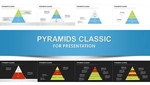
Triangle Pyramid Charts for PowerPoint - 28 Slides
Type: PowerPoint Charts template
Category: Pyramids
Sources Available: .pptx
Product ID: PC01092
Template incl.: 28 editable slides
Strategic Frameworks Demand Visual Precision
You're three slides into explaining your company's market positioning framework to the investment committee when you notice the glazed expressions. Bullet points and tables haven't conveyed the interconnected nature of your competitive advantages. Senior stakeholders need to see how foundational capabilities support differentiated offerings, which in turn enable premium market positioning. This triangle and pyramid PowerPoint template provides 28 meticulously designed chart variations that translate strategic logic into geometric clarity, transforming abstract business models into shapes that mirror how executives mentally process competitive dynamics.
Through years of preparing investor presentations and strategic planning documents, I've observed that triangle geometry resonates because it visually represents stability, progression, and interdependence - exactly the characteristics that investment committees seek in growth strategies. Triangular charts force presenters to think critically about which elements truly form the foundation versus which represent aspirational outcomes, improving analytical rigor while simultaneously enhancing communication clarity.
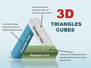
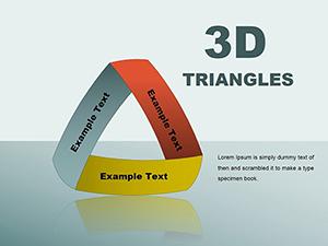
This collection extends beyond basic pyramids to include interconnected triangle clusters, segmented analysis frameworks, and comparative positioning grids. Whether mapping product portfolio maturity, explaining technology architecture dependencies, or communicating organizational capability layers, these slides provide the visual vocabulary for sophisticated strategic discussions. Purchase today and access professional-grade chart formats immediately.
Detailed Slide Architecture and Configuration Options
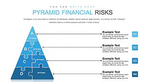
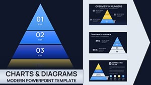
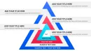
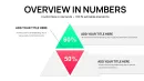
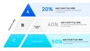
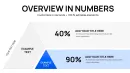
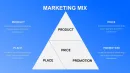
The template organizes into four thematic sections, each addressing distinct presentation needs encountered during strategy development cycles. The foundational section contains classic upward pyramids in three, four, and five-tier configurations. These work exceptionally well for capability maturity models where I need to show progression from basic operational competence through intermediate proficiency to advanced strategic differentiation. Portfolio managers presenting asset allocation philosophies use these same layouts to show how low-risk foundations support progressively sophisticated investment strategies.
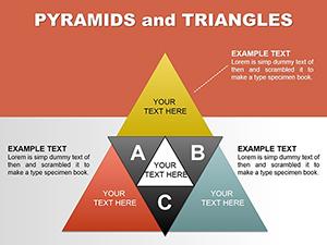
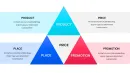
Segmented pyramid variations enable multi-dimensional analysis within unified frameworks. One particularly valuable layout divides each pyramid tier into three horizontal sections, perfect for showing how different functional areas - sales, operations, and technology - contribute to each strategic capability level. During transformation program reviews, this format helps program management offices communicate how cross-functional workstreams align to deliver integrated business outcomes rather than siloed initiatives.
Triangle cluster arrangements facilitate comparative analysis across related concepts. Side-by-side equilateral triangles work brilliantly when contrasting current-state versus future-state architectures. I recently used this format during a cloud migration planning session, with one triangle showing legacy infrastructure layers and the adjacent triangle depicting target cloud-native architecture. The parallel visualization enabled the technical steering committee to grasp migration complexity and sequence dependencies instantly.
Inverted triangle configurations serve specialized analytical purposes that traditional pyramids cannot address. These bottom-narrow, top-wide formats visualize expansion scenarios, customer journey broadening, or market opportunity funnels where initial narrow focus expands into diverse applications. Business development teams pitching partnership strategies use inverted triangles to show how concentrated pilot programs scale into expansive market coverage.
Intersecting triangle diagrams depict overlapping competencies or convergent strategies. Two triangles sharing a common base create a diamond shape ideal for illustrating how separate capability tracks - perhaps technical expertise and industry knowledge - must integrate to achieve strategic objectives. Talent management professionals explaining leadership development requirements use this format to show how individual contributor skills and people management capabilities converge to create executive readiness.
Where Operations and Planning Teams Apply Triangle Visualizations
Supply chain directors presenting network optimization strategies to operations committees use triangle charts to communicate distribution center tiering logic. The base represents high-volume regional hubs, middle tiers show specialized fulfillment centers, and the apex depicts rapid-response urban micro-fulfillment nodes. This geometric representation helps executive audiences understand capital allocation rationale for network investments without requiring detailed facility specifications or throughput calculations.
Research and development leaders explaining innovation portfolio balance to product steering committees employ triangle segmentation to show investment distribution across horizon categories. Horizon one core business innovations occupy the pyramid base, horizon two adjacent market expansions fill middle tiers, and horizon three transformational bets sit at the apex. The proportional visualization enables productive debate about portfolio balance without getting derailed by individual project advocacy.
Information technology architects presenting application modernization roadmaps to enterprise architecture review boards use layered triangles to communicate technical debt retirement sequencing. Legacy systems requiring immediate attention form the base, applications needing phased upgrades occupy middle layers, and strategic platforms warranting continued investment sit at top tiers. This priority visualization helps architecture governance teams allocate scarce modernization budgets across competing technical demands.
Sales operations teams explaining territory management philosophy to regional leadership deploy triangle frameworks to show account segmentation logic. Strategic accounts requiring dedicated coverage occupy the apex, mid-market opportunities with specialist support fill middle tiers, and transactional customers served through digital channels form the base. The visual hierarchy communicates resource allocation rationale more effectively than spreadsheet-based territory assignments.
Implementation Mechanics for Rapid Deployment
Load the template through PowerPoint's File > Open dialog - the PPTX format ensures compatibility with PowerPoint 2016 through current Microsoft 365 versions on both Windows and Mac platforms. Each slide appears in the thumbnail navigation panel, enabling quick selection of the specific triangle configuration matching your presentation requirements. The slides use native PowerPoint shape objects rather than imported graphics, ensuring fast rendering and trouble-free editing across different systems.
Text modification requires simply clicking within any triangle segment and typing replacement content. The text boxes use automatic font scaling to maintain readability as label length varies. For complex descriptions exceeding shape capacity, I supplement with leader lines connecting external text boxes to relevant triangle elements. This annotation approach preserves clean geometric appearance while accommodating detailed explanations necessary during technical reviews.
Color scheme adaptation to corporate brand standards follows straightforward procedures. Select triangle base shapes using PowerPoint's selection pane, then apply company primary colors through the format menu. Use the eyedropper tool to sample exact brand colors from imported logo files, ensuring perfect color matching across presentation materials. Apply graduated tints to upper triangle tiers - typically ten percent lighter shades for each successive level - creating visual hierarchy without requiring multiple brand colors.
Animation programming adds narrative sequencing during live presentations. Configure fade-in effects for individual triangle elements, revealing segments sequentially as you explain each strategic component. This progressive disclosure maintains audience attention on current discussion points rather than permitting premature examination of subsequent concepts. For board presentations requiring deliberate pacing, I typically animate one triangle tier per click, pausing to address questions before advancing the narrative.
Data linkage to Excel workbooks enables dynamic chart updates when underlying metrics change. Build supporting data tables tracking key performance indicators for each triangle tier, then establish paste-link relationships between Excel cells and PowerPoint text boxes. This connection proves invaluable for quarterly business reviews where strategic framework remains consistent but performance metrics require updating. The approach eliminates manual transcription errors and reduces deck preparation time substantially.
Client Engagement Examples Demonstrating Practical Applications
A private equity firm needed to present portfolio company value creation plans to their limited partner advisory board. Using the five-tier pyramid template, they structured operational improvement initiatives at the base, revenue growth programs in tier two, margin expansion efforts in tier three, market position strengthening in tier four, and strategic repositioning initiatives at the apex. This value creation hierarchy helped limited partners understand the sequenced approach to doubling enterprise value over the hold period. The visual framework communicated that sustainable value creation required systematic attention across all tiers rather than concentration on any single dimension.
A pharmaceutical research organization developed a drug pipeline presentation for their scientific advisory board using segmented triangle charts. Each pyramid tier represented a development phase - preclinical, Phase I, Phase II, Phase III, regulatory review - with horizontal segments showing therapeutic areas. The matrix visualization enabled board members to assess pipeline balance across both development risk and therapeutic diversification simultaneously. This dual-dimensional view surfaced concentration risks that traditional pipeline lists obscured, prompting strategic discussions about acquisition targets to fill portfolio gaps.
A professional services firm pitched their market expansion strategy to the managing partner committee using comparative triangle diagrams. One pyramid showed current revenue distribution across service lines and client types, while the adjacent triangle depicted target three-year revenue mix. The side-by-side comparison immediately highlighted strategic shifts requiring investment - specifically, planned movement from transactional engagements toward recurring advisory relationships. Partners grasped growth strategy instantly, enabling the meeting to focus on execution planning rather than strategic rationale debates.
A municipal government presented public safety resource allocation to the city council using inverted triangle logic. Rare catastrophic events requiring specialized response teams occupied the narrow base, escalating through moderate incidents needing trained responders to routine calls handled by community service officers at the wide top. This inverted presentation helped elected officials understand why capability investments didn't align with call volume distributions - specialized capabilities at the narrow base required disproportionate resources despite infrequent deployment.
Comparative Analysis of Triangle Chart Development Methods
| Assessment Factor | This Triangle Template | PowerPoint Drawing Tools | Business Intelligence Software |
|---|---|---|---|
| Time to First Usable Slide | Immediate upon download - select appropriate slide and begin customizing text within minutes | Thirty to sixty minutes to create symmetrical triangles, align elements precisely, and format consistently | Requires data preparation, software configuration, export to presentation format - typically several hours |
| Design Consistency Across Decks | All 28 slides follow unified design language ensuring visual coherence throughout multi-section presentations | Each manually created chart reflects individual creator's skill level and aesthetic choices | Software-generated charts maintain consistency but often appear generic and fail to match presentation design standards |
| Narrative Flexibility During Delivery | Static shapes allow presenter to guide discussion flow without software constraints; easy annotation during live sessions | Similar flexibility to template once shapes created, but initial creation effort discourages iterative refinement | Software-driven charts lock presenters into predetermined data views; pivoting during discussions requires returning to source software |
| Collaboration Efficiency | Standard PowerPoint file format enables seamless sharing, commenting, and co-editing across team members regardless of technical skill | Files sharable but recipients without drawing expertise struggle to maintain visual quality when making edits | Requires all collaborators to access specialized software licenses; non-technical stakeholders cannot contribute to refinement |
| Audience Comprehension | Clean geometric forms focus attention on strategic relationships rather than visual complexity; executives grasp concepts rapidly | Quality varies dramatically based on creator skill; poorly constructed charts confuse rather than clarify | Data-rich visualizations provide analytical depth but often overwhelm audiences during strategic discussions requiring conceptual focus |
| Long-Term Reusability | One-time purchase provides unlimited applications across years of presentations, building organizational asset library over time | Each new presentation requires rebuilding charts from scratch unless organizations maintain rigorous template libraries | Ongoing software subscription costs and version compatibility issues create long-term expense and maintenance burden |
Triangle Framework Applications Across Business Functions
Human capital management teams presenting succession planning frameworks to board governance committees use triangle hierarchies to visualize leadership pipeline depth. Entry-level talent pools form the base, individual contributors with high potential occupy middle tiers, and senior executives ready for C-suite roles sit at the apex. This talent pyramid helps boards assess organizational bench strength and approve development investment priorities aligned with future leadership needs.
Procurement organizations explaining supplier relationship management strategies to executive stakeholders deploy triangle segmentation to show vendor categorization logic. Transactional commodity suppliers occupy the base tier, preferred vendors providing important goods and services fill middle layers, and strategic partners enabling competitive differentiation sit at the apex. The tiered visualization justifies why relationship investment intensity varies across supplier categories, supporting decisions about supplier development program funding.
Customer success teams pitching expansion strategies to revenue leadership use triangle charts to communicate account development pathways. New customer onboarding activities form the base, adoption and utilization programs occupy middle tiers, and expansion and advocacy initiatives sit at the top. This journey visualization helps cross-functional teams understand how customer success activities drive revenue outcomes beyond initial sales, supporting investment in post-sales capabilities.
Environmental sustainability directors presenting decarbonization roadmaps to corporate responsibility committees employ triangle frameworks to show emission reduction opportunity hierarchies. High-volume low-cost operational efficiency improvements form the base, moderate-investment process optimization occupies middle tiers, and transformational technology adoption sits at the apex. The prioritized visual helps executive teams sequence climate commitments against capital availability and business impact considerations.
Corporate communications teams explaining stakeholder engagement strategies to executive committees use interconnected triangle diagrams to show how employee, customer, and investor communication programs reinforce overall brand positioning. Each triangle represents a stakeholder group with base, mid, and apex tiers showing awareness, understanding, and advocacy objectives. The overlapping triangle arrangement illustrates how coordinated messaging across stakeholder groups creates multiplicative brand value beyond siloed communication efforts.
Legal departments presenting contract management maturity roadmaps to general counsel use layered triangle charts to depict capability evolution. Manual contract administration occupies the base tier, centralized repository implementation fills the middle layer, and intelligent contract analytics sits at the apex. This progression visualization supports business case development for legal technology investments by showing how foundational capabilities enable advanced automation that transforms legal function economics.
Frequently Asked Questions
Can I rotate triangle orientations to create different visual metaphors for my framework?
Yes, select any triangle shape and use PowerPoint's rotate function under the Format tab to flip orientations. Right-pointing triangles suggest forward movement or progression, useful for depicting innovation pipelines or market expansion journeys. Left-pointing triangles can represent retrospective analysis or lessons learned frameworks. Downward triangles work well for risk mitigation funnels or filtering processes. When rotating, ensure text orientation remains readable - you may need to rotate text boxes independently from shape rotation. Maintain consistent triangle orientation throughout your presentation deck to avoid visual confusion.
How do I adapt these charts for oral presentations versus written reports?
For oral presentations, minimize text within triangle shapes to just key labels - detailed explanations come from your spoken narrative. Use larger font sizes, minimum 20-point for labels visible from the back of conference rooms. Increase color contrast between adjacent tiers to maintain visual distinction under varying lighting conditions. For written reports where readers study diagrams independently, include more descriptive text within or adjacent to triangle elements. Add detailed annotations using callout boxes and leader lines. Consider including a legend explaining what each tier represents, since readers lack your verbal context. I typically create two versions - a simplified oral presentation deck and an enriched written report version with the same underlying structure.
What's the maximum number of triangle tiers that remains visually effective?
Five tiers represent the practical maximum for maintaining visual clarity during presentations. Audiences struggle to distinguish more than five hierarchical levels, and narrow apex tiers become difficult to label clearly when pyramids exceed five divisions. If your analytical framework genuinely requires six or more levels, consider using two complementary triangles showing different categorical dimensions rather than forcing excessive tiers into a single pyramid. Alternatively, create a high-level five-tier triangle for overview discussions, then develop separate detailed slides that unpack individual tiers into sub-components. This hierarchical approach maintains visual simplicity during executive presentations while preserving analytical detail for implementation teams.
Can I combine triangle charts with other visualization types on the same slide?
Absolutely, though exercise restraint to avoid visual clutter. Triangle charts pair effectively with timeline graphics showing how pyramid tiers develop over phases. Placing a triangle alongside a table that quantifies metrics for each tier combines qualitative framework with quantitative evidence. Avoid combining triangles with other geometric shapes like circles or matrix grids on the same slide - competing visual metaphors confuse rather than clarify. If you need multiple visualization types, consider creating a visual narrative across sequential slides: introduce the triangle framework first, then follow with complementary charts on subsequent slides. This approach maintains focus while building comprehensive understanding.
How should I handle triangle charts when presenting to international audiences where pyramid symbolism varies culturally?
Triangle and pyramid structures generally translate well across cultures since they're based on geometric logic rather than cultural metaphor. However, color choices require cultural sensitivity - red signals danger in Western contexts but represents prosperity in many Asian cultures. When presenting internationally, I use neutral color palettes like blues and grays unless cultural research indicates specific color symbolism. Orient triangles apex-upward for universal interpretation as hierarchy or progression. If working with Middle Eastern audiences, consider that pyramid imagery specifically resonates due to regional architectural heritage. For East Asian contexts, triangular structures align with Confucian hierarchical thinking. Always preview presentations with local team members to identify unintended cultural interpretations before high-stakes international meetings.
What's the best approach for animating triangle charts during virtual presentations with screen sharing?
Use simple fade-in animations for individual triangle tiers rather than complex motion effects that may render poorly during video compression. Advance animation one tier at a time with manual clicks rather than automatic timing, giving you flexibility to adjust pacing based on audience questions. Pause after revealing each tier to ensure remote participants have processed the content before advancing - virtual audiences need slightly more time than in-person groups. Use PowerPoint's presenter view to see upcoming animation steps without revealing them to participants. Consider adding a static agenda slide listing the triangle tiers as your roadmap, then animate the detailed triangle slide progressively. This dual approach helps virtual participants maintain context throughout your presentation despite the cognitive overhead of remote meeting formats.