Circular Cycle Diagram Template for PowerPoint


Business is rarely a straight line; it is a cycle of improvement, feedback, and reinvestment. Yet, most presenters force these circular concepts into linear bullet points, stripping the idea of its momentum. This Circular Cycle Diagram Template is designed specifically to capture the "Flywheel Effect" - showing how the output of one phase fuels the input of the next.
As a presentation designer, I reach for this specific layout when the client's narrative is about sustainability, retention, or ecosystem synergy. It communicates unity and infinite progression, which is a powerful psychological signal to investors and teams alike.
Template Features and Design Logic
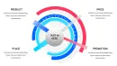
This layout moves beyond the basic "pie chart" aesthetic to offer a segmented, informative loop. It is not just about dividing a whole; it is about connecting the parts.
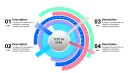
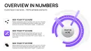
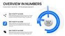
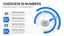
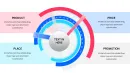
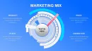
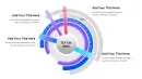
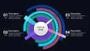
The Segmented Core
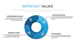
The central graphic is divided into clear, equal segments. Unlike a data-driven Excel chart which fluctuates based on numbers, this is a conceptual chart. This ensures that every step in your cycle is given equal visual weight, perfect for illustrating core values or standard operating procedures (SOPs) where no single step is optional.
Iconography Integration
Visual learners process icons 60,000 times faster than text. This template includes dedicated placeholders for icons within each segment. Whether you use the included icon set or import your company’s SVG assets, the layout ensures they remain centered and aligned, providing an instant visual cue for the text adjacent to it.
Radiating Text Layout
One of the biggest struggles with circular diagrams is label placement. Text inside the circle often becomes too small to read. This template solves that by using a "hub-and-spoke" text alignment, placing detailed descriptions outside the ring. This utilizes the whitespace of the slide effectively, allowing for longer explanations without cluttering the visual core.
Professional Use Cases
I have utilized this specific template in dozens of high-level decks. Here is where it performs best:
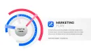
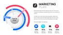
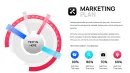
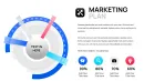
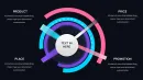
- Marketing Flywheels: CMOs use this to demonstrate how content creates traffic, traffic generates leads, and leads fuel more content. It proves that marketing is an engine, not a vending machine.
- Product Lifecycle Management: Product Managers display the infinite loop of Discover > Define > Design > Deliver. It reinforces the agile mindset that the product is never "finished," only improved.
- Sustainability Reports (ESG): This layout is ideal for the "Reduce, Reuse, Recycle" narrative or circular economy presentations, visually committing the brand to zero-waste principles.
- Customer Retention Strategy: Showing the journey from Acquisition to Onboarding to Retention to Advocacy. The circle shape visually implies that an Advocate naturally leads to new Acquisition.
Workflow Integration
Integrating this slide into your quarterly review or pitch deck is seamless. It respects the aspect ratios of modern screens (16:9), ensuring the circle looks like a circle, not an oval - a common issue when resizing generic shapes.
Time-Saving Benefit: Manually aligning text boxes around a circle is a nightmare in PowerPoint. You usually end up with uneven spacing. This template comes with pre-aligned text anchors. You simply click and type. If you need to rotate the cycle to put a different segment at the "12 o'clock" position, the group rotation tools handle it without scattering your text.
Real Presentation Example
I recently consulted for a SaaS company struggling to explain their "Customer 360" approach. Their original slide was a list of features. It felt disjointed. We migrated their content to this Circular Cycle Diagram.
We placed the "Customer Data" icon in the center hub, and arranged their four service pillars (Sales, Service, Marketing, Commerce) in the surrounding ring. Immediately, the slide told a story: Everything revolves around the customer data. The investors didn't just read the features; they understood the ecosystem. The client secured their Series B funding, and this slide was the backdrop for their closing argument.
Comparison: Cycle Diagram vs. Lists
| Presentation Goal | Bullet Point List | Circular Diagram Template |
|---|---|---|
| Relationship Display | Implies ranking or hierarchy (top is best) | Implies equality and interconnection |
| Visual Retention | Low; audience reads and forgets | High; shape association aids memory |
| Strategic Message | "Here are things we do" | "Here is how our system works" |
| Editing Speed | Fast but low impact | Fast (with template) and high impact |
Don't let your ecosystem strategy die in a bulleted list. Give it the geometry it deserves.
Industry-Specific Applications
Finance & Banking
Use this to illustrate the flow of capital or audit cycles. The closed loop implies security and robust internal controls, which is exactly what risk officers want to see.
Education
Teachers use this for biological life cycles or the water cycle. The clear segmentation helps students distinguish between stages while seeing the whole picture.
Human Resources
Visualize the annual performance review cycle: Goal Setting > Mid-Year Review > Final Assessment > Compensation Adjustment. It makes the process feel predictable and fair to employees.
Frequently Asked Questions
Can I change the icons to match my specific industry?
Yes. The icons included are standard vectors, but you can delete them and drag-and-drop any icon from the "Insert > Icons" menu in PowerPoint or your own SVG files. The placeholders are centered, so your new icons will snap into the correct position.
Does this chart support data entry (Excel)?
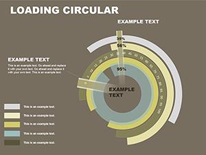
No, this is a conceptual diagram, not a data chart. It is designed for processes and relationships, not quantitative percentages. If you need to show exact data values (like 23% vs 77%), a Donut Chart template would be a better fit. This template is for when the steps are of equal importance.
How do I change the number of segments in the circle?
Since this is a composed vector shape, the segments are grouped. To remove a segment, you ungroup the object, delete the slice you don't need, and then resize the remaining slices to fill the gap. However, for best results, we recommend using the template as-is for the number of steps shown to maintain perfect symmetry.
Is the background transparent?
Yes. The background is transparent by default. This means you can place this diagram over a subtle texture or a dark background, and it will float perfectly without an ugly white box around it.
Ready to close the loop on your strategy? Download this Circular Diagram template today and present with system-level clarity.