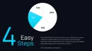
Pie Charts PowerPoint Template 46 Slides

Type: PowerPoint Charts template
Category: Pie
Sources Available: .pptx
Product ID: PC01076
Template incl.: 46 editable slides
Transform Raw Statistics Into Executive-Ready Pie Chart Presentations
When you're staring at Excel columns filled with budget allocations, market segment percentages, or departmental spending ratios at 11 PM before tomorrow's board meeting, you need more than PowerPoint's default pie chart wizard. This SmartArt Data-Driven Pie PowerPoint Charts Template delivers 46 professionally structured slides that convert proportion-based datasets into visual arguments that finance committees, steering groups, and investment panels actually remember three weeks later.
After building over two hundred quarterly business reviews for Fortune 500 clients, I've watched executives glaze over at generic pie charts countless times. The difference between slides that spark strategic discussions versus ones that get buried in email threads comes down to intentional design hierarchy, deliberate color strategy, and structural flexibility that respects how senior leaders process comparative data during high-stakes presentations.
This template solves the specific challenge of presenting proportional data when stakeholders need to grasp relative magnitudes instantly. Whether you're defending a capital expenditure proposal, justifying headcount distribution across business units, or demonstrating customer segmentation for a product launch, these 46 layouts provide the visual scaffolding for proportion-focused narratives that land with credibility.
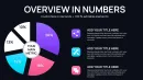
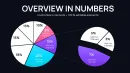
Detailed Breakdown of All 46 Slide Configurations
This collection provides systematic coverage of every proportion visualization scenario you'll encounter in corporate, academic, and consulting presentations. Each slide addresses specific data storytelling requirements with deliberate layout choices.
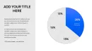
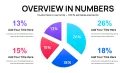
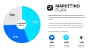
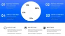
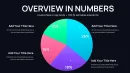
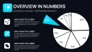
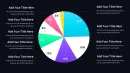
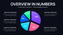
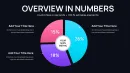
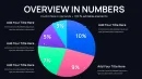
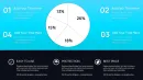
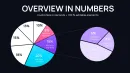
Classic Proportional Representation Slides
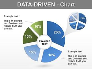
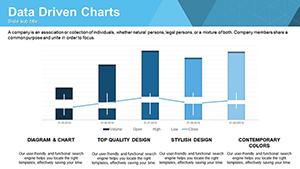
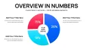
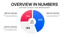
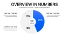
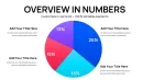
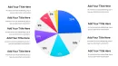
Slides 1-8 feature traditional circular pie configurations with segment counts ranging from three to eight divisions. The three-segment layout works brilliantly for before-and-after-and-projected scenarios in transformation roadmaps. I used this exact structure last quarter when a manufacturing client needed to show current state operational costs versus optimized state versus industry benchmark - the visual made budget reallocation discussions significantly more productive than spreadsheet comparisons.
The five-segment and six-segment variations handle departmental budget breakdowns, regional sales distributions, and product portfolio revenue splits. Each segment includes dedicated label zones with percentage callouts, descriptor text boxes, and supporting icon placeholders. The built-in SmartArt functionality means data updates flow through automatically when you modify the underlying spreadsheet - critical for monthly recurring reports where you're refreshing the same deck structure with new period data.
Exploded Emphasis Variations
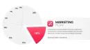
Slides 9-16 introduce exploded segment designs where one or two pie slices pull away from the main circle for emphasis. This technique proves invaluable during competitive analysis presentations when you need to highlight your company's market position against four competitors, or in investment committee decks when isolating the highest-risk budget category for detailed discussion.
A healthcare administration team used Slide 12's two-segment explosion layout to demonstrate their largest expense categories - clinical staffing and medical supplies - during their annual planning session. The physical separation made it immediately clear why those two line items deserved dedicated cost reduction initiatives, driving approval for their proposed operational efficiency programs.
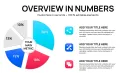
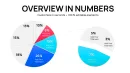
Nested and Comparative Structures
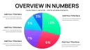
Slides 17-28 tackle multi-level categorical data through nested pie configurations and side-by-side comparison layouts. The nested designs work exceptionally well for hierarchical budget presentations where you need to show both macro allocation across divisions and micro distribution within each division simultaneously.
Side-by-side configurations on Slides 23-28 enable year-over-year comparisons, actual-versus-budget analyses, and this-quarter-versus-last-quarter performance reviews. A retail client used this format to demonstrate how their customer demographic mix shifted after opening stores in three new markets - the visual immediately validated their geographic expansion strategy to their private equity owners.
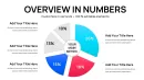
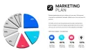
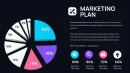
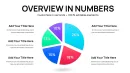
Icon-Enhanced Contextual Slides
Slides 29-38 integrate icon libraries and infographic elements alongside pie structures. These slides address presentations where contextual storytelling matters as much as the numerical proportions. Each layout includes placeholder zones for process icons, industry symbols, or custom graphics that reinforce your narrative theme.
During a university capital campaign presentation, the development office used Slide 31 to show donor contribution categories with relevant icons - major gifts represented by a trophy symbol, annual fund with a calendar icon, planned giving with an estate planning graphic. The icon integration helped non-finance board members connect abstract dollar distributions to tangible fundraising program activities.
Timeline and Sequential Progression Designs
Slides 39-46 introduce temporal dimensions through timeline-integrated pie charts and sequential revelation structures. These layouts excel in transformation narratives, phased implementation roadmaps, and historical trend presentations where showing how proportions evolved across multiple time periods matters more than static snapshots.
A technology consulting firm used Slide 44's four-quarter progression layout to demonstrate how their billable hour mix shifted from legacy maintenance work toward strategic consulting throughout the fiscal year. The sequential visualization made their business model transformation tangible for partners evaluating compensation structure changes.
Where Senior Presentation Designers Deploy These Proportional Visualizations
These 46 pie chart configurations serve distinct functions across professional presentation contexts that I encounter weekly in client engagements.
Corporate Financial Planning and Analysis
Finance teams building quarterly business reviews use these slides to present operating expense breakdowns, revenue mix by product line, capital allocation across strategic initiatives, and cost center distributions. The SmartArt data-linking capability means your FP&A analyst updates the source Excel model once and every linked pie in the fifty-slide QBR deck refreshes automatically - saving hours of manual chart updating before each board meeting.
Market Research and Competitive Intelligence
Product marketing managers presenting market share analyses, customer segmentation studies, and competitive positioning assessments rely on these proportional structures. When you're showing that your company holds a specific market share percentage against six competitors, the exploded slice designs help focus executive attention on your position while maintaining context of the competitive landscape.
Academic Research and Grant Applications
University researchers use these slides to visualize study participant demographics, research budget allocations across workstreams, and funding source distributions in grant proposals. The nested configurations work particularly well for showing how a total study population breaks into treatment groups, control groups, and subgroup analyses within each.
Nonprofit Fundraising and Impact Reporting
Development directors and program officers deploy these slides in donor cultivation presentations, annual reports, and grant reporting deliverables. Showing how donated dollars distribute across program categories, administrative overhead, and fundraising costs builds transparency that sophisticated philanthropic investors expect before committing significant funding.
Management Consulting Deliverables
Strategy consultants building client recommendations use these proportional visualizations to present organizational structure analyses, cost reduction opportunity sizing, and implementation phase resource requirements. The side-by-side comparison slides prove especially valuable when showing current state versus future state operational models in transformation engagements.
Technical Workflow Integration Details
This template integrates seamlessly into existing presentation development processes with several workflow advantages that save preparation time during deadline-driven projects.
SmartArt Data Connectivity
Every pie chart connects to PowerPoint's native data table editor, which accepts paste-special links from Excel workbooks. This means your financial model, CRM export, or research database becomes the single source of truth. When numbers change - and they always change the night before presentations - you refresh the links rather than rebuilding charts manually. I've seen this capability save client teams literally eight hours during earnings season when final numbers arrive at midnight.
Brand Color Customization
Each slide's color palette lives in the PowerPoint master slide theme, enabling one-click recoloring across all 46 layouts when you need to match corporate brand guidelines. Marketing departments can set their official brand colors once in the theme editor and every pie segment, label, icon, and background element updates simultaneously. This prevents the all-too-common scenario where a fifty-slide deck has seventeen different shades of "company blue" because different team members grabbed colors inconsistently.
Software Compatibility Specifications
These slides function fully in PowerPoint 2016, 2019, 2021, Office 365, and PowerPoint for Mac. They also import into Google Slides with preserved formatting, though you'll lose the SmartArt data-linking functionality and need to manually update chart values. Keynote imports work for visual use but require manual chart rebuilding if you need to modify data. For production workflows, I always recommend keeping the master deck in PowerPoint to preserve all automation features.
Real-World Application Scenarios From Recent Client Projects
These specific examples from consulting engagements illustrate how different professional roles leverage these pie chart structures.
Private Equity Portfolio Review
A PE firm's operating partner used Slide 19's nested pie configuration during quarterly portfolio review meetings. The outer ring showed capital allocation across eight portfolio companies. The inner ring broke each company's performance into on-track, at-risk, and underperforming status. This dual-layer visualization enabled the partnership team to assess both portfolio diversification and within-company health in a single glance, driving more focused discussions about where to deploy additional support resources.
University Enrollment Management
An admissions director presented student body composition to the provost's cabinet using Slide 26's year-over-year comparison layout. Left pie showed current year enrollment by academic program. Right pie displayed prior year distribution. The side-by-side structure made enrollment shifts visible immediately - specifically that engineering programs grew from eighteen percent to twenty-three percent of the student body while humanities declined proportionally. This visualization supported budget reallocation decisions for faculty hiring across colleges.
Hospital System Resource Allocation
A chief medical officer used Slide 33's icon-enhanced layout to present operating budget distribution during a town hall meeting for clinical staff. Each pie segment included relevant medical icons - surgical services with a scalpel symbol, imaging with an X-ray icon, pharmacy with a prescription symbol. The icon integration helped physicians and nurses who don't typically review financial statements understand how their hospital allocated its operating resources across service lines.
Corporate Strategy Annual Plan
A chief strategy officer used Slide 42's timeline progression structure to show how the company's revenue mix would evolve across a three-year transformation plan. Four sequential pies represented current year, year one, year two, and year three target states. The visual clearly communicated the strategic intent to shift from seventy percent product revenue toward sixty percent services and recurring revenue - a fundamental business model change that the timeline progression made concrete for the board.
Nonprofit Program Evaluation
An executive director used Slide 15's exploded three-segment design during an impact report presentation to major donors. The chart showed program expense distribution across youth services, adult education, and community outreach, with the largest segment - youth services at forty-eight percent - exploded for emphasis. This visual choice reinforced the organization's core mission focus while demonstrating balanced commitment to all three program areas, ultimately supporting a major gift ask for youth program expansion.
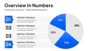
Comparative Analysis Table
| Presentation Approach | Development Time | Visual Consistency | Data Update Process | Professional Impact |
|---|---|---|---|---|
| PowerPoint Default Pie Charts | 15-20 minutes per slide to format manually | Inconsistent colors and layouts across deck | Manual re-entry for each chart when data changes | Functional but generic appearance, limited executive engagement |
| Building Custom From Scratch | 45-60 minutes per slide including design iterations | High consistency if you maintain strict discipline | Requires rebuilding charts from shapes when updating | Unique but time-prohibitive for recurring presentations |
| This SmartArt Template Collection | 3-5 minutes to customize pre-built layouts | Master theme ensures uniform appearance automatically | SmartArt data links refresh all charts with one update | Polished professional quality with efficient production workflow |
Specialized Customization Techniques
Beyond basic data input, several advanced customization approaches extend this template's functionality for sophisticated presentation requirements.
Conditional Color Coding Systems
Apply consistent color logic across your entire presentation by assigning segment colors based on data meaning rather than arbitrary aesthetics. Use green tones for on-target or positive categories, amber for at-risk or caution items, red for below-target or problem areas. This creates visual consistency when you're using multiple pie charts throughout a fifty-slide deck - audiences learn your color language and process subsequent slides faster. Download this template and establish your color rules immediately for maximum impact.
Annotation Layer Integration
Overlay text boxes with leader lines pointing to specific segments when you need to call out particular data points. This technique works especially well during quarterly business reviews when explaining variance from plan. Rather than cluttering the base chart with excessive labels, use clean annotation callouts for the two or three segments that require executive attention - perhaps highlighting that marketing expenses exceeded budget by twelve percent while R&D came in seven percent under budget.
Animation Sequencing for Complex Stories
Configure slide transitions to reveal pie segments sequentially rather than displaying the complete chart immediately. This progressive disclosure technique proves valuable when presenting to audiences unfamiliar with your data structure. Start with the largest segment, establish context, then build remaining segments one at a time while narrating each category. This controlled revelation prevents cognitive overload and ensures audiences process your narrative in the intended sequence.
Frequently Asked Questions
Can I connect these pie charts to external Excel data sources for automatic updates?
Yes, the SmartArt data tables support paste-special links from Excel workbooks. Right-click the data table, choose paste special, select paste link, and your PowerPoint charts will update whenever the source Excel file changes. This works best when you save both files in the same folder location and refresh links before presenting. For recurring monthly reports where the same chart structure displays updated period data, this capability eliminates manual chart rebuilding.
How many pie segments can each chart configuration accommodate effectively?
While technically you can add up to twelve segments, cognitive research suggests limiting charts to seven segments maximum for audience comprehension. Beyond seven categories, consider grouping smaller segments into an "other" category or switching to a different visualization type like a stacked bar chart. The template includes layouts optimized for three through eight segments - select based on your specific data structure and presentation context.
What's the recommended approach for presenting pie charts during virtual meetings?
In video conferences, use the exploded segment variations from Slides 9-16 because the physical separation improves visibility on smaller screens. Increase font sizes by at least two points compared to in-person presentations - what reads clearly on your monitor often appears cramped on attendees' laptops. Use the annotation techniques described earlier to direct attention verbally to specific segments, since you can't use a laser pointer during Zoom calls.
Can I modify these slides to match our corporate brand guidelines?
Absolutely. Access View menu, select Slide Master, and modify the color theme in the master slide. Every pie chart, label, background, and text box inherits from this central theme, so your changes propagate across all 46 slides simultaneously. Most brand compliance teams need you to match specific Pantone or RGB values - input those exact codes in the theme editor and save as your custom template for future presentations.
Do these charts work for presenting survey data and research results?
They're ideal for survey visualization when you're showing response distribution across answer choices. The five-segment and six-segment layouts handle typical Likert scale results beautifully - strongly agree, agree, neutral, disagree, strongly disagree. For demographic breakdowns in research presentations, use the nested configurations to show both overall sample composition and within-group distributions simultaneously. Academic conference presentations benefit particularly from the clean design that emphasizes data over decorative elements.
How do I handle pie charts when my data includes many small percentage categories?
Group categories under five percent into a consolidated "other" segment, then use a supplementary slide with a detailed table listing those minor categories. This approach maintains visual clarity in your main chart while preserving data completeness. Alternatively, use the nested pie designs where the outer ring shows your grouped categories and you can expand one "other" segment in the inner ring to reveal its components. This technique works especially well for expense category presentations where you have numerous small line items.