Professional Pie Charts PowerPoint Template


Type: PowerPoint Charts template
Category: Pie
Sources Available: .pptx
Product ID: PC01067
Template incl.: 42 editable slides
In my weekly work building investor updates, sales reports, and executive summaries for C-level teams across industries, pie charts remain the go-to for instantly conveying proportions and breakdowns. This professional pie charts PowerPoint template with sector designs provides 42 specialized editable slides dedicated to making your data divisions sharp, memorable, and precisely tailored to audience needs.
I`ve relied on focused pie layouts when distilling market share analyses for startup founders or budget allocations for nonprofit boards. The emphasis on clean sector segmentation ensures even dense datasets read effortlessly on screen or in handouts, allowing you to maintain control of the conversation rather than explaining cluttered visuals.
Specialized Sector Designs That Enhance Data Clarity
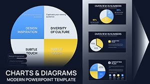
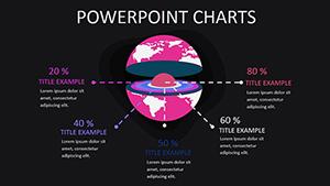
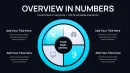
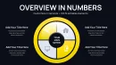
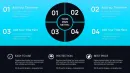
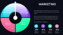
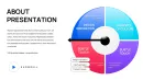
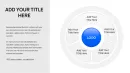
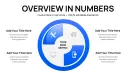
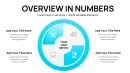
Each slide prioritizes proportional accuracy with refined sector styling - exploded views for emphasis, layered rings for multi-level breakdowns, and gradient fills for visual hierarchy. Placeholders accommodate labels, percentages, and legends that auto-adjust for balance. The designs avoid gimmicks, focusing on professional polish that aligns with boardroom expectations.
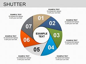
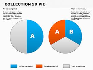
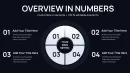
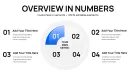
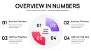
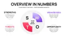
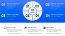
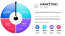
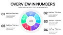
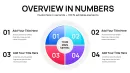
- Classic single-level pies for straightforward share distributions
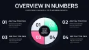
- Exploded sector variants to spotlight key segments
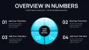
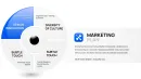
- Donut-style rings for comparing multiple datasets side-by-side
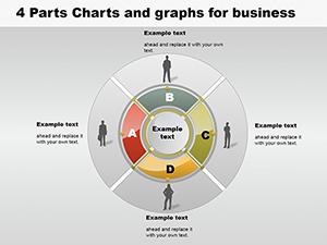
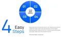
- Multi-ring compositions for hierarchical or year-over-year proportions
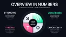
- Integrated callouts for annotating critical insights directly on charts
Practical Deployment in Professional Reporting Scenarios
Financial analysts use these for expense category breakdowns during quarterly reviews. Marketing leads illustrate campaign channel performance to justify resource shifts. Operations managers display inventory composition or supplier contributions. The sector precision helps when defending recommendations backed by proportional evidence.
Educators teaching data literacy incorporate the slides for student assignments on survey results. Government officials present demographic distributions in policy briefings. Across these contexts, the template accelerates assembly while ensuring visual integrity.
Seamless Fit Into Standard Presentation Pipelines
Built for PowerPoint 2016 and above in .pptx format, the slides integrate directly into existing decks. Input data via simple placeholders or link to Excel for dynamic updates. Adjust sector colors to brand standards instantly, resize without distortion, and export for any delivery format. Lifetime license means it becomes your reliable resource for recurring reporting cycles.
Examples From Actual Client Reporting Decks
Recently, for a tech scale-up seeking Series B funding, we used exploded pie sectors to highlight revenue stream diversification, making growth potential immediately apparent to investors. In a corporate strategy session, multi-ring pies compared regional sales contributions across fiscal years, facilitating swift alignment on expansion priorities.
HR directors have deployed donut variants to show workforce diversity metrics in annual reports. Product managers break down feature adoption rates to guide roadmap decisions. The consistent clarity shortens review times and strengthens data-driven arguments.
Comparison Against Standard PowerPoint Pie Options
| Feature | This Pie Charts Sector Template | Built-In PowerPoint Chart Tools |
|---|---|---|
| Sector Styling Variety | Diverse exploded, ring, and layered designs | Limited to basic pie or donut |
| Professional Polish | Refined gradients and balanced labeling | Often requires manual tweaks for alignment |
| Layout Options | 42 dedicated variations for any scenario | Single insert with minimal variants |
| Data Emphasis Tools | Built-in callouts and emphasis effects | Basic formatting only |
| Branding Ease | Instant color scheme application | Individual element adjustments needed |
Default tools suffice for quick drafts but fall short in executive settings where precision matters. This specialized collection elevates your proportions from adequate to authoritative.
Industry Applications for Proportion-Focused Visuals
Sales teams map customer segment contributions. Consultants illustrate risk portfolios. Researchers display survey response distributions. Nonprofit leaders show funding sources versus program spending. The focused designs support clear communication wherever parts-to-whole relationships drive decisions.
For professionals who regularly need to make proportions persuasive, adding this pie charts template to your arsenal saves hours while sharpening impact.
Frequently Asked Questions
Are all 42 slides variations of pie charts?
Yes, each slide offers unique sector configurations and layouts centered on pie and donut proportions.
Can I link these charts to Excel data?
Certain layouts support direct data linking for automatic updates when sources change.
How customizable are the sector colors and labels?
Fully editable - change fills, outlines, fonts, and positions using standard PowerPoint controls.
Is this suitable for dark mode presentations?
The designs adapt well to both light and dark themes with appropriate contrast adjustments.
Do the slides include percentage auto-calculation?
Placeholders allow manual or formula-based percentage display for accuracy.
What file format is provided?
Native .pptx for full compatibility with modern PowerPoint versions.