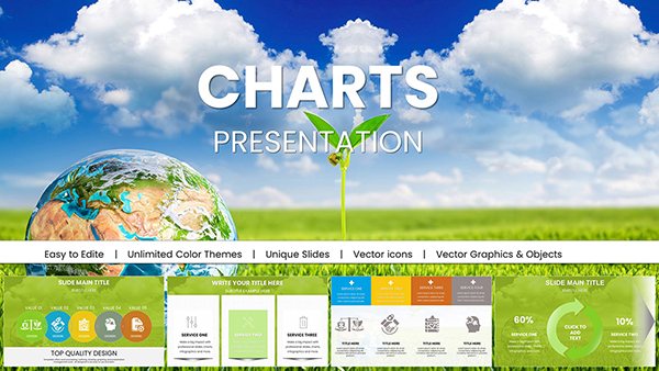
Ecology PowerPoint Template - Fully Editable Conservation Charts | Instant Download


Type: PowerPoint Charts template
Category: Graphs, Illustrations
Sources Available: .pptx
Product ID: PC01028
Template incl.: 59 editable slides
In environmental science and conservation, presenting complex data clearly can make the difference in influencing decisions and inspiring action. This fully editable Ecology PowerPoint charts template provides a professional collection of visuals specifically designed to communicate ecological insights effectively, helping you transform raw data into compelling narratives for policymakers, students, and stakeholders.
Key Features of This Conservation Ecology Charts Template
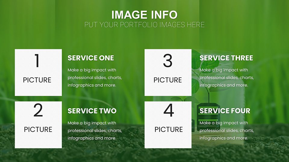
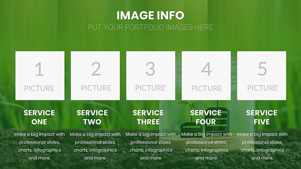
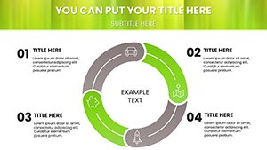
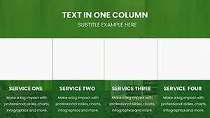
- 59 Unique Editable Slides: A comprehensive set covering multiple data visualization needs.
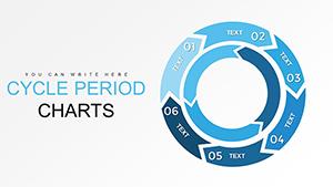
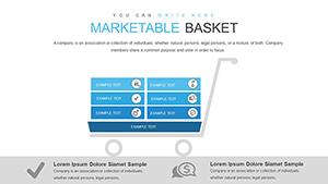
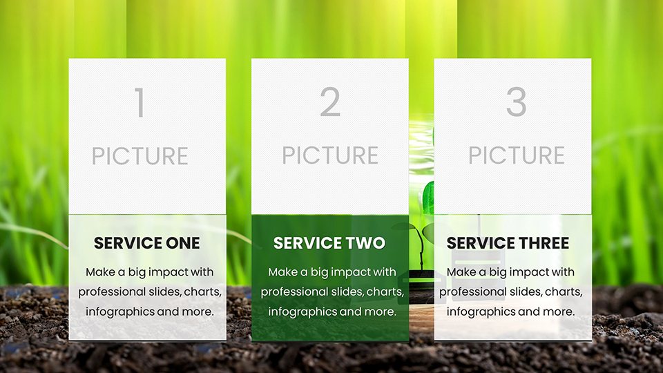
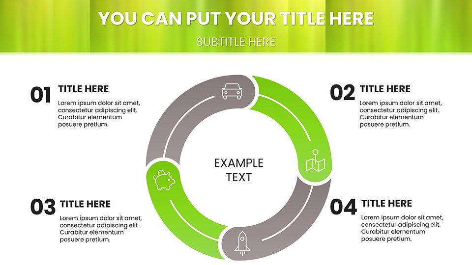
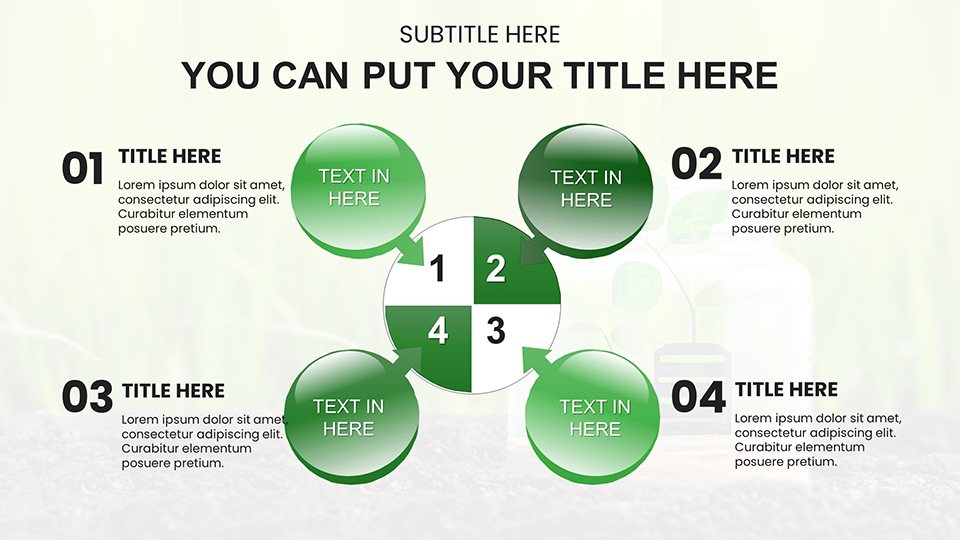
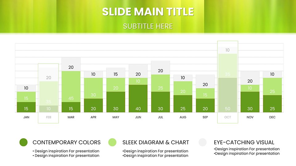
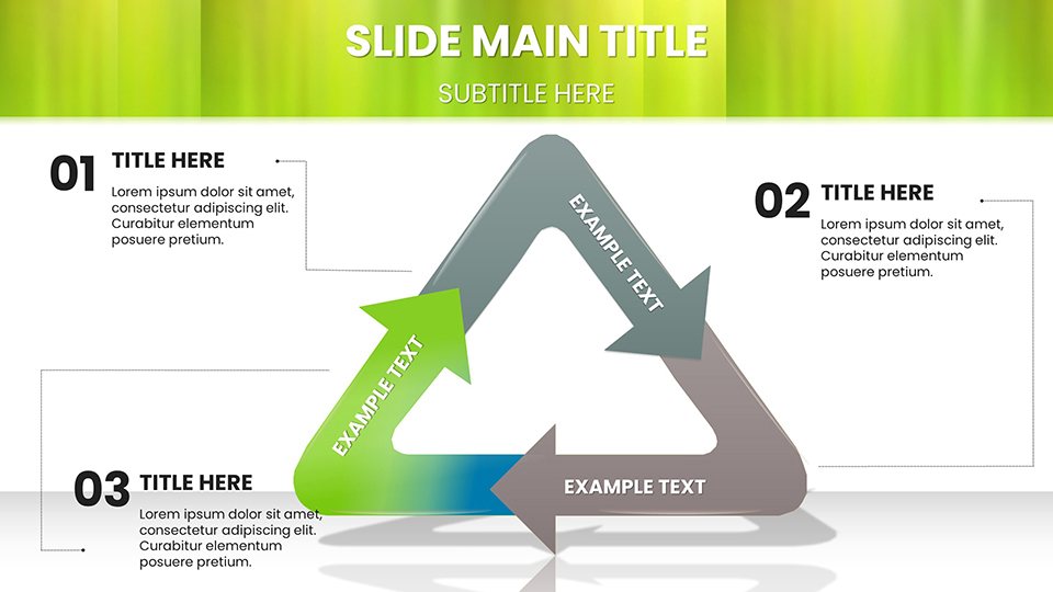
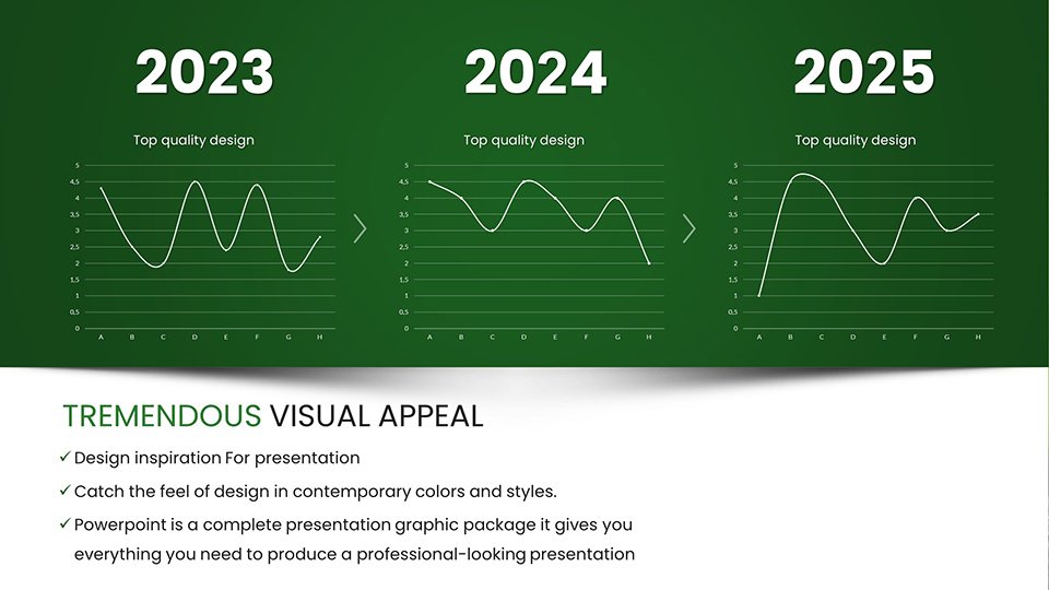
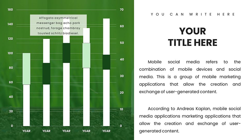
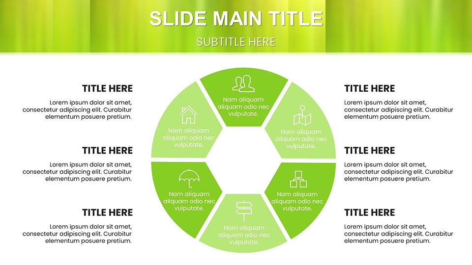
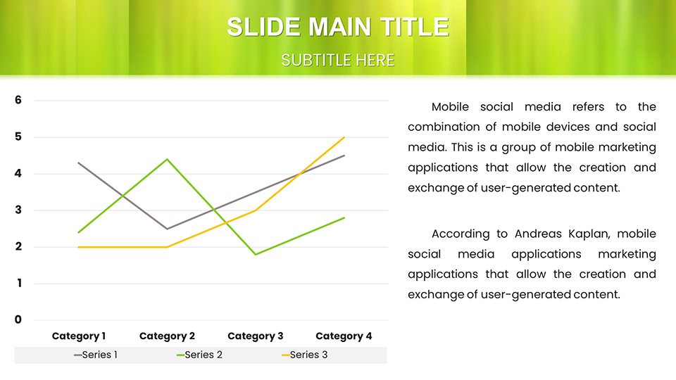
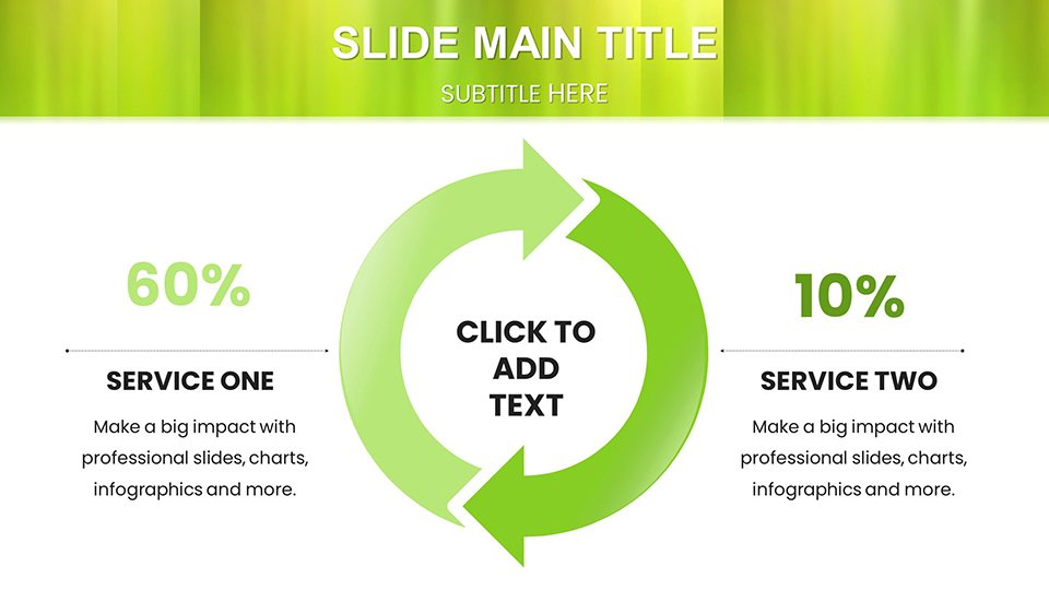
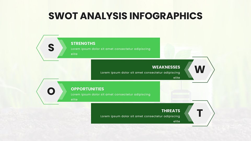
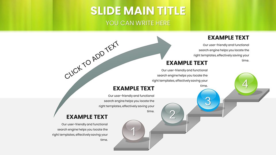
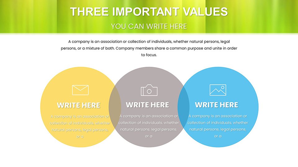
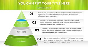
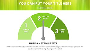
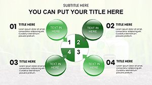
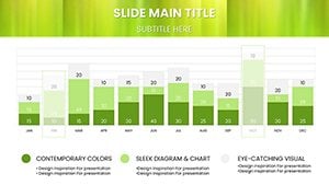
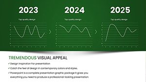
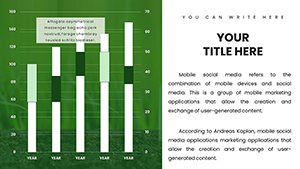
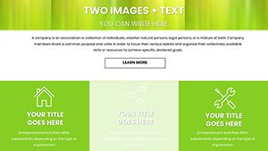
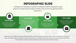
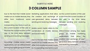
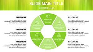
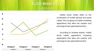
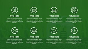
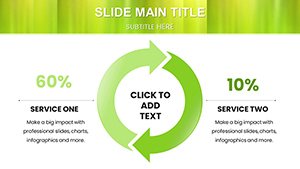
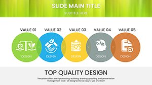
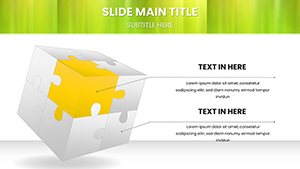
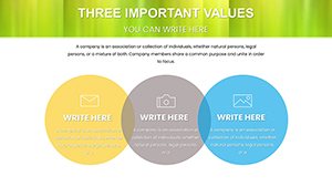
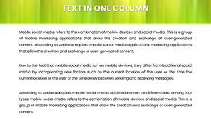
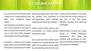
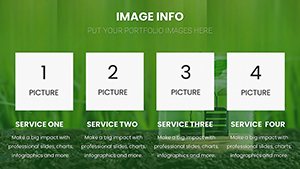
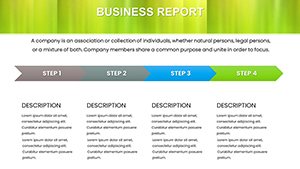
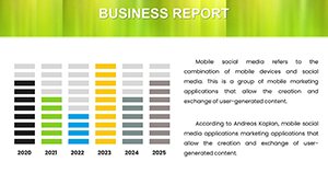
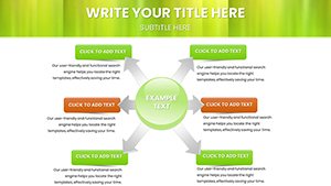
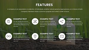
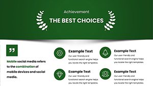
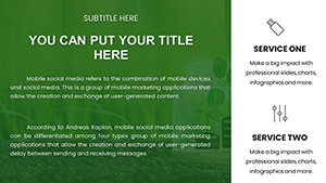
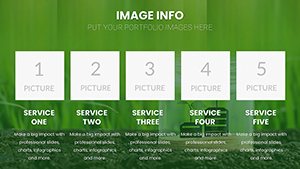
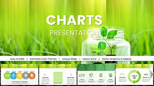
- Diverse Chart Types: Includes pie charts for species distribution, line graphs for trend analysis, bar charts for comparisons, ecological pyramid visuals, infographics, and interactive maps.
- Conservation-Focused Design: Elements tailored to topics like biodiversity, pollution trends, habitat restoration, and climate data.
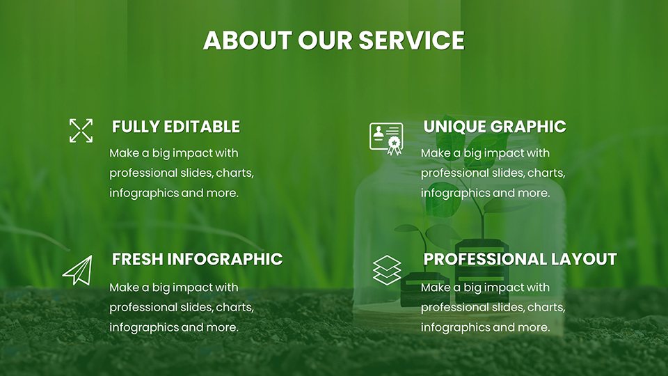
- Full Customizability: Easily adjust colors, fonts, data labels, and layouts to match your branding or specific requirements.
- High-Resolution Quality: Sharp visuals that look professional on screens and print beautifully for handouts.
- Broad Compatibility: Works seamlessly with Microsoft PowerPoint and Google Slides.
Professional Scenarios Where These Charts Excel
This template is built for real-world environmental communication needs across various settings:
- Wildlife biologists presenting biodiversity research findings to funding organizations or government bodies.
- Educators teaching ecology concepts, food webs, or environmental impacts in university lectures or school workshops.
- Conservation NGOs reporting habitat restoration outcomes and progress metrics to donors and partners.
- Sustainability consultants delivering climate trend analyses and ecological impact assessments to corporate clients.
- Environmental advocates creating persuasive visuals for policy briefings or public awareness campaigns.
In each case, the ready-to-use professional designs help you focus on your message while ensuring your data is visually impactful and easy to understand.
How to Use and Customize This Ecology Template
Getting your presentation ready is straightforward and efficient:
- Complete your purchase and instantly download the .pptx file.
- Open the template in Microsoft PowerPoint or Google Slides.
- Replace placeholder data with your own ecological statistics and research findings.
- Customize colors, fonts, and layouts to align with your organization's branding.
- Add text, images, or additional slides as needed for your specific presentation.
These intuitive designs save significant time, allowing you to create polished, professional presentations without starting from scratch.
Elevate your next environmental presentation - download this versatile ecology charts template today.
Frequently Asked Questions
What types of charts are included in this ecology template?
The template features a wide variety including pie charts, bar graphs, line graphs, 3D bars, ecological pyramids, infographics, climate trend visuals, habitat maps, and more - all designed with conservation ecology themes.
Is every element in the template fully editable?
Yes, all slides, charts, colors, fonts, data points, and layouts are completely customizable to fit your specific needs.
What software does this template work with?
It is fully compatible with Microsoft PowerPoint and Google Slides for seamless editing and presentation.
How many slides are included?
The template contains 59 unique, professionally designed slides ready for immediate use.
What file format will I receive?
You will download a standard .pptx file that opens directly in PowerPoint or Google Slides.
Are the charts print-ready?
Yes, all visuals are high-resolution and designed to maintain quality when printed for handouts or posters.