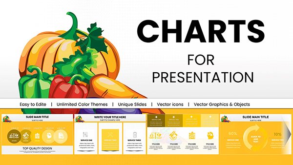
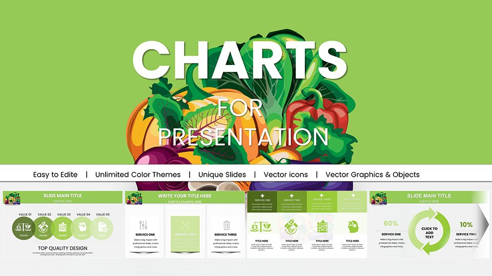
Vegetable PowerPoint Charts & Greengrocery Templates for Engaging Presentations


Type: PowerPoint Charts template
Category: Illustrations
Sources Available: .pptx
Product ID: PC00944
Template incl.: 59 editable slides
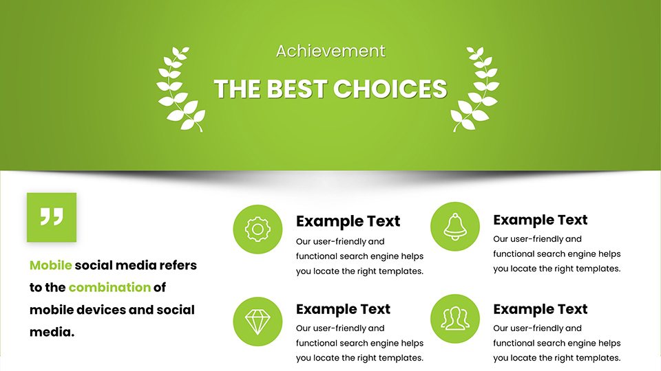
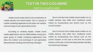
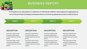
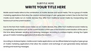
Imagine transforming your raw data on vegetable sales, nutrition profiles, or market trends into captivating visual stories that resonate with your audience. Our Vegetable Greengrocery PowerPoint Charts template is designed precisely for that purpose. With 59 fully editable slides, this collection empowers nutritionists, farmers' market managers, and food industry analysts to present complex information in an accessible, visually appealing way. Whether you're pitching a new organic produce line to investors or educating consumers on the benefits of seasonal vegetables, these templates streamline your workflow, saving hours of design time while ensuring professional polish.
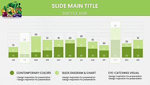
Drawing from real-world applications, such as those aligned with USDA guidelines for nutritional education, this template incorporates thematic elements like fresh produce icons and earthy color palettes to enhance relevance. Professionals in the field know the challenge of making data digestible - pun intended. Our charts address this by offering a blend of bar graphs for comparing harvest yields, pie charts for market share breakdowns, and infographics that highlight health benefits, all customizable to fit your brand's voice.
Unlocking the Potential of Vegetable-Themed Data Visualization
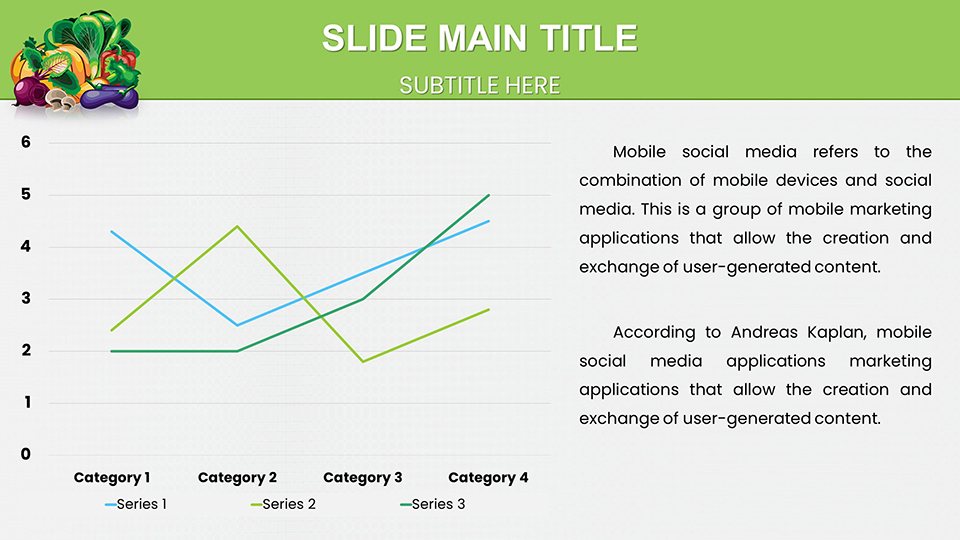
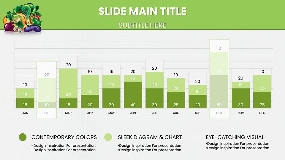
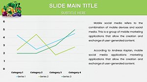
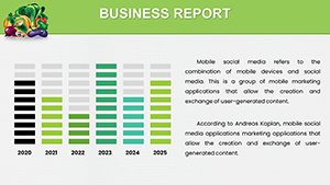
In the fast-paced world of agribusiness and health education, clear communication is key. This template's focus on greengrocery themes means every slide feels tailored, from depicting supply chain efficiencies to illustrating vitamin content in various veggies. For instance, use the line charts to track price fluctuations in leafy greens over seasons, providing stakeholders with insights that drive decisions.
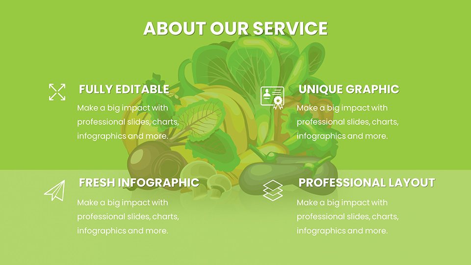
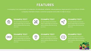
Core Features That Set This Template Apart
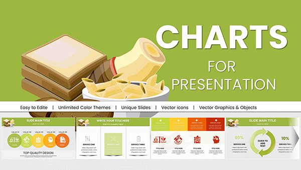
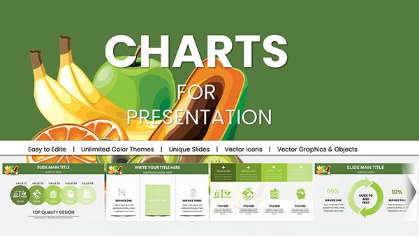
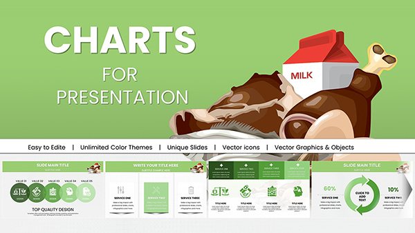
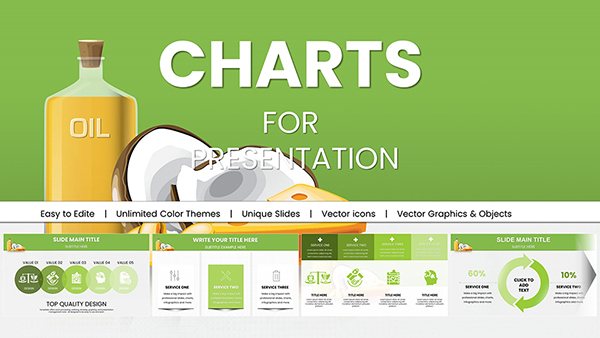
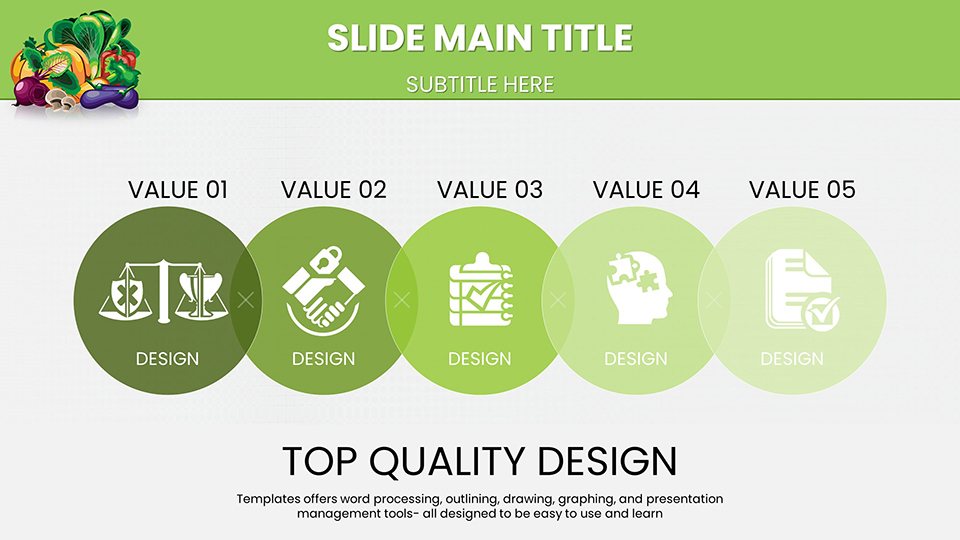
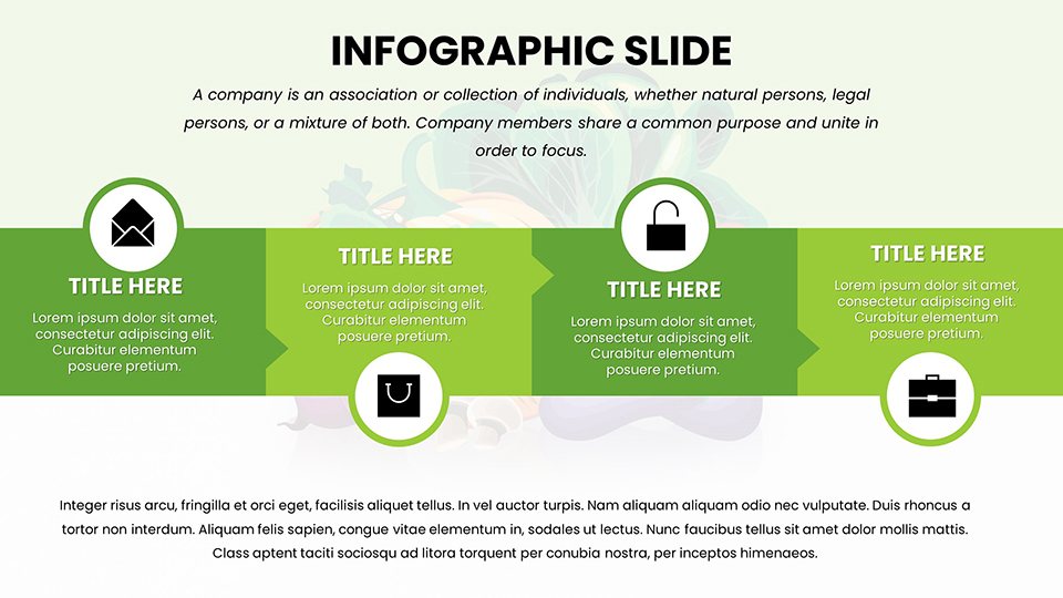
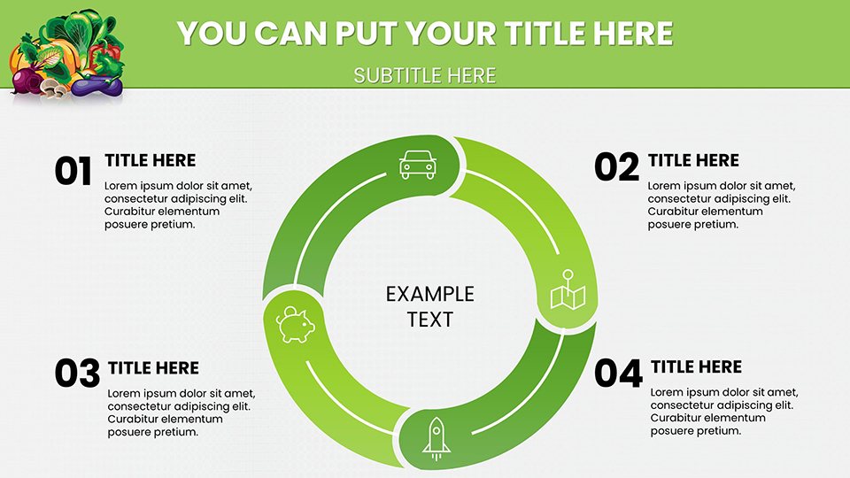
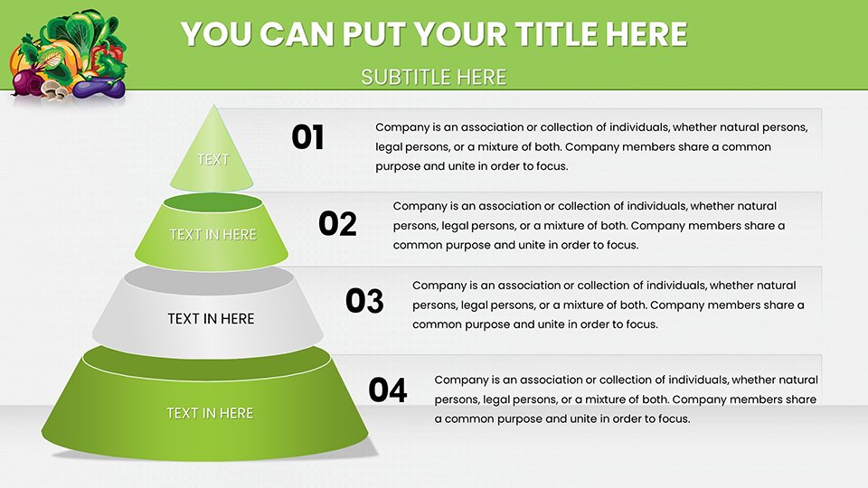
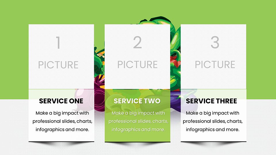
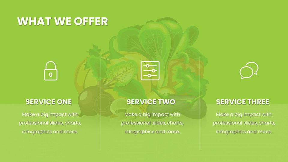
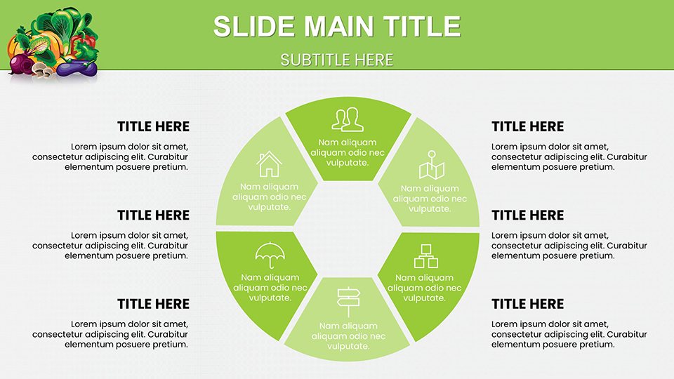
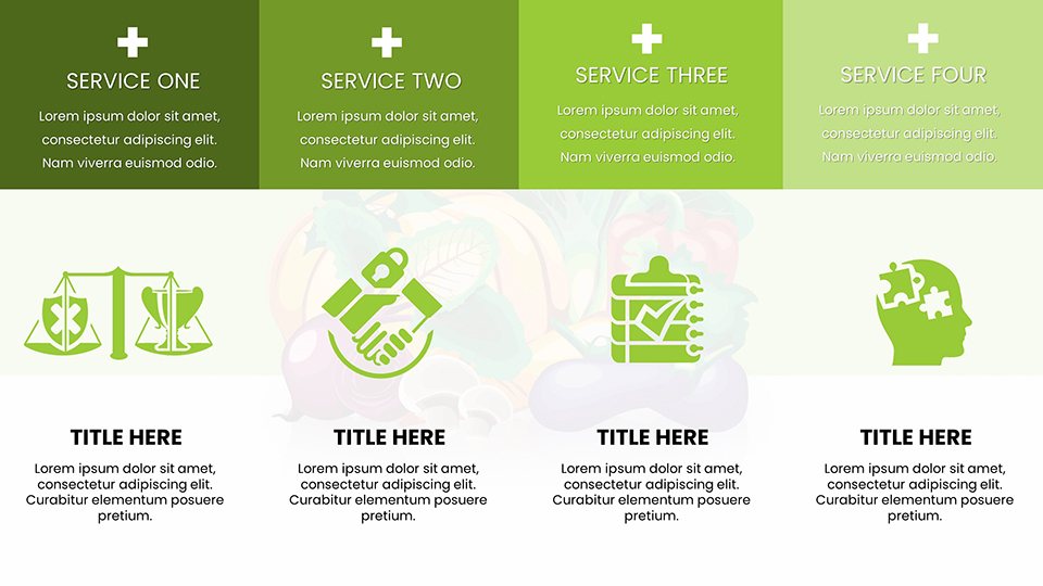
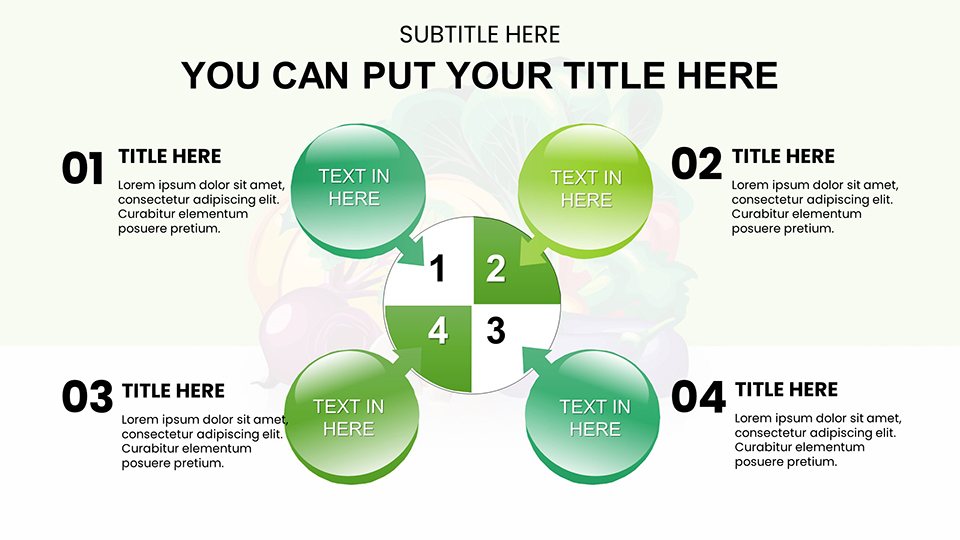
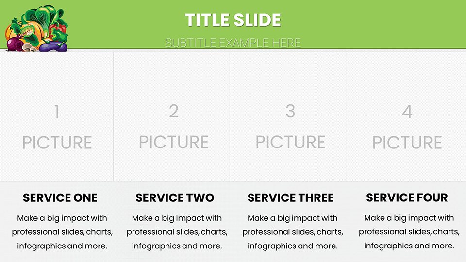
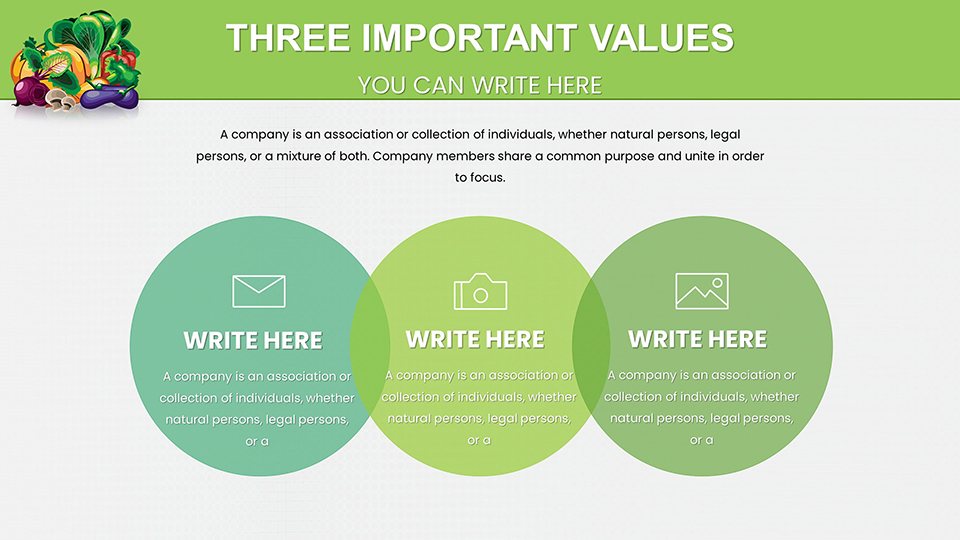
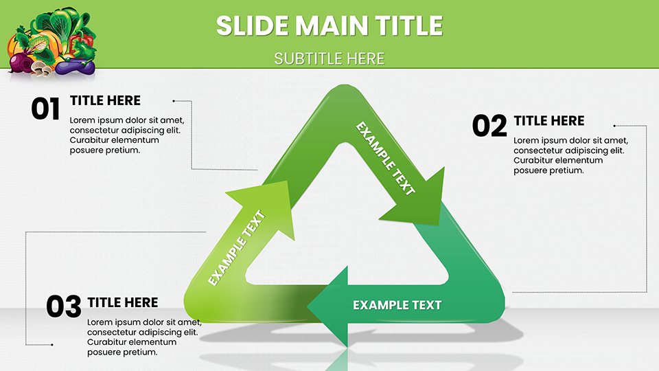
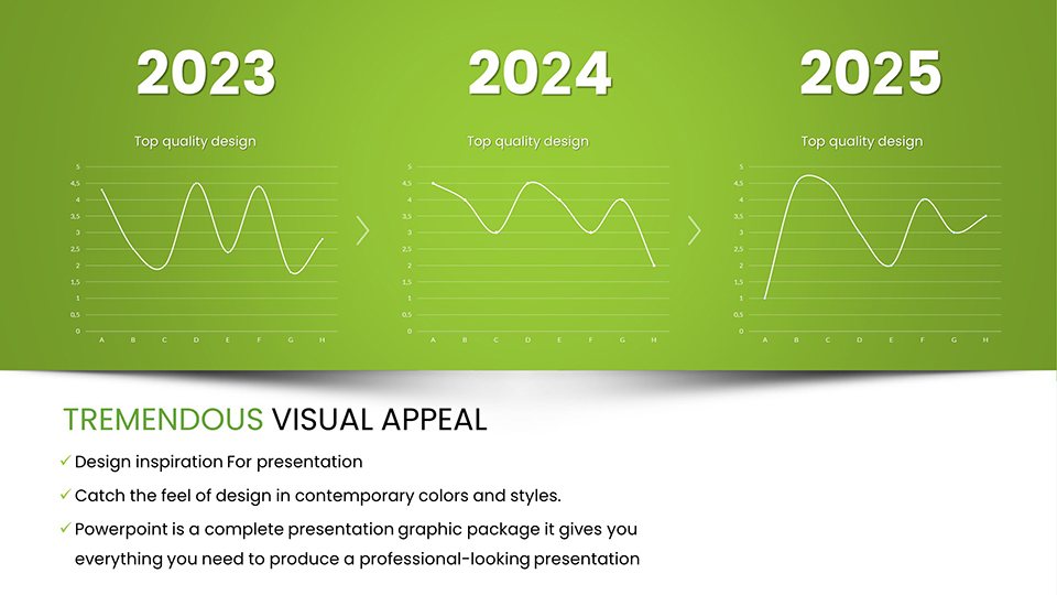
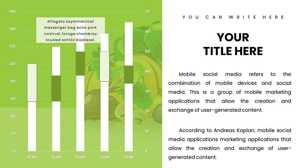
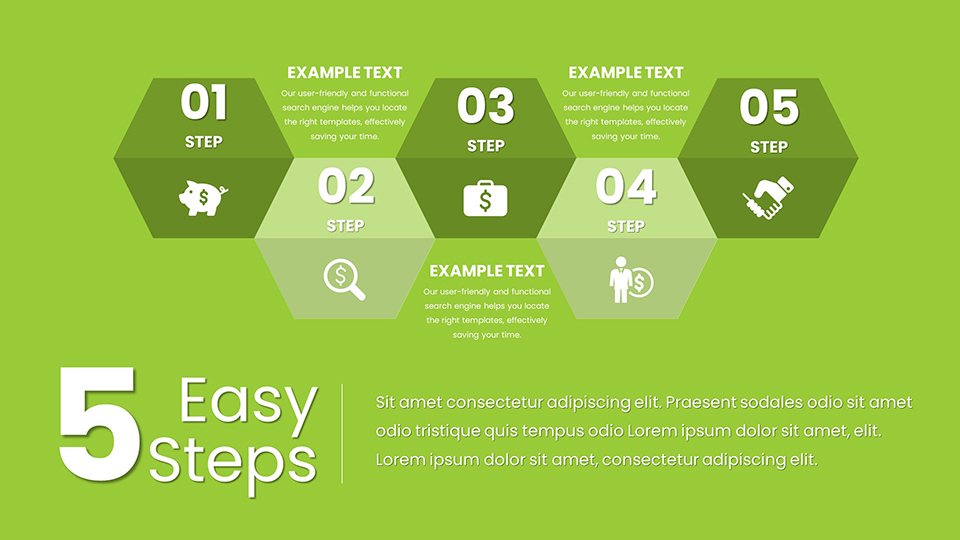
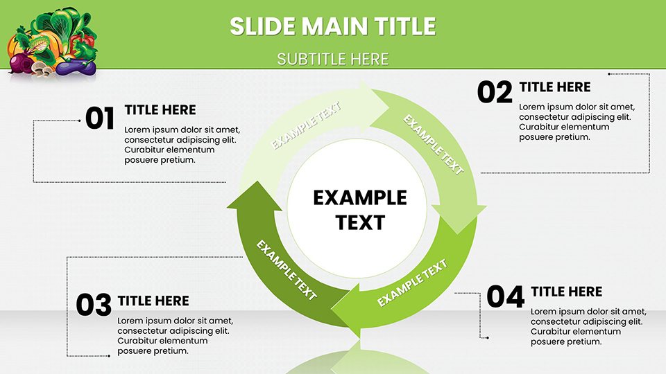
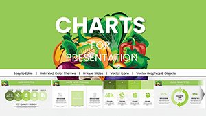
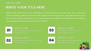
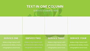
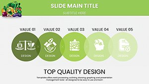
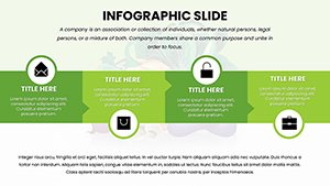
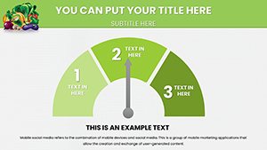
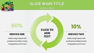
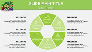
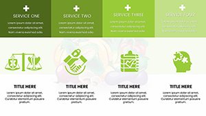
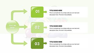
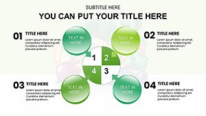
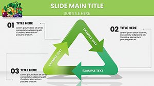
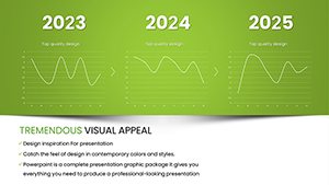
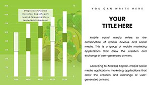
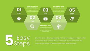
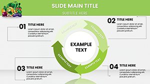
- Extensive Slide Variety: 59 slides covering bar, pie, line, and area charts, plus specialized infographics for nutritional pyramids and farm-to-table processes.
- Full Editability: Adjust colors to match your branding, resize elements without quality loss, and integrate your datasets seamlessly.
- Cross-Platform Compatibility: Works flawlessly in PowerPoint, Google Slides, and even importable to Keynote for Mac users.
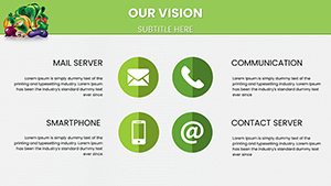
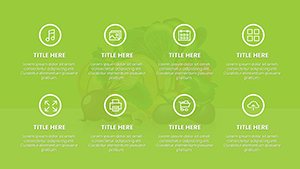
- Themed Icons and Graphics: Over 100 vegetable-specific icons, from carrots to kale, to add authenticity and visual interest.
- User Guide Included: Step-by-step instructions to get you started quickly, even if you're new to advanced charting.
These features aren't just bells and whistles; they're grounded in best practices from design experts like those at the American Society for Nutrition, ensuring your presentations not only look great but also convey authority.
Real-World Applications for Nutrition and Market Pros
Picture this: A dietitian preparing for a community workshop on balanced diets. Using our pie charts, they segment daily vegetable intake recommendations, making abstract guidelines tangible. Or consider a greengrocery chain executive analyzing sales data - bar charts compare organic vs. conventional produce performance, revealing trends that inform inventory strategies.
In educational settings, teachers leverage these templates for classroom lessons on sustainable farming, with timeline charts mapping crop cycles. Businesses benefit too; marketing teams create compelling pitches for new product launches, like a line of heirloom tomatoes, using area charts to forecast demand based on historical data.
Step-by-Step Use Case: Building a Market Trend Report
- Start with the intro slide: Customize the title with your report's focus, e.g., "2025 Vegetable Market Insights."
- Select a bar chart slide: Input data on top-selling veggies like broccoli and spinach, adjusting bars for emphasis.
- Add infographics: Incorporate icons to visualize supply sources, enhancing narrative flow.
- Incorporate pie charts: Break down market shares by region, using color coding for quick comprehension.
- Finalize with a summary slide: Highlight key takeaways and include a call-to-action for audience engagement.
This approach, inspired by case studies from firms like Whole Foods' presentation strategies, turns data dumps into persuasive narratives.
Expert Tips for Maximizing Your Template
To elevate your presentations further, integrate storytelling elements. For example, pair a chart showing rising kale popularity with anecdotes from health trends reports. Ensure accessibility by using high-contrast colors, adhering to WCAG standards. Compare this to basic PowerPoint tools: While native charts are functional, our pre-designed, themed options save time and add professionalism, reducing the risk of mismatched visuals.
Workflow integration is seamless - import your Excel data directly into slides, then tweak for impact. For advanced users, layer animations to reveal data points progressively, keeping audiences engaged.
Why This Template Outshines Standard Options
Unlike generic charts, our vegetable-focused designs resonate with niche audiences, fostering better retention. Benefits include time savings (up to 70% faster creation), enhanced credibility through expert-aligned visuals, and versatility across industries. Subtle CTAs throughout your deck, like "Explore more at our site," can drive further interaction.
In a competitive field, standing out means delivering value. This template does just that, turning everyday data into memorable experiences.
Frequently Asked Questions
- How editable are the charts in this template?
- All elements are fully customizable, from data points to colors and fonts, allowing complete personalization.
- Is this compatible with Google Slides?
- Yes, upload the PPTX file directly to Google Slides for editing and presenting.
- Can I use these for commercial presentations?
- Absolutely, designed for professional use in business, education, and more.
- What if I need help customizing?
- A detailed user guide is included, and our support team is available for assistance.
- Are there free samples available?
- Yes, download a demo to test the template before purchasing.