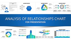
Corporate Hierarchy & Structure Chart - Presentation Template


Type: PowerPoint Charts template
Category: Relationship, Organizational, Analysis
Sources Available: .pptx
Product ID: PC00940
Template incl.: 39 editable slides
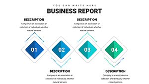
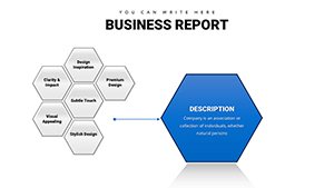
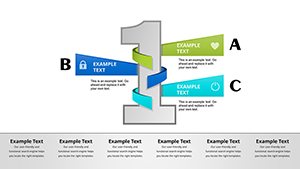
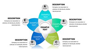
Bring clarity to complex organizational structures. Representing team hierarchies or system architectures in PowerPoint often results in messy, misaligned boxes using SmartArt. This Corporate Structure Chart Template provides a sophisticated alternative. It is designed to handle multi-level hierarchies, reporting lines, or component relationships with precise alignment and professional spacing. Ideal for HR Directors, Project Managers, and System Architects, this template ensures that the "people" or "components" side of your business is presented with the same rigor as your financials.
Key Use Cases
This layout is not just for org charts; it is versatile enough for any structured relationship diagram.
- Restructuring Announcements: visually communicating changes in leadership or department consolidation.
- Project Team Roles: Defining clear ownership and reporting lines for cross-functional initiatives.
- System Architecture: Mapping out how different software modules or business units interact with a central core.
Workflow: From Draft to Deck
We know that organizational structures change frequently. This template is built for rapid iteration.
- Grouped Elements: Text boxes and shapes are grouped for easy moving. You can drag a "Manager" box to a new department, and the formatting stays intact.
- Text adaptability: The placeholders are set to auto-fit text, meaning you can type long titles or names without the text overflowing the box boundaries.
- Connector Flexibility: Lines and connectors can be re-routed simply by dragging the anchor points, maintaining a clean look even after major edits.
Real-World Example: The M&A Integration
During a merger or acquisition, the most stressful slide is the "New Org Structure." Employees are anxious to see where they fit. Using a default, cramped diagram increases anxiety. By using this spacious, clear chart template, you present a calm, well-thought-out vision of the future. The visual hierarchy implies stability and clear governance, crucial for maintaining morale during transitions.
Scenario Comparison
| Goal | PowerPoint SmartArt | This Structural Template |
|---|---|---|
| Customization | Limited (preset layouts) | Full (move anything anywhere) |
| Professionalism | Standard corporate look | Bespoke design agency look |
| Complex flows | Breaks easily | Handles complexity well |
Industry Applications
Human Resources: Talent mapping and succession planning. IT & Engineering: Network topology diagrams. Consulting: Stakeholder mapping and influence analysis.
Download & Organize Your Team
Frequently Asked Questions
Can I add photos of team members to this chart?
Yes. The shapes can be filled with images. Select the shape, go to "Shape Fill," and choose "Picture." This is great for introducing new leadership teams.
Is this compatible with Keynote for Mac?
Yes. While native to PowerPoint, the vector shapes impart cleanly into Apple Keynote. You may need to make minor font adjustments depending on your installed typefaces.
How many levels deep can this hierarchy go?
The template is designed for flexibility. You can copy and paste layers to go as deep as required, though for slide readability, we recommend splitting very deep hierarchies across multiple slides.