Financial Statement Analysis PowerPoint Charts: Decode Data with Precision


Type: PowerPoint Charts template
Category: Analysis
Sources Available: .pptx
Product ID: PC00932
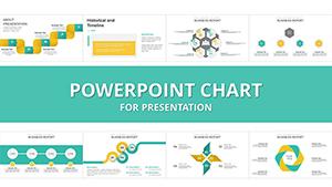
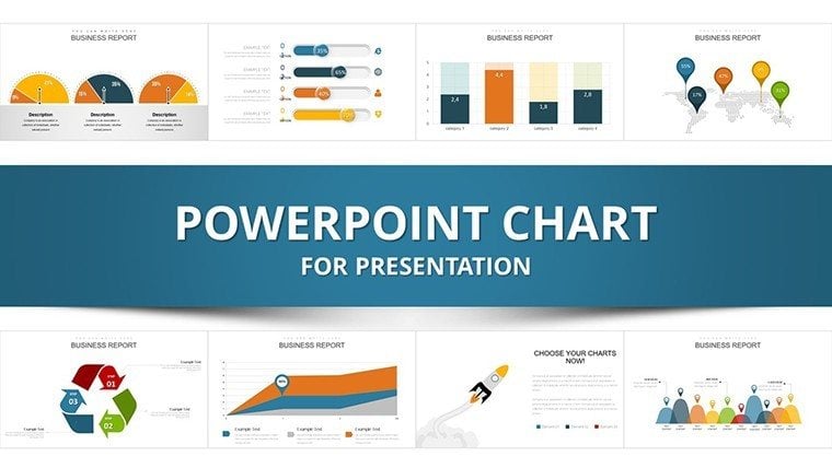
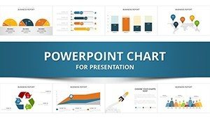
Template incl.: 34 editable slides
Financial statements hold the keys to a business's story, but deciphering them requires the right tools. Our Financial Statement Analysis PowerPoint Charts template, with 34 editable slides, is your gateway to professional, insightful presentations. Designed for financial analysts, business owners, and students, it transforms income statements, balance sheets, and cash flows into compelling visuals. Engage your audience in boardrooms or classrooms by highlighting trends and ratios that drive decisions. Aligned with GAAP standards from sources like PwC's viewpoint, this template ensures your analysis is both accurate and authoritative.
Core Features for Comprehensive Analysis
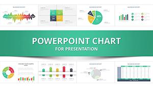
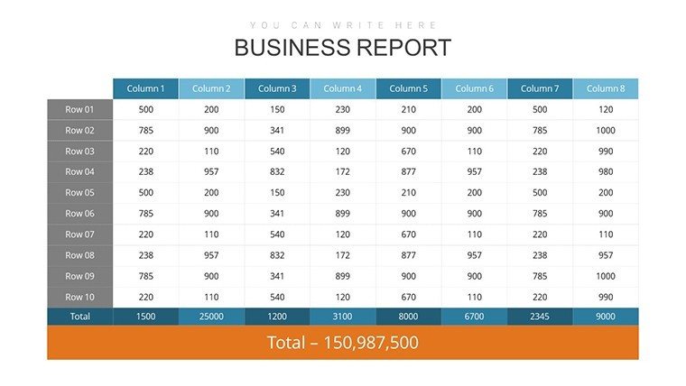
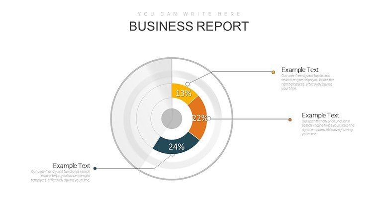
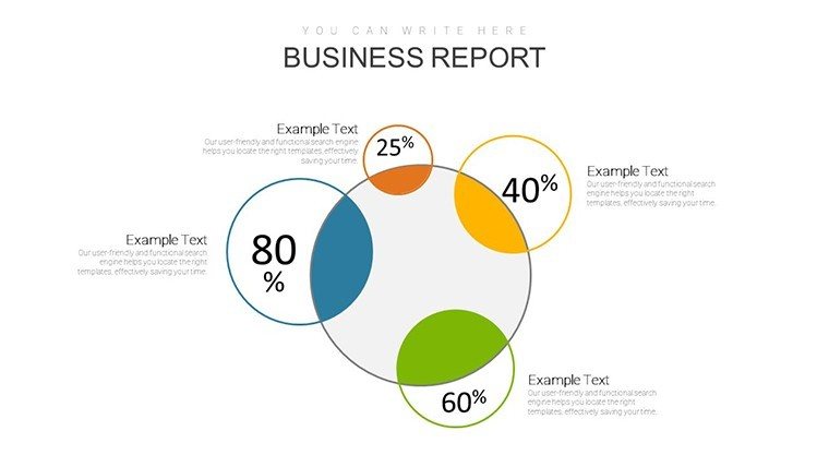
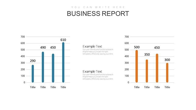
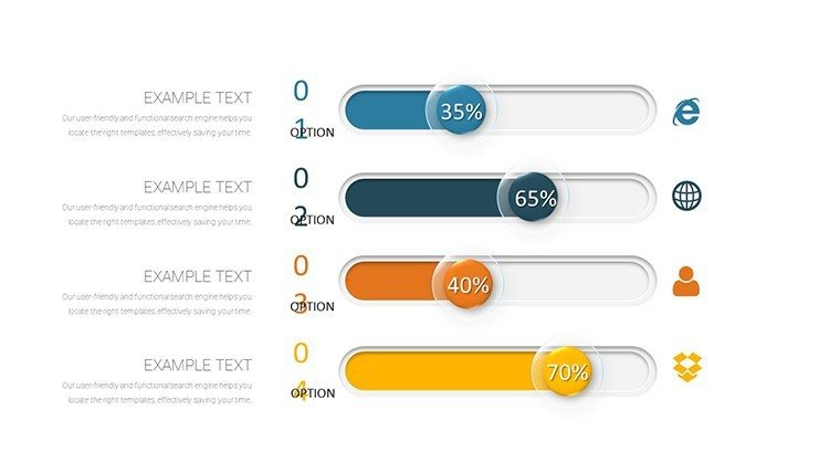
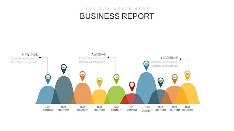
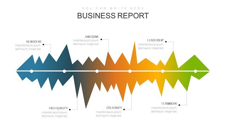
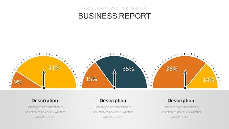
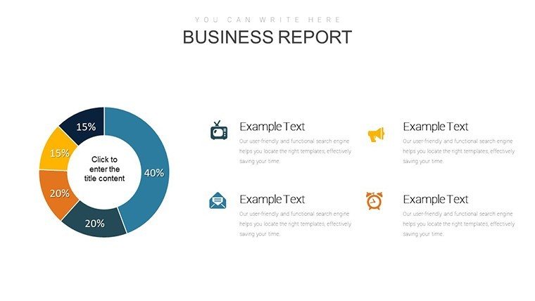
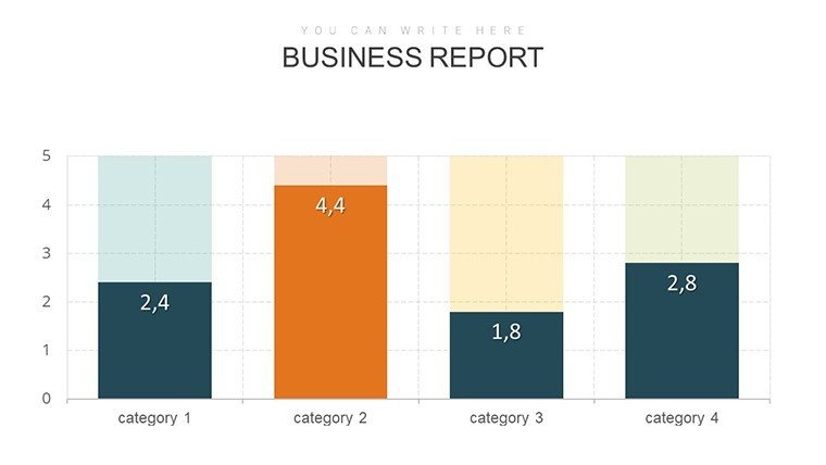
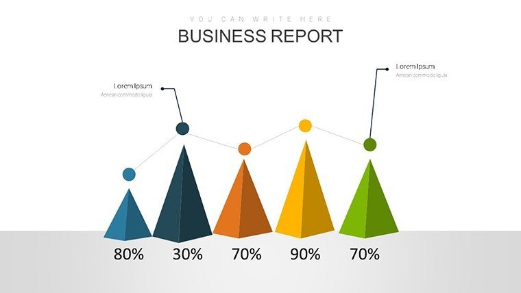
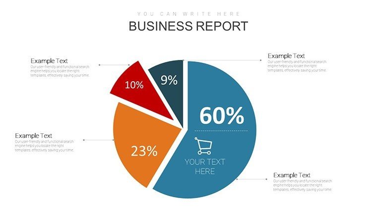
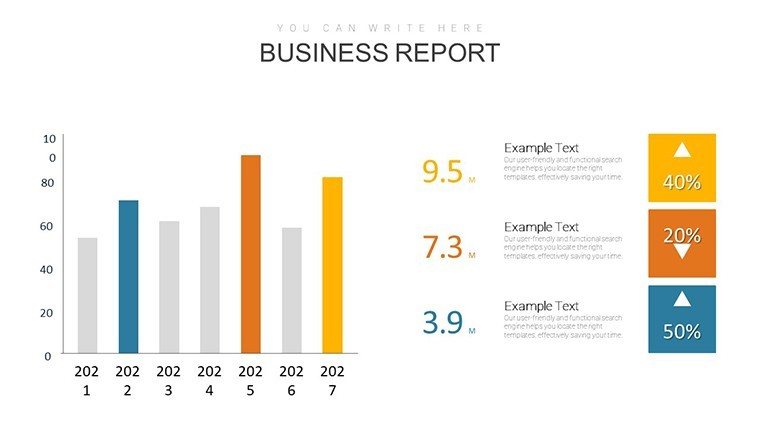
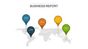
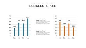
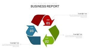
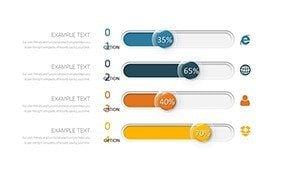
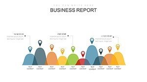
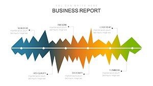
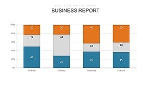
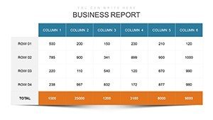
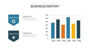
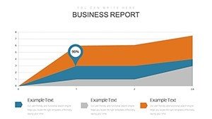
At its heart, this template offers stunning charts tailored for financial scrutiny. Income statement slides use column graphs to compare revenues and expenses, while balance sheets employ pie charts for asset distribution. Cash flow reports come alive with waterfall charts, and overall analysis includes scatter plots for correlations. Extensive customization lets you tweak layouts, colors, and fonts to suit your style, making it far superior to basic PowerPoint options.
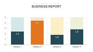
- Income Statement Charts: Visualize profits with dynamic lines and bars for trend spotting.
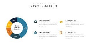
- Balance Sheet Charts: Break down equity and liabilities with intuitive segments.
- Cash Flow Charts: Track movements with flows that reveal operational efficiency.
- Comparative Tools: Side-by-side graphs for period-over-period insights.
- User-Friendly Design: Clear structures that enhance readability and engagement.
Applications Across Professional and Educational Spheres
Analysts can leverage this for in-depth reports, using radar charts to assess multiple metrics at once. A case from financial best practices shows how a corporation used similar visuals to uncover cost inefficiencies, boosting profits. Business owners benefit in pitches, presenting cash flows to attract investors. Students find it ideal for assignments, simplifying complex concepts like solvency ratios.
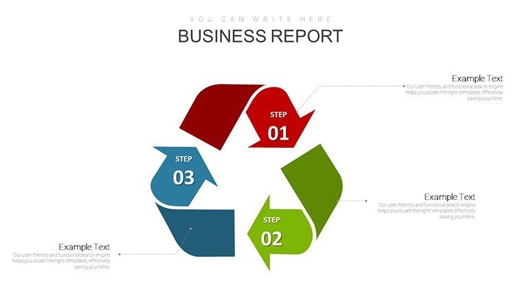
Tailoring Your Analysis Journey
Customize by populating data fields - charts refresh instantly. Add subheadings for narrative flow or animations for emphasis. For advanced use, integrate bubble charts showing size-based impacts, adhering to KPMG's presentation standards.
- Launch the template and map your statement data.
- Edit visuals to highlight key findings.
- Adjust aesthetics for audience appeal.
- Incorporate explanatory notes.
- Simulate presentations for refinement.
Workflow integration is seamless - link to accounting software for auto-updates, or share for collaborative edits.
Superior Benefits for Impactful Delivery
This template outshines defaults with professional infographics that captivate. From Slidor's design tips, it uses emotional language to make data relatable, increasing retention. An example: A student project using these charts earned top marks by clearly illustrating financial health.
Address challenges like data complexity with bite-sized visuals. Dedicated slides for trend analysis help forecast, while synonyms in labels boost SEO if shared online.
Insights from Experts
Craft narratives around data: Start broad, zoom in on details. Use consistent themes for cohesion. Per Visme, employ verbs like "surge" for dynamism. Keep slides uncluttered for focus.
Embrace this template to turn statements into strategic assets.
Frequently Asked Questions
Are the charts GAAP-compliant?Yes, structured to support accurate GAAP representations.
How many analysis types are covered?Income, balance, cash flow, and ratios across 34 slides.
Can I modify layouts extensively?Fully, including adding elements or changing structures.
Suitable for educational use?Ideal, with clear designs for teaching and learning.
Animation features included?Yes, customizable for engaging reveals.
Unlock deeper insights now - download and analyze with excellence.