Manager PowerPoint Charts Template: Elevate Your Professional Presentations


Type: PowerPoint Charts template
Category: Relationship
Sources Available: .pptx
Product ID: PC00926
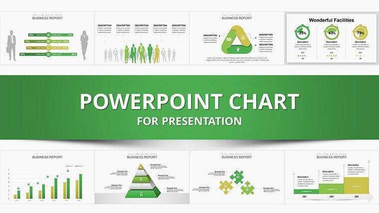
Template incl.: 36 editable slides
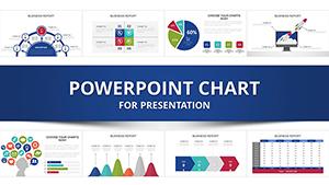
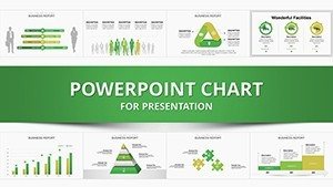
In the fast-paced world of management, where decisions hinge on clear data interpretation, having the right tools can make all the difference. Imagine transforming complex datasets into compelling visuals that captivate your audience, whether it's a boardroom meeting or a team briefing. Our Manager PowerPoint charts template is designed precisely for forward-thinking managers like you. With 36 fully editable slides, this template offers a suite of professional charts and graphs tailored to highlight key metrics, trends, and relationships in your business operations.
This isn't just another generic slide deck; it's a strategic asset built to align with real-world managerial needs. Drawing from best practices in data visualization - think Edward Tufte's principles of clarity and efficiency - the template ensures your presentations are not only informative but also engaging. For instance, if you're overseeing a project team, use the bar graphs to compare performance across departments, or leverage pie charts to break down resource allocation. The result? Audiences grasp your insights faster, leading to quicker consensus and action.
Key Features That Set This Template Apart
Dive deeper into what makes this Manager PowerPoint charts template a must-have. Each of the 36 slides is crafted with precision, incorporating modern design elements like subtle gradients and clean lines that exude professionalism without overwhelming the data. Customization is at your fingertips: adjust colors to match your company branding, resize elements for emphasis, or insert your logo seamlessly. Compatibility is seamless with Microsoft PowerPoint 2016 and later versions, ensuring no hiccups during edits or presentations.
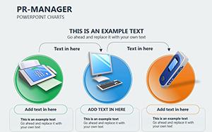
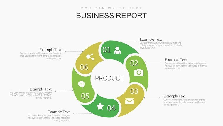
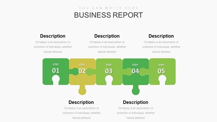
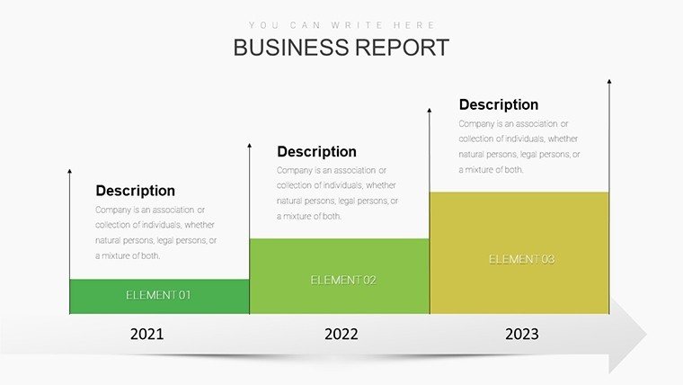
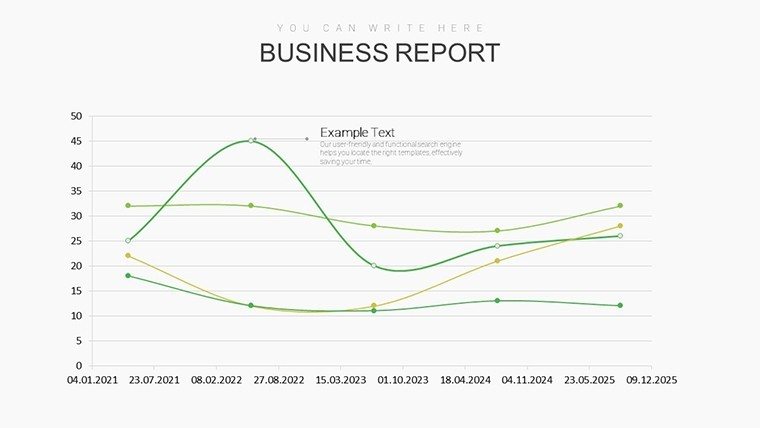
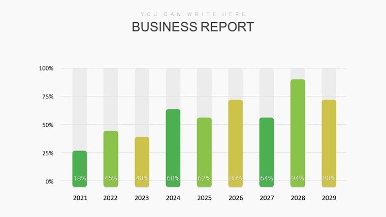
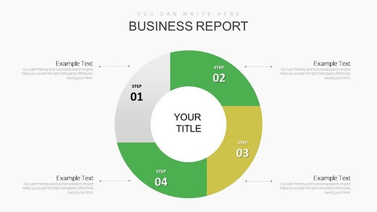
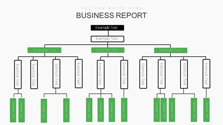
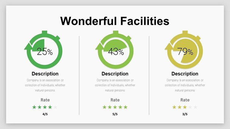
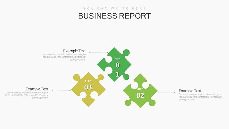
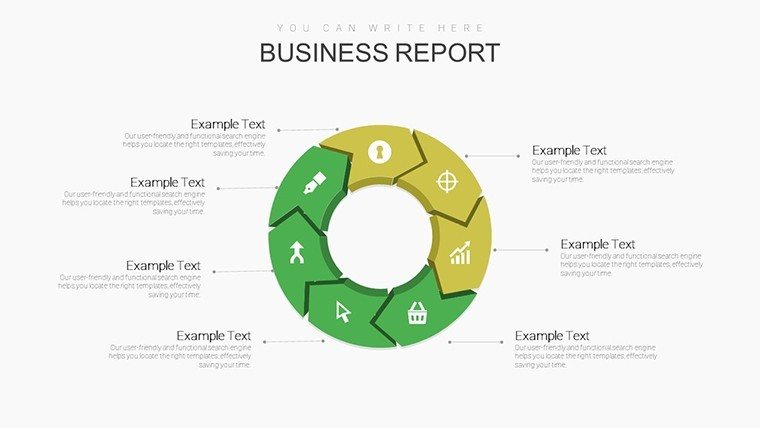
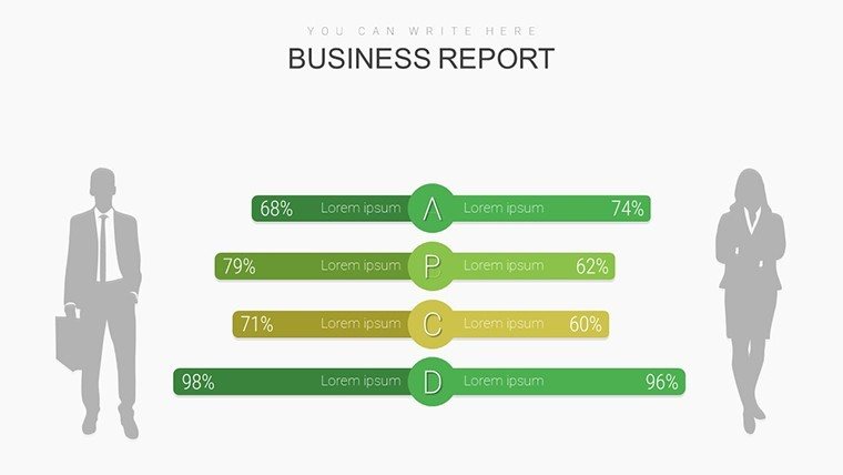
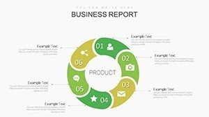
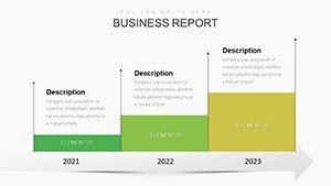
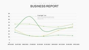
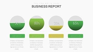
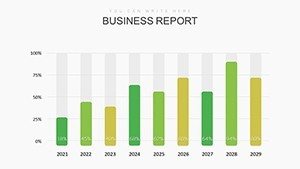
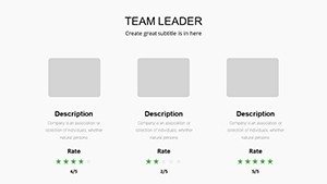
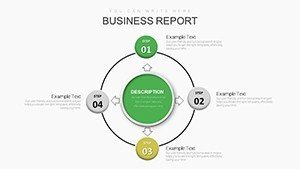
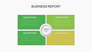
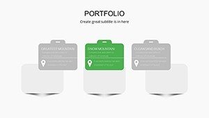
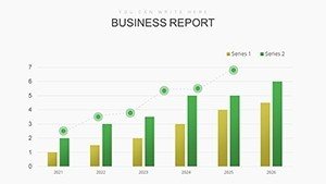
- Variety of Chart Types: From horizontal bar charts for ranking team achievements to line graphs tracking quarterly progress, the template covers essential visuals.
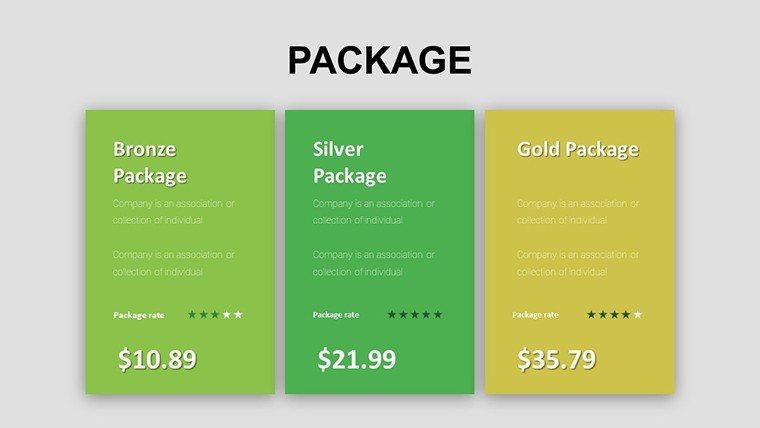
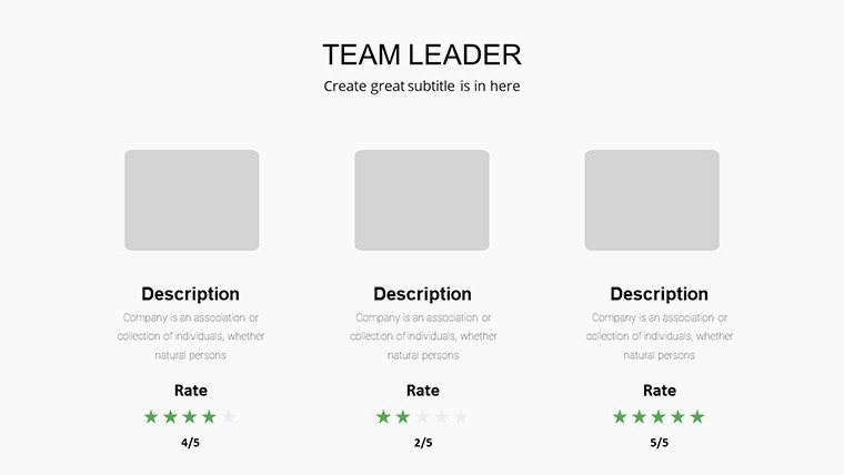
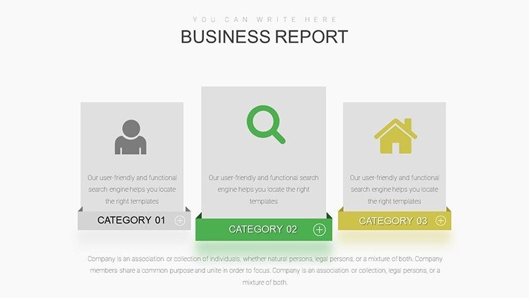
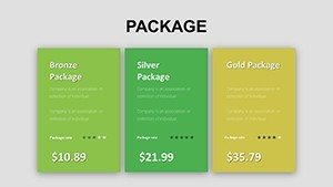
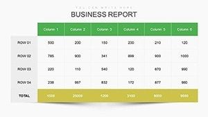
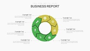
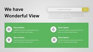
- Editable Tables and Icons: Include dynamic tables for detailed breakdowns and themed icons that add a touch of flair to your narratives.
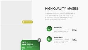
- High-Resolution Graphics: All elements are vector-based, so they scale perfectly on any screen size, from laptops to projectors.
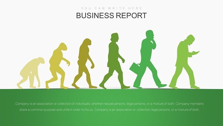
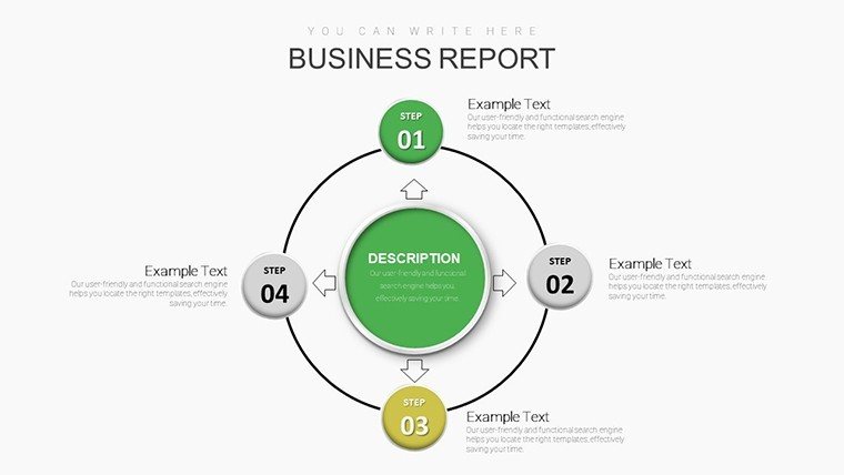
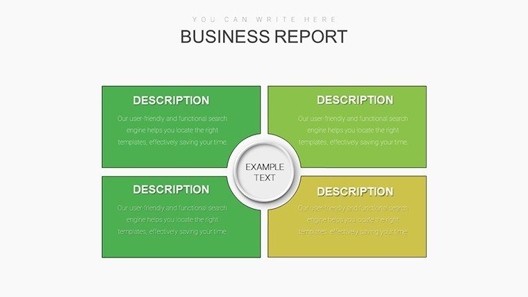
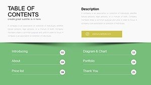
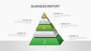
- Pre-Built Layouts: Save time with ready-to-use slides for common managerial scenarios, like SWOT analysis or KPI dashboards.
Beyond aesthetics, the template emphasizes usability. Managers often juggle tight deadlines, so we've included intuitive placeholders for text and data entry. No need for advanced design skills - just plug in your numbers, and watch the charts update automatically. This feature alone can shave hours off your preparation time, allowing you to focus on strategy rather than formatting.
Real-World Applications and Benefits for Managers
Picture this: You're preparing for an annual review with executives. Instead of dense spreadsheets, you unveil a sleek dashboard slide showing revenue growth via an area chart, complemented by a relationship diagram illustrating team interconnections. This Manager PowerPoint charts template turns such visions into reality. It's particularly valuable in industries like finance, where visualizing portfolio performance is key, or in HR, for mapping employee engagement trends.
One standout benefit is enhanced communication. According to a study by the Project Management Institute, poor communication contributes to project failure in 30% of cases. By using these charts, you bridge that gap, making abstract concepts tangible. For example, in a sales meeting, employ the pie charts to segment market shares, sparking discussions on growth opportunities. Or, in operational reviews, use line charts to forecast inventory needs based on historical data.
Let's explore a step-by-step use case for a typical managerial pitch. First, select a base slide, say a bar graph for comparing departmental budgets. Input your data directly into the embedded Excel-like interface - PowerPoint handles the rest. Next, customize the legend and axes for clarity, perhaps adding annotations for key insights. Then, integrate it into your deck with smooth transitions. Finally, rehearse and present, confident that your visuals will drive home your points.
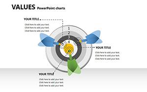
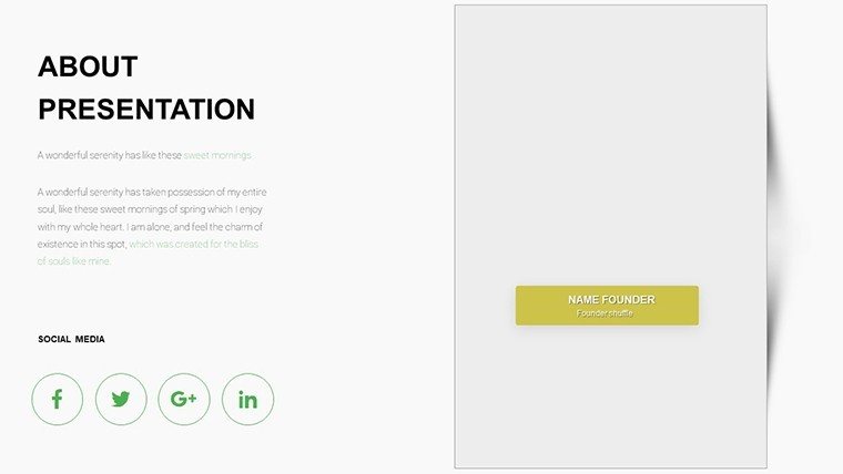
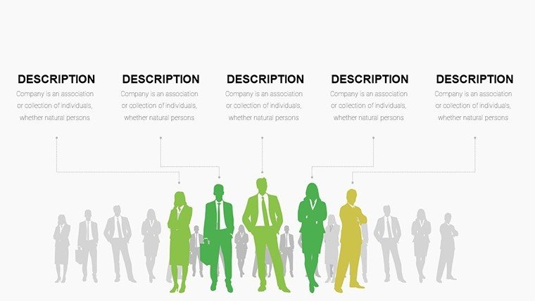
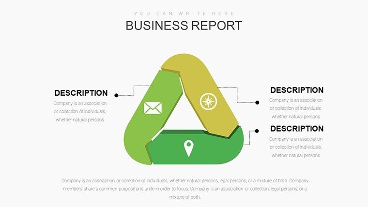
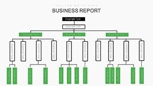
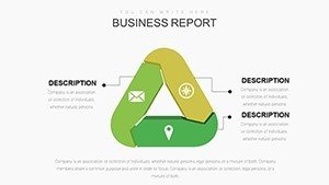
Compared to basic PowerPoint tools, this template offers superior flexibility. Standard charts often look dated and rigid, but here, you get themed icons - like gear symbols for process efficiency - that add context without clutter. It's like upgrading from a bicycle to a sports car for your data journeys. And for those in relationship management, the template shines with diagrams that map stakeholder interactions, helping you nurture partnerships effectively.
Tips for Maximizing Your Template's Potential
To get the most out of this resource, start by aligning it with your audience's needs. If presenting to C-suite executives, emphasize high-level summaries with bold visuals. For team huddles, drill down into details with interactive elements. Always incorporate storytelling: Use a sequence of slides to build a narrative, from problem identification via charts to solution proposals. Pro tip: Pair with PowerPoint's animation features to reveal data points progressively, keeping engagement high.
Integration into your workflow is straightforward. Export charts as images for reports or embed them in emails for quick updates. For collaborative environments, share the .pptx file via OneDrive, allowing real-time edits. This versatility extends its value beyond presentations, into everyday managerial tools.
Why Choose This Template Over Competitors?
In a sea of presentation templates, what makes ours stand out? It's the focus on managerial specificity - slides aren't just pretty; they're purposeful. Unlike free alternatives that lack polish, this $24 investment delivers premium quality, backed by 151 user ratings praising its ease and impact. Think of it as an extension of your expertise, amplifying your voice in meetings.
For architecture firms adapting this (though tailored for managers), imagine using relationship charts to depict project team hierarchies, aligning with AIA standards for clear documentation. Or in urban planning, visualize timelines with Gantt-like elements embedded in the slides.
Ready to transform your presentations? Customize this Manager PowerPoint charts template today and watch your managerial influence soar.
Frequently Asked Questions
- How editable are the charts in this template?
- All 36 slides are fully editable, allowing you to change data, colors, fonts, and layouts directly in PowerPoint.
- Is this template compatible with Google Slides?
- While optimized for PowerPoint, you can upload the .pptx file to Google Slides for basic compatibility, though some advanced features may vary.
- What file format will I receive upon purchase?
- You'll get a .pptx file, ready for immediate use in Microsoft PowerPoint.
- Can I use this for commercial presentations?
- Yes, it's licensed for professional use, including client pitches and internal meetings.
- Are there any tutorials included?
- The template comes with basic instructions, but PowerPoint's built-in help covers most customizations.