Interactive PowerPoint Charts Template: Bring Data to Life in Your Presentations


Type: PowerPoint Charts template
Category: Analysis
Sources Available: .pptx
Product ID: PC00923
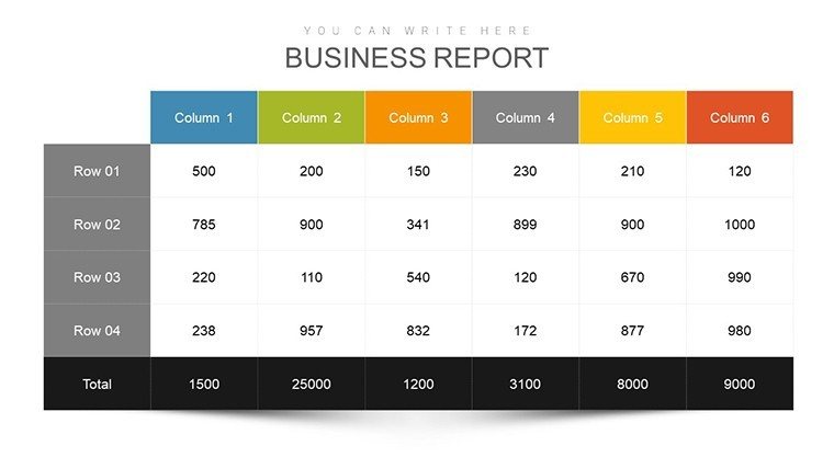
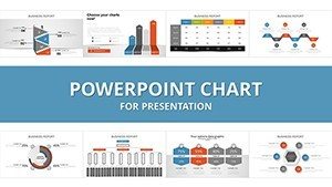
Template incl.: 35 editable slides
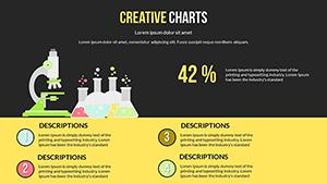
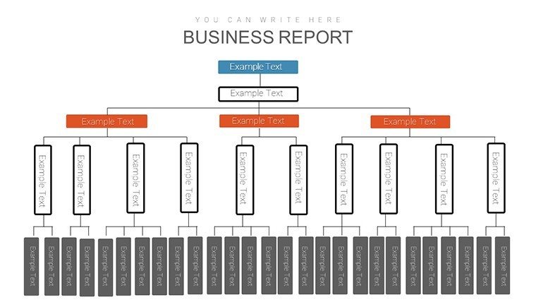
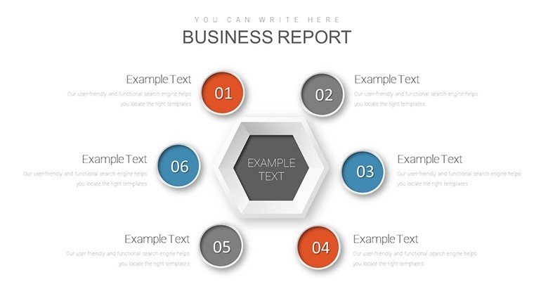
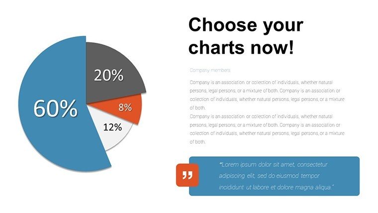
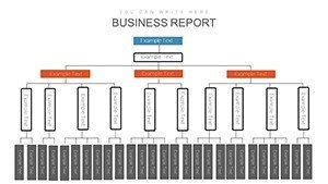
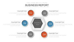
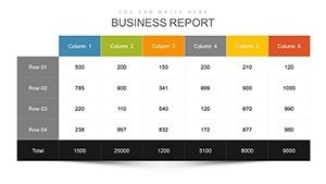
Picture this: You're in a high-stakes meeting, and instead of droning through static slides, your charts come alive, responding to clicks and revealing insights layer by layer. That's the magic of our Interactive PowerPoint Charts Template, boasting 35 editable slides tailored for professionals, educators, and trainers who crave audience engagement. From animated bar graphs that build suspense to pie charts that slice data dynamically, this .pptx powerhouse transforms mundane reports into interactive experiences, perfect for demystifying complex information in business reviews, classroom lessons, or workshop sessions.
Rooted in cognitive science principles - like those from Richard Mayer's multimedia learning theory - this template leverages interactivity to boost retention by up to 40%, as studies suggest. It's not just about flash; it's about fostering understanding, whether you're pitching to clients or teaching statistics. For example, in a sales team huddle, use an interactive line graph to trace revenue trends, allowing participants to hover over points for details, turning passive viewers into active learners.
Standout Features for Seamless Interactivity
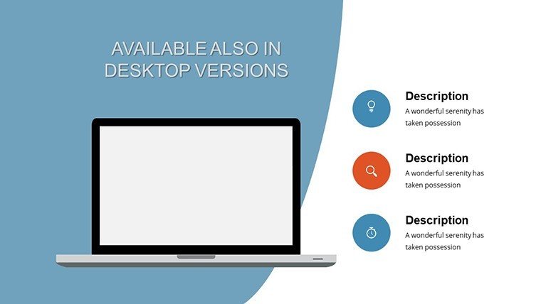
This template's core strength lies in its blend of aesthetics and functionality, designed for quick adaptations without a steep learning curve. Compatible with PowerPoint on multiple platforms, it includes:
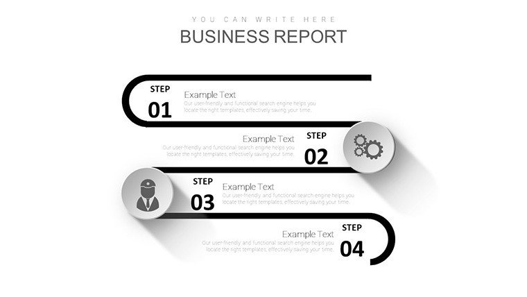
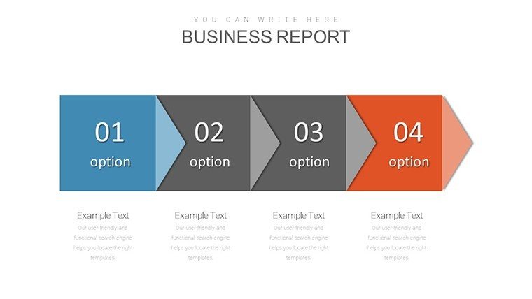
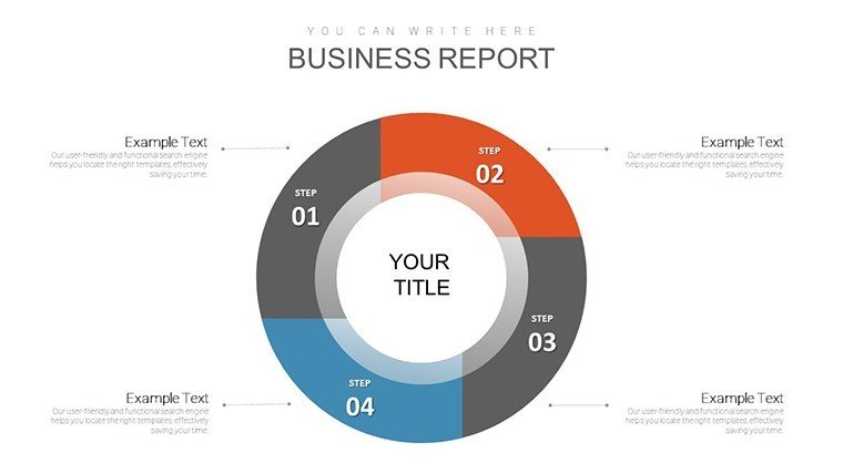
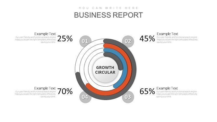
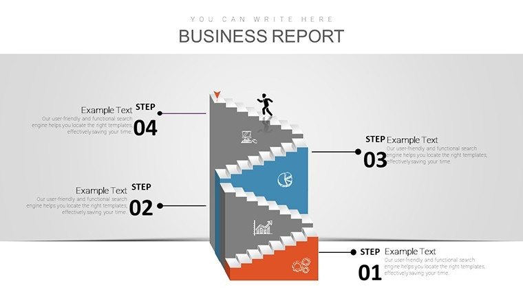
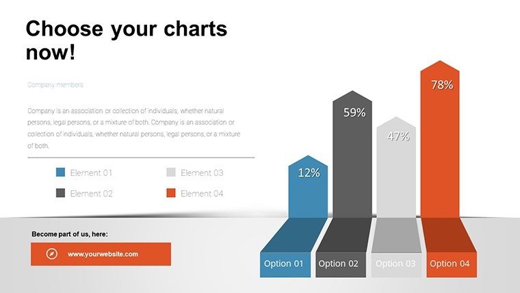
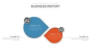
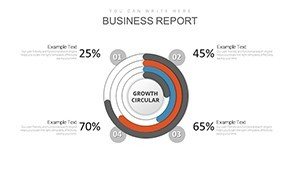
- Animated Chart Varieties: Bar, pie, line, and area charts with built-in animations that reveal data progressively.
- Customization Tools: Tweak colors, fonts, and layouts to fit your narrative, plus add hyperlinks for deeper dives.
- User-Centric Design: Intuitive interfaces that let even novices create pro-level slides in minutes.
- Data Visualization Enhancers: Incorporate tooltips, zoom features, and transitions for storytelling flair.
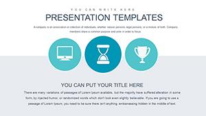
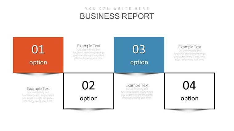
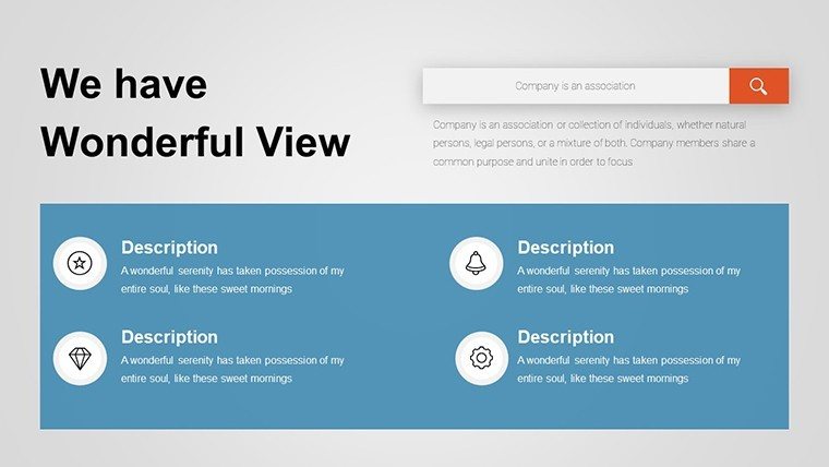
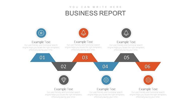
- Versatile Templates: Pre-set themes for corporate, educational, or creative uses, ensuring relevance across fields.
These elements draw from expert guidelines, such as those in Stephen Few's data viz books, emphasizing clarity over clutter. By avoiding overloaded designs, you build trust, showcasing data integrity that aligns with standards.
Diverse Applications That Drive Impact
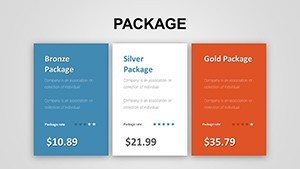
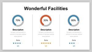
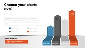
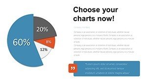
In corporate environments, envision using bar charts to compare quarterly metrics, with clicks unveiling breakdowns - ideal for securing buy-in during board meetings. Educators might employ pie charts in lessons on market shares, letting students interact to explore segments, enhancing comprehension as per Bloom's taxonomy.
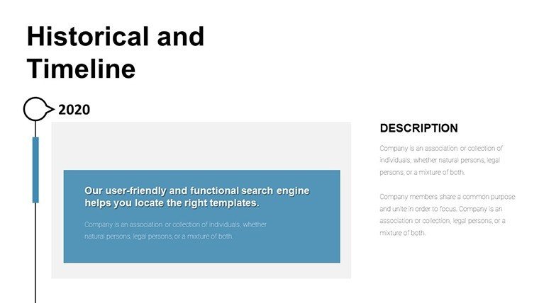
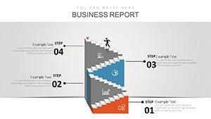
For trainers, area charts illustrate performance trends in workshops, with interactive layers revealing influencing factors. A notable case: A Fortune 500 company used similar tools to increase training efficacy, per a Gartner report, by making sessions more participatory. In marketing pitches, line graphs track campaign ROI, dynamically adjusting to scenarios, making your deck a conversation starter rather than a monologue.
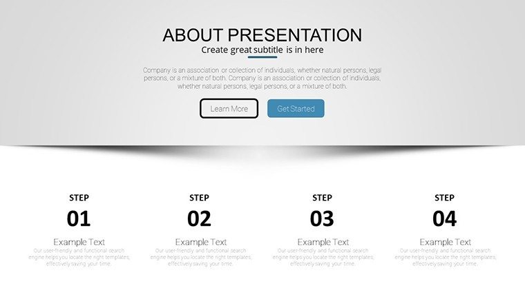
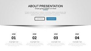
Customizing for Maximum Engagement: A Practical Workflow
- Select Your Chart: Choose from the library based on data type - bars for comparisons, lines for trends.
- Import Data: Link to Excel for real-time updates, ensuring accuracy.
- Add Interactivity: Apply animations and triggers for click-based reveals.
- Refine Aesthetics: Align with brand guidelines, test on different devices.
- Integrate Storytelling: Weave narratives around data points to guide audience focus.
- Rehearse and Deploy: Practice interactions to polish delivery.
This step-by-step integration outperforms basic slides, which lack depth, by offering immersive experiences that resonate long after the presentation ends.
Advantages Over Conventional PowerPoint Tools
While standard PowerPoint offers basics, this template elevates with pre-built interactivity, saving design time and reducing errors. Inspired by UX principles from Nielsen Norman Group, it prioritizes intuitive navigation, making complex data accessible. Benefits include heightened audience interaction, as interactivity can spike engagement rates, per e-learning studies.
In fields like healthcare training, interactive charts clarify patient outcome trends, fostering better protocols. LSI integration - terms like 'dynamic data displays' or 'audience-responsive visuals' - enhances discoverability, while internal links to analysis templates expand user journeys. Add alt texts to images, like "Interactive bar chart showing sales growth," for SEO and accessibility.
For CTR boosts, embed previews and subtle CTAs like "Click to explore trends," guiding users toward action.
Unlock Interactive Mastery Now
Dive into a world where data dances and stories unfold interactively. This template is your key to unforgettable presentations that inform and inspire. Customize it today and see the difference in engagement. Step up your game - your audience awaits.
Frequently Asked Questions
- What makes these charts interactive?
- Built-in animations and triggers allow clicks to reveal data layers, enhancing engagement beyond static views.
- Can I edit animations?
- Yes, fully customizable - adjust timing, effects, and sequences to suit your pace.
- Suitable for beginners?
- Absolutely, with intuitive tools that require no coding or advanced skills.
- Compatible with older PowerPoint versions?
- Works best with 2016+, but basic features function in earlier ones.
- How do I import external data?
- Easily link to Excel or paste directly for seamless updates.