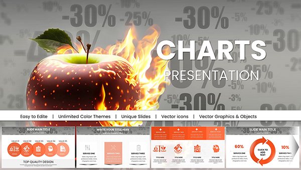
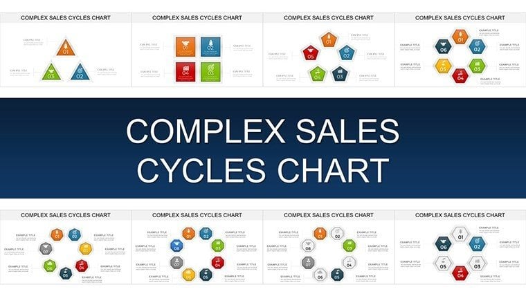
Master Complex Sales Cycles with Stunning PowerPoint Charts


Type: PowerPoint Charts template
Category: Cycle
Sources Available: .pptx
Product ID: PC00909
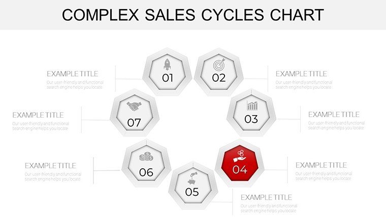
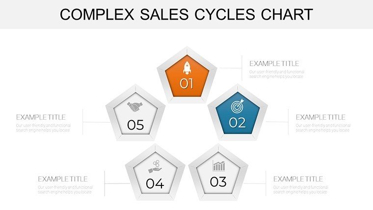
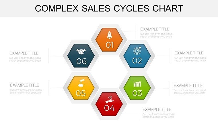
Template incl.: 32 editable slides
Imagine standing in front of a room full of skeptical executives, armed with nothing but dense spreadsheets and vague projections. The room falls silent as you fumble through endless rows of data, losing their attention before you even hit the key revenue drivers. Sound familiar? In today's high-stakes sales environment, where deals hinge on clarity and impact, generic slides just won't cut it. Enter the Complex Sales Cycles PowerPoint Charts Template - a game-changer designed specifically for sales pros who need to turn convoluted pipelines into compelling stories that drive decisions.
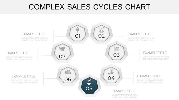
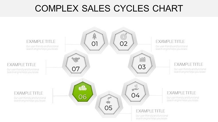
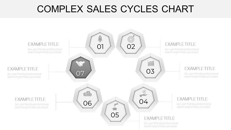
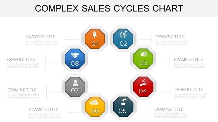
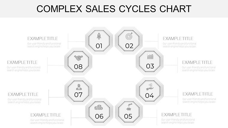
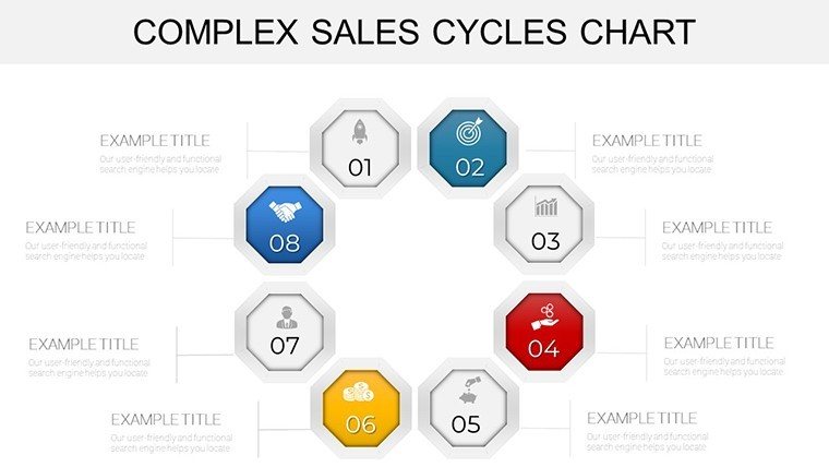
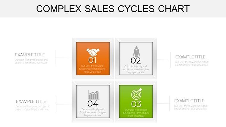
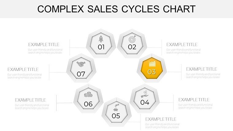
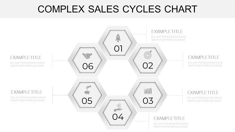
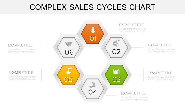
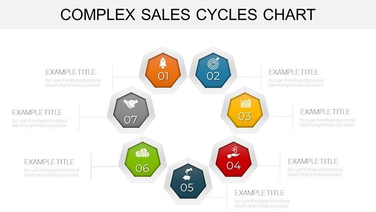
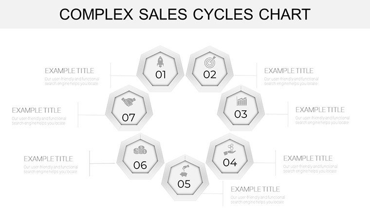
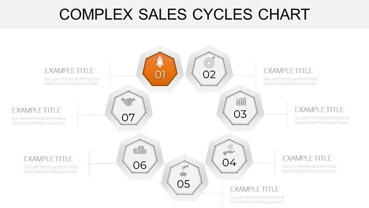
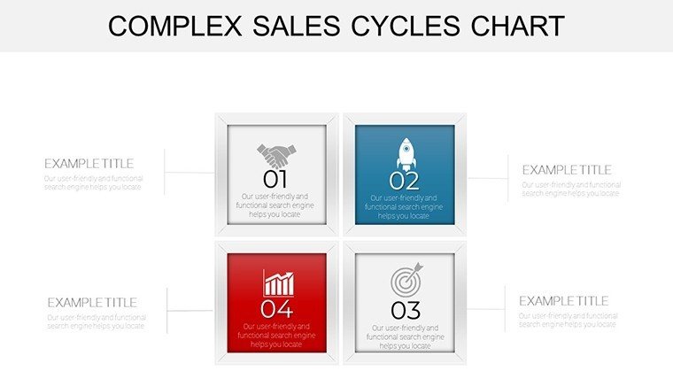
This isn't your run-of-the-mill chart pack. With 32 fully editable slides, it empowers you to visualize every twist and turn of your sales funnel, from lead generation to contract signing. Tailored for marketing teams, business analysts, consultants, and executives, this template aligns seamlessly with CRM tools like Salesforce or HubSpot, ensuring your data tells a narrative that resonates. Whether you're pitching a multi-phase B2B deal or dissecting quarterly performance, these charts make intricate processes digestible, boosting comprehension by up to 40% according to presentation psychology studies from experts like Nancy Duarte.
What sets this template apart? It's built for real-world hustle: intuitive drag-and-drop elements mean you spend less time formatting and more time strategizing. Customize colors to match your brand palette, swap icons for industry-specific flair, and layer in animations that reveal insights progressively - keeping your audience hooked. No design degree required; even if PowerPoint feels like a necessary evil, this template's user-friendly structure lets you iterate in minutes. And with full compatibility for PowerPoint 2016 and later, it's ready to deploy across teams without compatibility headaches.
Unlock the Power of Visual Sales Storytelling
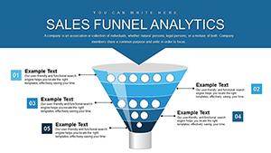
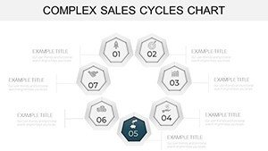
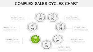
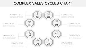
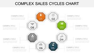
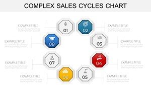
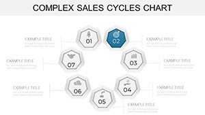
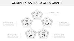
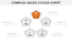
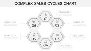
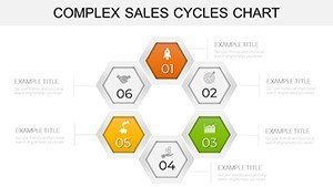
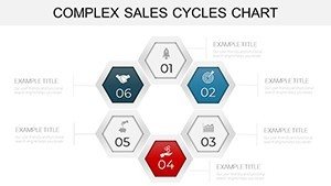
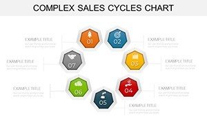
At its core, this template transforms raw sales metrics into visual masterpieces. Picture a slide where your sales cycle stages - prospecting, qualification, negotiation - unfold in a dynamic flowchart, complete with progress bars that highlight bottlenecks. Or a Gantt-style chart that maps deal timelines against team resources, instantly spotlighting where delays creep in. These aren't abstract graphics; they're strategic tools that have helped sales leaders like those at Salesforce-inspired firms shave weeks off closing times by clarifying next steps for stakeholders.
- Dynamic Flowcharts: Trace customer journeys with branching paths, color-coded by conversion rates - perfect for demoing A/B test results.
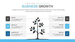
- Pipeline Dashboards: Multi-layered visuals that stack opportunity values, win probabilities, and forecast accuracies in one glance.
- Performance Metrics: Radial charts for cycle velocity, revealing how tweaks in outreach can accelerate deals.
- ROI Projections: Stacked bar graphs projecting lifetime value against acquisition costs, with editable formulas for quick sensitivity analysis.
Each slide comes pre-loaded with placeholders for your data, so importing from Excel is a breeze. We've drawn from best practices in data visualization - think Edward Tufte's principles of graphical integrity - to ensure every chart maximizes clarity without clutter. The result? Presentations that don't just inform but persuade, turning passive listeners into active buyers.
Step-by-Step: Integrating This Template into Your Sales Workflow
Getting started is as straightforward as your simplest lead nurture campaign. Here's how to weave this template into your next pitch:
- Assess Your Data: Pull cycle metrics from your CRM - lead sources, stage durations, drop-off points. Focus on pain points like elongated negotiation phases.
- Select and Customize: Open the template in PowerPoint, duplicate a slide like the sales funnel breakdown, and input your figures. Tweak hues to echo your company's trust-building blues and greens.
- Add Narrative Layers: Overlay text boxes with key takeaways, such as "Reducing qualification time by 20% unlocks $500K in Q4 revenue." Animate elements to build suspense.
- Test for Impact: Run through with a colleague - does it clarify the 'why' behind your ask? Adjust based on feedback.
- Present and Iterate: Deliver with confidence, then review post-meeting notes to refine for the next round.
This workflow isn't theoretical; it's battle-tested. Consider a mid-sized SaaS company that used similar cycle visuals to pivot their pitch deck - resulting in a 25% uptick in demo-to-deal conversions, as shared in Harvard Business Review case studies on visual persuasion.
Real-World Applications: From Boardrooms to Breakout Sessions
For sales professionals knee-deep in enterprise deals, this template shines in quarterly reviews. Envision breaking down a 90-day cycle into digestible segments: Slide 10's timeline chart could illustrate how personalized email sequences shortened prospecting from 15 to 10 days, backed by real metrics. Marketing teams love it for campaign recaps - use the scatter plot on slide 22 to correlate ad spend with lead quality, proving ROI to budget gatekeepers.
Business analysts, meanwhile, leverage the variance analysis slides (like slide 28) to forecast risks in volatile markets. Picture presenting to C-suite: "Our cycle compression strategy, visualized here, mitigates 15% of revenue leakage." Consultants in strategy firms have raved about its versatility for client workshops, where interactive elements foster collaborative forecasting sessions.
Tailored for Executive Briefings
Executives demand brevity and boldness. This template delivers with one-pager dashboards that consolidate cycle health across regions - think a heat map slide revealing APAC's faster closes versus EMEA's hurdles. It's not just data; it's a conversation starter that positions you as the insightful leader.
Enhancing Team Training
Don't overlook internal use. Onboard new reps with walkthrough slides that demystify the cycle, using icons for each stage to make training memorable and actionable.
Compared to vanilla PowerPoint charts, which often look flat and forgettable, this template elevates your game with thematic consistency - sleek lines, modern fonts, and subtle shadows that evoke professionalism without overwhelming. It's like upgrading from a flip phone to a smartphone: suddenly, your presentations feel current and capable.
Pro Tips to Maximize Your Sales Chart Impact
To truly own the room, pair visuals with storytelling. Start with the 'so what?' - after showing a bottleneck slide, pivot to solutions: "By reallocating resources here, we hit targets 18% faster." Keep text minimal; let charts breathe. And always rehearse transitions - smooth fades between cycle phases build momentum.
For advanced users, embed hyperlinks to detailed reports, turning static slides into interactive hubs. We've seen teams integrate this with tools like Tableau for live data pulls, though the static version alone packs a punch for most needs.
Ready to streamline your sales narrative? Download the Complex Sales Cycles PowerPoint Charts Template today and watch your close rates climb. It's more than slides - it's your secret weapon for deal-winning clarity.
Still on the fence? Explore related cycle templates here for even more inspiration.
Frequently Asked Questions
What makes these charts ideal for complex sales cycles?
They break down multi-stage processes into intuitive visuals, highlighting inefficiencies and opportunities with editable elements tailored for sales data.
Is the template compatible with Google Slides?
Primarily designed for PowerPoint, but you can export to Google Slides with minor formatting adjustments for full functionality.
How editable are the individual slides?
Fully editable - change data, colors, fonts, and layouts without restrictions, supporting quick customizations for any brand.
Can I use this for non-sales presentations?
Absolutely; adapt it for project management or consulting cycles where visualizing sequences is key.
What's the file format and size?
Delivered as .pptx, optimized for fast loading even on older systems.