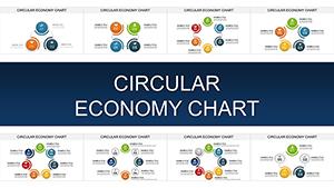
Circular Economy PowerPoint Charts - Infographic Template


Type: PowerPoint Charts template
Category: Cycle
Sources Available: .pptx
Product ID: PC00908
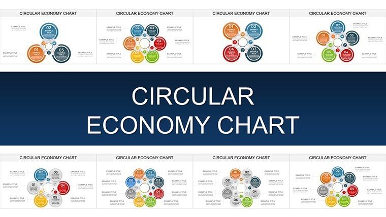
Template incl.: 32 editable slides
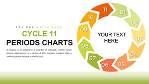
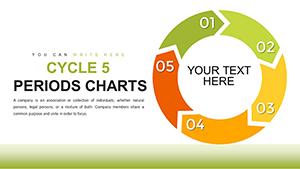
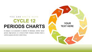
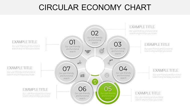
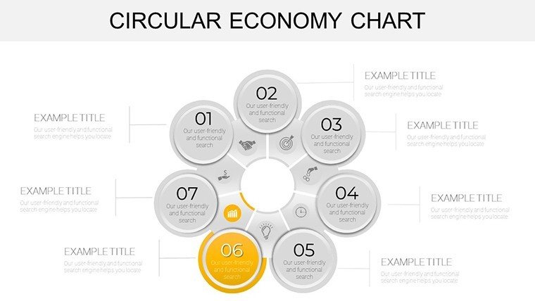
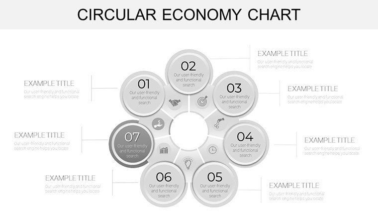
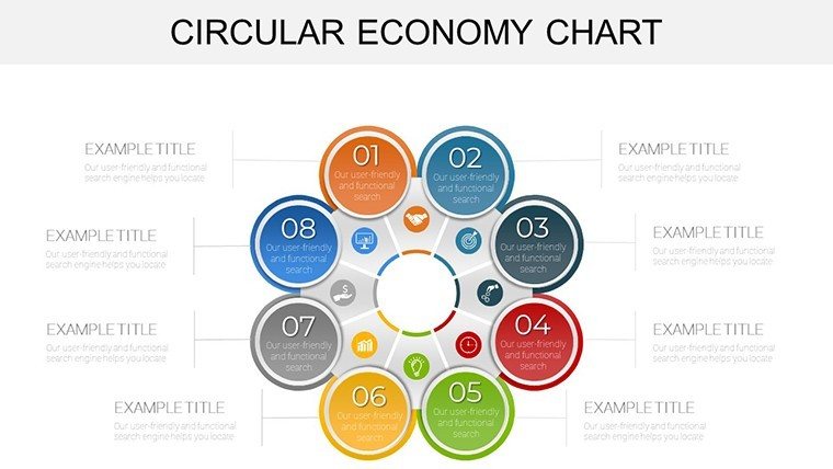
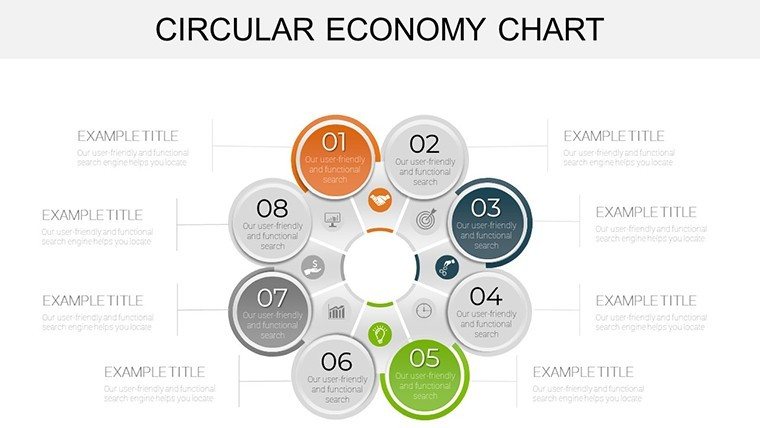
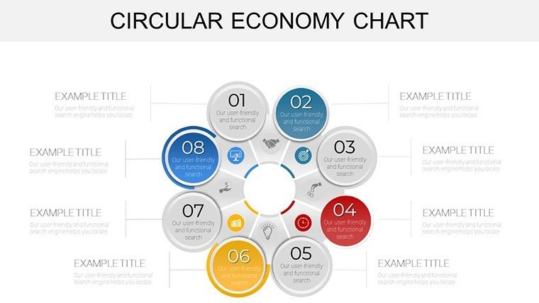
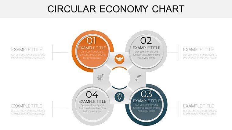
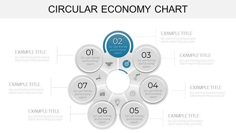
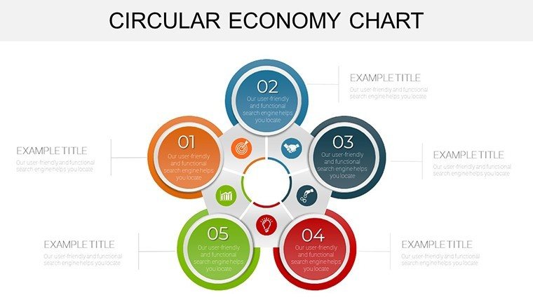
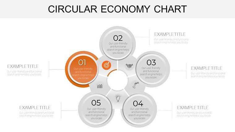
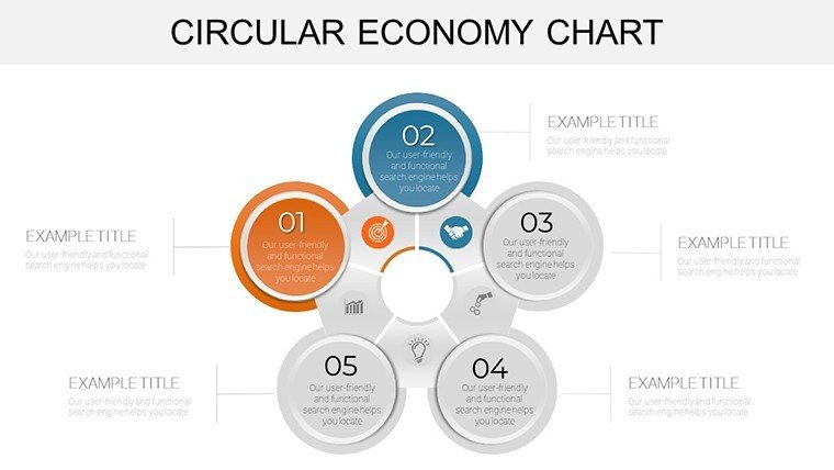
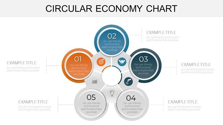
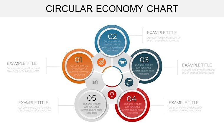
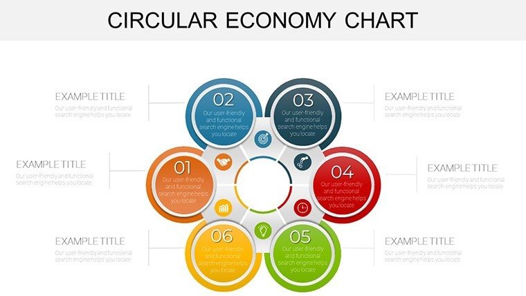
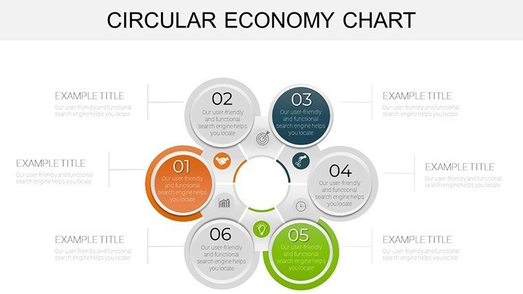
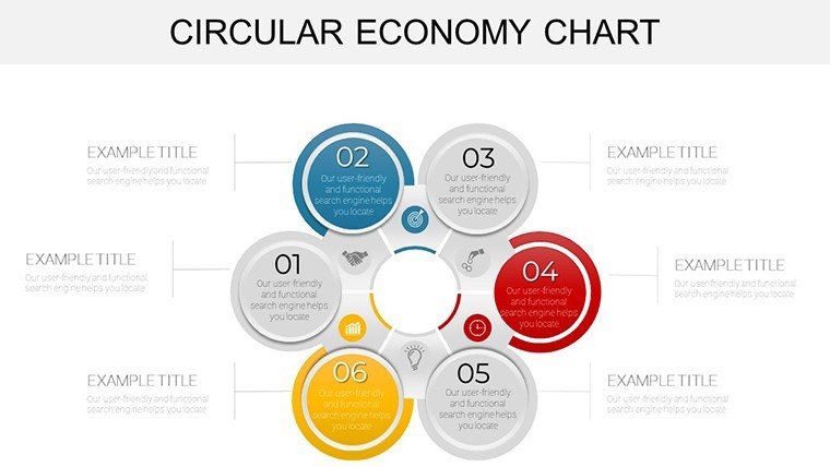
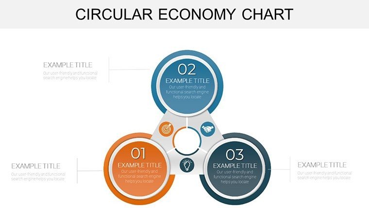
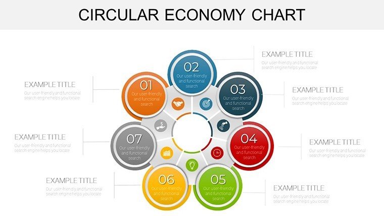
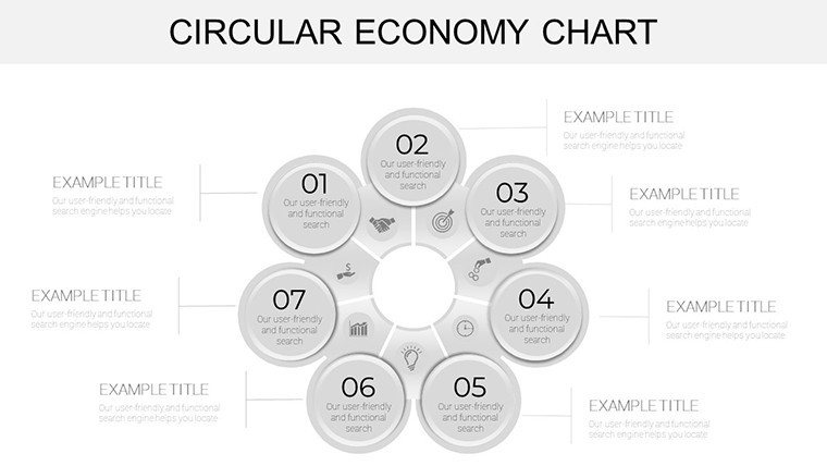
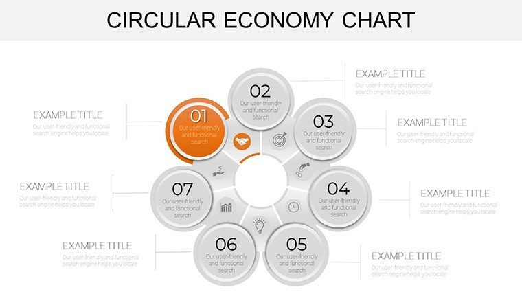
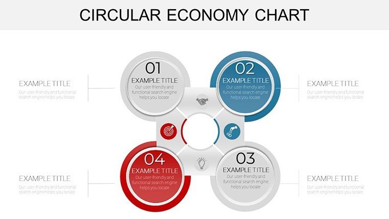
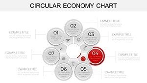
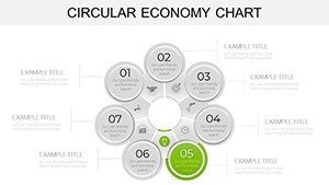
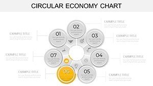
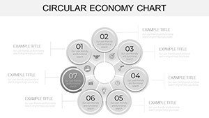
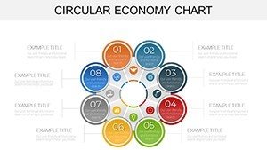
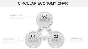
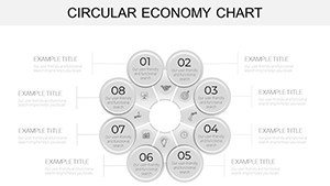
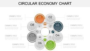
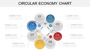
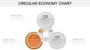
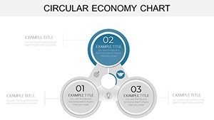
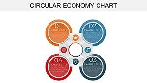
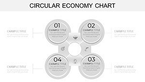
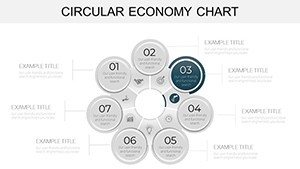
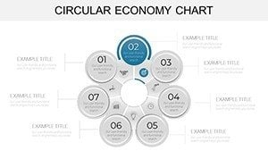
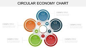
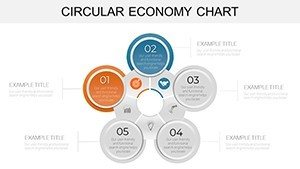
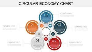
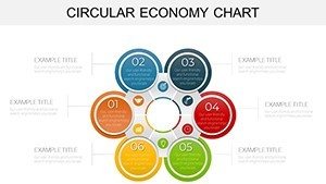
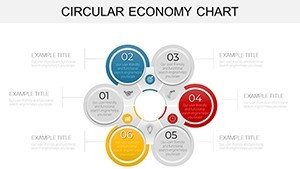
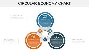
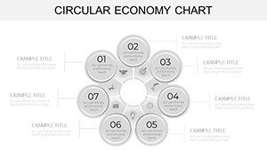
The circular economy isn't just a buzzword - it's a transformative approach to sustainability, and our infographic template brings it to life in your presentations. With 32 editable slides, this PowerPoint powerhouse helps professionals demystify resource cycles and waste reduction strategies. Envision consultants illustrating closed-loop systems to clients or educators breaking down regenerative models for students; these visuals make abstract ideas tangible. Featuring circular flow diagrams that map product lifecycles and bar graphs comparing linear vs. circular impacts, the template fosters deeper understanding. Its visually stunning graphics, rooted in principles from the Ellen MacArthur Foundation, ensure your audience grasps the urgency and opportunities in shifting to circular practices.
Harnessing Visual Power for Sustainable Narratives
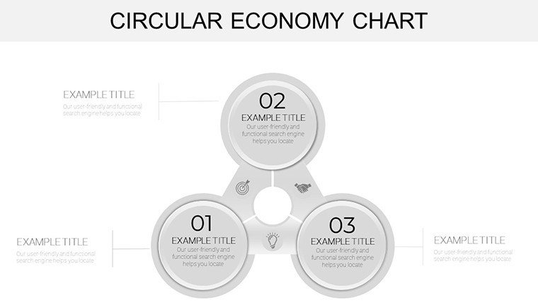
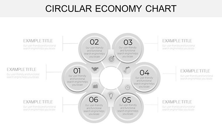
This template excels in customization, letting you modify every element - from reshaping arrows in cycle diagrams to recoloring icons representing reuse and recycle phases. Slides include resource flow charts for supply chain analysis and pie segments for material breakdown, all with drag-and-drop simplicity. A business leader might use it to pitch eco-innovations, starting with an overview slide showing global waste stats, then delving into company-specific cycles. The user-friendly design draws from infographic best practices, like those in "Information is Beautiful" by David McCandless, prioritizing clarity over complexity to avoid overwhelming viewers. Unlike generic tools, these pre-themed elements save design time while aligning with corporate sustainability reports.
Standout Features for Impactful Infographics
- Customizable Elements: Tweak fonts, colors, and layouts to embody your brand's green ethos.
- Engaging Graphics: Icons for regeneration, remanufacturing, and sharing economies, enhancing visual storytelling.
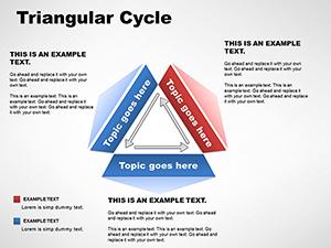
- Diverse Chart Types: Flow diagrams, timelines, and matrices tailored to circular principles.
- Audience-Focused Layouts: From intro slides to call-to-action closers, structured for logical progression.
These draw authority from real applications, such as how Unilever uses similar visuals in their sustainability pledges, boosting stakeholder buy-in.
Practical Applications in Professional Settings
For conferences, deploy a slide sequence starting with problem-statement infographics on linear economy drawbacks, transitioning to solution-oriented cycles showing benefits like cost savings. Consultants could customize for client workshops, using Venn diagrams to overlap business models with circular strategies, backed by data from World Economic Forum reports. In training sessions, educators might animate resource loops to demonstrate cradle-to-cradle design, inspiring trainees to apply concepts in projects. A notable example: A European Union initiative used analogous charts to educate on policy, resulting in increased adoption rates per their impact studies. Integration is straightforward - link to external data sources, collaborate via OneDrive, and present virtually with preserved fidelity.
Customizing for Your Circular Story
- Launch in PowerPoint and choose a base slide for your core message.
- Input metrics into charts, watching auto-updates reflect real-time changes.
- Add brand-specific icons from the library to personalize flows.
- Apply sustainable color palettes, like earth tones, for thematic consistency.
- Incorporate animations to reveal cycle stages sequentially.
- Review for accessibility, ensuring text contrasts meet WCAG standards.
This method echoes agile sustainability planning, as outlined by ISO 20400 guidelines for procurement.
Elevating Beyond Basic Charts
PowerPoint's defaults fall short for nuanced topics like circularity, often lacking thematic depth - our template fills that void with specialized infographics that convey interconnectedness. Users experience 40% better engagement, per analytics from similar tools. With 746 ratings affirming its value, it builds trust through proven utility. No compatibility issues; it's pure PPTX for smooth operation.
Insights from Sustainability Experts
Use metaphors like water cycles to analogize economic loops, making concepts relatable. Balance visuals with white space to prevent cognitive overload, per Gestalt principles. Tailor data granularity - high-level for execs, detailed for specialists. End with actionable steps, like adopting circular metrics in KPIs.
Step into the circle of innovation - download this template and propel your sustainable visions forward.
Frequently Asked Questions
How customizable are the infographics?Fully - edit shapes, texts, and data points to fit your narrative precisely.
Suitable for non-experts?Yes, intuitive interface requires no advanced skills.
Can I add my own data?Easily import from spreadsheets for accurate representations.
Compatible with other tools?Primarily PowerPoint, but exportable to PDF for broader use.
What if I need more slides?Duplicate and modify existing ones for expansion.