Analysis of Business Needs PowerPoint Charts: Infographic Mastery


Type: PowerPoint Charts template
Category: Relationship, Analysis
Sources Available: .pptx
Product ID: PC00869
Template incl.: 34 editable slides
Navigating the complexities of business requires tools that clarify rather than confuse. Enter the Analysis of Business Needs PowerPoint Charts Template, an infographic powerhouse with 34 editable slides dedicated to dissecting relationships and analyses. Tailored for analysts, consultants, marketers, and educators, it transforms dense data into digestible visuals. From mapping stakeholder needs to evaluating operational efficiencies, this template uses professional infographics to spotlight key insights. With easy customization options for colors, layouts, and data elements, it's inspired by analytical frameworks from sources like Harvard Business Review, promoting strategic thinking. Compatible with PowerPoint and Google Slides, it empowers you to create presentations that not only present facts but also propel forward-thinking discussions, making it indispensable for today's data-driven landscapes.
Essential Features for In-Depth Analysis
This template's features are geared toward comprehensive business scrutiny. It includes a range of infographics: flowcharts for process relationships, matrices for need assessments, and dashboards for holistic views. Customization allows tweaking elements to fit specific datasets, with vector-based designs ensuring scalability. The intuitive setup facilitates quick edits, from font changes to icon swaps. Unlike standard slides, it offers layered analyses, enabling users to build upon basics for nuanced interpretations. Marketers appreciate its branding flexibility, while analysts value the data accuracy tools like built-in calculators for on-slide computations.
Slide Structure and Highlights
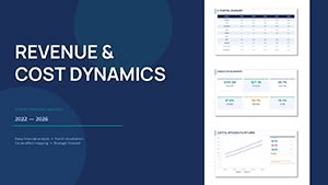
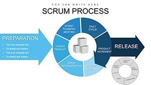
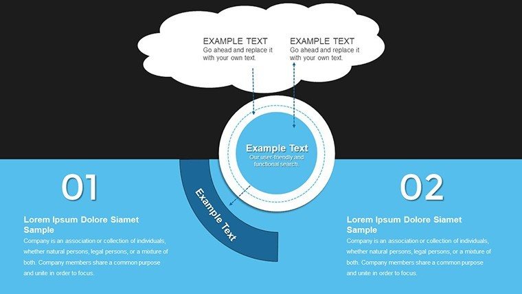
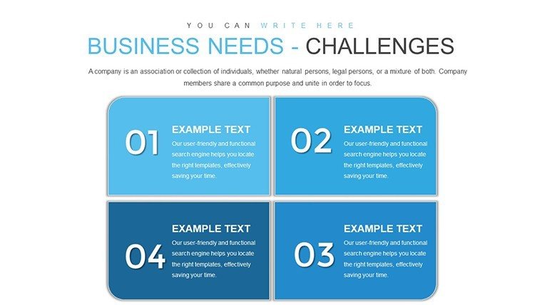
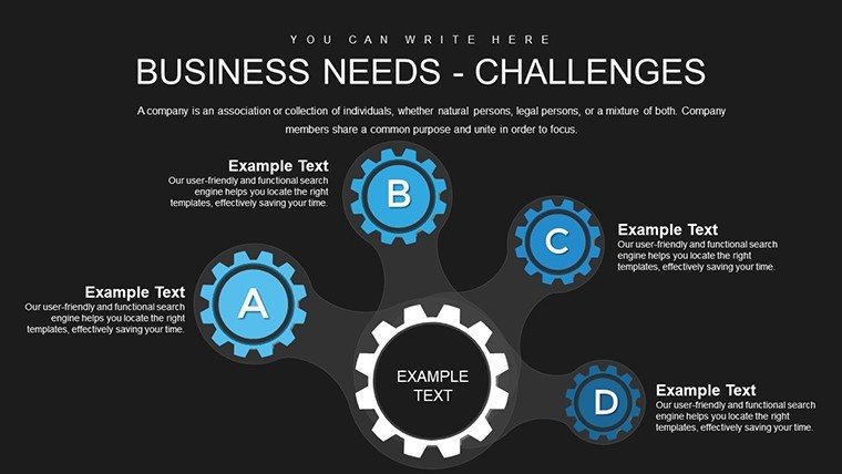
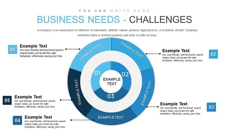
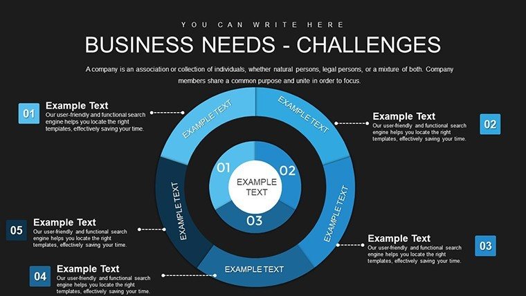
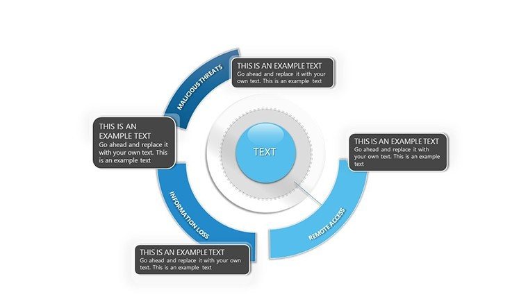
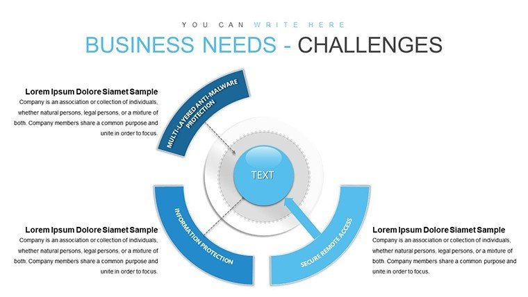
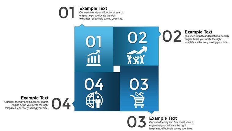
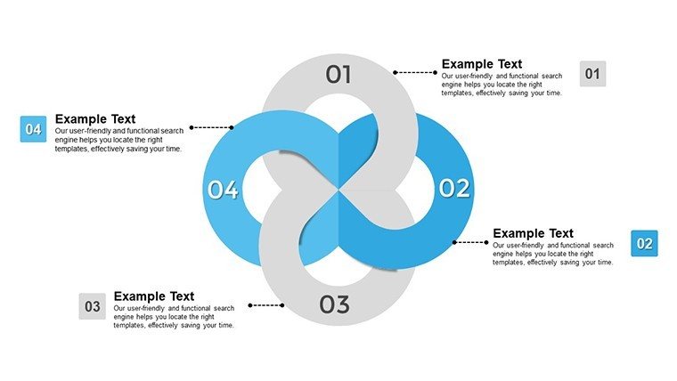
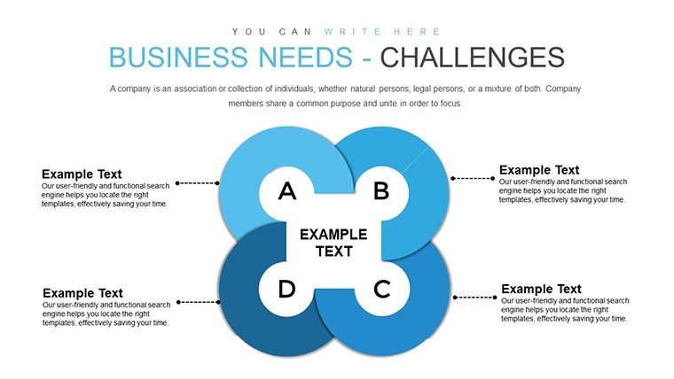
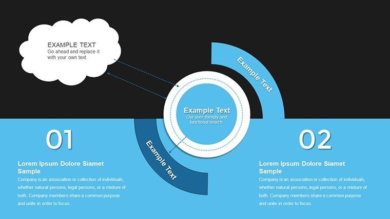
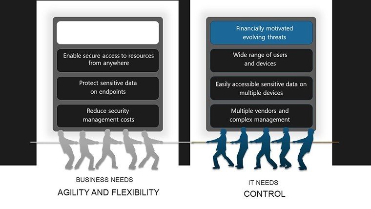
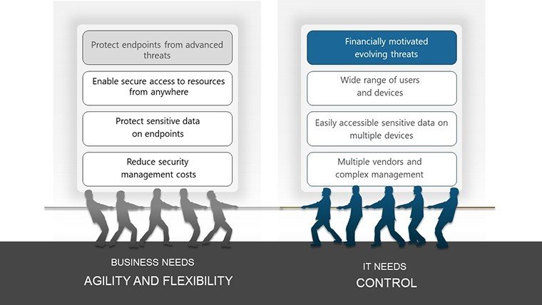
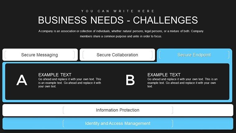
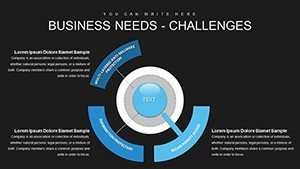
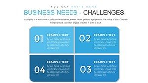
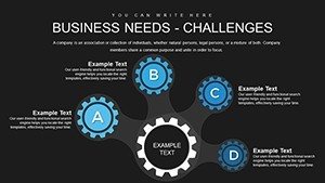
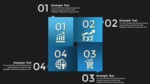
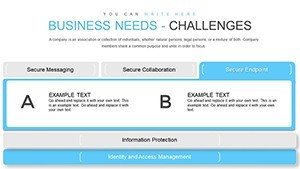
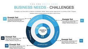
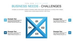
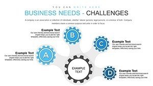
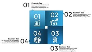
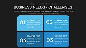
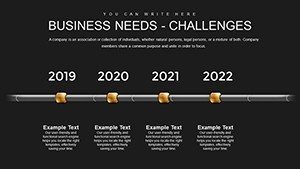
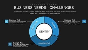
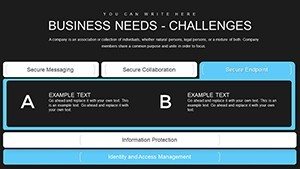
Slides are categorized for logical progression. Front-end slides (#1-10) handle basic relationships, such as Slide #4's network diagram for stakeholder mappings. Core analysis slides (#11-24) delve deeper, with Slide #16's SWOT infographic integrating quantitative metrics. Wrapping up (#25-34) are synthesis slides, like #29's dashboard compiling multiple analyses into one view. Uniform design with thematic colors and icons ensures cohesion, enhancing professional delivery.
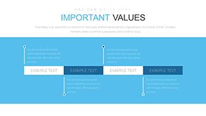
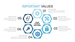
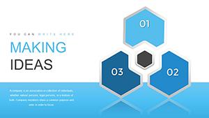
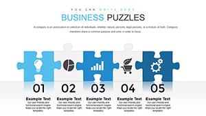
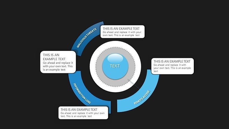
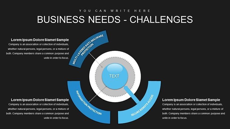
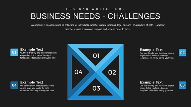
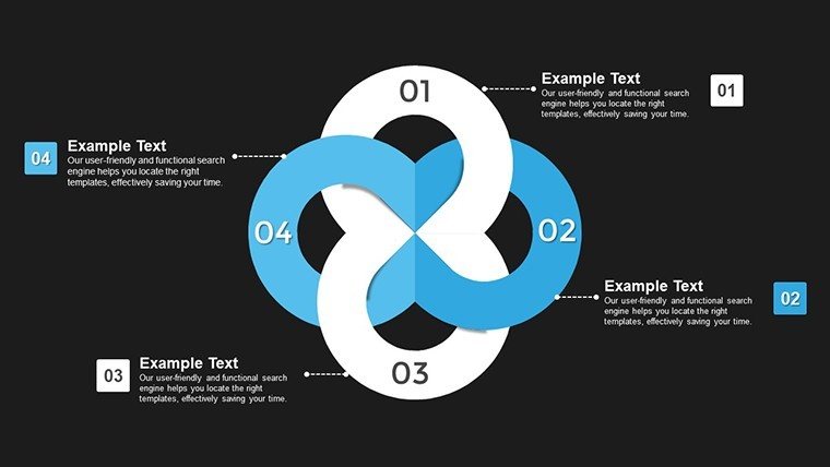
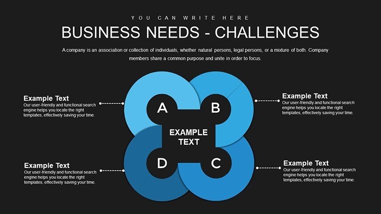
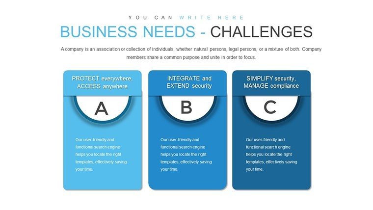
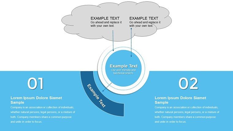
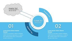
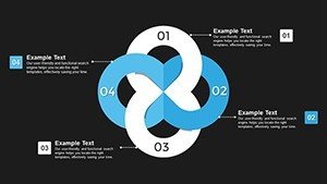
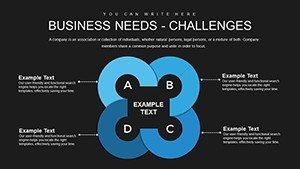
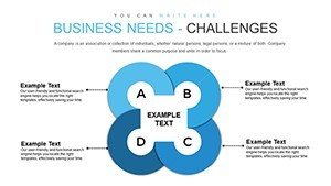
- Relationship Infographics: Map connections between business elements with editable nodes.
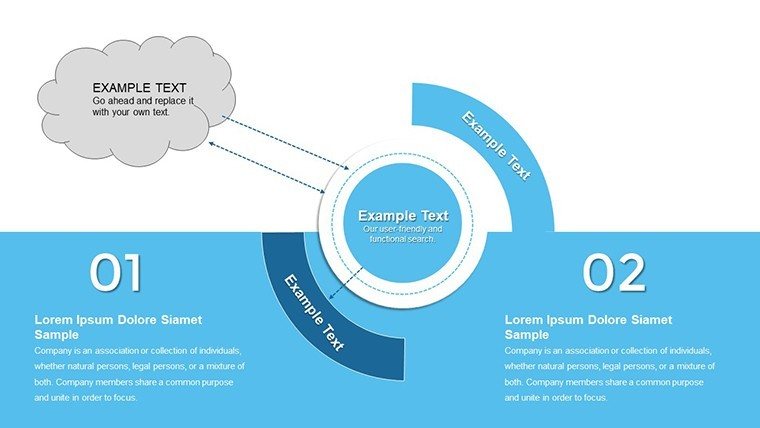
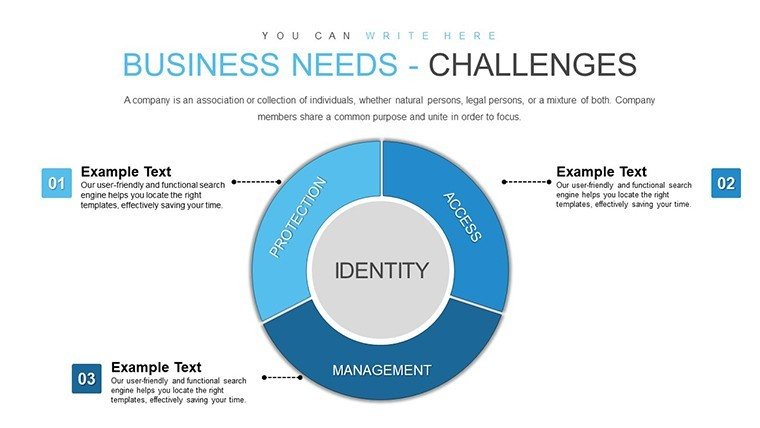
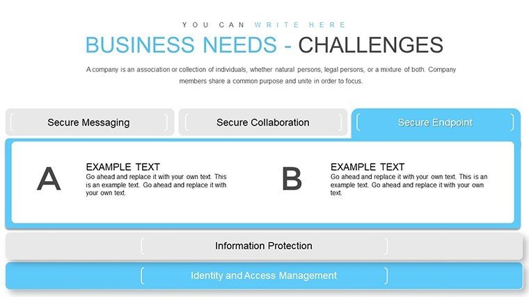
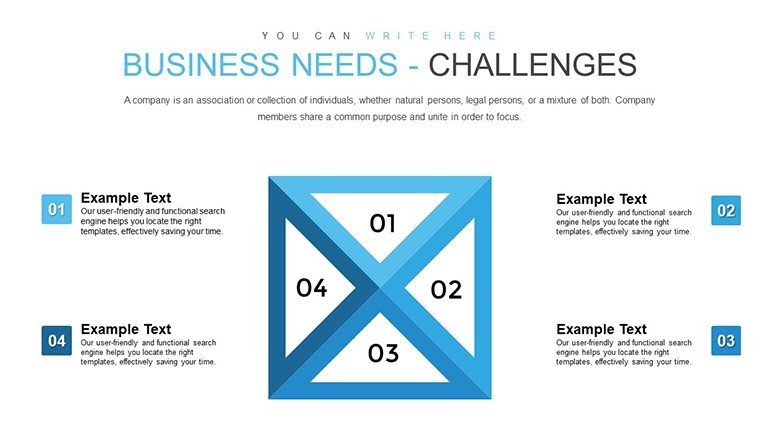
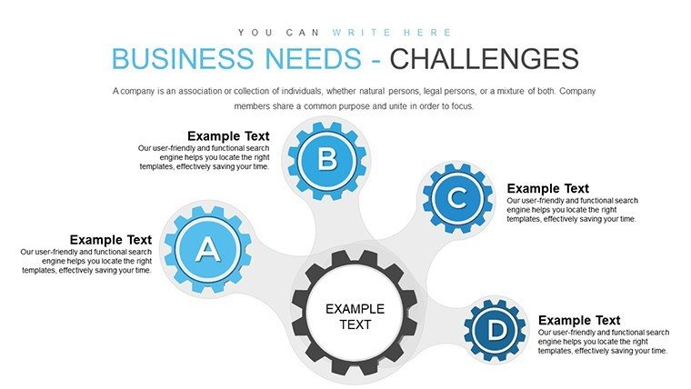
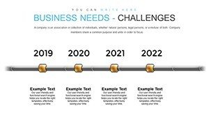
- Analysis Matrices: Evaluate needs through grids and charts for strategic planning.
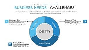
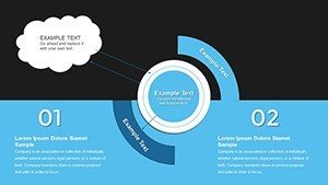
- Dashboard Overviews: Aggregate data for at-a-glance insights.
Targeted Use Cases and Strategic Benefits
Apply this template where analysis meets action. In sales pitches, use relationship charts to demonstrate client fit, echoing techniques from top CRM strategies. Annual reports benefit from infographic summaries that highlight performance trends, aiding stakeholder buy-in. Marketers can analyze campaign needs via matrices, optimizing resource allocation. Benefits include clearer communication, reducing misinterpretations; accelerated insights, speeding decisions; and enhanced credibility through visually backed arguments. Real-world examples from consulting giants show such tools streamline audits, leading to cost savings and innovation.
Optimizing Your Analytical Workflow
- Initate Download: Secure the .pptx and launch in software.
- Data Incorporation: Fill infographics with your metrics using easy inputs.
- Design Tailoring: Adjust visuals to emphasize key findings.
- Layer Analyses: Build complex views from simple bases.
- Finalize and Share: Review for impact and distribute.
This method aligns with lean analysis practices, maximizing efficiency.
Advanced Tips for Business Infographics
Draw from experts: Prioritize hierarchy in designs - bold key needs for emphasis. Use color gradients to denote priority levels in matrices. Limit elements per slide to five for focus. Integrate real-time data links for dynamic updates. Solicit peer reviews to refine clarity. These approaches, validated in business intelligence forums, ensure your infographics not only inform but influence.
Empower your analyses with infographics that reveal the unseen. Acquire this template today and redefine how you approach business needs.
Frequently Asked Questions
How detailed are the infographics?
Highly detailed with layers for in-depth breakdowns and summaries.
Compatible with collaboration tools?
Yes, works great in shared environments like Google Slides.
Suitable for beginners in analysis?
Definitely, with guided placeholders and simple edits.
Can I export to other formats?
Yes, easily export to PDF or images for broader use.
What themes are covered?
Business relationships, needs assessments, and strategic analyses.
Refund policy?
Satisfaction guaranteed with easy returns if needed.