Analytical Pyramid PowerPoint Charts Template


Type: PowerPoint Charts template
Category: Analysis
Sources Available: .pptx
Product ID: PC00845
Template incl.: 51 editable slides
In an era where data reigns supreme, the ability to distill complex information into digestible visuals is a superpower. Our Analytical Pyramid PowerPoint Charts Template equips you with just that, featuring 51 editable slides tailored for unveiling hierarchies, performance metrics, and strategic insights. Whether you're a business analyst breaking down market trends or an educator illustrating conceptual frameworks, this template turns raw data into persuasive narratives that captivate and convince.
Envision leading a boardroom session where your pyramid charts effortlessly layer information from broad overviews to granular details, mirroring the logical flow of decision-making processes. Inspired by proven analytical models like the MECE principle from McKinsey consulting, this tool helps you avoid overlaps and gaps, ensuring your presentations are as sharp as they are insightful. Professionals using similar structured visuals often see enhanced audience retention, with studies from Gartner indicating up to 30% better comprehension in data-heavy talks.
Standout Features for Data Mastery
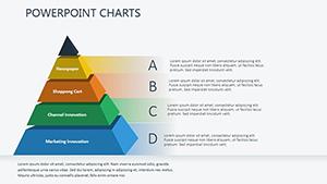
This template stands out with its pyramid-centric design, perfect for representing layered data. All 51 slides are in .pptx format, compatible across PowerPoint, Google Slides, and Keynote, allowing seamless collaboration. Smooth transitions and animations add dynamism, making your presentations not just seen but felt.
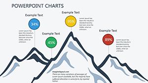
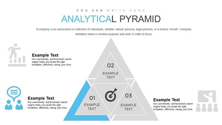
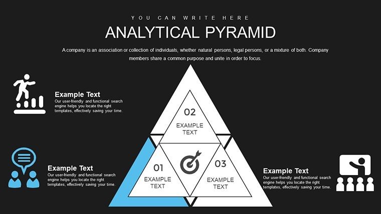
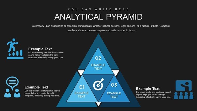
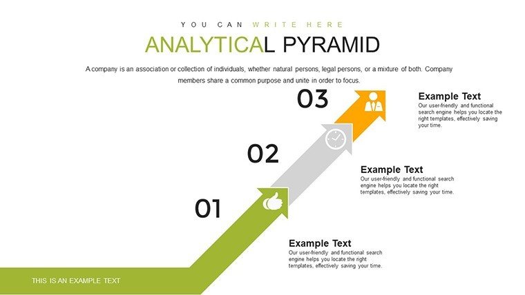
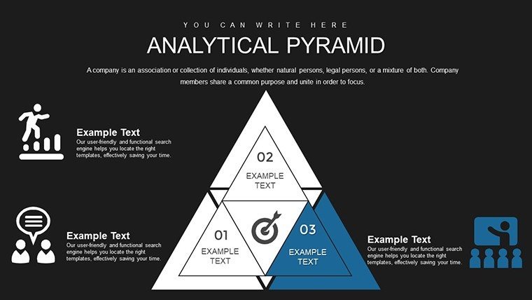
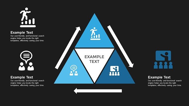
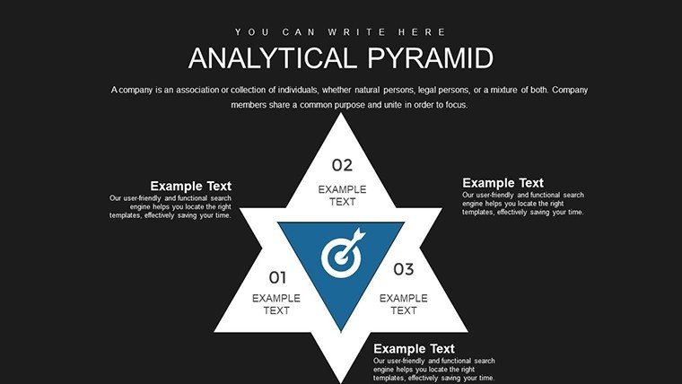
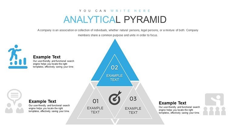
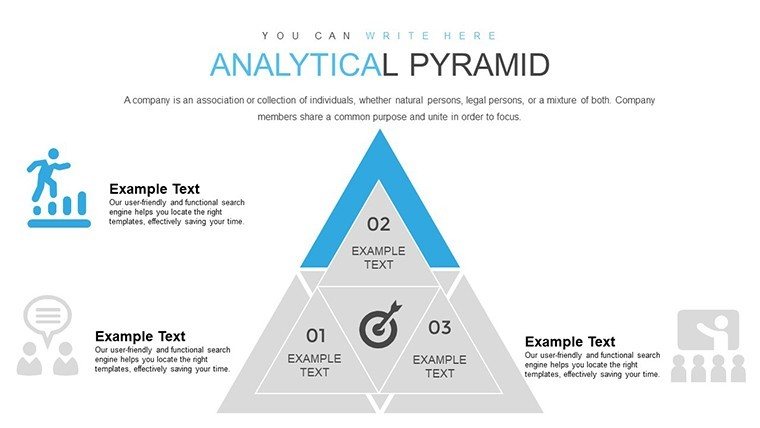
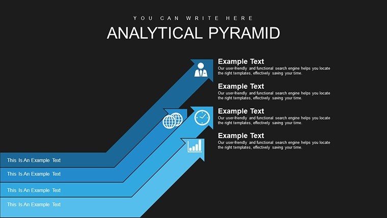
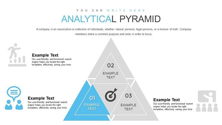
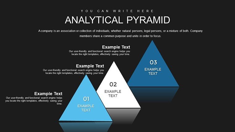
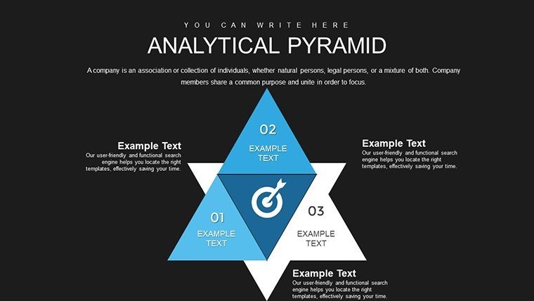
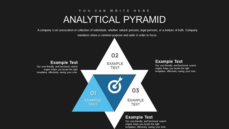
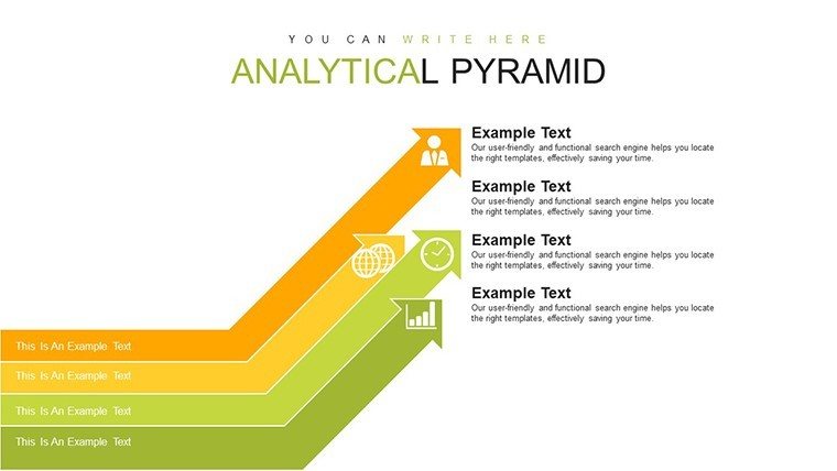
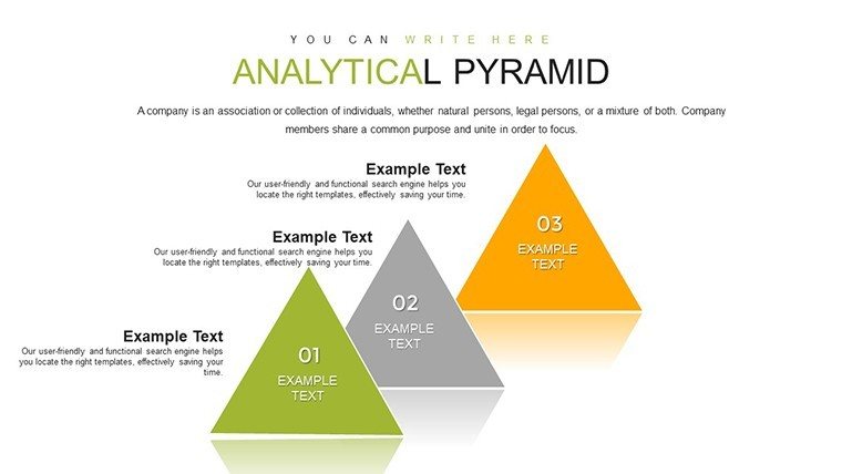
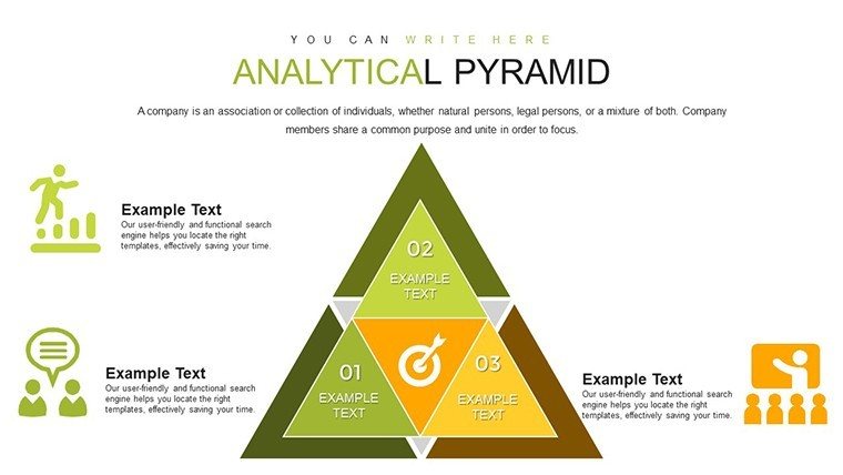
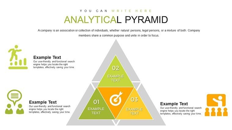
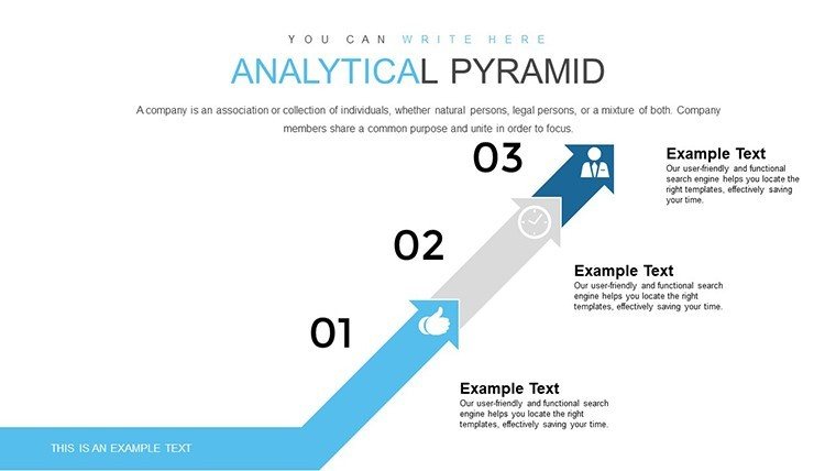
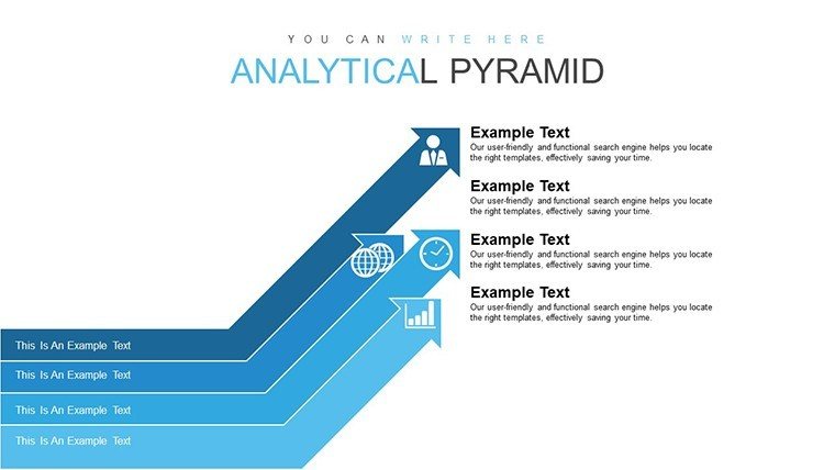
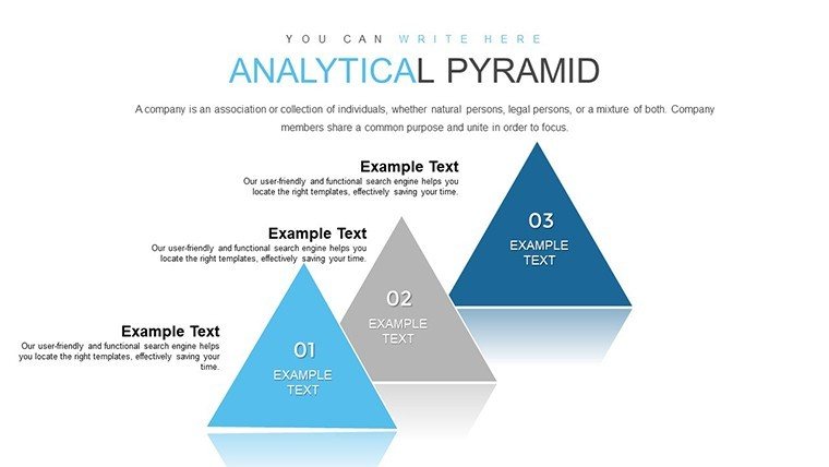
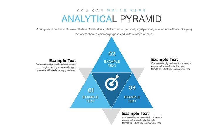
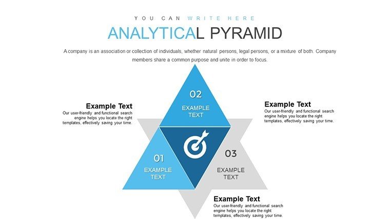
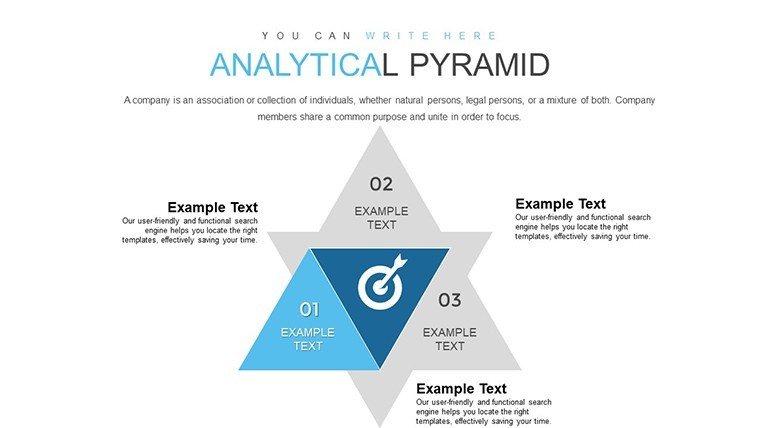
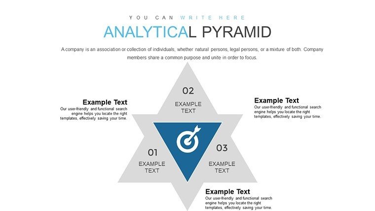
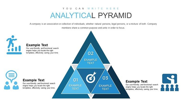
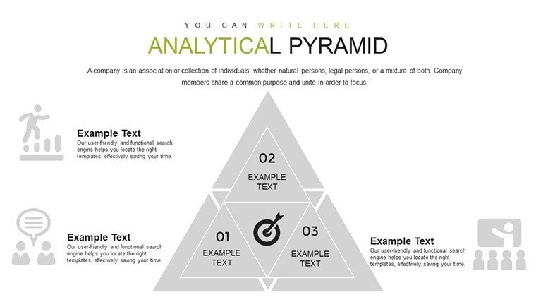
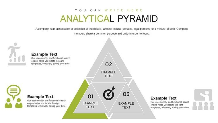
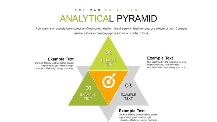
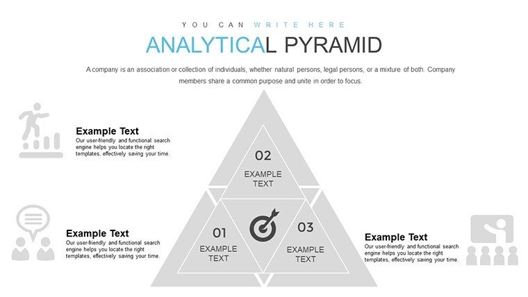
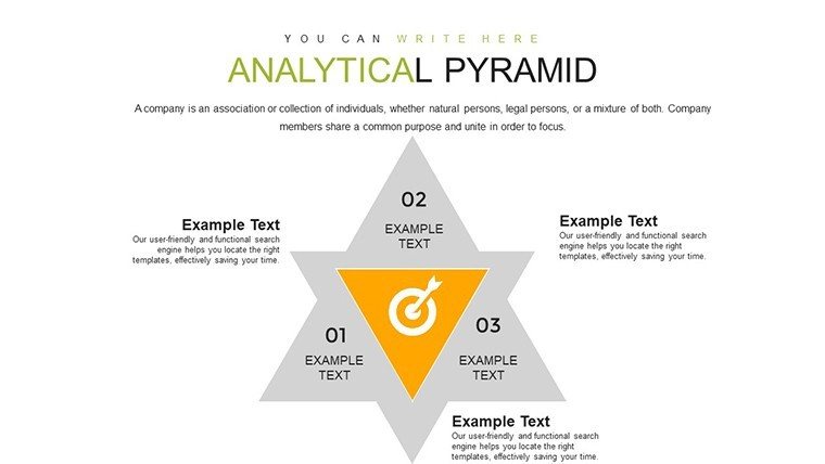
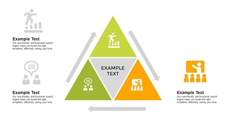
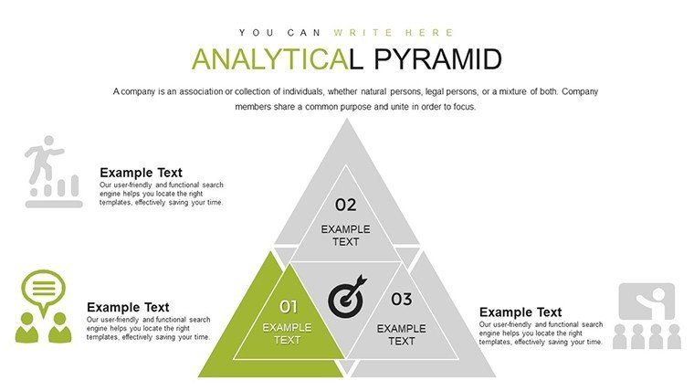
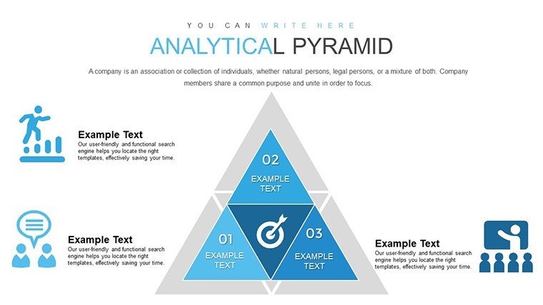
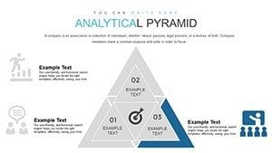
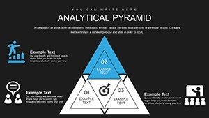
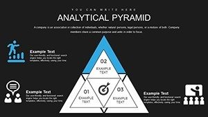
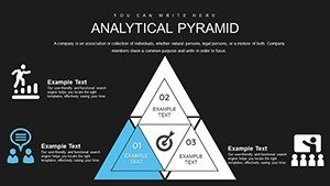
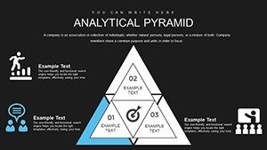
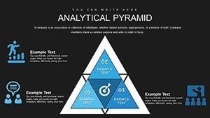
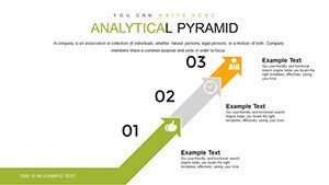
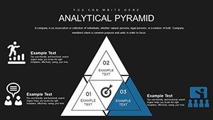
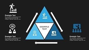
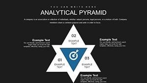
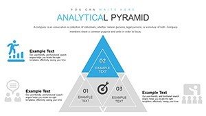
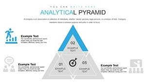
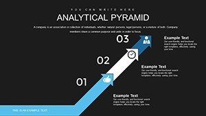
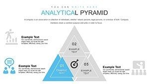
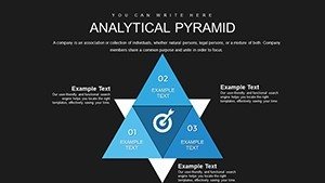
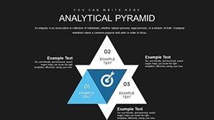
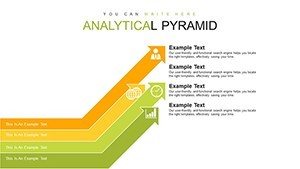
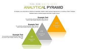
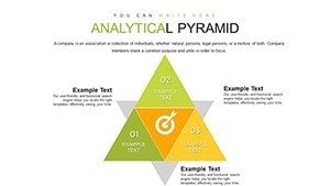
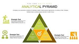
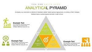
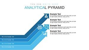
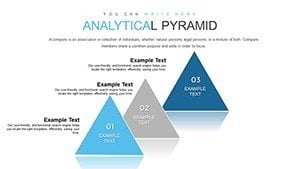
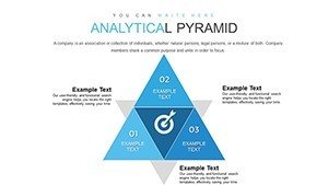
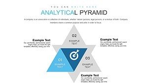
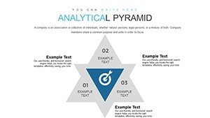
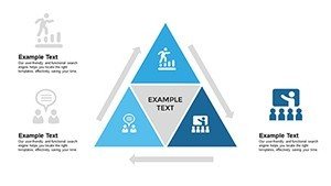
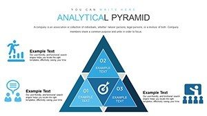
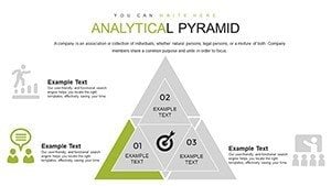
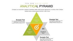
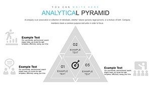
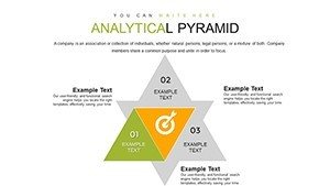
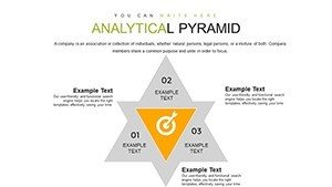
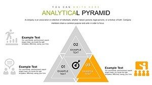
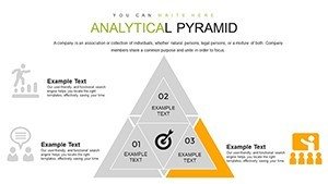
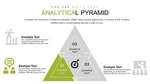
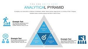
- Hierarchical Pyramids: Build multi-level charts to show breakdowns like sales funnels or organizational structures.
- Customization Freedom: Alter shapes, colors, and text to align with your branding, with easy data import from Excel.
- Interactive Elements: Embed hyperlinks and tooltips for deeper exploration during Q&A sessions.
- Professional Polish: Pre-set themes ensure consistency, saving time while elevating aesthetic appeal.
Unlike standard PowerPoint pyramids that lack depth, this version includes advanced layering options, enabling comparisons like year-over-year metrics without starting from scratch.
In-Depth Slide Exploration
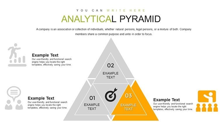
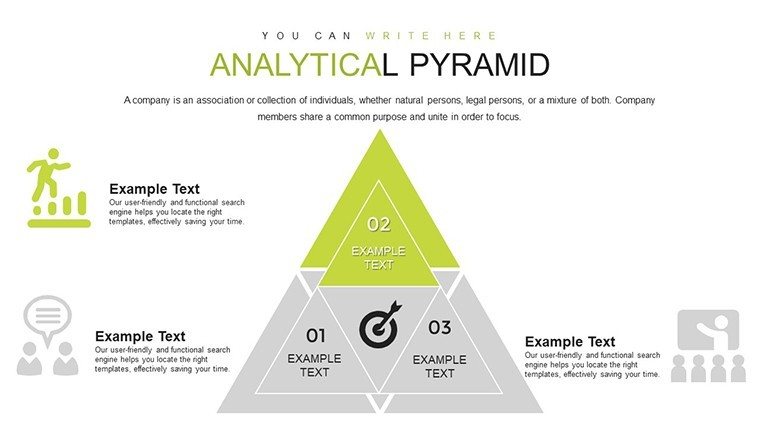
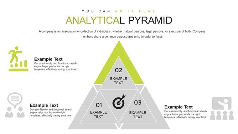
The template opens with introductory slides for setting the stage - pyramids outlining problem statements or objectives. Slides 10-20 delve into core analysis: Segmented pyramids for KPI breakdowns and inverted ones for root-cause diagnostics. Further in, find comparative charts on slides 30-40, ideal for benchmarking against competitors.
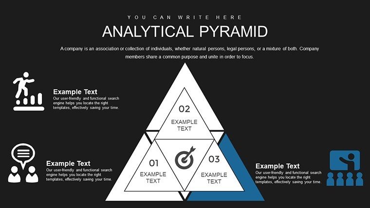
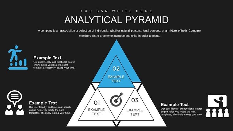
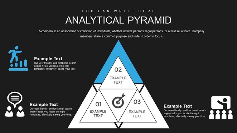
Concluding slides offer summary pyramids that synthesize findings, complete with callout boxes for key takeaways. For instance, slide 25 might display a strategy pyramid where base layers represent foundational data, ascending to actionable recommendations at the top.
Practical Use Cases Across Industries
From marketing campaigns to academic lectures, this template adapts effortlessly. A consultant might use it to present client recommendations, layering from market analysis to implementation steps, as seen in real-world successes like Deloitte's strategy decks. Startups pitching to investors can visualize growth trajectories, highlighting scalable models that secure funding.
- Performance Review Workflow: Input metrics into slide 15's pyramid, analyze layers in slide 20, and propose fixes in slide 25.
- Educational Module Building: Structure lessons with base concepts at the bottom, advancing to applications at the peak.
- Campaign Analysis: Map out ROI hierarchies, from awareness metrics to conversion rates.
For educators, integrate it with learning management systems; for analysts, pair with BI tools like Tableau for hybrid visuals.
Pro Tips to Amplify Your Analysis
Enhance impact by limiting layers to 5-7 per pyramid to maintain focus, per cognitive load theory. Use color gradients for progression emphasis, and always test animations for smooth playback. Referencing authoritative sources like the Pyramid Principle by Barbara Minto, prioritize top-down communication for persuasive power.
Weave in related terms like data hierarchy diagrams or metric visualization tools to enrich content without forcing keywords, solving user challenges like overwhelming datasets through structured clarity.
Transform Data into Decisions Now
Don't let insights stay buried - grab this Analytical Pyramid PowerPoint Charts Template and lead with confidence. Your next breakthrough presentation awaits.
Frequently Asked Questions
Are the pyramid charts fully customizable?
Yes, adjust levels, colors, and data inputs to suit your specific analytical needs.
Does it support animations for presentations?
Absolutely, with built-in transitions to make your data reveals engaging and dynamic.
Is this suitable for non-business uses like education?
Definitely - educators love it for illustrating concepts in a layered, memorable way.
How many levels can a pyramid have?
Up to 10, but we recommend 5-7 for optimal clarity and impact.
Can I import data from spreadsheets?
Yes, seamless integration with Excel for quick updates.
What makes it better than default PowerPoint tools?
It offers pre-designed hierarchies and interactivity not found in basics.