Comparative Analysis of Life Cycle PowerPoint Charts Template


Type: PowerPoint Charts template
Category: Cycle, Business Models
Sources Available: .pptx
Product ID: PC00832
Template incl.: 24 editable slides
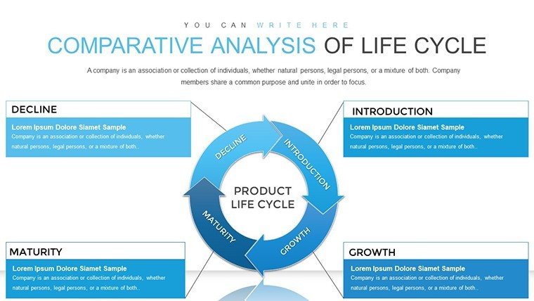
In today's fast-paced business environment, conveying complex processes through clear, compelling visuals is essential. Whether you're mapping out a product's journey from inception to market or outlining project phases in a construction endeavor, our Comparative Analysis of Life Cycle PowerPoint Charts Template stands out as a versatile tool. With 24 fully editable slides, this template empowers professionals across industries to transform raw data into narrative-driven presentations. Imagine captivating your audience with seamless comparisons of life cycles, highlighting efficiencies and potential pitfalls without overwhelming them with text-heavy slides.
This template isn't just about charts; it's about storytelling. Designed for ease of use in PowerPoint or Google Slides, it features intuitive layouts that adapt to your needs. Business analysts can dissect operational workflows, while educators simplify learning curves for students. Even in fields like architecture, where visualizing building life cycles - from conceptual design to sustainable decommissioning - can make or break a pitch, these charts provide the clarity needed to align stakeholders. The result? Presentations that not only inform but inspire action, saving you hours of design time and elevating your professional edge.
Unlock the Features of Our Life Cycle Charts
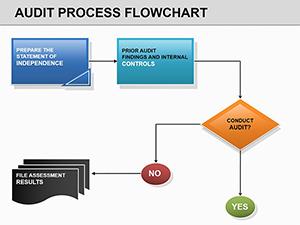
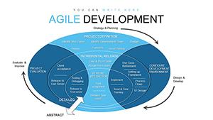
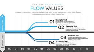
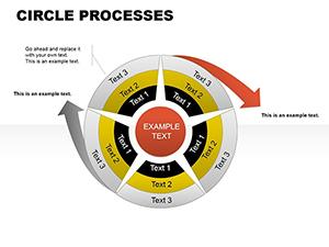
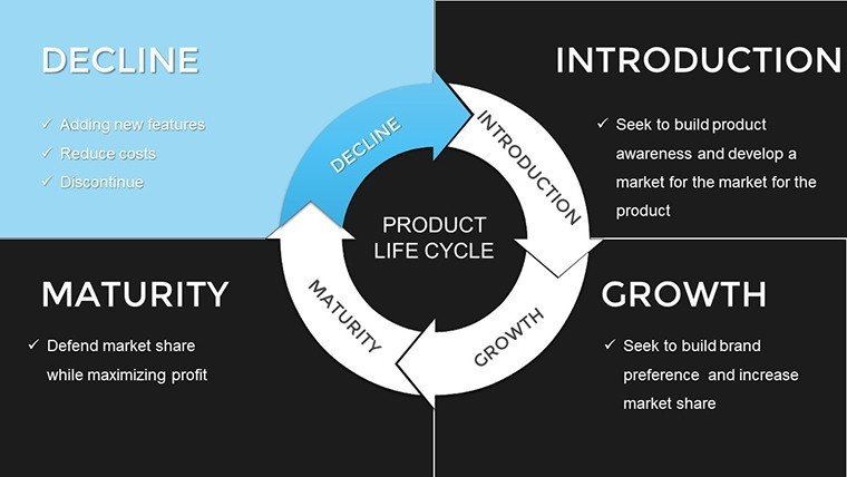
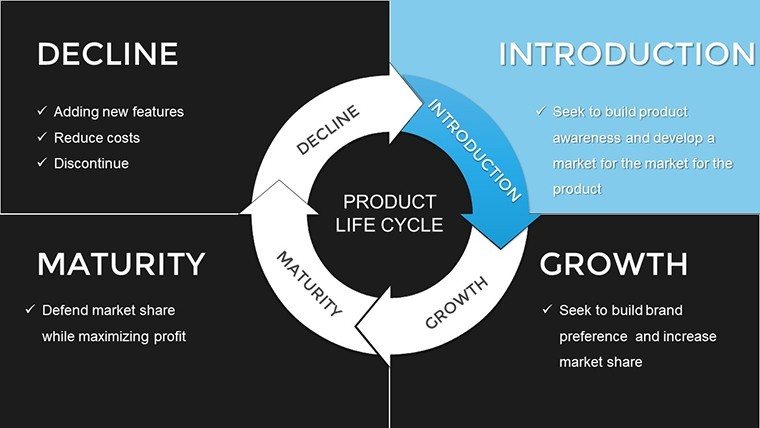
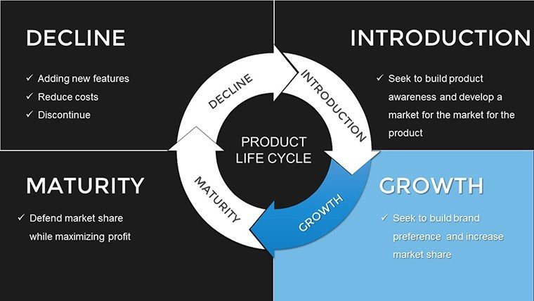
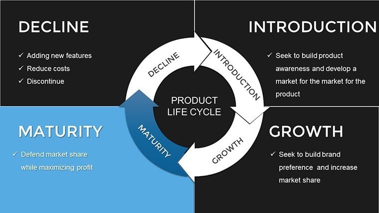
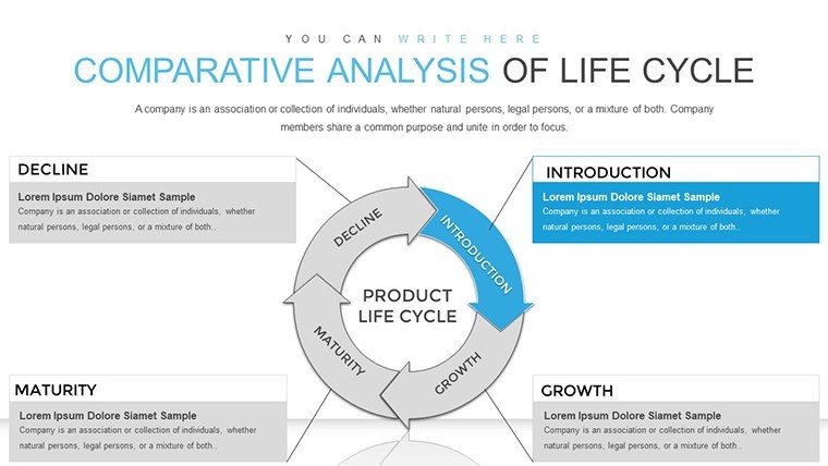
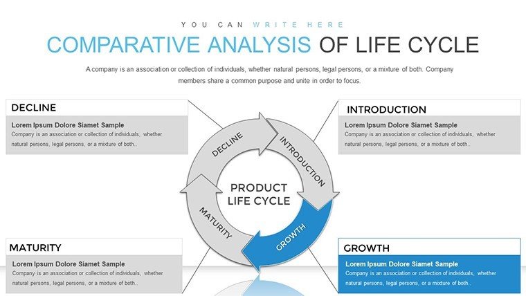
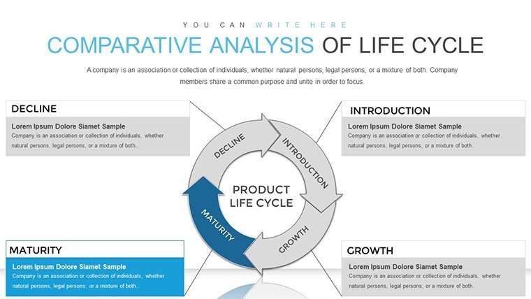
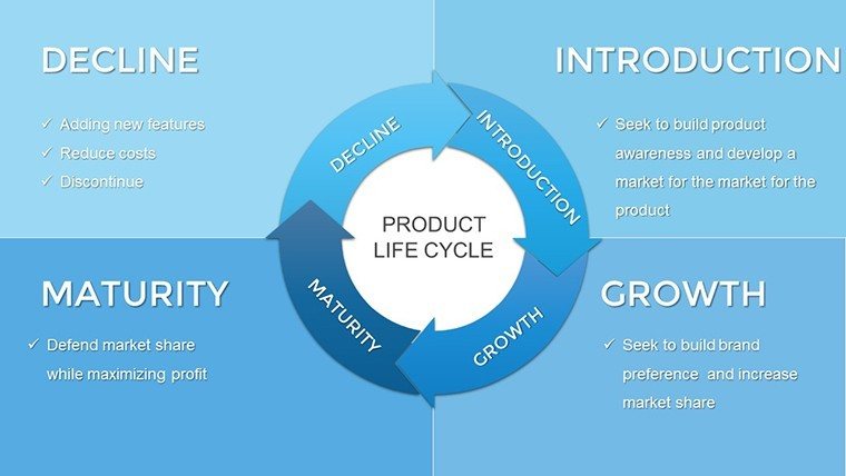
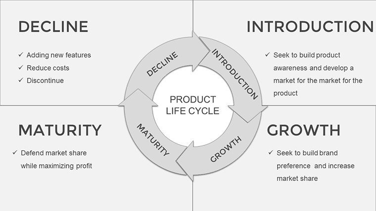
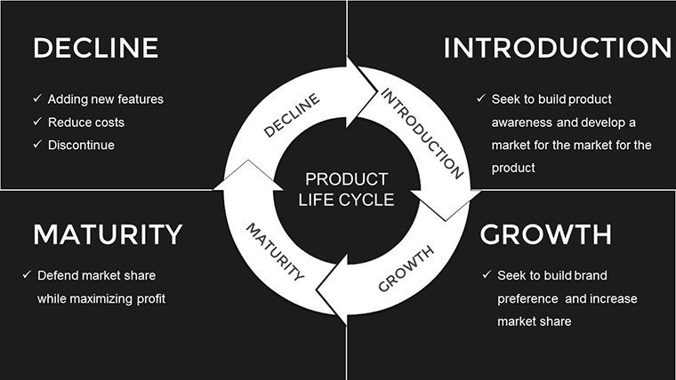
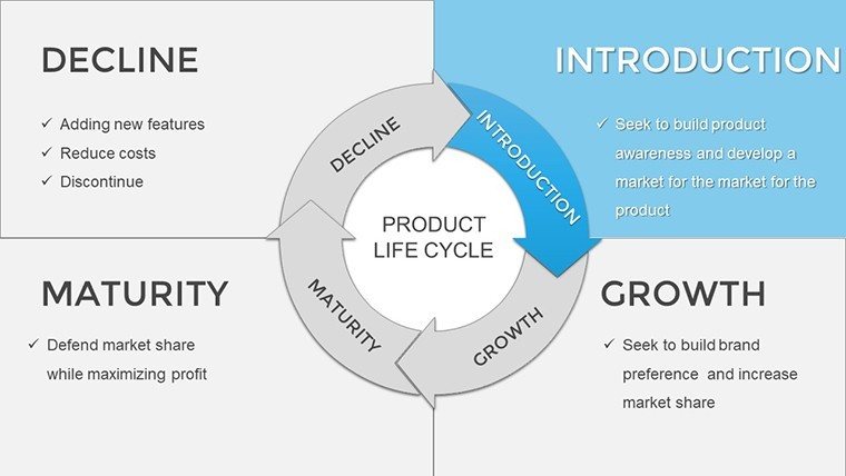
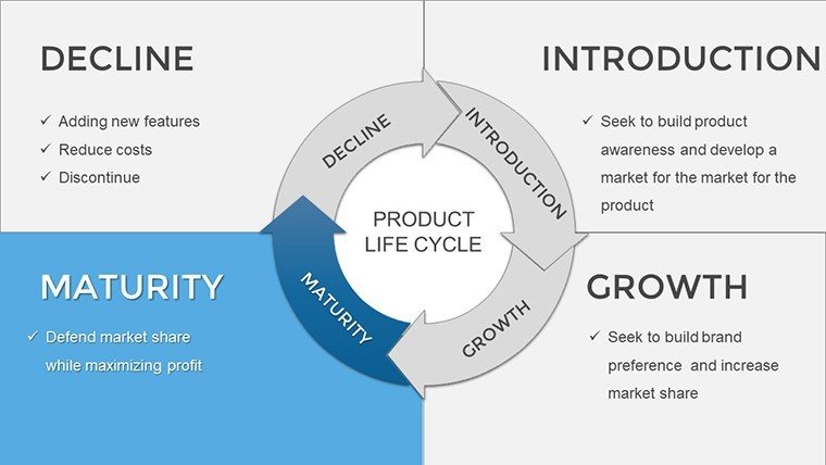
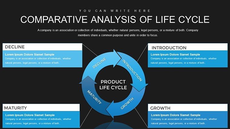
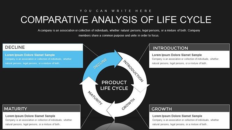
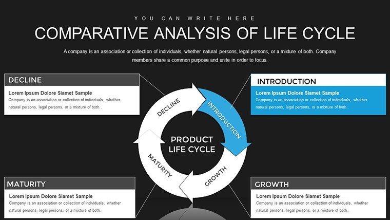
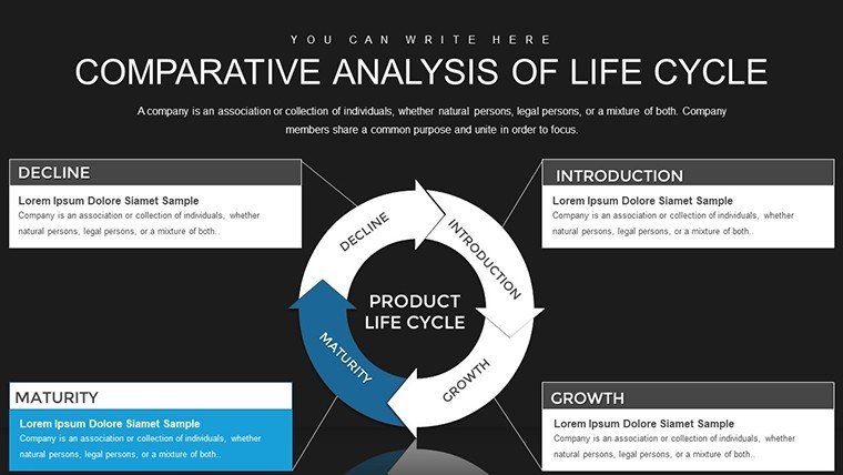
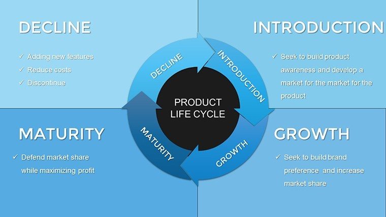
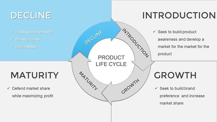
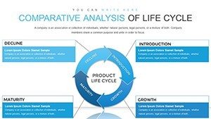
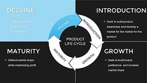
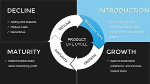
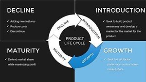
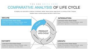
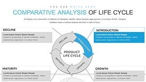
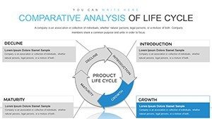
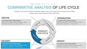
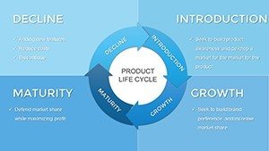
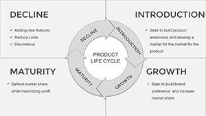
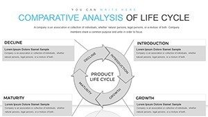
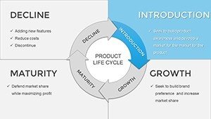
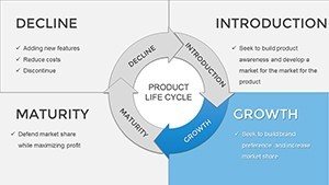
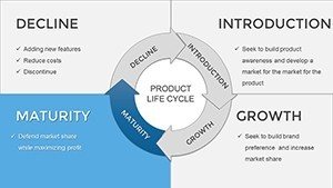
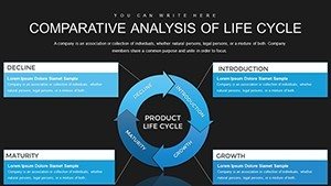
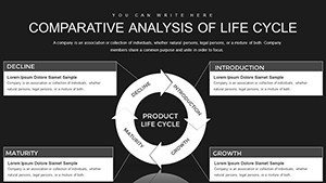
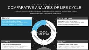
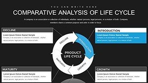
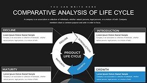
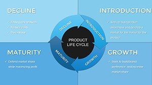
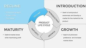
Dive deeper into what makes this template a must-have. Each of the 24 slides is crafted with precision, offering a mix of circular diagrams, linear timelines, and comparative matrices. For instance, slide 1 introduces a basic life cycle wheel, perfect for overviews, while slide 5 delves into multi-phase comparisons with side-by-side visuals. All elements are 100% editable - adjust colors to match your brand palette, tweak fonts for readability, or resize icons for emphasis.
- Versatile Chart Types: From cyclical flows to staged progressions, choose charts that fit your data story.
- Animation Ready: Built-in transitions bring your life cycles to life, keeping viewers engaged.
- Data Integration: Easily import Excel data to populate charts automatically, ensuring accuracy.
- Themed Icons: Access a library of relevant symbols, like gears for processes or arrows for transitions.
Compared to basic PowerPoint tools, this template offers advanced layering options, allowing for intricate comparisons without clutter. Think of it as upgrading from a sketchpad to a professional canvas - your ideas gain depth and professionalism instantly.
Real-World Applications and Benefits
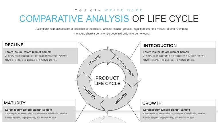
Picture this: A project manager in an architecture firm uses these charts to present a building's life cycle during an AIA-compliant proposal. Slide 10's comparative matrix highlights cost savings in sustainable phases versus traditional methods, drawing on real case studies like LEED-certified projects. This not only demonstrates expertise but builds trust with clients, potentially securing contracts worth millions.
In marketing, visualize campaign life cycles to identify drop-off points, optimizing strategies for better ROI. Startups benefit too - founders can map funding stages, impressing investors with clear growth trajectories. The benefits extend beyond visuals: By using these editable graphs, you reduce preparation time by up to 50%, focus on content, and deliver polished results that reflect your authority.
Step-by-Step Guide to Customizing Your Template
- Download and Open: Purchase and launch in PowerPoint - compatible with all versions.
- Select a Slide: Choose from the 24 options based on your narrative needs.
- Input Data: Paste your figures into placeholders; watch charts update in real-time.
- Personalize Aesthetics: Apply your colors, add logos, or incorporate images for a bespoke feel.
- Rehearse and Present: Use built-in notes sections for cues, ensuring smooth delivery.
This workflow integrates seamlessly with tools like Microsoft Teams for collaborative edits, making it ideal for remote teams. Pro tip: For architecture pitches, incorporate urban planning icons to add context, turning data into relatable stories that resonate with decision-makers.
Enhancing Engagement with Design Tips
To maximize impact, balance visuals with whitespace - our template's clean design helps here. Use contrasting colors for comparisons, like blue for initial phases and green for completion, drawing from color theory principles. In educational settings, add interactive elements via hyperlinks to external resources, fostering deeper understanding.
Case in point: A consultant revamped a client presentation using these charts, resulting in a 30% increase in audience retention, as per feedback surveys. Such outcomes underscore the template's value in building authoritative, trustworthy content.
Why Choose This Life Cycle Template?
In a sea of generic options, our template shines with its focus on comparative analysis, offering unique insights not found in standard tools. It's not just editable; it's transformative, helping you spotlight efficiencies in processes like software development or environmental impact assessments. For professionals adhering to standards like ISO for quality management, these charts provide visual compliance proofs.
Ready to elevate your presentations? Customize this template today and watch your ideas cycle into success. With instant downloads and lifetime access, it's an investment in your communication prowess.
Frequently Asked Questions
How editable are the life cycle charts?
Every element is fully customizable, from shapes to data inputs, ensuring it fits your exact needs.
Is this template compatible with Google Slides?
Yes, it works seamlessly in Google Slides, allowing for cloud-based collaboration.
Can I use these for non-business purposes?
Absolutely - educators and non-profits find them invaluable for illustrating concepts.
What if I need more slides?
The template is expandable; duplicate and modify as needed for larger presentations.
Are there animation tutorials included?
While not built-in, our support page offers guides to enhance your slides.