Agile Methodology PowerPoint Charts Template


Type: PowerPoint Charts template
Category: Business Models
Sources Available: .pptx
Product ID: PC00831
Template incl.: 45 editable slides
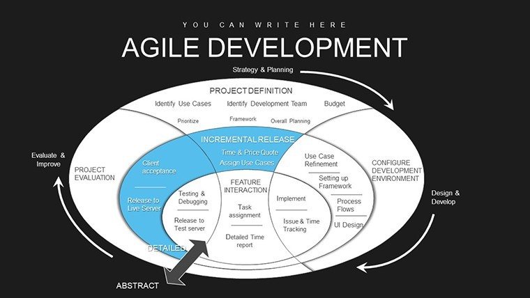
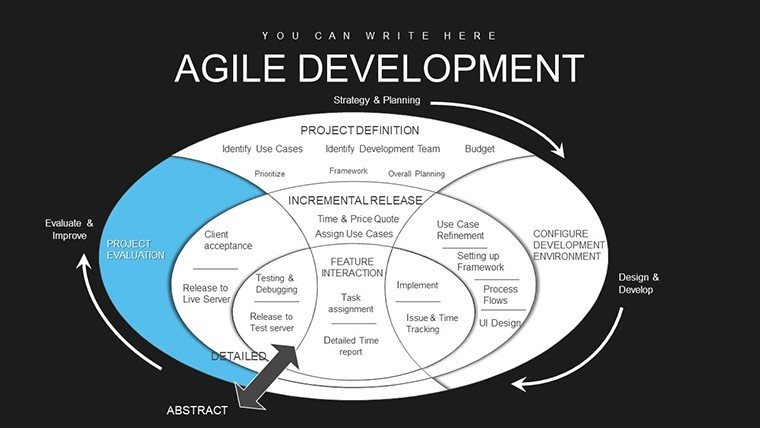
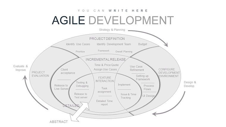
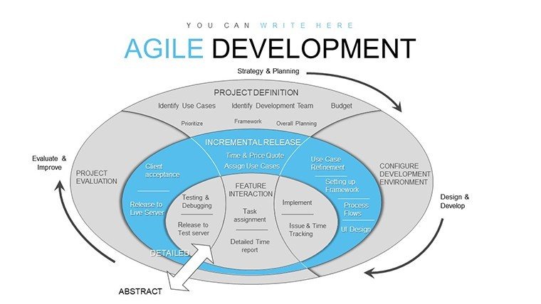
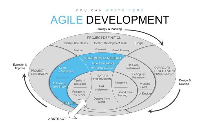
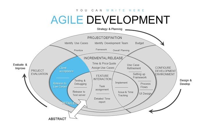
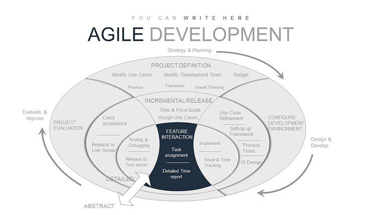
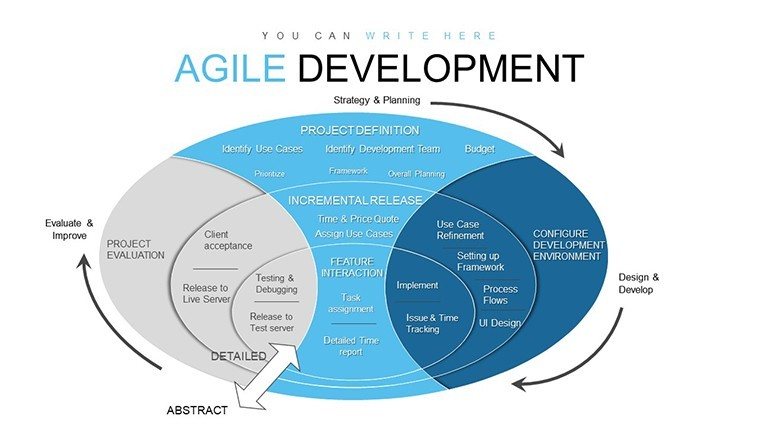
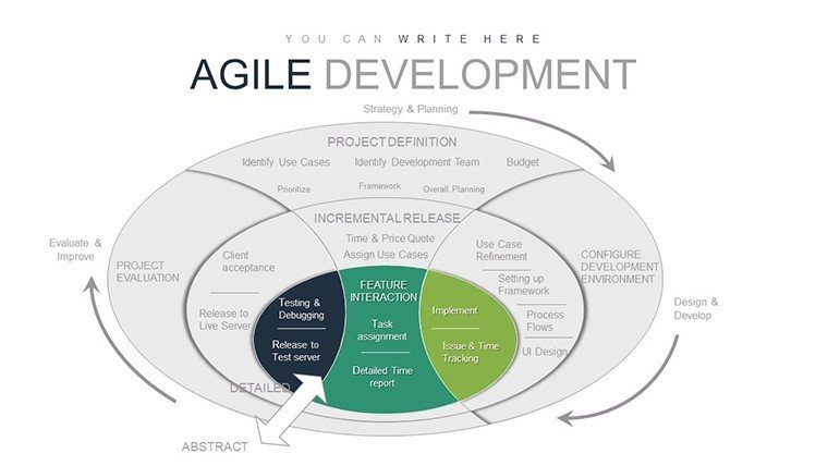
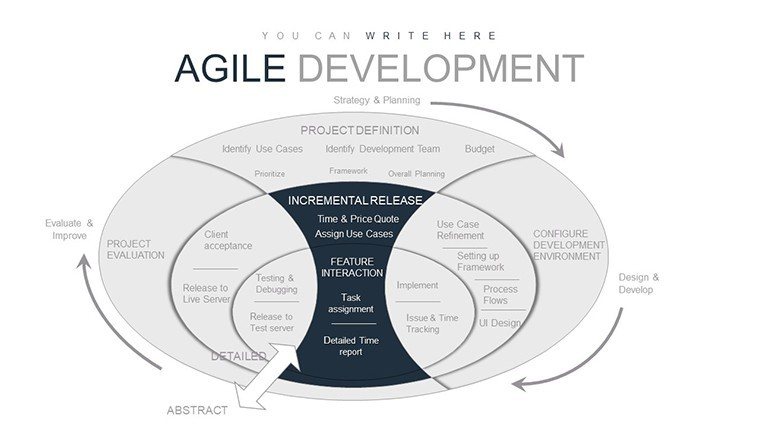
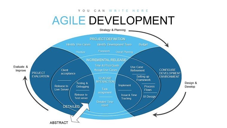
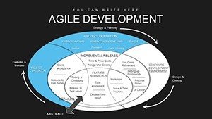
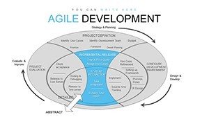
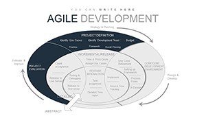
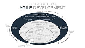
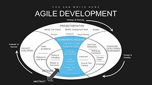
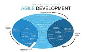
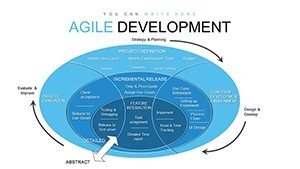
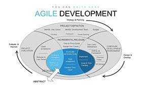
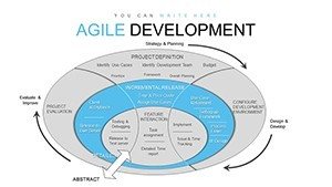
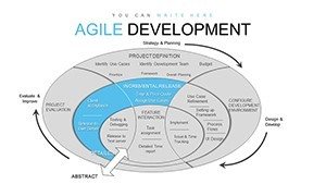
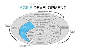
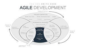
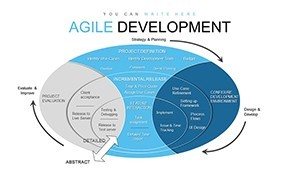
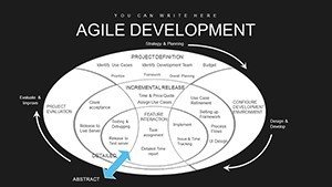
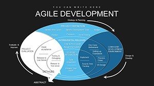
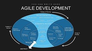
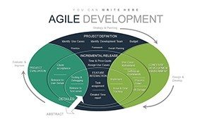
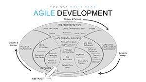
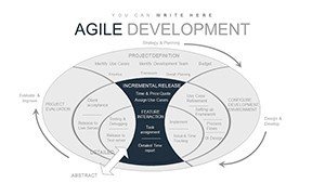
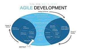
I`ve led dozens of software rollouts for tech firms, and nothing derails a client meeting faster than vague timelines or unclear team roles. That`s why I reach for this Agile Methodology PowerPoint Charts template whenever I need to map out sprints or demo progress without the fluff. It`s built for folks like you - project managers juggling deadlines, developers explaining backlogs to non-tech execs, or consultants pitching iterative strategies to skeptical boards. With 45 ready-to-tweak slides, it turns abstract Agile principles into sharp, scannable visuals that keep everyone aligned and engaged.
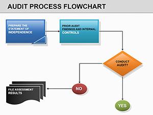
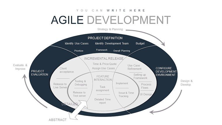
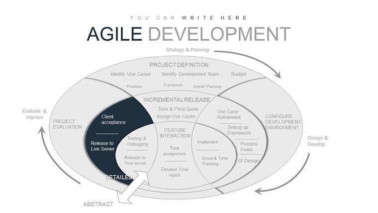
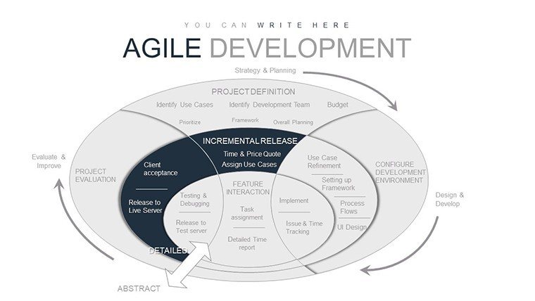
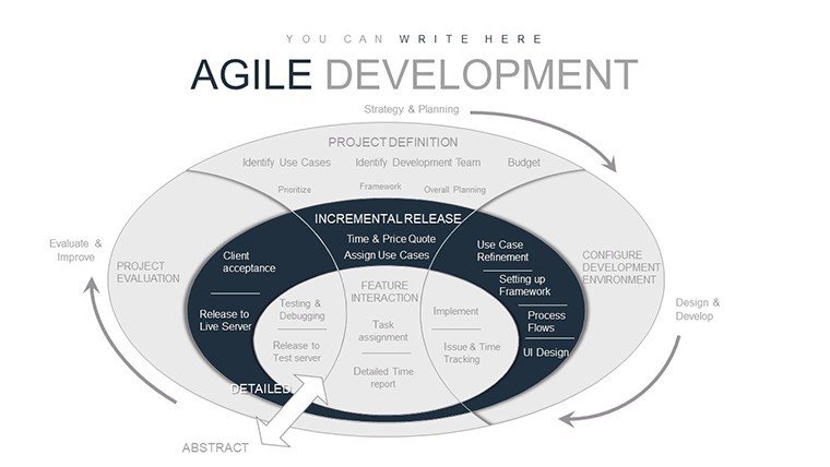
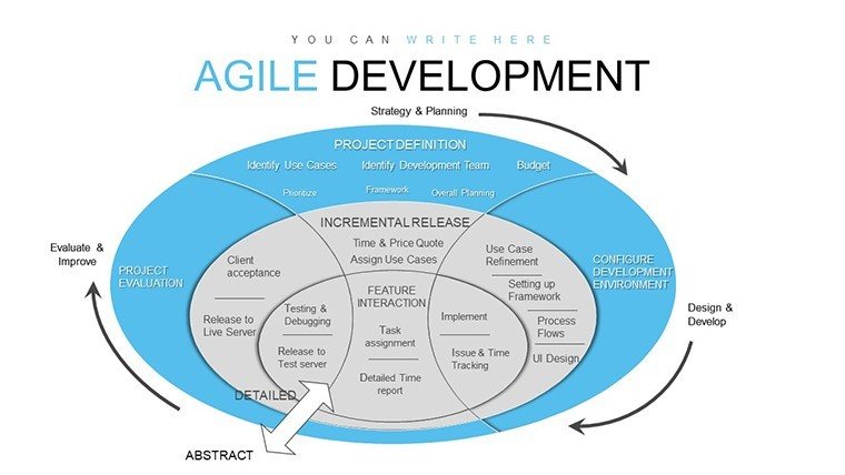
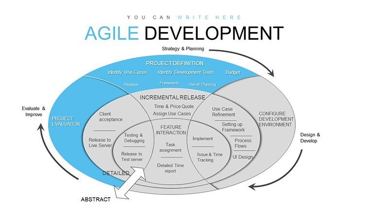
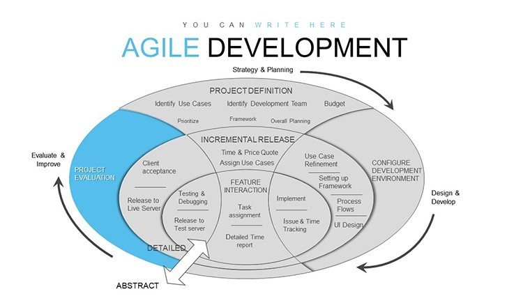
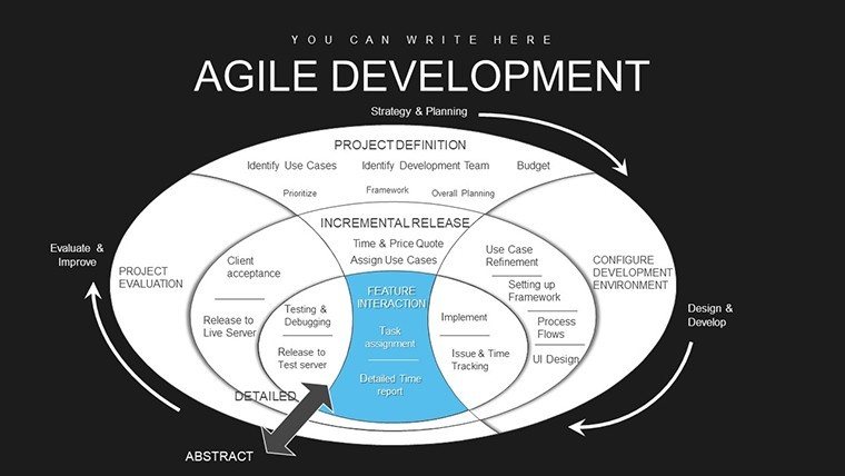
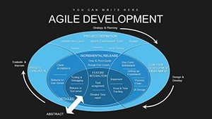
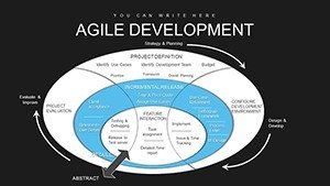
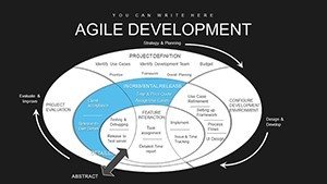
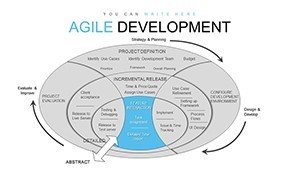
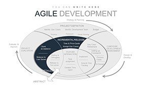
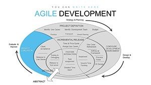
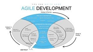
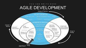
What sets this apart is how it captures the rhythm of Agile work without overwhelming your audience. Picture starting with a clean Kanban board slide: columns for "To Do," "In Progress," and "Done" laid out horizontally, each card slot holding placeholders for tasks like "Refine user stories" or "Code review sprint." You drop in your actual items, adjust the swimlanes for team members, and suddenly, that chaotic Jira export becomes a shared roadmap everyone nods along to. No more finger-pointing over bottlenecks - just clear flow that highlights where the holdups are.
Breaking Down Key Slides for Real-World Wins
Let`s walk through a few standouts I`ve customized for client decks. Take the burndown chart on one of the early slides - it`s a simple line graph tracking remaining story points against sprint days, with a dashed ideal line curving gently downward. I once used this for a fintech client to show how their velocity picked up after daily stand-ups kicked in. By the retrospective, the execs were asking for printouts, not revisions. It`s that intuitive: tweak the data points in Excel, link it back, and watch the graph update live during your presentation.
Then there`s the performance heatmap, smack in the middle of the pack. Imagine a grid where rows are team members and columns are phases like planning, execution, and review - cells shaded from cool blues for smooth sailing to warm reds for delays. This one`s a game-changer for retrospectives. I pulled it up in a workshop for a marketing agency transitioning to Scrum, shading in spots where content creation lagged. The discussion flowed naturally from there, leading to actionable tweaks like pairing junior writers with seniors. It`s not just data; it`s a conversation starter that uncovers patterns you might miss in spreadsheets.
Handling Sprints and Backlogs with Precision
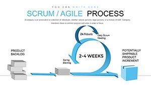
For sprint planning, the template shines with a dedicated timeline chart slide. Envision a horizontal Gantt-style bar, broken into two-week chunks, with milestones marked by bold icons - a sprint start flag here, a demo checkpoint there, looping back with dotted lines for feedback iterations. I adapted this for an e-commerce startup`s product launch, layering in dependencies like "UI design" feeding into "Dev sprint." It clarified why the release slipped a week, saving hours of email chains. And since everything`s vector-based, scaling it for a full-screen projector doesn`t blur a single line.
The backlog prioritization slide takes it further with a pie chart segmented by effort versus value - think wedges for high-impact, low-effort wins in vibrant teal, contrasted against the grind-it-out reds. Pair it with the adjacent radar chart for team self-assessment: spokes radiating out for velocity, collaboration, and adaptability, each scored from the center. In my experience with remote dev teams, this combo prompts honest check-ins. One founder I worked with said it cut their sprint waste by 20% after the first round - purely from visualizing the imbalances.
Team Feedback and Process Flows Tailored to You
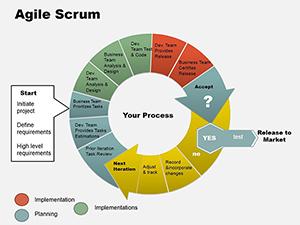
Don`t sleep on the process flow slides, either. One lays out the Scrum cycle as a circular diagram: arrows curving from product backlog to sprint planning, execution, review, and retrospect, with icon callouts for each phase - a lightbulb for ideas, a gear for building. It`s ideal for onboarding new hires or training stakeholders who think Agile is just "faster chaos." I customized a version for an education nonprofit, swapping in their grant cycles instead of software sprints, and it bridged the gap between ops and donors seamlessly.
Animations keep it dynamic without distracting - subtle fades reveal steps one by one, syncing with your narrative. For instance, in the retrospective slide, elements pop in sequentially: first the "What went well?" quadrant, then "What to improve," building to a full 360-view. I`ve seen this turn passive listeners into active contributors, especially in hybrid meetings where Zoom fatigue sets in.
Customization That Fits Your Workflow
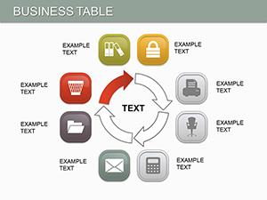
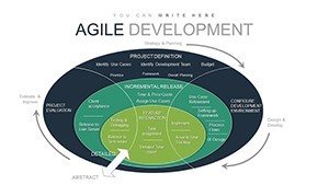
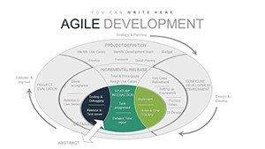
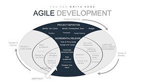
Editing is straightforward, no design degree required. The color palette defaults to a modern scheme - crisp whites with accents in slate gray and energizing orange - but slide over to the theme editor, and you`re swapping to your brand`s greens in seconds. Icons? Over 100 Agile-specific ones, from user story speech bubbles to epic mountain peaks, all scalable and recolorable. Need more slides? Duplicate any of the 45 and layer in your metrics; it handles extras like velocity trend lines or epic roadmaps without breaking a sweat.
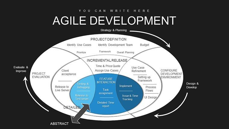
For educators teaching project management, this template demystifies Agile for students - assign a slide on the pillars of transparency, inspection, and adaptation, and watch them build case studies around it. Consultants, use the heatmap to diagnose client pain points during discovery calls. Founders pitching VCs? That release timeline slide sells the iterative edge over waterfall rivals. It`s versatile enough for any scenario where clarity drives decisions.
I`ve built entire workshop series around these charts, from startup accelerators to corporate training sessions. They cut through jargon, letting the visuals do the heavy lifting so you focus on the story. Open it in PowerPoint and make it yours in minutes - your next presentation will feel less like a report and more like a strategy session.