Communication PowerPoint Charts Template: Bridging Ideas in Architecture


Type: PowerPoint Charts template
Category: Illustrations
Sources Available: .pptx
Product ID: PC00826
Template incl.: 24 editable slides
In architecture, where concepts evolve from sketches to skyscrapers, effective communication is the cornerstone of success. The Communication PowerPoint Charts Template steps in as your ultimate ally, offering 24 editable slides tailored for architects, designers, and communicators who need to articulate visions clearly and persuasively. This isn't merely a collection of graphs; it's a narrative enhancer that turns technical details into accessible stories. Envision pitching a sustainable housing project: use interactive charts to map out energy flows, diagrams to illustrate spatial relationships, and graphs to forecast environmental impacts. Designed with a sleek, modern interface, this template ensures your messages resonate, whether in boardrooms or virtual meetings. Compatible with PowerPoint and Google Slides, it adapts effortlessly to your tools, freeing you to focus on crafting compelling dialogues that drive projects forward. From initial client consultations to final approvals, these charts foster understanding, reduce miscommunications, and elevate your professional presence in the competitive architecture field.
Mastering Visual Dialogue in Architectural Presentations
Communication in architecture often involves translating abstract ideas into tangible visuals. This template excels by providing interactive elements that invite audience participation, aligning with principles from communication theorists like Marshall McLuhan, who stressed the medium's role in the message. For example, in a firm like Zaha Hadid Architects, known for fluid designs, similar charts have been used to communicate parametric modeling results, turning complex algorithms into digestible insights for non-experts.
Standout Features for Seamless Expression
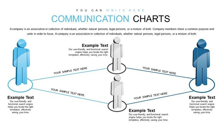
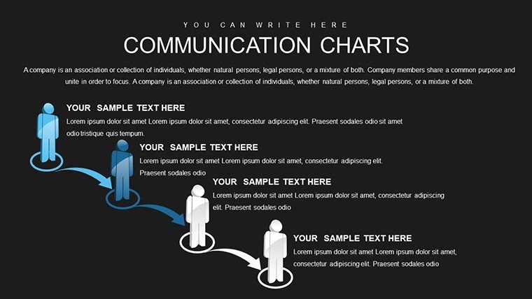
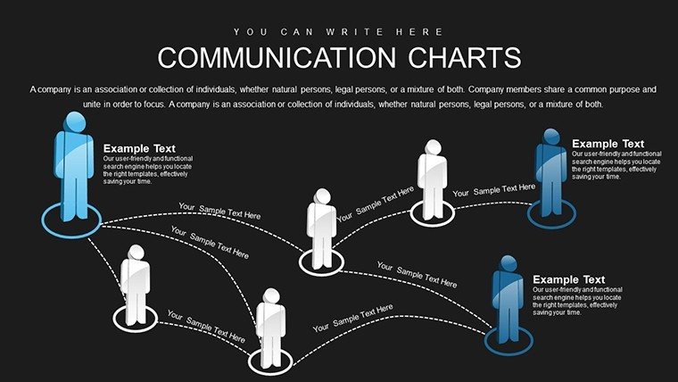
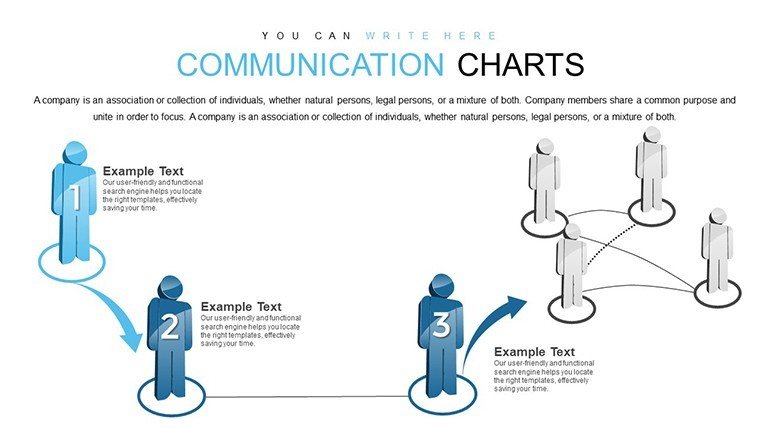
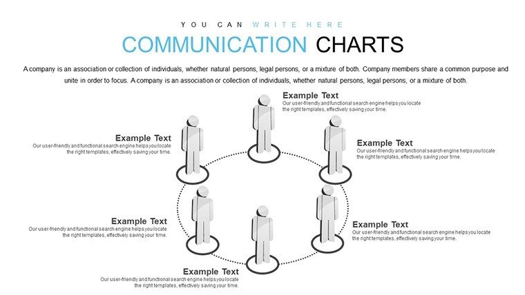
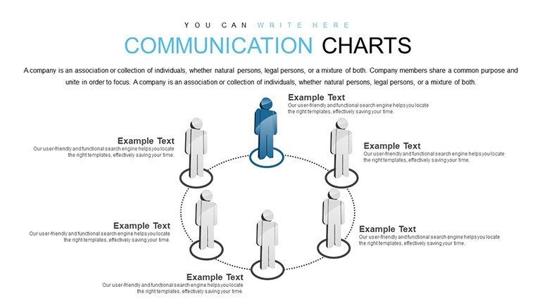
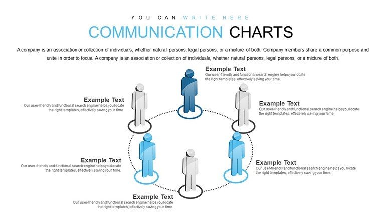
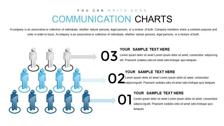
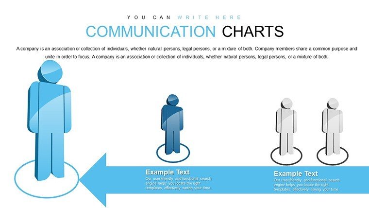
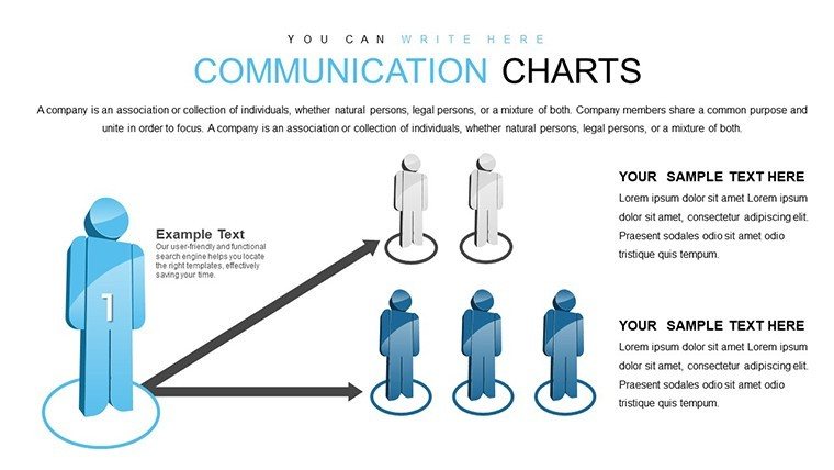
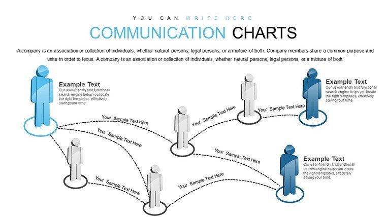
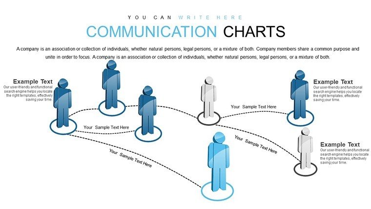
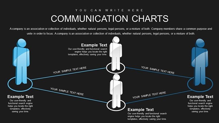
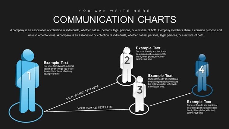
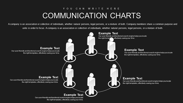
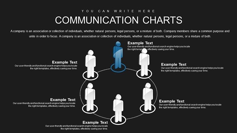
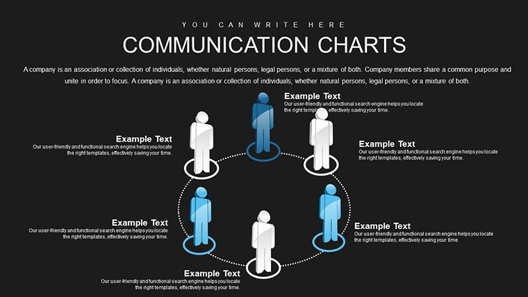
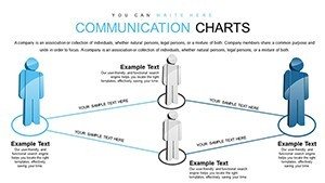
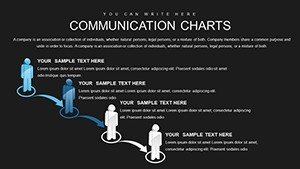
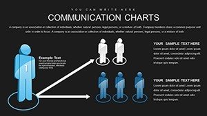
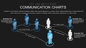
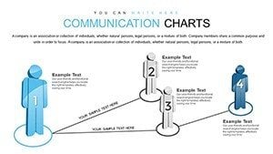
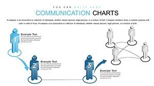
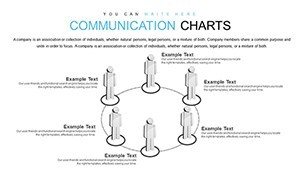
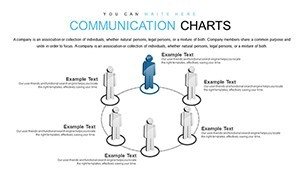
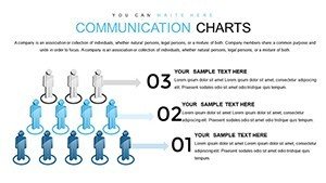
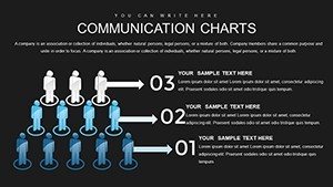
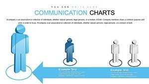
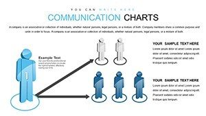
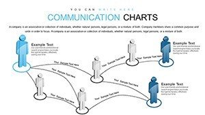
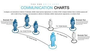
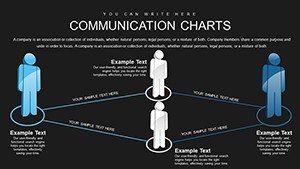
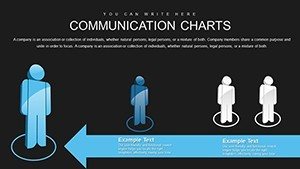
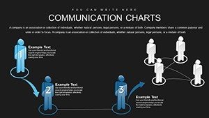
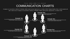
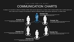
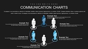
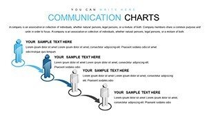
- Interactive Charts and Diagrams: Engage viewers with clickable elements that reveal deeper data layers, perfect for detailing architectural phases like concept to construction.
- Modern Design Aesthetics: Clean lines and customizable palettes that mirror contemporary architecture trends, ensuring your slides look as innovative as your designs.
- Easy Customization: Edit text, colors, and layouts intuitively, incorporating firm-specific elements like logos or project photos without hassle.
- Versatile Applications: From reports to pitches, these slides handle everything from stakeholder updates to educational workshops on building codes.
- High-Resolution Graphics: Ensure clarity in prints or projections, meeting professional standards for architectural documentation.
These attributes draw from authoritative sources like the RIBA (Royal Institute of British Architects) guidelines, emphasizing visual clarity in client communications.
Practical Use Cases: From Blueprints to Boardrooms
Imagine coordinating a multi-disciplinary team on a green building initiative. Start with a diagram slide outlining communication flows between architects, engineers, and contractors, using arrows and nodes to prevent bottlenecks. As the project advances, switch to graphs showing progress metrics, such as material procurement timelines, inspired by real-world successes in projects like the Edge in Amsterdam, where effective visuals streamlined stakeholder alignments.
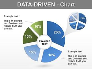
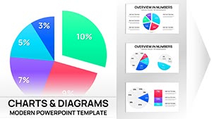
For educators in architecture schools, these charts simplify teaching communication strategies, like using infographics to explain urban planning theories. In marketing pitches, highlight how your firm's designs communicate sustainability, with pie charts dividing benefits into economic, social, and environmental slices.
Workflow Integration: A Step-by-Step Approach
- Choose Your Chart Type: Select based on message - diagrams for processes, graphs for data trends in architectural analytics.
- Populate with Content: Input project specifics, like site analysis data, with auto-scaling for accuracy.
- Tailor Visuals: Adjust to audience needs, perhaps softening colors for client-friendly vibes in residential designs.
- Enhance Interactivity: Add hyperlinks to external resources, like zoning laws, for enriched discussions.
- Finalize and Share: Export in various formats, ensuring compatibility for global team collaborations.
This method, echoed in Harvard Business Review articles on visual aids, can cut meeting times by highlighting key points upfront.
Superior to Standard Tools: Why It Matters
Basic PowerPoint lacks the polish this template provides - think static vs. dynamic. For architects, it means avoiding misinterpretations in design intents, with built-in accessibility features like alt text prompts for images, aligning with ADA standards. A case from Foster + Partners shows how enhanced communication visuals secured funding for iconic structures by clearly articulating value propositions.
Incorporate LSI elements like "architectural infographics" and "design communication tools" naturally to boost discoverability in searches.
Expert Tips for Impactful Architectural Communication
Layer your charts with storytelling: Begin with a problem (e.g., urban congestion), build with data visuals, and conclude with solutions (innovative layouts). Infuse light humor, like a chart titled "Communication Breakdowns: Avoid This Architectural Horror Story." Always cite reliable sources, such as UIA (International Union of Architects) reports, to add credibility.
Pair with software like Revit for data exports, creating a holistic communication ecosystem. For hybrid settings, use animations to guide focus, ensuring messages land effectively across distances.
Start communicating architecturally today - grab this template and bridge the gap between ideas and reality.
Frequently Asked Questions
What makes these charts interactive?
They include clickable layers and hyperlinks, allowing audiences to explore data deeply during architectural presentations.
Does it support team collaboration?
Yes, compatible with shared editing in Google Slides, ideal for multi-architect firms.
Are there architecture-specific elements?
Absolutely, with customizable icons for buildings, plans, and materials to tailor communications.
How do I handle large data sets?
The template supports Excel imports, scaling automatically for complex architectural metrics.
Is it suitable for virtual pitches?
Yes, with smooth animations and high-res visuals optimized for screen sharing.