Sales Funnel PowerPoint Template - Fully Editable Analytics Charts Instant Download


Type: PowerPoint Charts template
Category: Flow
Sources Available: .pptx
Product ID: PC00818
Template incl.: 24 editable slides
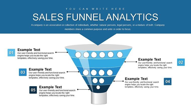
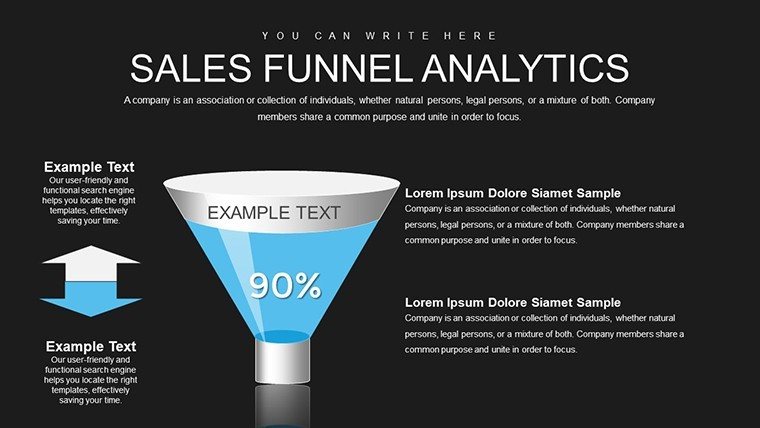
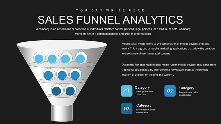
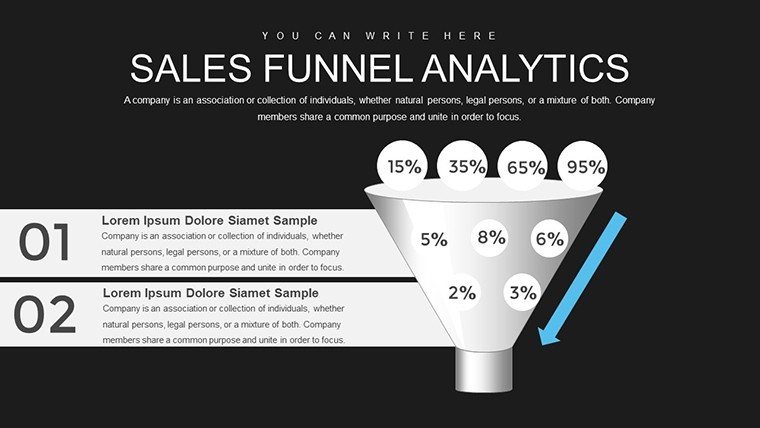
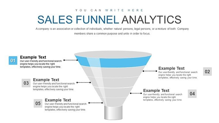
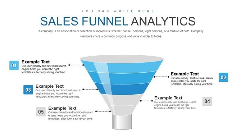
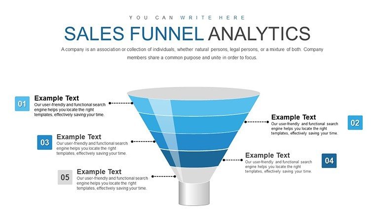
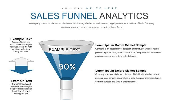
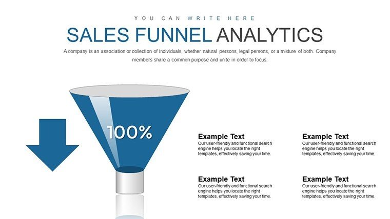
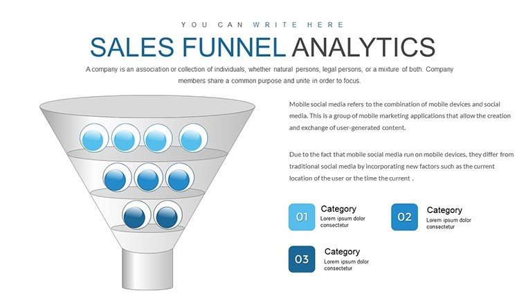
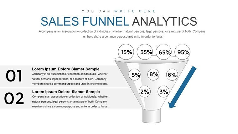
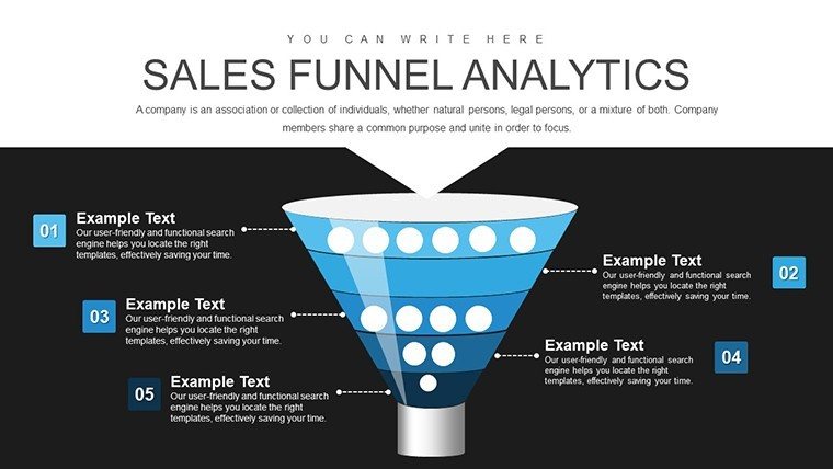
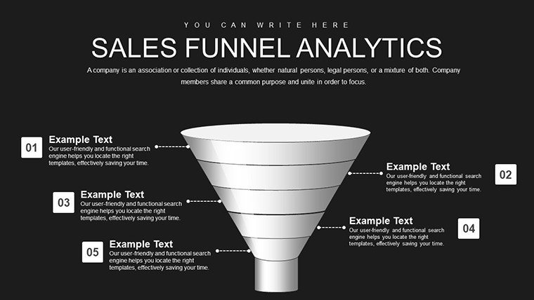
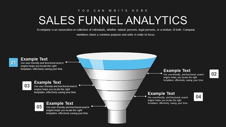
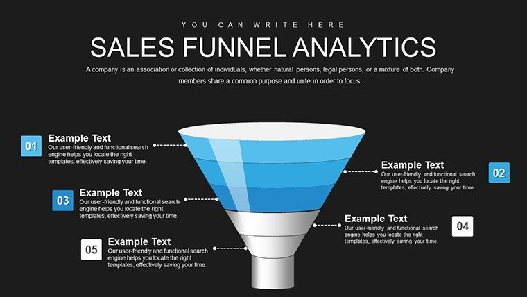
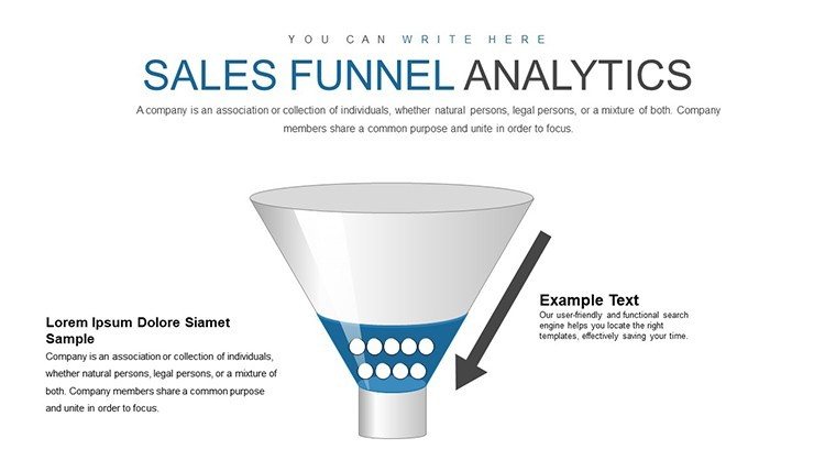
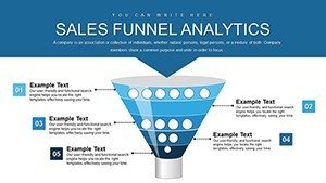
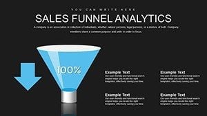
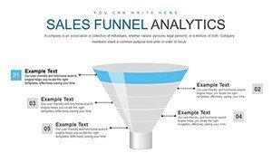
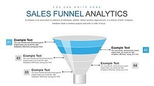
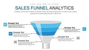
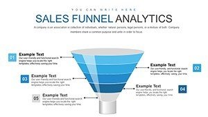
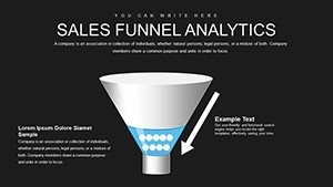
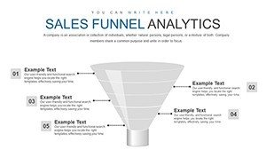
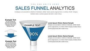
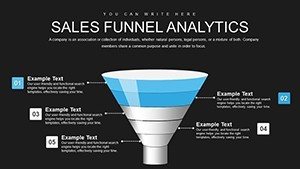
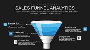
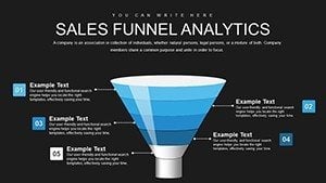
Visualize your sales pipeline with clarity and precision using this professional Sales Funnel Analytics PowerPoint Template. Featuring 24 fully editable slides, it helps you present conversion rates, lead progression, and funnel performance in a compelling, data-driven format that engages stakeholders.
Ideal for professionals who need polished visuals quickly, this template delivers board-ready charts without the time-consuming design work. Get instant access and elevate your next sales presentation today.
Key Features
- 24 unique, professionally designed slides focused on sales funnel analytics
- 100% editable text, colors, shapes, and data points
- High-quality vector graphics for sharp, scalable visuals
- Compatible with Microsoft PowerPoint (.pptx format)
- Instant download - no waiting
Benefits of This Sales Funnel Template
This template eliminates hours of manual chart creation while ensuring consistent, professional results every time. The ready-to-use analytics layouts make complex sales data easy to understand at a glance.
Clear visual representation of funnel stages and metrics leads to better audience comprehension, stronger insights, and more confident decision-making in meetings.
It's a reliable tool for anyone responsible for reporting sales performance or optimizing conversion processes.
Professional Scenarios
This sales funnel PowerPoint template shines in real business settings:
- Board and executive meetings - present pipeline health and revenue forecasts with authority
- Sales team reviews - analyze quarterly performance and identify bottlenecks
- Marketing reports - evaluate campaign effectiveness and lead-to-customer conversion
- Consulting deliverables - provide clients with clear, actionable sales process insights
- Internal strategy sessions - align departments on lead progression and optimization opportunities
How to Use and Customize
After purchase, download the .pptx file instantly. Open it in PowerPoint and replace placeholder data with your own metrics.
Adjust colors to match your brand, modify stage labels, resize elements, or add new data series - everything is fully editable with standard PowerPoint tools.
The intuitive structure requires no advanced skills, so you can create tailored, professional presentations quickly.
Frequently Asked Questions
What software do I need to edit this template?
The template is provided in .pptx format and requires Microsoft PowerPoint (recent versions on Windows or Mac) for full editing and compatibility.
How many slides are included?
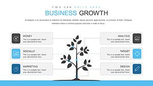
This template includes 24 unique, professionally designed slides dedicated to sales funnel analytics charts.
Are all elements fully customizable?
Yes - text, colors, shapes, data, and layouts are 100% editable to match your specific requirements.
What file format is provided?
You receive a standard .pptx file, fully compatible with Microsoft PowerPoint.
Can I use this template for commercial or client work?
Yes - after purchase, you have unlimited usage rights for personal, business, and commercial projects, including client presentations.