00% off everything!
SALE ENDS TODAY, Saturday November 0
Promo code "00LAYOUTS"
Time Left to Save
00:00:00

Professional Data Comparison Chart Template - PowerPoint

4
1150 ratings
Professional Data Comparison Chart Template - PowerPoint - Slide #0
Professional Data Comparison Chart Template - PowerPoint - Slide #1
Professional Data Comparison Chart Template - PowerPoint - Slide #2
Professional Data Comparison Chart Template - PowerPoint - Slide #3
Professional Data Comparison Chart Template - PowerPoint - Slide #4
Professional Data Comparison Chart Template - PowerPoint - Slide #5
Professional Data Comparison Chart Template - PowerPoint - Slide #6
Professional Data Comparison Chart Template - PowerPoint - Slide #7
Professional Data Comparison Chart Template - PowerPoint - Slide #8
Professional Data Comparison Chart Template - PowerPoint - Slide #9
Professional Data Comparison Chart Template - PowerPoint - Slide #10
Professional Data Comparison Chart Template - PowerPoint - Slide #11
Professional Data Comparison Chart Template - PowerPoint - Slide #12
Professional Data Comparison Chart Template - PowerPoint - Slide #13
Professional Data Comparison Chart Template - PowerPoint - Slide #14
Professional Data Comparison Chart Template - PowerPoint - Slide #15
Professional Data Comparison Chart Template - PowerPoint - Slide #16
Professional Data Comparison Chart Template - PowerPoint - Slide #17
Professional Data Comparison Chart Template - PowerPoint - Slide #18
Professional Data Comparison Chart Template - PowerPoint - Slide #19
Professional Data Comparison Chart Template - PowerPoint - Slide #20
Professional Data Comparison Chart Template - PowerPoint - Slide #21
Professional Data Comparison Chart Template - PowerPoint - Slide #22
Professional Data Comparison Chart Template - PowerPoint - Slide #23
thumbnail slide #0
thumbnail slide #1
thumbnail slide #2
thumbnail slide #3
thumbnail slide #4
thumbnail slide #5
thumbnail slide #6
thumbnail slide #7
thumbnail slide #8
thumbnail slide #9
thumbnail slide #10
thumbnail slide #11
thumbnail slide #12
thumbnail slide #13
thumbnail slide #14
thumbnail slide #15
thumbnail slide #16
thumbnail slide #17
thumbnail slide #18
thumbnail slide #19
thumbnail slide #20
thumbnail slide #21
thumbnail slide #22
thumbnail slide #23

Type: PowerPoint Charts template
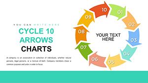
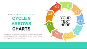
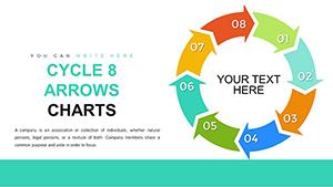
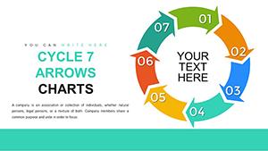
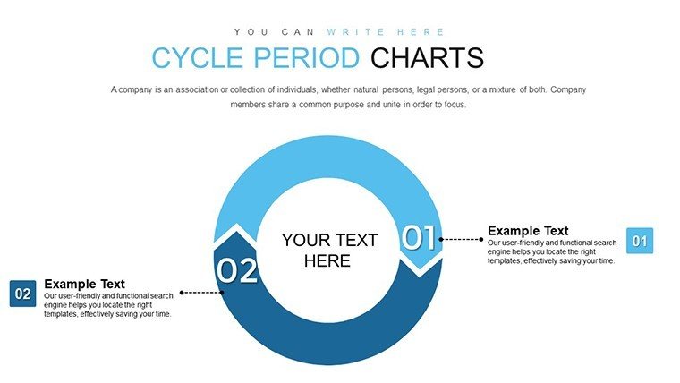
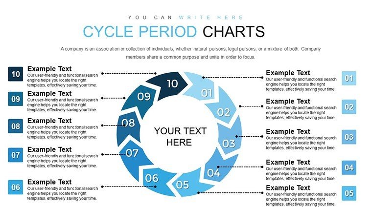
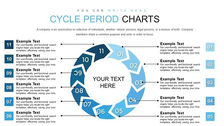
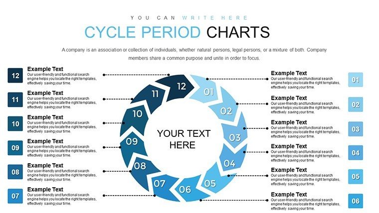
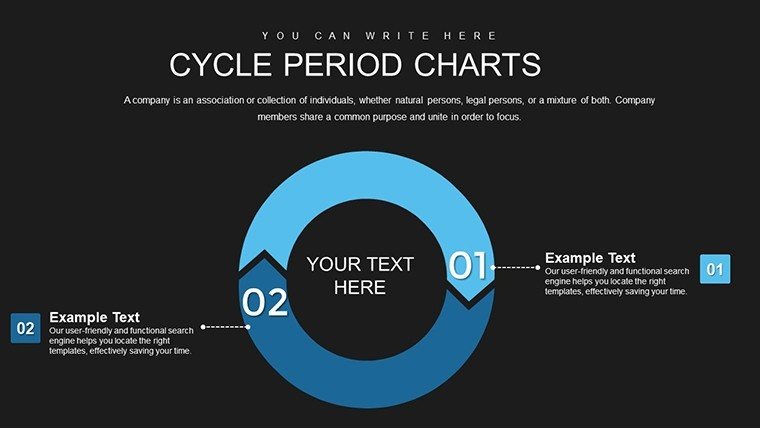
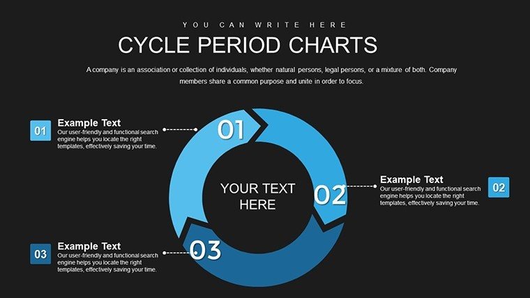
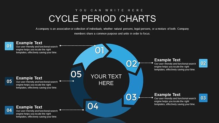
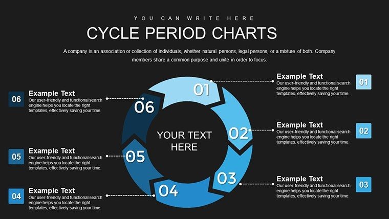
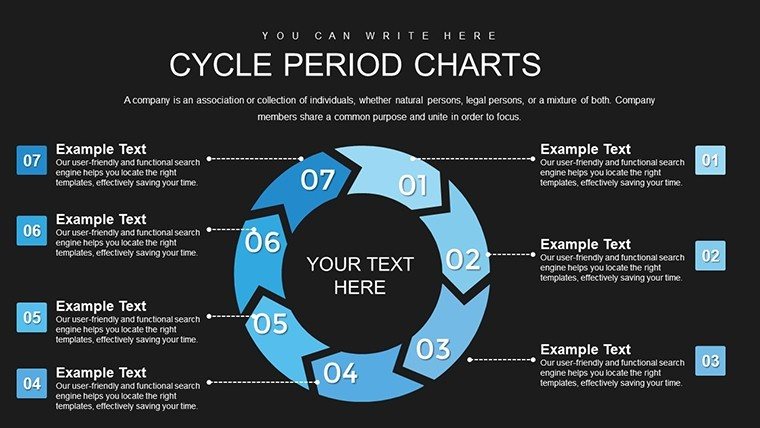
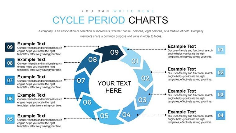
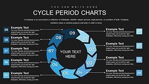
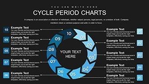
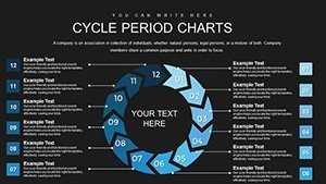
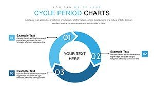
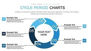
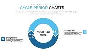
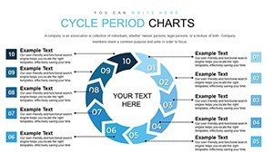
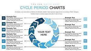
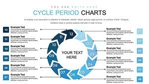
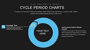
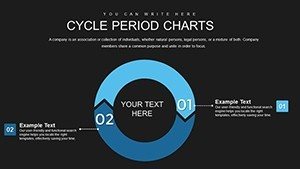
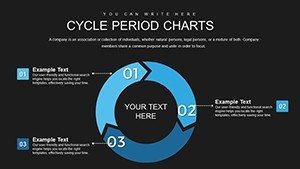
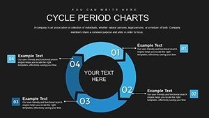
Category: Cycle

Sources Available: .pptx

Product ID: PC00760

Template incl.: 24 editable slides

Purchase this template
$ 22.00

Professional Data Comparison Chart Template for PowerPoint Presentations

When stakeholders need to evaluate competing options, assess performance gaps, or justify strategic decisions, a data comparison chart transforms raw numbers into compelling visual evidence. This PowerPoint template delivers a structured framework where metrics, benchmarks, and performance indicators align in clean columns - making side-by-side analysis immediate and defensible. Built for professionals who present quarterly reviews, vendor evaluations, product launches, and investment committees, this chart template eliminates guesswork and accelerates decision-making through clarity.

The template provides fully editable text placeholders, customizable color schemes, and scalable vector shapes that maintain crisp resolution on any screen size. You control every label, every data point, every comparison axis - no design skills required. Compatible with PowerPoint 2016 and later versions, Keynote, and Google Slides, this template integrates instantly into existing decks and adapts to your brand guidelines in minutes.

Core Features Built for Business Analysts and Strategy Teams

Each comparison column includes dedicated fields for category names, numerical values, percentage changes, and qualitative indicators. The layout supports up to six parallel comparison tracks without visual clutter, ensuring your audience absorbs differences at a glance. Color-coded bars or icons highlight positive and negative variances, while annotation boxes let you flag critical insights directly on the chart.

Editable chart elements include axis labels, data series names, legend positions, and grid line visibility. You can swap vertical bars for horizontal formats, adjust spacing between columns, and apply gradient fills or flat colors to match corporate palettes. The vector-based design ensures smooth scaling from laptop screens to conference room projectors without pixelation.

Professional Use Cases Across Departments

Finance teams deploy this template during budget variance reports, comparing actual spend against forecasts across cost centers. Marketing managers use it to evaluate campaign ROI by channel - social media versus email versus paid search - showing which investments deliver measurable returns. Product teams present feature adoption rates across user segments, revealing where engagement clusters and where friction persists.

Sales operations leaders track quota attainment by region or rep, identifying top performers and coaching opportunities within seconds of opening the slide. HR departments compare employee satisfaction scores year-over-year or across divisions, supporting retention strategies with visual proof. IT managers present SLA compliance metrics, contrasting uptime, response times, and incident resolution rates across service tiers.

Workflow Integration for Faster Deck Assembly

Copy your comparison data from Excel or Google Sheets and paste values directly into the template's text fields - no reformatting loops. Adjust column widths by dragging shape edges, reorder comparison items by cut-and-paste, and duplicate the slide to create multi-page comparisons for extensive datasets. The template's modular structure lets you insert it into pitch decks, board presentations, training modules, or client proposals without layout conflicts.

For recurring reports, save the customized template with your branding, fonts, and color codes as a master slide. Each month or quarter, update only the data points while preserving formatting consistency. This approach cuts deck preparation time from hours to minutes and ensures every comparison chart follows the same professional standard.

Real-World Scenarios Where Comparison Charts Drive Decisions

Vendor selection meetings: A procurement manager presents three software platforms side-by-side, comparing pricing tiers, feature sets, implementation timelines, and customer support ratings. The comparison chart reveals which vendor offers the best value per dollar and highlights deal-breakers like missing integrations.

Product launch reviews: A product director shows launch performance for the new offering versus the legacy version, tracking first-month sales, customer acquisition cost, and return rates. The visual gap between columns justifies scaling marketing spend or adjusting pricing strategy.

Market positioning analysis: A competitive intelligence analyst compares your brand's market share, pricing, and feature coverage against three competitors. The chart exposes white space opportunities and validates messaging priorities for the next campaign cycle.

Comparison Table: Data Chart Template vs. Manual Chart Building

FactorPre-Built TemplateManual Chart Creation
Setup TimeUnder 5 minutes - paste data and adjust colors30–60 minutes - align shapes, format text, test layouts
Design ConsistencyUniform spacing, alignment, and typography locked inVaries slide-to-slide; requires manual alignment checks
ScalabilityVector shapes maintain quality at any resolutionRaster graphics may pixelate on large displays
EditabilityAll elements unlocked; change colors, labels, data points instantlyEditing locked groups or embedded images frustrates quick updates
ReusabilitySave as master slide; reuse indefinitely with one-time purchaseRebuild from scratch or copy-paste from old decks with formatting drift

Industry Applications for Data Comparison Charts

Healthcare: Hospital administrators compare patient outcome metrics across departments - readmission rates, average length of stay, patient satisfaction scores - identifying best practices to replicate system-wide.

Education: School districts present standardized test score trends by grade level or campus, showing which interventions correlate with performance gains and where additional resources should flow.

Manufacturing: Operations managers track defect rates, cycle times, and equipment uptime across production lines, using comparison data to prioritize maintenance schedules and process improvements.

Retail: Merchandising teams compare same-store sales growth, inventory turnover, and shrinkage rates across regions, guiding assortment planning and loss prevention investments.

Financial services: Portfolio managers display asset class returns, volatility measures, and correlation coefficients side-by-side, helping clients understand diversification benefits and risk trade-offs.

Customization Tips for Maximum Impact

Apply conditional formatting principles by assigning green hues to favorable metrics and red tones to underperformers - audiences decode meaning without reading footnotes. Use bold typography for the most critical comparison category, drawing eyes to the decision-driving factor. Add subtle drop shadows to column headers for depth, but avoid heavy gradients that distract from data clarity.

When presenting to executive audiences, limit comparison columns to three or four; more options slow decision velocity. For technical or analytical teams, expand to six columns with detailed submetrics, supporting deep-dive discussions. Always include a clear legend if using icons or color codes unfamiliar to your audience.

This data comparison chart template turns complex datasets into executive-ready visuals, supports evidence-based decision-making, and ensures your analysis lands with confidence. Download once, customize in minutes, and present comparisons that move meetings forward.

Frequently Asked Questions

Can I add more comparison columns than the template provides?

Yes, duplicate existing column groups by selecting all shapes in one column, copying, and pasting adjacent to the current layout. Adjust spacing manually by dragging column edges to maintain alignment. The template's vector design ensures new columns match the original formatting exactly.

How do I link live data from Excel into this PowerPoint chart?

PowerPoint supports paste-link functionality. Copy your Excel data range, then in PowerPoint use Paste Special and select "Paste Link." Changes in the Excel file will update the chart when you refresh links in PowerPoint. This method works best for tables and simple data ranges.

Does the template work with Google Slides and Keynote?

Absolutely. Export the PowerPoint file as PPTX and upload to Google Slides or import into Keynote. All shapes, text, and colors transfer cleanly. Minor font substitutions may occur if you use proprietary typefaces, but standard fonts like Arial, Calibri, and Helvetica render identically across platforms.

Can I change the chart orientation from vertical bars to horizontal?

Yes, rotate the entire chart by selecting all elements, right-clicking, choosing "Rotate," and applying a 90-degree turn. Alternatively, rebuild the layout by repositioning individual shape groups horizontally. Horizontal orientations work well when category names are long and require more reading space.

Is there a limit to how many times I can use this template after purchase?

No usage limits apply. The one-time purchase grants lifetime access to the template file. Use it in unlimited presentations, across unlimited projects, for internal and client-facing work. You may not resell or redistribute the template file itself as a standalone product.

See more in Cycle PowerPoint Chart →