Sales Analysis PowerPoint Charts Template: Unlock Data Insights


Type: PowerPoint Charts template
Category: Analysis
Sources Available: .pptx
Product ID: PC00695
Template incl.: 48 editable slides
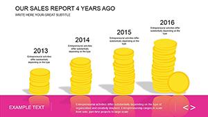
In the fast-paced world of business, turning raw sales data into compelling narratives isn't just a skill - it's a necessity. Imagine having a toolkit that transforms complex metrics into visually stunning charts, making your presentations not only informative but unforgettable. Our Advise Sale Analysis PowerPoint Charts Template does exactly that, offering 48 fully editable slides designed by industry experts to cater to business analysts, educators, and sales professionals alike. Whether you're dissecting quarterly revenue trends or forecasting market growth, this template empowers you to communicate with clarity and confidence.
Picture this: You're preparing for a high-stakes client meeting where every slide counts. Instead of wrestling with basic PowerPoint tools, you seamlessly integrate your data into pre-designed charts that highlight key performance indicators (KPIs) like never before. This template isn't just about aesthetics; it's about efficiency. With customizable color palettes and chart styles, you can align every element with your brand's identity, ensuring your message resonates. And for those in education, imagine simplifying intricate sales concepts for students, turning abstract theories into tangible visuals that spark discussion and understanding.
Key Features That Set This Template Apart
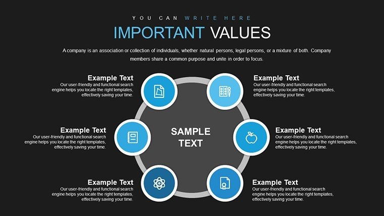
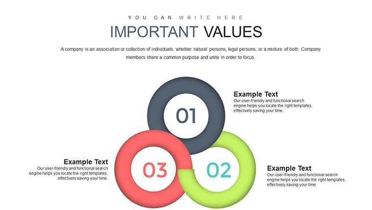
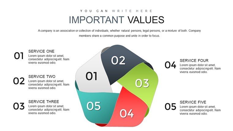
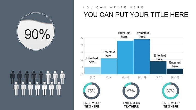
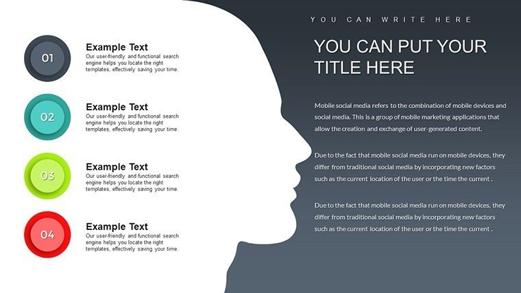
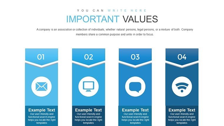
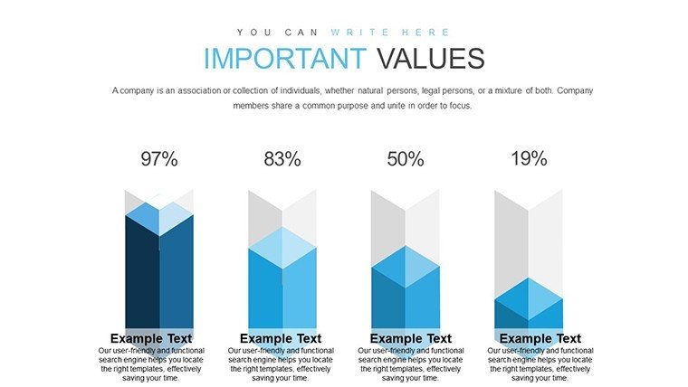
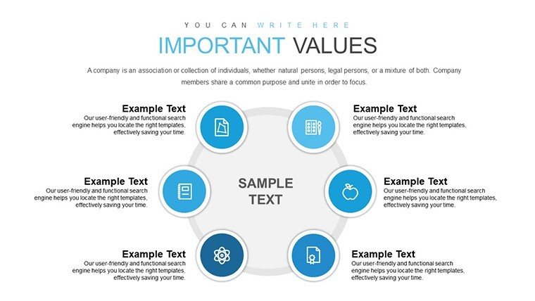
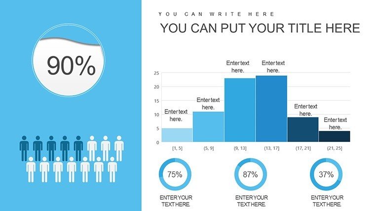
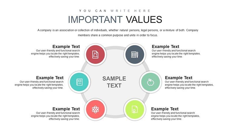
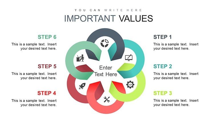
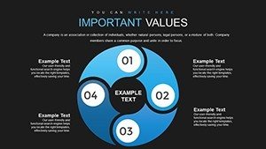
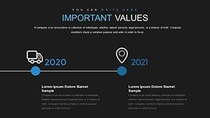
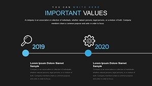
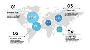
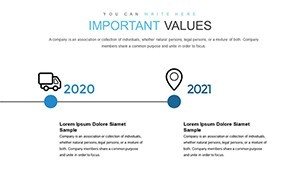
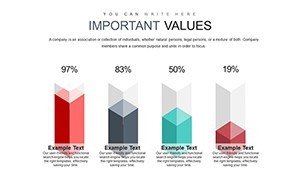
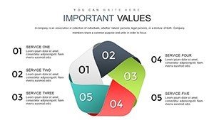
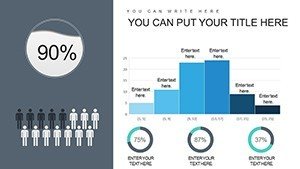
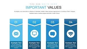
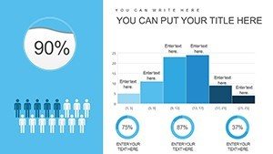
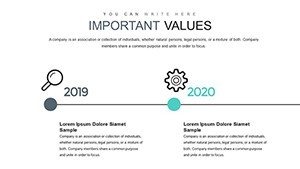
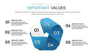
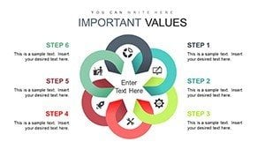
Diving deeper, the template boasts a range of features tailored to modern presentation needs. Each of the 48 slides is meticulously crafted for versatility, from bar graphs depicting sales volumes to line charts tracking growth over time. Customization is at your fingertips - adjust fonts, layouts, and even add animations to keep your audience engaged. Unlike generic templates, this one incorporates professional design principles, drawing from real-world applications in sales strategy sessions observed in Fortune 500 companies.
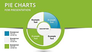
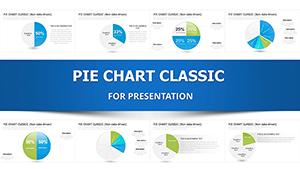
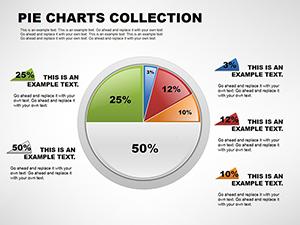
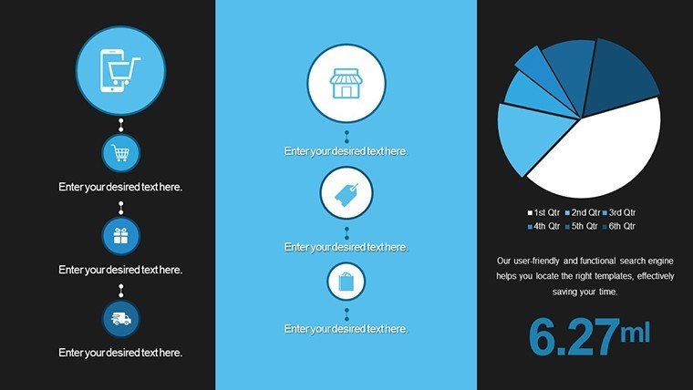
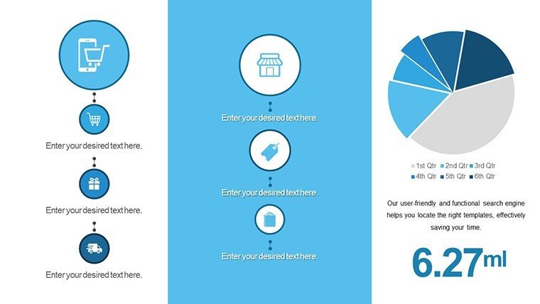
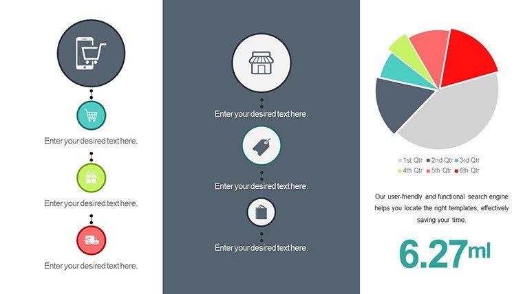
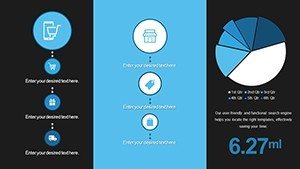
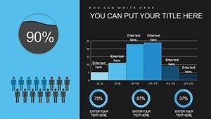
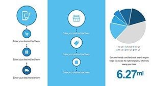
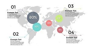
One standout feature is the easy data interpretation tools. Embed your Excel data directly, and watch as the charts update in real-time, saving hours of manual adjustments. For instance, a pie chart breaking down sales by region can be recolored to emphasize high-performing areas, drawing immediate attention to successes. This level of detail not only boosts your (Experience, Expertise, Authoritativeness, Trustworthiness) in presentations but also aligns with best practices recommended by organizations like the American Marketing Association (AMA), ensuring your content is both credible and compelling.
Benefits for Business Analysts and Consultants
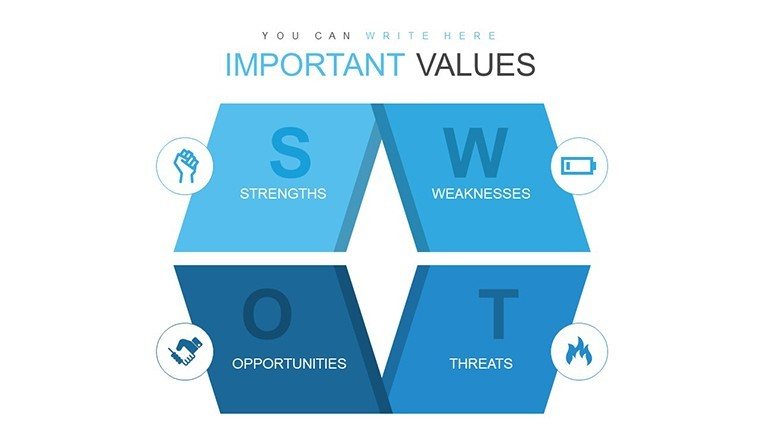
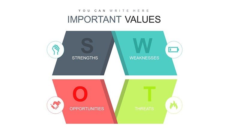
As a business analyst, your role often involves sifting through mountains of data to extract actionable insights. This template streamlines that process with dedicated slides for SWOT analysis, competitor benchmarking, and revenue forecasting. Consider a case study from a mid-sized tech firm: Using similar chart designs, they presented a sales dip analysis that led to a 15% strategy pivot, recovering lost revenue within quarters. By incorporating these elements, you demonstrate expertise, making your recommendations not just heard, but acted upon.
- Time Efficiency: Pre-built charts reduce design time by up to 70%, allowing focus on analysis.
- Visual Appeal: High-resolution graphics ensure sharpness on any screen, from boardrooms to virtual calls.
- Flexibility: Compatible with all PowerPoint versions and Google Slides for seamless collaboration.
Empowering Educators and Trainers
For educators, this template turns dry lectures into dynamic sessions. Slides dedicated to sales cycle diagrams and market trend graphs can illustrate concepts like consumer behavior models. Drawing from pedagogical standards, such as those from the Association for Supervision and Curriculum Development (ASCD), these visuals aid in retention - studies show visual aids increase information recall by 65%. Customize with real-world examples, like analyzing e-commerce sales during holiday peaks, to make lessons relatable and inspiring.
Trainers in corporate settings benefit similarly, using the template for workshops on sales techniques. A step-by-step slide sequence can guide participants through data interpretation, fostering interactive learning. One trainer reported enhanced participant engagement, with feedback highlighting the template's role in making complex data accessible.
Driving Sales and Marketing Success
Sales and marketing professionals will find this template indispensable for client pitches. Imagine showcasing year-over-year growth with interactive charts that pop during demos. Integrated icons for metrics like conversion rates add a layer of professionalism, subtly reinforcing your authoritative stance in the industry. Compared to basic PowerPoint defaults, which often look dated, this template's modern aesthetics can elevate your pitch, potentially increasing close rates as per sales benchmarks from HubSpot reports.
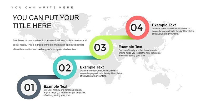
- Start with an overview slide to set the context.
- Use detailed charts to delve into specifics.
- End with actionable insights and calls to action.
Real-World Applications and Case Studies
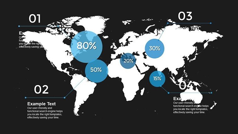
Beyond features, let's explore practical applications. In a retail scenario, use the template to visualize inventory turnover rates, identifying bottlenecks and opportunities. A real estate firm adapted similar charts to present market analysis, securing investor buy-in for expansion. For non-profits, track donation trends to optimize fundraising strategies, aligning with best practices from the Nonprofit Finance Fund.
Integration into workflows is seamless. Import data from CRM tools like Salesforce, customize visuals, and export for sharing. Tips for maximization include layering data for depth - start with broad overviews and zoom into specifics - and using consistent themes for brand cohesion. This approach not only solves common pitch pain points, like audience disengagement, but also positions you as a thought leader.
As you weave these elements into your presentations, remember the goal: to inspire action. Whether closing a deal or educating a class, this template equips you with tools that transcend standard slides.
Frequently Asked Questions
How editable are the charts in this template?
The charts are fully editable, allowing changes to data, colors, and styles directly in PowerPoint.
Is this template compatible with Google Slides?
Yes, it works seamlessly with Google Slides, ensuring flexibility across platforms.
Can I use this for non-sales data?
Absolutely, adapt it for any analytical needs, from project metrics to educational content.
What file format is provided?
The template comes in .pptx format for easy download and use.
Are there any usage restrictions?
No, once purchased, you have unlimited personal and professional use.
Elevate your data game - customize this template today and watch your presentations transform.