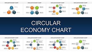
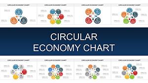
3D Circular PowerPoint Charts Template: Mastering Trend Visualization


Dive into the world of immersive data presentation with our 3D Circular PowerPoint Charts Template. Crafted for those who turn numbers into narratives, this collection of 18 editable slides specializes in circular designs that bring trends to life. Picture slicing through market data like a pro, using depth and rotation to reveal patterns that flat pie charts miss. Aimed at analysts, marketers, and strategists, it solves the common pain of dull visuals by offering customizable 3D elements that pop off the screen. Whether tracking sales cycles or consumer behaviors, this template ensures your insights resonate, fostering better decisions and audience retention.
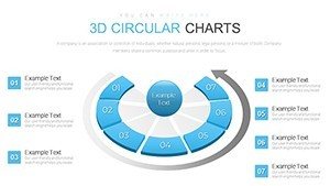
The Art of 3D Circular Data Representation
Drawing from principles in information design, akin to those in Stephen Few's works on perceptual dashboards, this template prioritizes intuitive understanding. Circular charts in 3D add a layer of sophistication, allowing viewers to grasp proportions and evolutions at a glance. No more squinting at 2D slices - here, you can animate rotations to unfold stories over time, ideal for sequential data like quarterly growth.
In practice, a digital marketing firm employed 3D circular visuals to map user engagement funnels, highlighting drop-off points with shaded depths. The outcome? A 25% uptick in campaign optimizations, proving the template's real-world value in driving actionable intelligence.
Essential Features for Seamless Customization
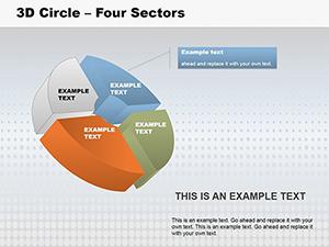
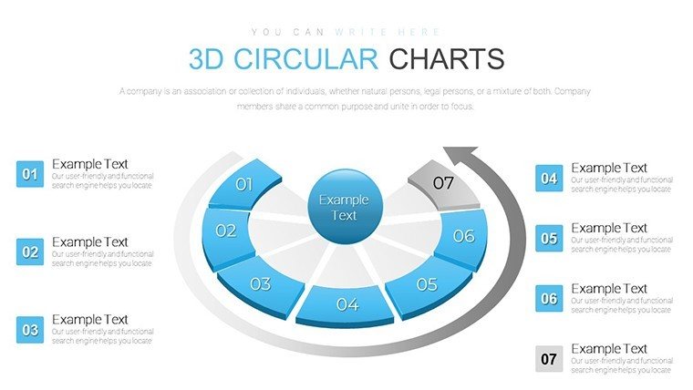
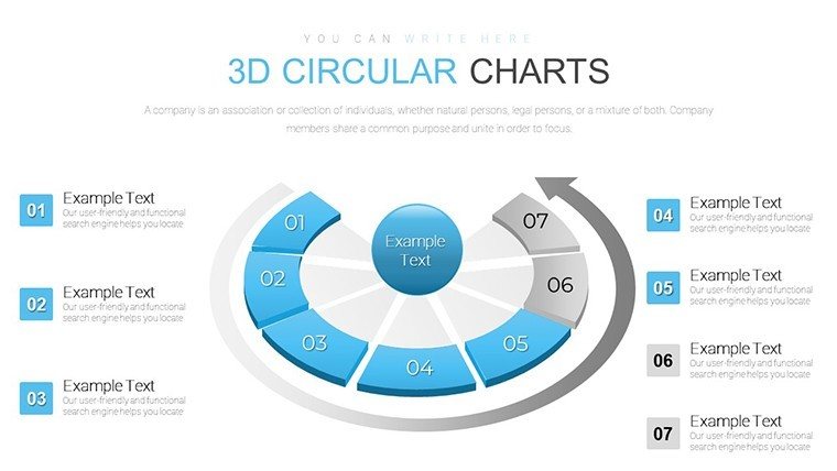
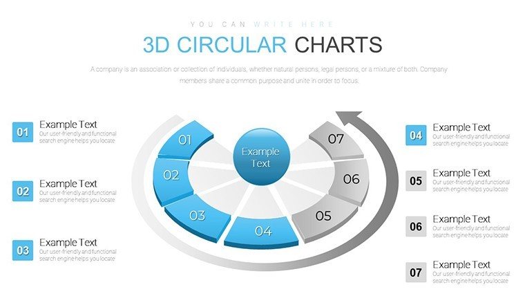
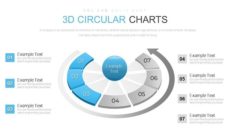
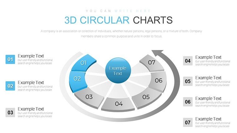
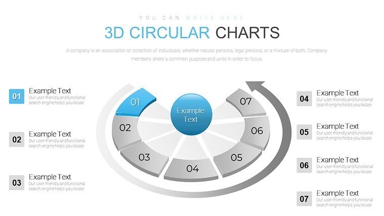
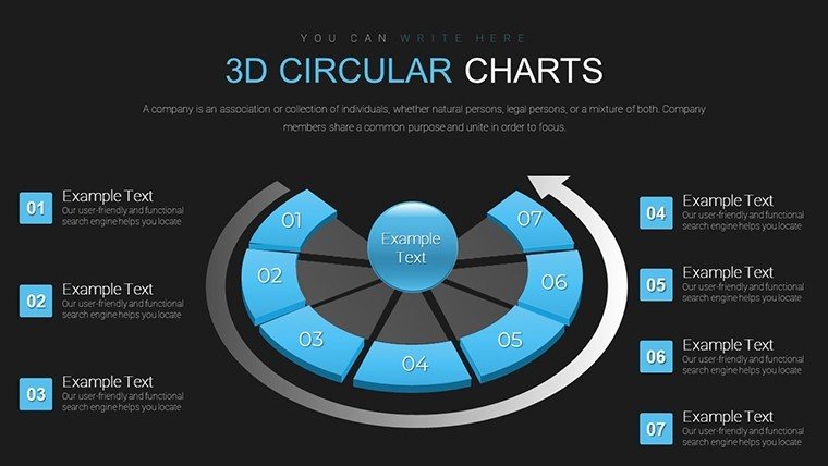
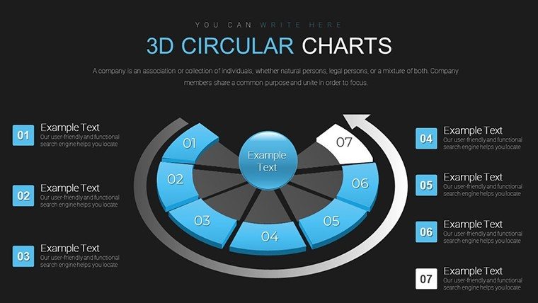
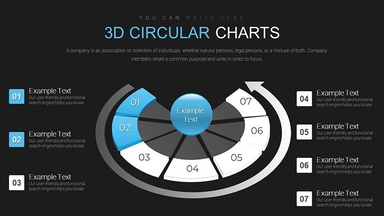
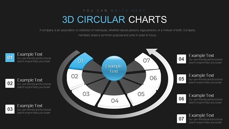
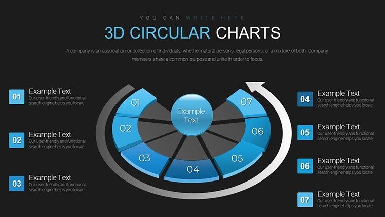
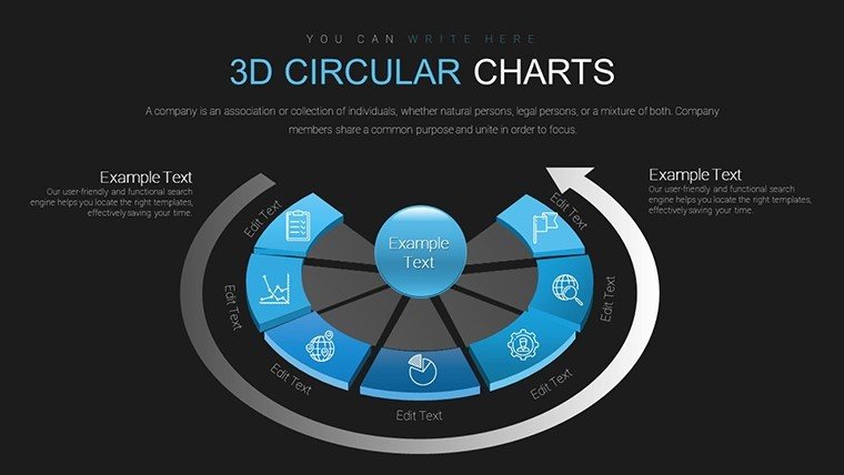
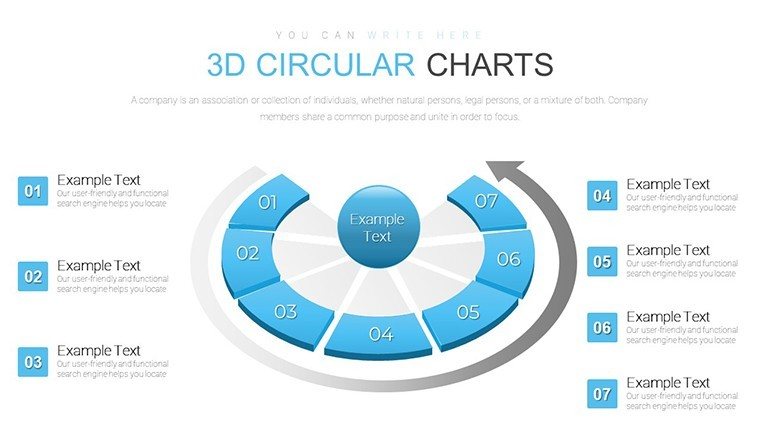
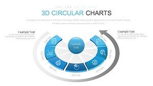
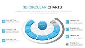
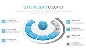
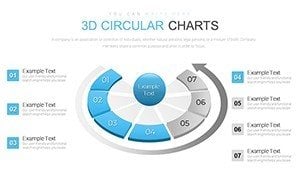
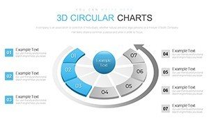
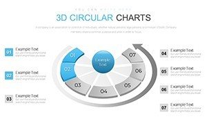
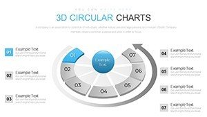
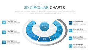
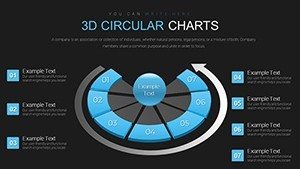
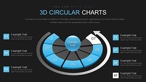
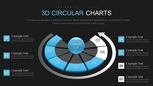
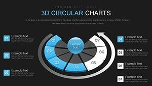
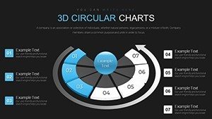
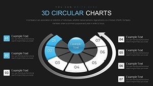
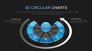
- 3D Circular Structures: Build pie-like charts with added depth, perfect for percentage breakdowns or cycle depictions.
- Advanced Editing Tools: Tweak colors, sizes, fonts, grids, and tick marks to fine-tune precision and aesthetics.
- Trend-Focused Layouts: Slides dedicated to time-series data, with options for exploding segments to emphasize shifts.
- Animation Integration: Smooth transitions that rotate or zoom, enhancing narrative flow in live presentations.
- Data Import Compatibility: Easily pull from spreadsheets, ensuring your charts stay current with minimal effort.
These tools surpass basic PowerPoint capabilities, providing a canvas that's as flexible as it is visually compelling.
Industry-Specific Use Cases and Strategies
For marketers, envision charting ad performance across channels, with 3D circles segmenting ROI by platform. Analysts in finance can visualize portfolio allocations, using depth to indicate risk levels. Educators might employ them for teaching economic cycles, rotating to show phases like boom and bust.
Business owners tracking trends in e-commerce sales find the template invaluable for seasonal pattern analysis, customizing ticks for monthly markers. This versatility extends to healthcare, where circular charts could represent patient outcome distributions, aiding in resource planning.
Practical Workflow: From Data to Delivery
- Choose Your Base: Select from 18 slides the circular format that suits your dataset - standard pie or multi-layered doughnut.
- Populate and Adjust: Input values, then modify grids and ticks for scale accuracy, ensuring readability.
- Enhance Visually: Apply 3D effects like bevels or shadows, aligning colors to your theme for brand consistency.
- Incorporate Dynamics: Add animations to reveal segments sequentially, building suspense in your storyline.
- Present with Confidence: Rehearse timings, leveraging the template's high-res output for flawless projection.
Versus traditional charts, which can distort perceptions in 2D, 3D adds context without confusion, backed by visualization research showing improved recall.
Pro Tips for Trend Mastery
Elevate your charts by limiting segments to seven for cognitive ease, per Miller's Law. Use contrasting colors for trends - warm tones for growth, cool for declines. Integrate legends dynamically, perhaps as pop-ups in animations, to keep slides clean.
A case from a retail chain: They customized circular charts to track inventory trends, resulting in optimized stock levels and reduced waste. Such integrations highlight how this template bridges data and decision-making.
Superior Value in a Crowded Market
Stand out from free alternatives with our polished, editable designs that save design time while amplifying impact. Users praise the intuitive interface, often halving preparation periods. Fully PowerPoint-native, it's a staple for evolving workflows.
Seize the opportunity to visualize trends like never before - start customizing your 3D circular charts today.
Frequently Asked Questions
What types of data work best with 3D circular charts?
Proportional data like market shares or trend cycles, where depth adds interpretive value.
Can I adjust the 3D depth levels?
Yes, fully customizable via PowerPoint's shape effects for varying emphasis.
Is animation support included?
Pre-built animations for rotations and reveals are ready to use.
How do I import external data?
Link or copy from Excel; the template supports dynamic updates.
Suitable for large datasets?
Best for summarized data; aggregate for clarity in presentations.