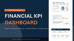
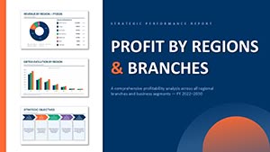
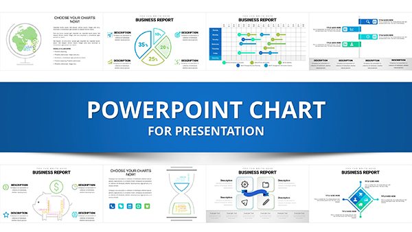
Data-Driven PowerPoint Charts Template: Visualize Insights Effortlessly


Type: PowerPoint Charts template
Category: Free Templates, Analysis
Sources Available: .pptx
Product ID: PC00637
Template incl.: 32 editable slides
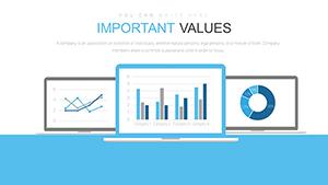
In an era where data reigns supreme, presenting it effectively can make or break your message. Our Data-Driven PowerPoint Charts Template bridges that gap, offering 32 editable slides packed with versatile graphs like bar, pie, and line charts. Tailored for business professionals, educators, and students, this free PPTX download turns raw numbers into compelling narratives. Whether analyzing sales trends or teaching complex concepts, these charts ensure clarity and impact, compatible with PowerPoint and Google Slides for hassle-free use.
What sets this apart is its focus on automation - link to Excel for real-time updates, saving precious time. Inspired by data visualization pioneers like Edward Tufte, who advocated for minimalism in design, this template avoids clutter, emphasizing insights. A case in point: A financial analyst at a Fortune 500 company used similar dynamic charts to highlight quarterly variances, leading to quicker executive decisions and a 15% efficiency gain. Step into a world where data doesn't overwhelm but enlightens, starting with this versatile tool.
Standout Features for Seamless Data Presentation
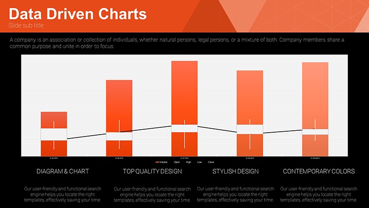
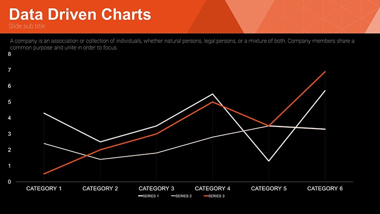
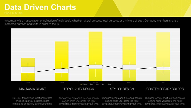
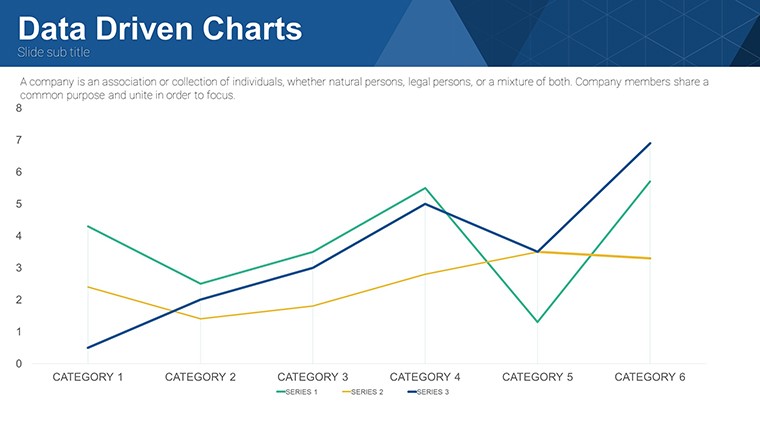
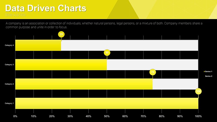
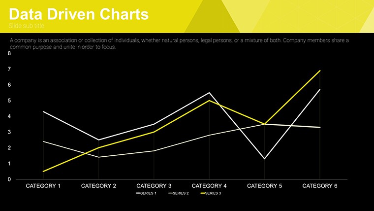
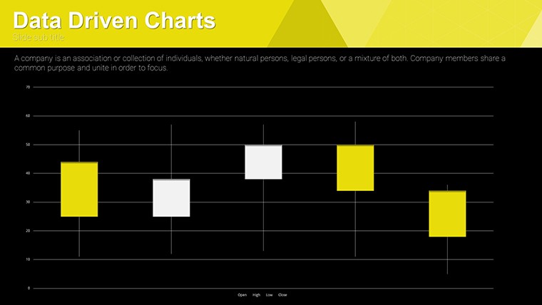
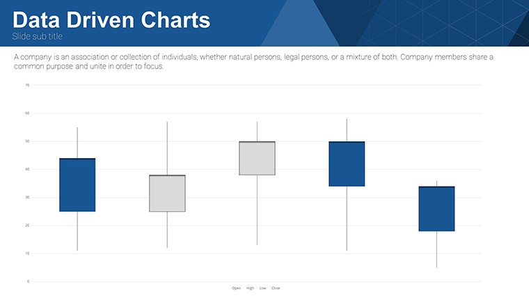
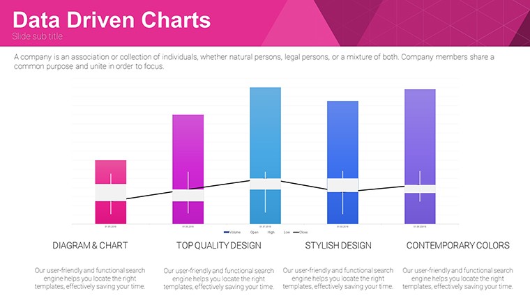
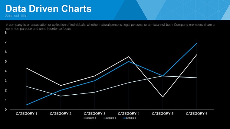
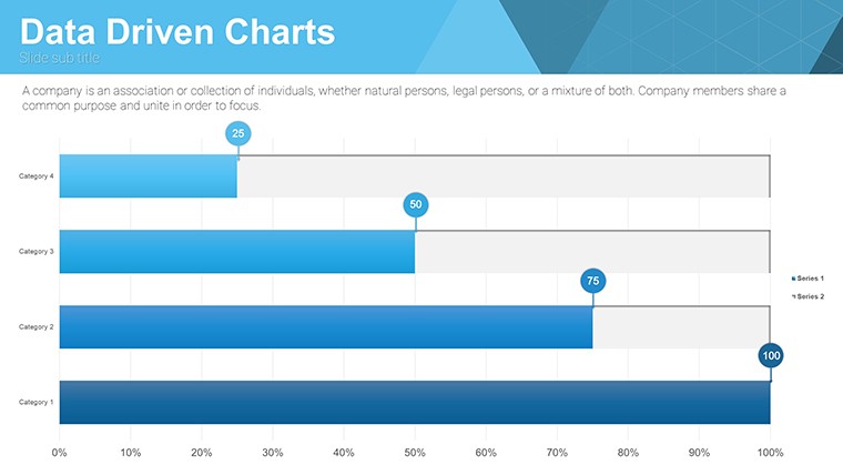
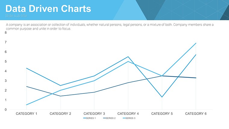
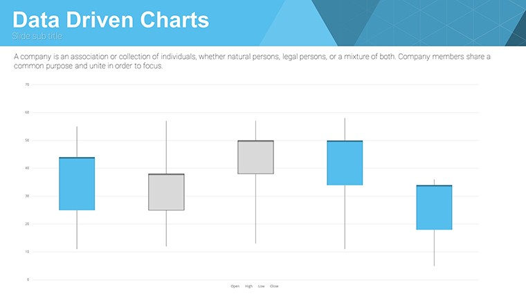
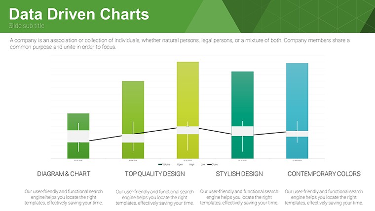
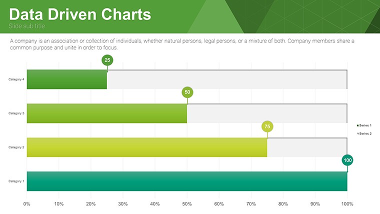
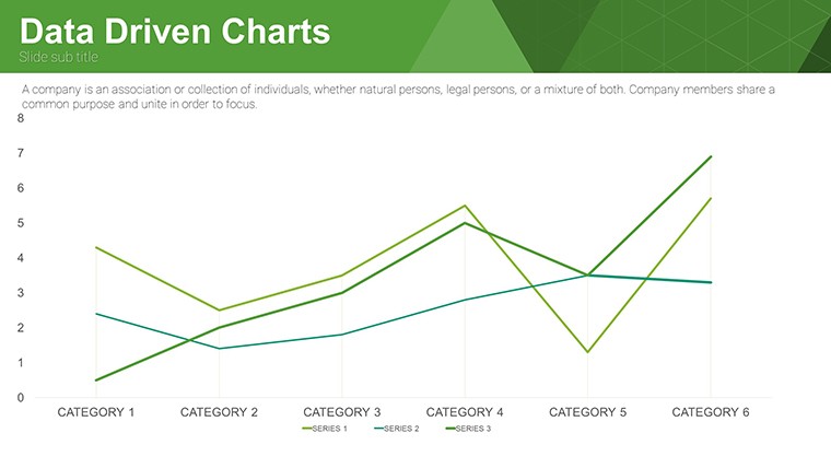
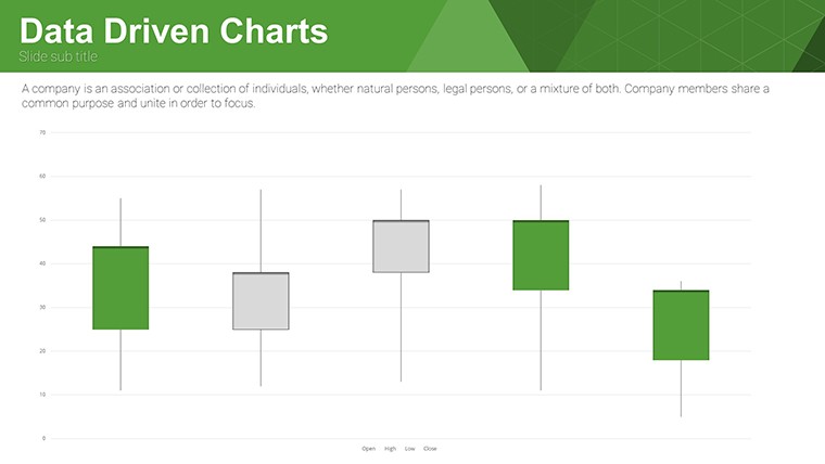
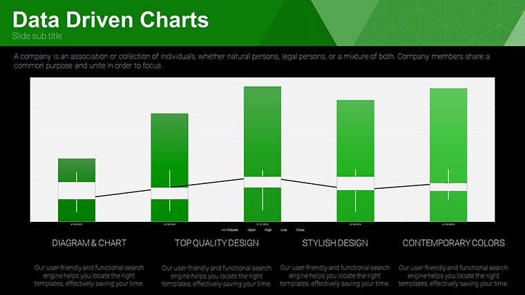
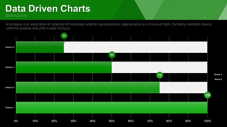
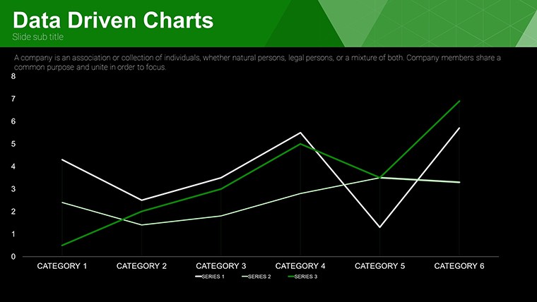
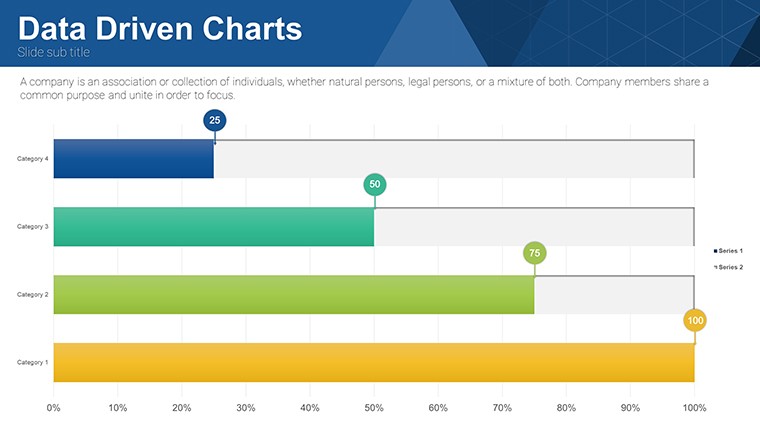
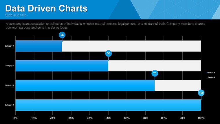
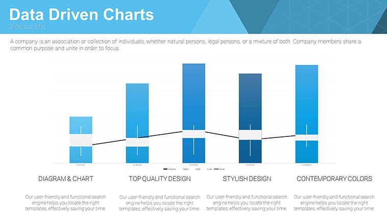
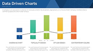
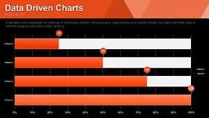
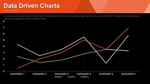
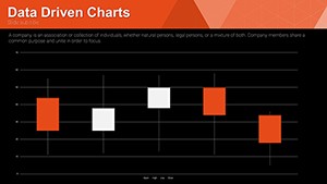
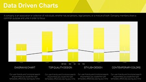
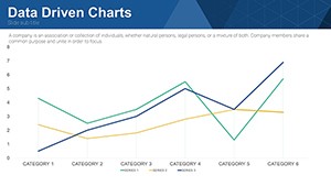
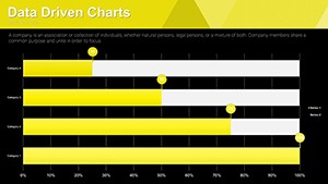
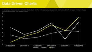
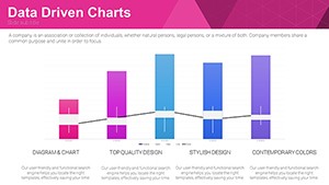
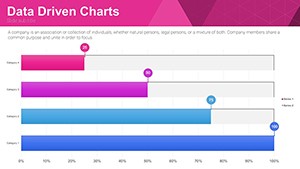
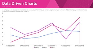
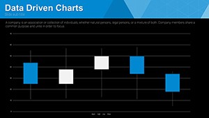
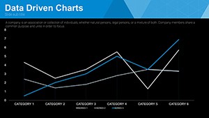
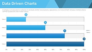
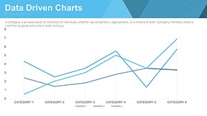
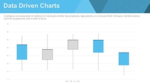
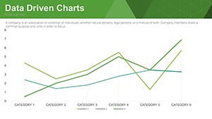
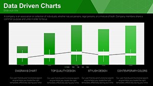
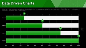
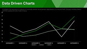
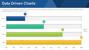
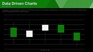
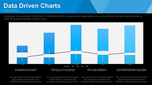
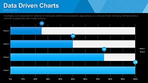
This template's user-friendly interface democratizes design, allowing even novices to create pro-level visuals. Select from a buffet of chart types, each optimized for specific data stories - bar graphs for comparisons, line for trends, pie for proportions.
- Dynamic Data Linking: Connect to spreadsheets for automatic refreshes, ideal for ongoing reports.
- Style Customization: Tweak fonts, colors, and sizes to align with corporate branding guidelines.
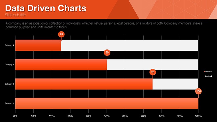
- Varied Layouts: 32 slides cover everything from simple overviews to multi-faceted analyses.
- Tooltips and Legends: Built-in for enhanced readability, following best practices from the International Business Communication Standards (IBCS).
- Mobile Optimization: Responsive designs ensure legibility on any device, crucial for remote presentations.
These elements draw from authoritative sources like the Data Visualization Society, ensuring your charts are not just pretty but powerfully informative.
Diverse Applications Across Industries
Envision a sales manager unveiling quarterly results: Dynamic bar charts rise as figures populate, captivating the boardroom. Or an educator breaking down statistical models with interactive pie charts, fostering student engagement in ways static slides can't.
For students, it's a game-changer in thesis defenses - use line graphs to plot research timelines, impressing panels with professionalism. In marketing, segment audiences visually, as done in campaigns by brands like Nike, where data-driven visuals informed targeted strategies.
- Financial Reporting: Track KPIs with line charts, highlighting anomalies for swift action.
- Educational Seminars: Simplify datasets in workshops, using bar graphs for comparative studies.
- Project Updates: Pie charts for resource allocation, ensuring team alignment.
- Market Research: Combine multiple charts for comprehensive insights, driving strategic pivots.
Consultants leverage it for client deliverables, embedding custom data to demonstrate value, often leading to repeat business.
Unlocking Benefits: From Efficiency to Engagement
Efficiency skyrockets with pre-built elements, reducing design time by up to 70%, per user feedback. Visual impact draws eyes, with research from 3M showing visuals processed 60,000 times faster than text. Professional quality elevates your brand, building trust in high-stakes environments.
For educators, it enhances pedagogical outcomes; students retain more through visuals, as per dual-coding theory. Overall, it empowers data storytelling, turning information into influence.
Expert Tips to Harness Full Potential
Begin with clean data: Import from CSV for accuracy. Use color sparingly - stick to 3-5 hues for focus, per color theory experts. Add annotations for context, transforming charts into self-explanatory assets.
Integrate with add-ons like Think-Cell for advanced features. Test on audiences for feedback, refining for maximum impact. With these strategies, your presentations will resonate long after the lights dim.
Elevate your data game - grab this free template and start visualizing success.
Frequently Asked Questions
What chart types are included?
Bar, pie, line, and more, all fully editable for diverse data needs.
Does it support data linking?
Yes, connect to Excel or Google Sheets for automatic updates.
Is customization beginner-friendly?
Absolutely, with intuitive interfaces and included instructions.
Compatible with older PowerPoint versions?
Works with PowerPoint 2010 and later, plus Google Slides.
How to get started quickly?
Download, open in PowerPoint, and replace placeholders with your data.
Any usage restrictions?
None - free for all purposes, personal or commercial.