Free Bucket Chart PowerPoint Template - Fully Editable Instant Download


Type: PowerPoint Charts template
Category: Free Templates, Illustrations
Sources Available: .pptx
Product ID: PC00634
Template incl.: 16 editable slides
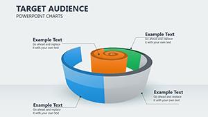
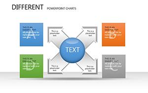
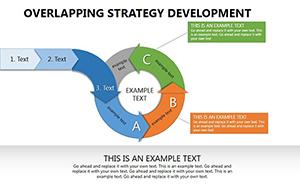
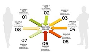
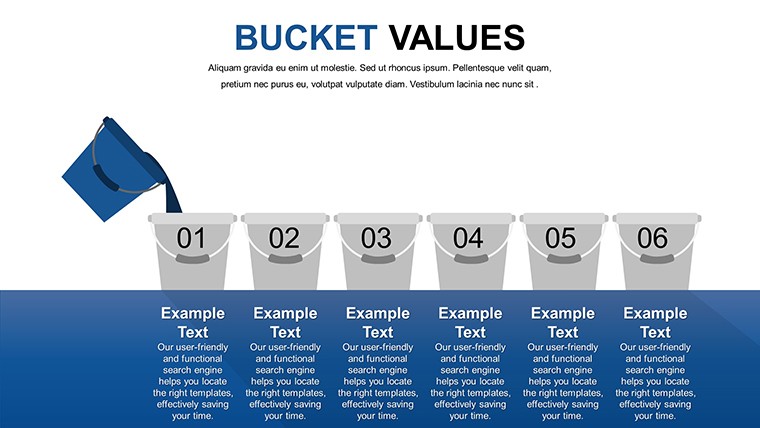
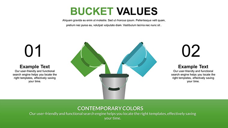
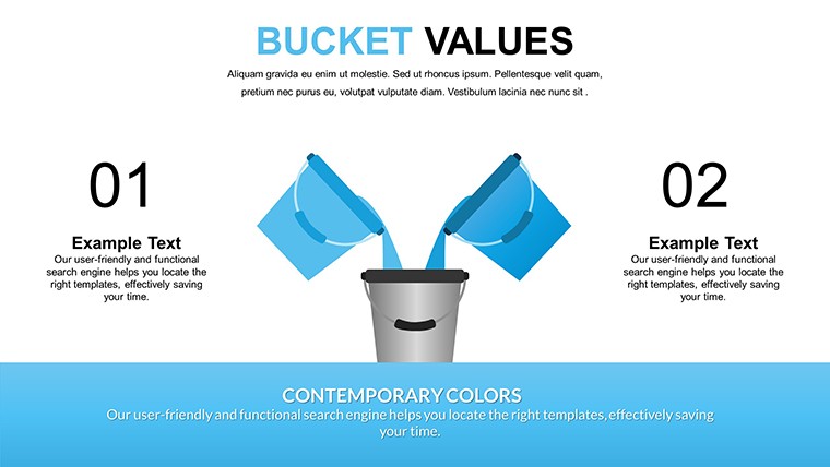
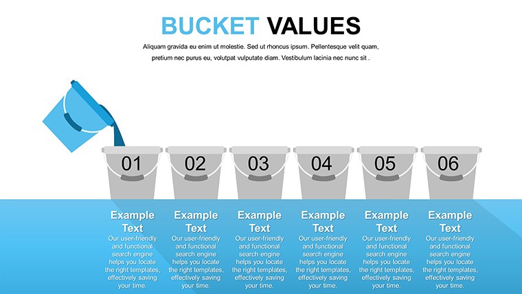
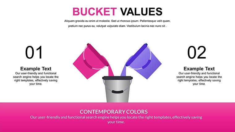
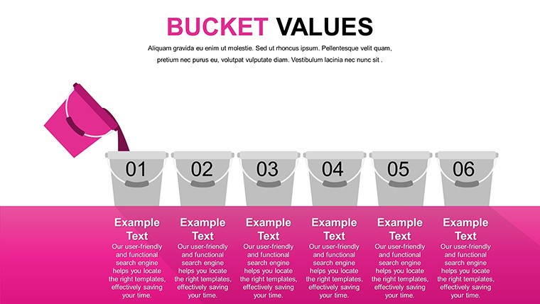
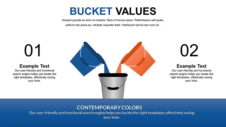
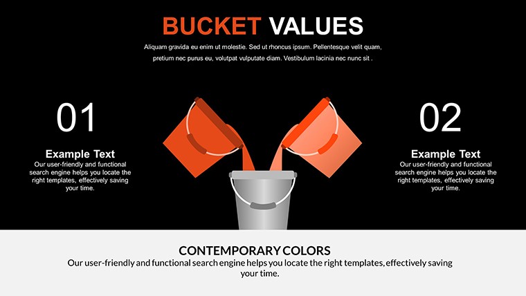
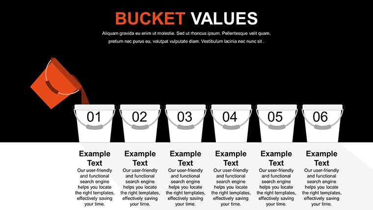
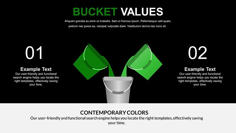
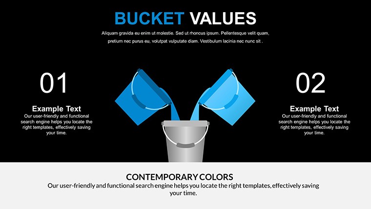
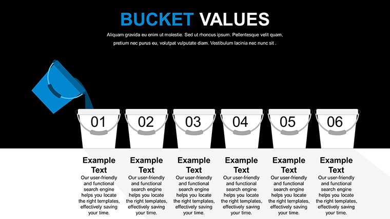
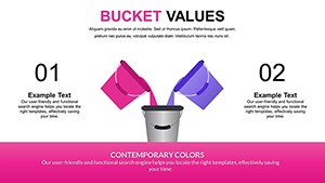
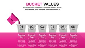
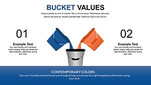
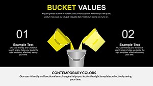
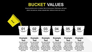
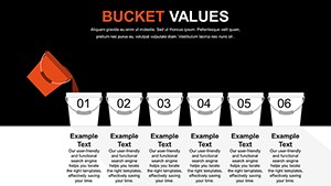
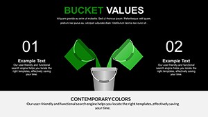
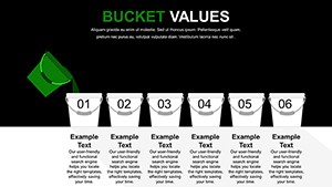
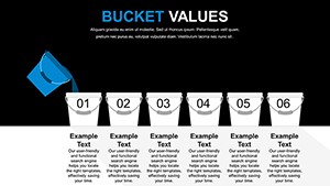
Organize complex information into intuitive categories with this free bucket chart PowerPoint template. Featuring 16 fully editable slides, these creative bucket-style charts help professionals present grouped data clearly in meetings, reports, and strategic discussions.
Ideal for consultants categorizing ideas, businesses grouping opportunities or risks, and educators structuring topics, this template delivers professional visuals that enhance audience understanding.
Key Features
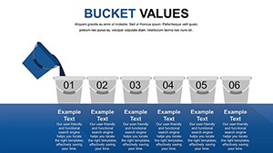
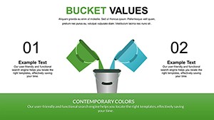
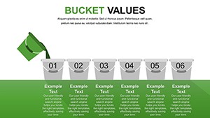
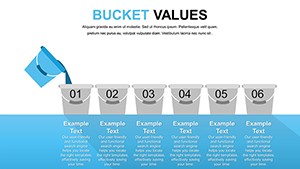
- 16 unique editable slides with varied bucket layouts
- Fully customizable colors, text, icons, and bucket sizes
- Vector-based elements for high-quality scaling
- Compatible with Microsoft PowerPoint and Google Slides
- Print-ready and optimized for presentations
Benefits of Bucket Charts
Bucket charts excel at simplifying complex datasets by dividing them into logical groups, making patterns and priorities immediately visible. This visual approach reduces cognitive load for audiences during detailed analyses. Professionals across industries rely on bucket charts to structure thoughts and communicate insights effectively.
The flexible designs adapt to various data volumes while maintaining visual appeal and clarity in both small team meetings and large presentations.
How to Use This Template
After instant download, open the .pptx file in PowerPoint or Google Slides. Replace placeholder content with your categories and data, adjust colors to match branding, and modify bucket arrangements as needed. The intuitive structure enables quick customization for any presentation requirement.
Customization Tips
- Update bucket labels to reflect your specific categories
- Resize buckets to emphasize key groups
- Add or remove buckets for perfect fit
Professional Scenarios
Consultants use bucket charts to present strategic frameworks and categorized recommendations to clients. Business teams group market opportunities, risks, or operational improvements during planning sessions. Educators categorize concepts or student projects for clearer instruction. Internal operations bucket KPIs or process enhancements for targeted discussions.
Download this free bucket chart PowerPoint template today to create structured, impactful presentations.
Frequently Asked Questions
Is this bucket chart template free to download?
Yes, the template is completely free for both personal and commercial use with instant download available.
What software is compatible with this template?
The template is provided in .pptx format and works seamlessly with Microsoft PowerPoint and Google Slides.
How many slides are included?
The template contains 16 unique editable slides with different bucket chart variations.
Can I fully customize the charts?
Yes, all elements including colors, text, icons, bucket sizes, and layouts are fully editable.
Is the template print-ready?
Yes, all designs are high-resolution and optimized for both screen projection and printing.