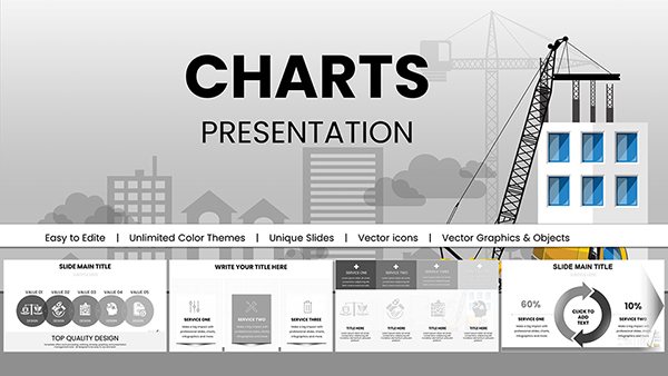
Various Types PowerPoint Charts Template


Architecture demands versatile tools to convey diverse data, from site analyses to budget breakdowns. Our Various Types PowerPoint Charts Template offers exactly that, with 17 editable slides encompassing bar graphs, pie charts, cycles, and 3D visuals tailored for design professionals. Whether you're an urban planner charting population impacts or a studio head presenting portfolio metrics, this template adapts to your needs. Fully compatible with PowerPoint and Google Slides, it provides a seamless download and instant customization, saving precious time amid tight deadlines. Inspired by innovative firms like BIG (Bjarke Ingels Group), it helps transform raw data into persuasive stories that align with AIA sustainability metrics, making your presentations not just informative but transformative for project outcomes.
Diverse Charting for Comprehensive Design Insights
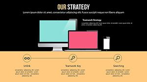
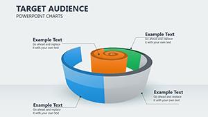
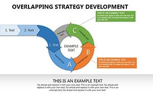
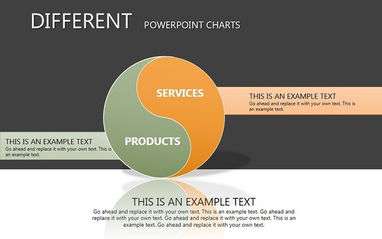
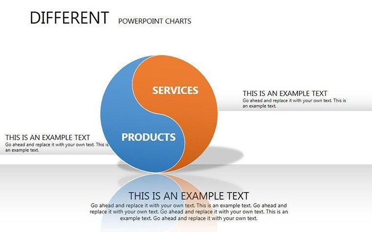
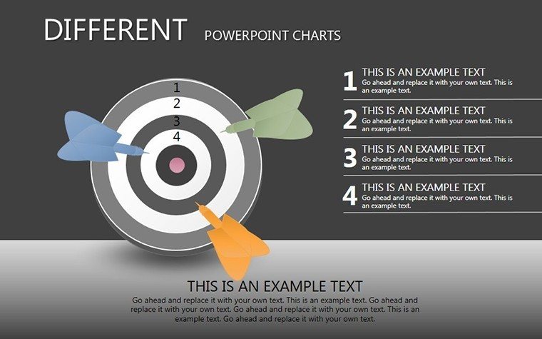
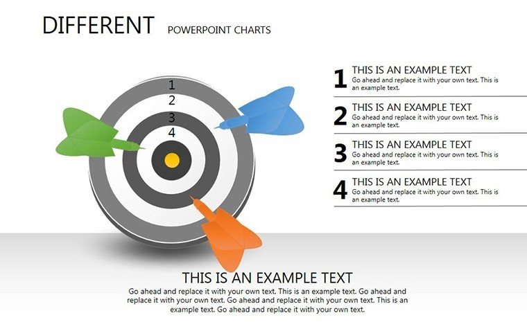
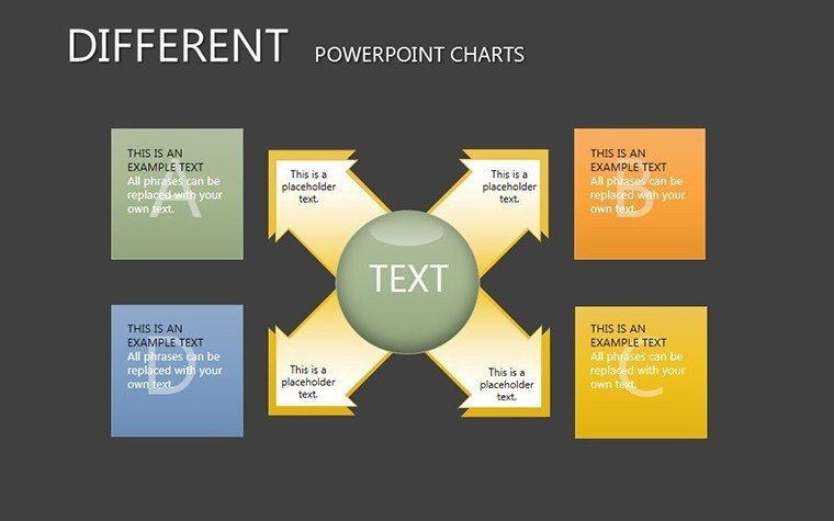
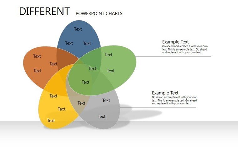
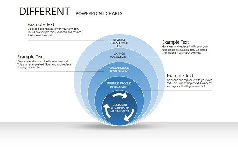
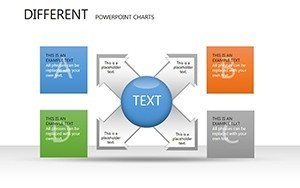
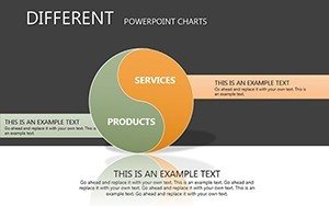
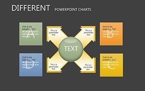
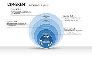
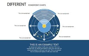
This template's strength lies in its variety, allowing you to mix chart types for multifaceted views - e.g., pie charts for material distributions alongside cycles for project phases. It supports professional polish, ensuring your visuals meet industry standards and enhance your firm's reputation.
Highlight Features for Design Excellence
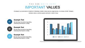
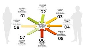
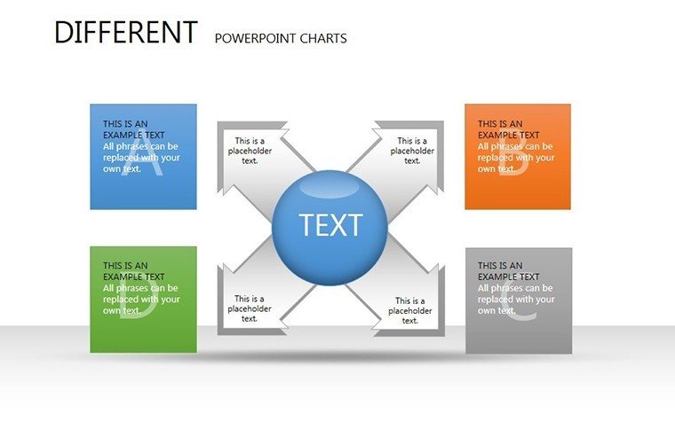
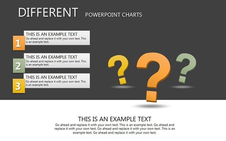
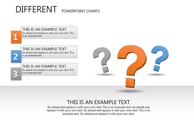
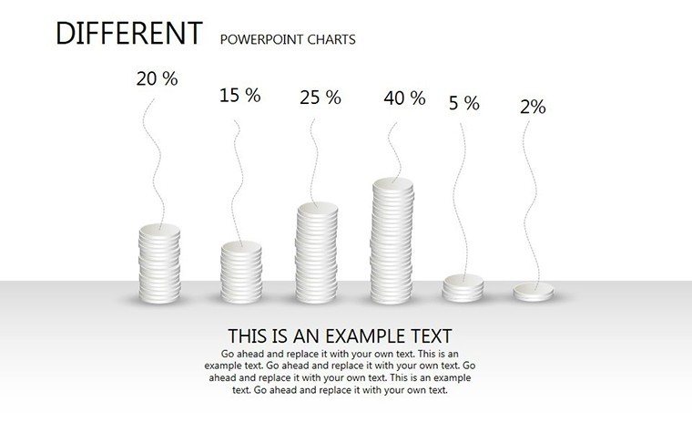
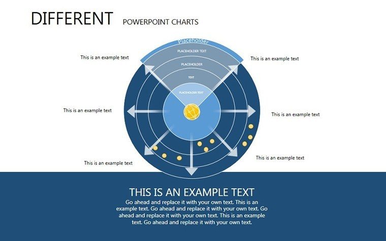
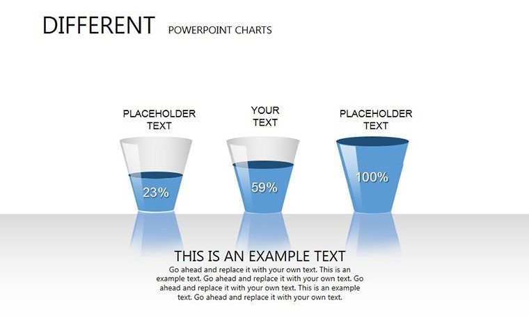
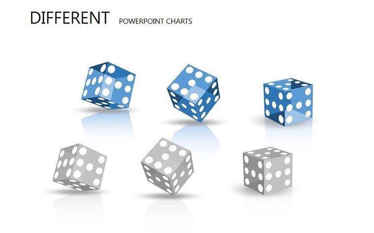
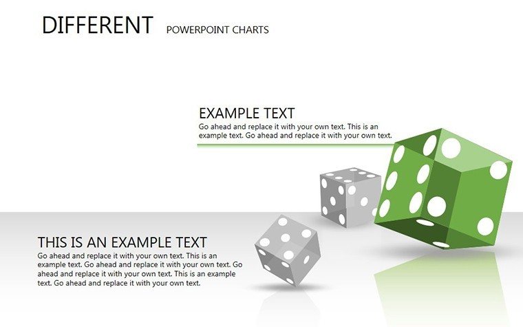
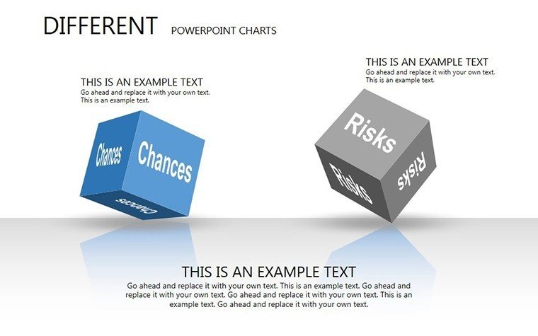
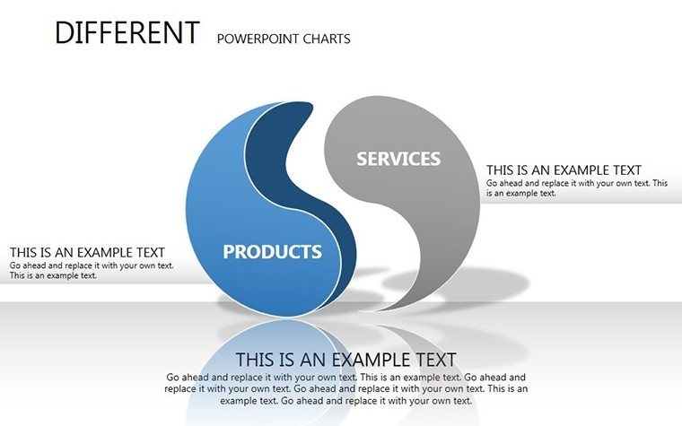
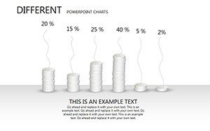
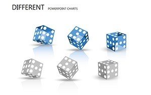
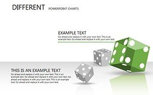
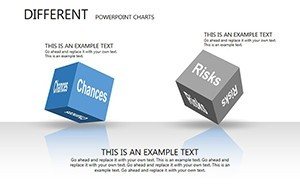
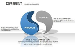
- Extensive Chart Selection: Bar, line, pie, and more for any data set.
- Customization Depth: Fonts, colors, styles to brand-match.
- Instant Access: Quick download, no design from scratch.
- Professional Designs: Clear, effective visuals for audience engagement.
- Multi-Use Compatibility: PowerPoint, Google Slides ready.
These make it a staple for architects seeking efficiency and impact.
Broad Applications Across Architecture Disciplines
Business pros use it for financial overviews in proposals; educators for teaching data interpretation; designers for conceptual explorations. In practice, it's key for visualizing LEED point allocations or client feedback trends.
Customization Workflow for Optimal Results
- Download and open the .pptx file.
- Choose chart type based on data needs.
- Tailor elements: Input figures, adjust aesthetics.
- Add enhancements: Labels, legends, images.
- Finalize and present with built-in tools.
This ensures tailored, professional outputs every time.
Elevating Beyond Standard Visuals
Outclasses basic options with ready, polished templates that inspire creativity and clarity.
Expert Advice for Chart Mastery
- Match charts to data: Pies for parts, lines for trends.
- Keep it simple: Avoid clutter for better comprehension.
- Storytell: Sequence charts for narrative flow.
- Innovate: Combine types for unique insights.
- Test visuals: Ensure readability across devices.
Apply these for presentations that win accolades.
Unleash Creativity - Secure Your Template
Dive into versatile charting to advance your architecture. Download and innovate today.
Frequently Asked Questions
What chart types are included?
Bar, line, pie, cycles, 3D, and more varieties.
Easy to customize for beginners?
Yes, intuitive interface for all skill levels.
Can I use in educational settings?
Perfect for teaching and student projects.
Any size limitations?
No, scalable for any presentation scale.
Support for 3D elements?
Yes, included for depth in visuals.