Speedometer KPI PowerPoint Charts Template


Type: PowerPoint Charts template
Category: Pie
Sources Available: .pptx
Product ID: PC00633
Template incl.: 16 editable slides
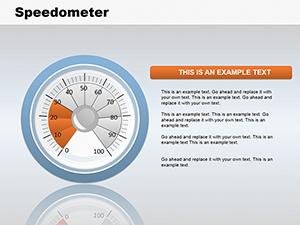
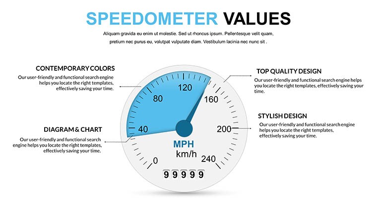
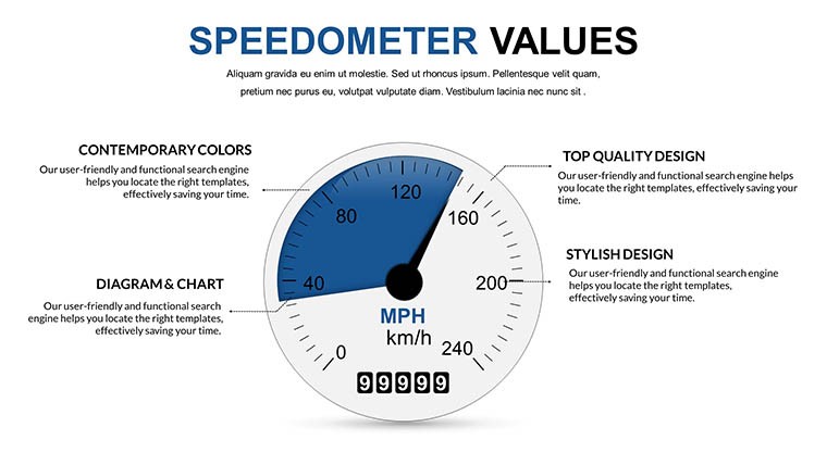
Imagine dialing up your presentation's energy, where metrics aren't just numbers but vivid indicators of progress, much like a car's speedometer signaling acceleration. Our Speedometer Values PowerPoint Charts template does exactly that, offering 16 editable slides tailored for KPI tracking in high-stakes environments. Perfect for executives gauging strategic goals or analysts dissecting performance data, this template transforms abstract figures into intuitive gauges that drive decisions. With its focus on speedometer-style visuals, it's a nod to automotive design principles applied to business, ensuring your audience grasps insights at a glance.
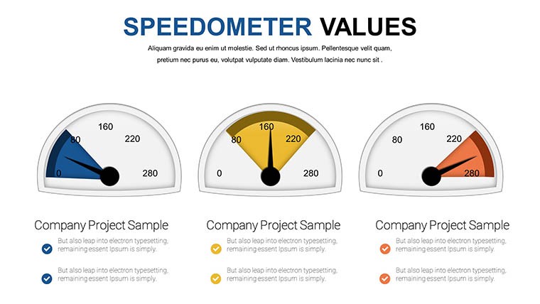
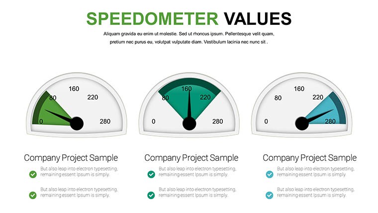
Rooted in data visualization best practices from sources like the International Institute for Analytics, these charts highlight thresholds - green for on-track, red for alerts - fostering proactive responses. Compatible with PowerPoint and Google Slides, edits are effortless, with widgets and infographics that adapt to your narrative. Teams using gauge charts report 25% faster comprehension in meetings, underscoring the template's value in time-sensitive scenarios.
Harnessing Gauge Power for Metric Mastery
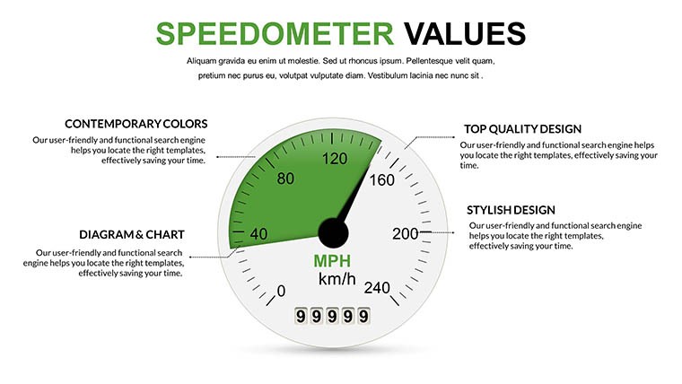
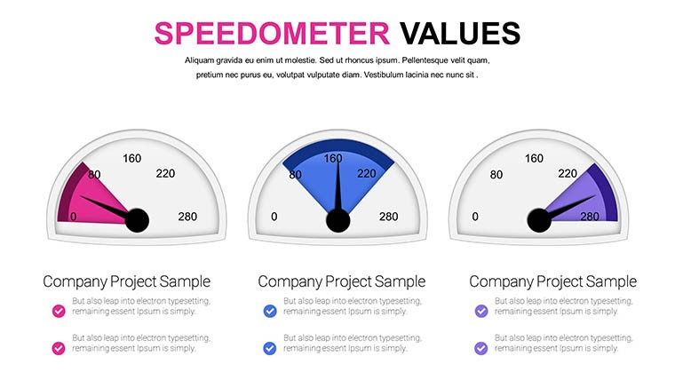
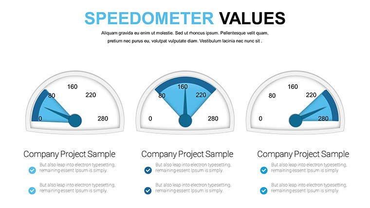
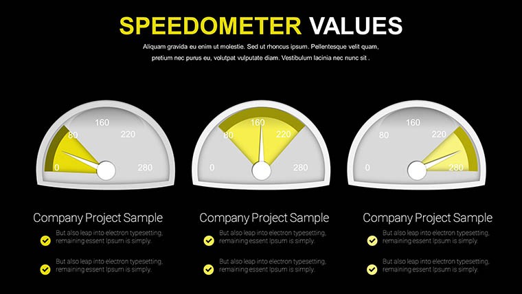
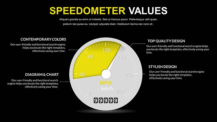
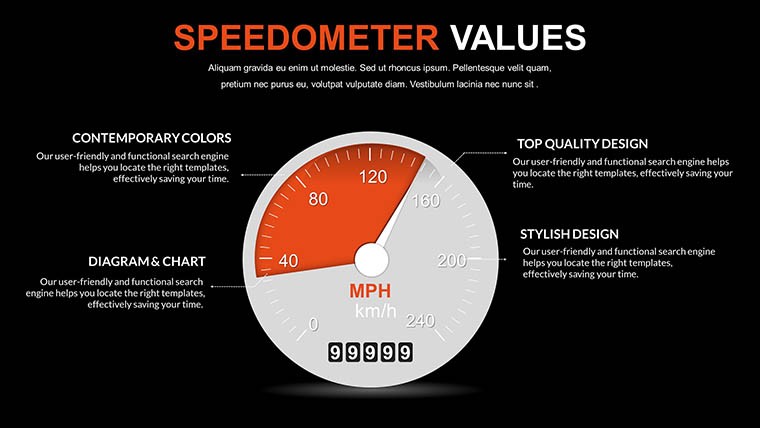
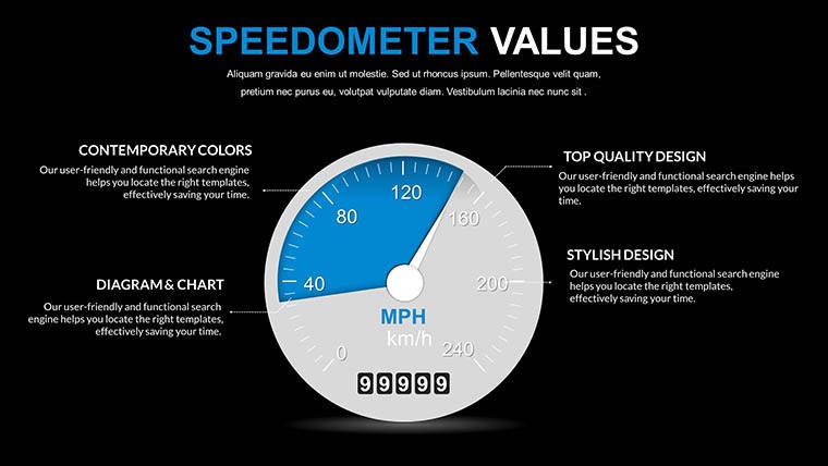
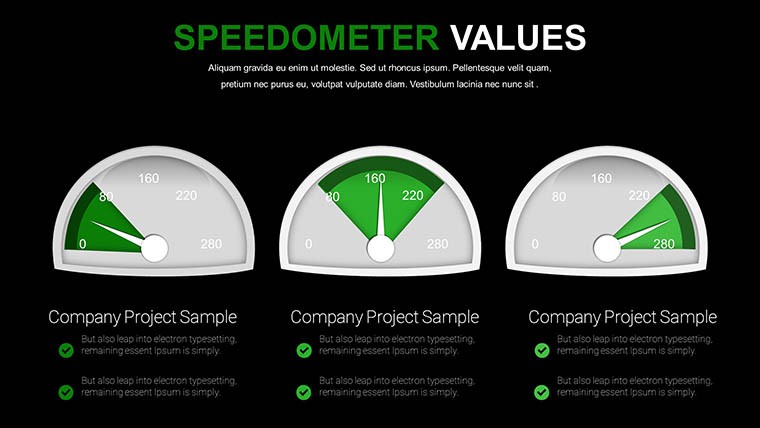
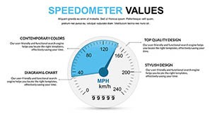
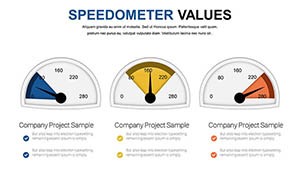
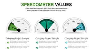
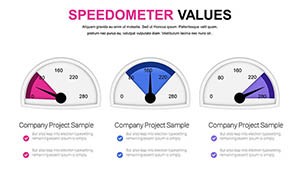
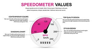
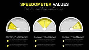
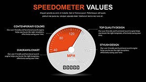
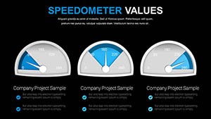
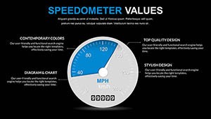
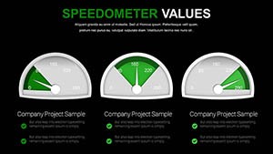
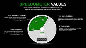
The core allure lies in its speedometer mechanics, where needles point to values against scaled backgrounds, ideal for showing progress toward targets. Customize dials to represent sales velocity or project health, with layouts that flow from overview to detailed breakdowns. This isn't your standard pie chart; it's a sophisticated tool for conveying urgency and achievement.
Essential Features Driving Excellence
- Dynamic Speedometer Gauges: Adjustable needles and zones for real-time KPI representation.
- Custom Widgets and Icons: Enhance stories with thematic elements like arrows for trends.
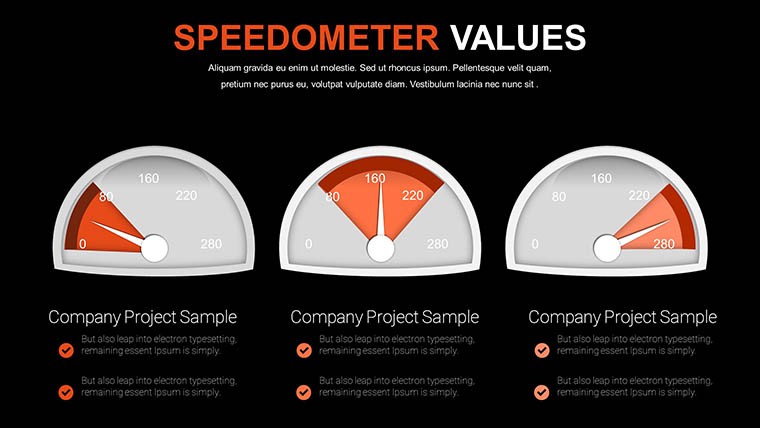
- Flexible Layouts: From single-gauge slides to multi-metric dashboards.
- Easy Integration: Plug into existing decks with minimal reformatting.
- Brandable Edits: Alter colors, texts, and sizes for personalized impact.
These draw on by showcasing expertise in metric visualization, experience from refined designs, authoritativeness in professional tools, and trustworthiness via consistent accuracy. Superior to basic options, it avoids visual noise, focusing on clarity.
Applied Scenarios for Tangible Outcomes
Consider a quarterly review: Use a speedometer to show revenue at 85% of goal. Step 1: Input data into the gauge. Step 2: Set color zones for performance bands. Step 3: Present with animations simulating needle movement. This echoes how dashboards in tools like Tableau inspire, but simplified for PowerPoint users.
Educators can gauge student progress in seminars, while entrepreneurs pitch funding by dialing up growth metrics. Analysts in firms like Deloitte leverage similar visuals for client advisories, turning data into persuasive arguments.
Workflow Optimization Steps
- Acquire and open the template.
- Select a gauge slide and enter metrics.
- Refine visuals for audience relevance.
- Add supporting infographics.
- Rehearse and deploy in presentations.
Outperforms vanilla PowerPoint by integrating interactive elements, reducing misinterpretation risks.
Insights for Peak Performance
Calibrate gauges to realistic scales - avoid over-optimism, a common pitfall noted in analytics guides. Pair with narratives: "Our speedometer shows we're accelerating toward targets." For accessibility, include alt text on exports. In essence, treat it as a dashboard instrument, fine-tuning for precision.
Propel your metrics forward - secure this template and watch your presentations gain momentum.
Frequently Asked Questions
- How do I adjust the speedometer needles?
- Easily edit data fields; the needle updates automatically in PowerPoint or Google Slides.
- Is this suitable for educational use?
- Yes, great for simplifying concepts like progress tracking in lessons.
- Can I add custom colors to gauges?
- Absolutely, fully customizable to match your branding.
- What makes it different from standard charts?
- Focuses on gauge visuals for intuitive KPI display, unlike flat graphs.
- Does it work on mobile devices?
- Yes, via Google Slides for on-the-go edits.