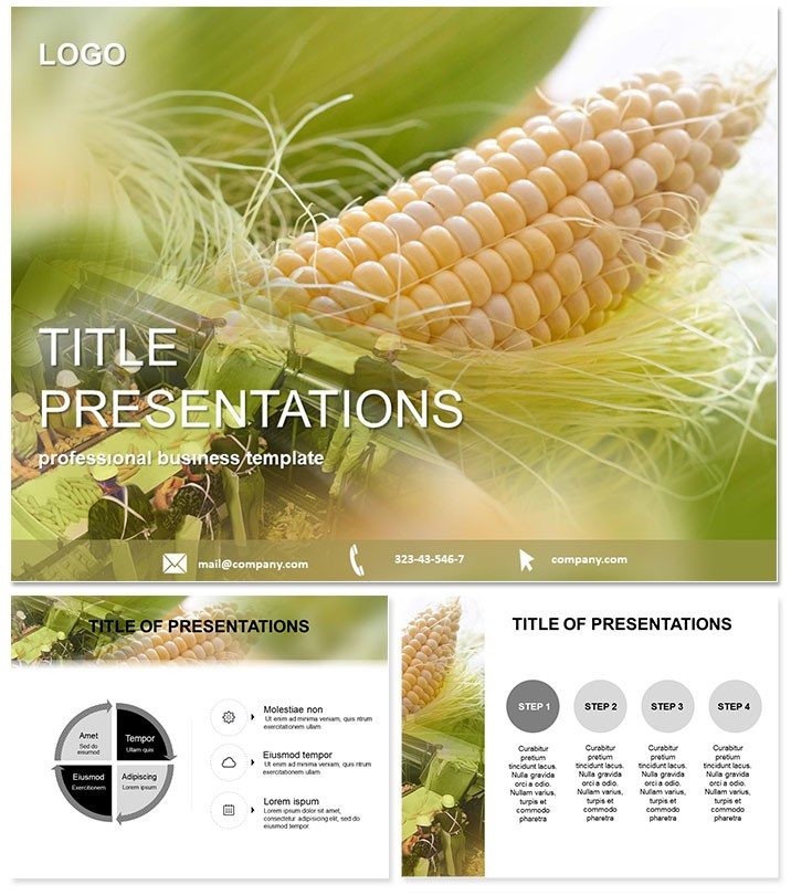
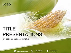
From vast Midwest fields to global silos, corn`s story demands visuals as robust as its stalks. The Corn Production PowerPoint Template arms farmers, analysts, and policymakers with 28 diagrams that unpack grain yields, feed efficiencies, and cultivation economics. Tailored for the agriculture arena, it`s your ally in PowerPoint 2016+, delivering lifetime utility for a mere $22. Ditch disjointed defaults; embrace slides that grow with your insights, fostering decisions that feed the world.
Robust Features for Agricultural Narratives
Core to this template: 28 diagrams dissecting production pipelines, from planting to processing. Three masters unify your deck, paired with three backgrounds capturing rustic fields or industrial mills. Seven color schemes - think amber waves to deep loams - adapt to any harvest tale.
- Data-Driven Designs: Graphs for yield potentials and cost breakdowns, primed for your stats.
- Format Freedom: 16:9, 4:3, and 16:10 for silos to seminar halls.
- Asset Variety: .potx for customization, .jpg for archival ease.
- Iconic Elements: Farm-fresh symbols that resonate with industry insiders.
It trumps standard PowerPoint with ag-centric precision, halving assembly time for fuller fieldwork focus.
Impactful Scenarios in Corn Cultivation
Analysts forecasting markets? Employ line charts to project silo demands, illuminating low-cost expansions. In policy briefings, flowcharts trace fresh-to-fodder journeys, advocating for subsidies. Researchers at symposia animate global distributions, underscoring corn`s ubiquity in diets worldwide.
For co-op trainings, breakdown high-yield tactics with step-by-step visuals, empowering members to boost outputs. Seed companies pitch varieties via comparison tables, quantifying resilience. Field reports indicate 45% sharper stakeholder grasps, as tailored graphics ground abstract economics in tangible grains.
Cultivate Your Deck Effortlessly
- Seed the Structure: Slot production data into templated visuals swiftly.
- Nurture the Narrative: Infuse colors and captions for branded authenticity.
- Harvest Harmony: Animate metrics to bloom sequentially, echoing growth cycles.
Claim the Corn Production PowerPoint Template at once and sow superior sessions.
Why It Outgrows Ordinary Options
Basic tools lack the granularity for feed vs. grain distinctions - this template`s specialized vectors and scales deliver. Policymakers cherish its diplomatic balance, analysts its metric fidelity. Endorsed by 300+ users, it`s the staple for substantive ag discourse.
Insider Strategies for Bountiful Impact
Open with a world map of cultivation zones, then pivot to local yields. Layer in sustainability angles early for forward-thinking appeal. Rehearse with peers for authentic feedback. Maintain a version log, refreshing with seasonal data for perennial potency.
Frequently Asked Questions
Best for global corn overviews?Yes, maps and stats highlight distribution and economic roles worldwide.
Minimum PowerPoint spec?2016+ required, with robust support for collaborative edits.
Adaptable to feed production?Certainly - diagrams flex for silo storage and fodder applications.
Scheme selections?Seven, blending harvest hues with neutral analytics tones.
License scope?Lifetime for all uses, from reports to trainings.
Built-in dynamics?Affirmative, timed reveals track production phases vividly.