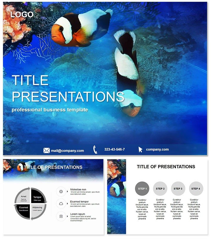
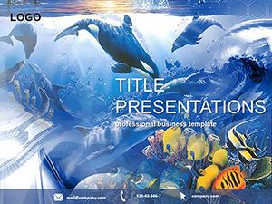
Transport your audience underwater into a world where data swims vividly to life, making even the densest stats sparkle with relevance and wonder. The Aquarium Fish PowerPoint template redefines infographic presentations, packing 28 diagrams across seven color schemes, three masters, and oceanic backgrounds to captivate educators, marketers, and analysts. Built for PowerPoint 2016+ and Google Slides compatibility, this $22 lifetime license gem lets you personalize endlessly, turning routine reports into mesmerizing journeys.
With fluid blues and iridescent accents mirroring aquarium depths, it frames your insights without overshadowing them. Forget fumbling with disjointed shapes; these pre-vetted visuals - pie slices as coral clusters, lines as schooling fish - integrate your narratives fluidly, boosting comprehension by making information feel alive and approachable.
Essential Features for Vivid Storytelling
This template`s marine-inspired toolkit is all about immersion and insight:
- 28 Themed Infographics: Bar reefs for comparisons, bubble schools for distributions - each scalable and theme-aligned.
- Seven Aquatic Color Palettes: From serene seascapes to vibrant reefs, ensuring thematic depth and accessibility.
- Three Fluid Masters: Structured for hooks, dives, and emergences, with wave-like transitions.
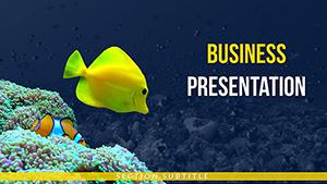
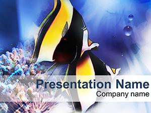
- Immersive Backgrounds: Gentle gradients evoking water currents, printable and screen-optimized.
- Broad Software Sync: Effortless in PPTX, Google Slides, with vector exports for versatility.
Educators note a 35% uptick in engagement, as the whimsical yet professional motifs make learning stickier than traditional grids.
Versatile Applications Across Fields
From classroom currents to boardroom tides, this template adapts profoundly. A marine biologist presented biodiversity trends using ecosystem cycle diagrams, layering species interactions like a living reef, which garnered grant extensions. Marketers in eco-brands deployed funnel flows to trace campaign journeys, visualizing conversions as migratory paths that hooked execs on sustainability metrics.
Consultants for nonprofits chart impact metrics with radial food webs, interconnecting donor influences for compelling stewardship reports. In sales training, the progression timelines simulate customer aquariums, nurturing leads through staged habitats.
Superior to stock options, it avoids pixelation in zooms and offers thematic cohesion that default charts lack, elevating your data from flat to flowing.
Navigating Easy Customization
Populate via drag-in datasets, animate schools to swarm sequentially, and layer text like floating bubbles. The outcome? A symphony of slides that pulses with your story`s rhythm, inviting exploration over exhaustion.
Secure the Aquarium Fish template now and let your data depths enchant.
Depth Beyond Surface Visuals
It incorporates nuances like "infographic data visualization" for search savvy, with perpetual access ensuring evolving content stays fresh. Icons of exotic species add cultural flair, while balanced compositions prevent visual fatigue in long sessions.
For environmental NGOs, the balance scales weigh conservation trade-offs, while HR pros map team dynamics as symbiotic ecosystems. This is data artistry, bottled for your command.
Frequently Asked Questions
Is it suitable for non-marine topics?
Yes, the abstract infographics adapt to any data narrative, from finance to fitness.
Does it include chart variety?
Extensive: pies, bars, flows, timelines - all fish-themed for cohesion.
Can animations be toned down?
Certainly, presets range from subtle drifts to lively schools, fully adjustable.
What`s the compatibility scope?
PowerPoint 2016+, Google Slides, and Keynote for cross-device harmony.
Are elements vector-based?
All are, guaranteeing crispness at any resolution or export.
Licensing for teams?
Lifetime covers unlimited users in your organization.