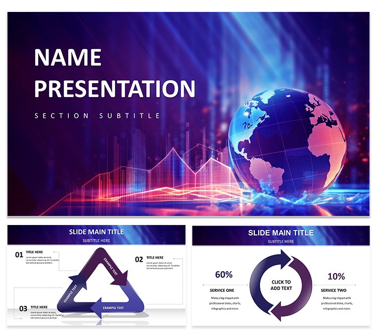
When global trends shape boardroom battles, your slides must cut through the noise with precision. The Global Impact: Data-Driven PowerPoint Template equips you with 28 meticulously crafted diagrams, three versatile masters, and backgrounds, plus seven color schemes to suit from corporate navy to impact orange. Aimed at analysts and leaders decoding worldwide patterns, it transforms datasets into decisive narratives that span borders.
Boasting bar charts for sector breakdowns, pie visuals for share distributions, and line graphs tracing evolutions, this editable suite in PowerPoint 2016+ lets you layer in specifics effortlessly. Adjust axes for regional focus or embed interactive elements for deeper dives - it's designed to make your data not just seen, but felt, much like how forward-thinking reports from organizations like the UN leverage visuals for policy sway.
Standout Features: Crafting Compelling Data Narratives
Central to the template is its analytical depth. The flagship slide, an integrated dashboard, merges multiple graphs into a unified view - toggle visibility to spotlight variances.
- Chart Arsenal: Bars for comparisons, pies for proportions, lines for progressions - all with error bars for rigor.
- Map Integrations: Choropleth designs shading economic indicators by country.
- Infographic Flows: Sequential arrows linking causes to global effects.
- Dynamic Elements: Hover-reveal details in presentation mode for interactivity.
Tweaking is straightforward: Select a series, apply theme colors, and watch cohesion spread. These tools empower you to present with the poise of a seasoned statistician.
Targeted Use Cases: From Reports to Revelations
Envision a financial strategist unveiling quarterly globals. Use the multi-axis line graph to juxtapose currency fluxes against trade volumes, annotating peaks with event callouts. Trainers in business schools might deploy the pyramid hierarchy for organizational impacts, stacking layers from local actions to planetary shifts.
Assemble a research presentation via these steps:
- Source Your Metrics: Aggregate from reliable bases like OECD databases.
- Match to Modules: Pair time-series data with line slides, categoricals with bars.
- Refine Accuracy: Calibrate scales; add legends for multi-dataset clarity.
- Narrate Outcomes: Use adjacent summaries to interpret, e.g., "This spike signals opportunity."
- Engage Endgame: Conclude with a synthesis infographic recapping key takeaways.
Marketers harness it for campaign audits, mapping ROI across territories to justify budgets. In corporate huddles, it facilitates scenario planning, with what-if sliders for projected impacts.
Refinement Tips: Sharpening Your Data Edge
Prioritize legibility: Opt for high-contrast schemes in the variants panel, especially for printed handouts. For voluminous data, employ drill-down animations - reveal sub-charts on cue to maintain momentum.
Insight: Anchor graphs with descriptive titles, not just labels, guiding viewers intuitively. Superior to ad-hoc PowerPoint builds, this template's calibrated proportions prevent distortion, ensuring fidelity across exports.
The Edge in Data-Driven Design
This template rises above by embedding analytical intent - grids that align decimals perfectly, sans generic fluff. Universally accessible, it performs on any setup, from cloud shares to offline preps.
A researcher once used a variant to illuminate climate correlations, swaying grant panels. Claim the Data-Driven Global Impact PowerPoint Template for $22 - download and let your data dictate destinies with undeniable force.
Frequently Asked Questions
Which graph types are pre-built?
Bar, pie, line, and area, with extensions for stacked and clustered variants.
Can I add interactivity beyond animations?
Yes, via hyperlinks and action buttons to supplementary slides.
Does it handle large datasets?
Efficiently; data tables link externally to avoid bloating file sizes.
How to export for non-PowerPoint users?
Save as PDF or interactive HTML for broad compatibility.
Is it geared toward specific industries?
Neutral yet potent for finance, research, and policy alike.