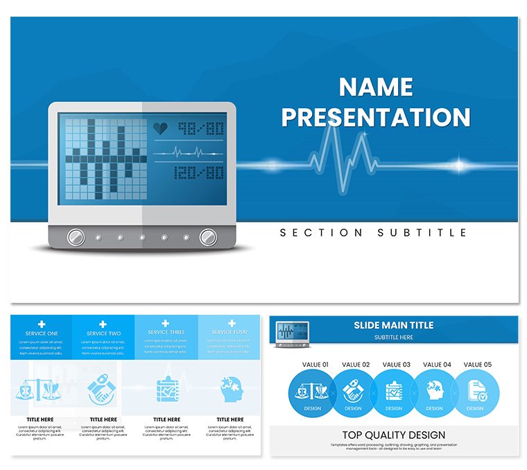
In the fast-paced world of healthcare, where every reading can signal a turning point, clear communication saves lives. This PowerPoint template steps in as your reliable partner for presentations on automatic blood pressure monitoring, hypertension protocols, and cardiovascular wellness. Crafted for doctors, nurses, and researchers, it offers 28 meticulously designed diagrams in seven soothing color schemes, turning complex physiological data into accessible insights that resonate with audiences from clinic staff to conference attendees.
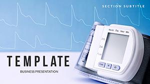
Think of it as a digital stethoscope for your slides - precise, professional, and attuned to the nuances of medical discourse. With layouts that echo the calm assurance of a well-equipped exam room, you'll highlight trends in systolic readings or the impact of lifestyle interventions without overwhelming your viewers. Compatible across PowerPoint versions from 2016 onward, it empowers you to focus on patient stories rather than slide tweaks, much like how frontline teams rely on automated devices for consistent accuracy.
Discovering the Essential Features
The template's strength starts with its three master slides, each tailored for different phases of your talk: an opening layout with space for vital stats overviews, a mid-deck infographic hub for detailed analyses, and a closing summary slide for key takeaways. Complementing these are three background choices - a soft clinical white for sterility, a gentle blue wave evoking steady heartbeats, and a neutral grid for data precision - allowing your deck to adapt seamlessly to seminar screens or printed handouts.
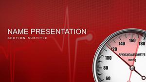
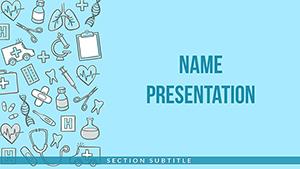
Diving deeper, the 28 diagrams cover everything from line graphs tracking diurnal variations to pie charts breaking down risk factors. These aren't off-the-shelf graphics; they're health-centric, with icons of cuffs and monitors that you can resize or recolor instantly. Seven color schemes range from calming greens for wellness topics to alert reds for urgency alerts, all vector-sharp for professional polish. Edit text hierarchies with ease, ensuring compliance with medical presentation standards like clear legends and scalable fonts.
- Targeted Visuals: Flowcharts for monitoring workflows, scatter plots for correlation studies - ready for your datasets.
- Flexibility First: Layer in animations to reveal stages, like inflating a cuff graphic step-by-step.
- Inclusive Design: Built-in contrast checks and resizable elements for diverse audience needs.
Practical Use Cases in Healthcare Settings
For educators in nursing programs, this template illuminates training sessions on device calibration. Use the process diagram to walk through automated readings, inserting anonymized case examples to show how early detection averts crises. Learners grasp protocols faster when visuals mimic real monitors, fostering hands-on confidence without the hardware.
Researchers presenting at cardiology forums find it invaluable for data showcases. Deploy a multi-axis chart to juxtapose trial results against baselines, drawing parallels to established guidelines without jargon overload. In hospital rounds, administrators leverage summary slides to advocate for equipment upgrades, blending stats with narrative to drive budget approvals.
Guided Workflow: Building a Monitoring Protocol Presentation
- Foundation Setup: Pick a master that fits your flow - intro for context, core for evidence.
- Data Integration: Feed metrics into graph placeholders, such as hourly readings into a trend line.
- Visual Tuning: Select a scheme that underscores themes, like blues for steady progress.
- Story Layering: Add callouts with clinical insights, linking slides to discussion prompts.
- Final Review: Simulate delivery to confirm timing, refining for audience engagement.
This approach not only structures your content but amplifies its life-saving clarity.
Pro Tips for Seamless Integration
Enhance dynamism by embedding real-time data links from monitoring apps, updating slides live during telehealth demos. For global teams, the Google Slides compatibility shines, enabling co-edits across time zones. And in high-stakes environments, leverage the template's print-friendly backgrounds for backup materials that hold detail at any scale.
One smart move: Use the icon library to symbolize comorbidities, creating at-a-glance overviews that spark informed Q&A. It's these touches that elevate routine reports into pivotal discussions.
Empower your next health talk with precision - grab the Automatic Blood Pressure PowerPoint Template for $22 and monitor your message's impact.
Frequently Asked Questions
Which software versions work best?
Optimized for PowerPoint 2016+, with full support for Google Slides too.
Are the diagrams medically accurate?
Yes, designed with standard health visuals in mind, fully editable for specifics.
Can I adjust colors for branding?
Effortlessly, via seven schemes or manual tweaks to match institutional palettes.
Does it support interactive elements?
Indeed, with hyperlinks and animations for engaging, clickable flows.
How do I handle sensitive data?
Placeholders ensure privacy; anonymize as needed before finalizing.
Is it suitable for patient education?
Perfectly - simplify diagrams for lay audiences with minimal adjustments.