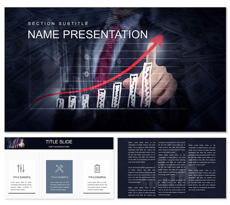
Imagine stepping into a boardroom where your financial training report doesn't just inform but captivates, turning dry numbers into a narrative that sticks. This Financial Management Training PowerPoint Template is your key to that transformation. Tailored for financial professionals who need to break down budgets, forecast trends, and outline investment paths without losing the audience's attention, it offers 28 meticulously crafted diagrams across three master slides and backgrounds. With seven versatile color schemes, you can align the visuals seamlessly with your company's branding or the session's tone - whether it's a conservative corporate blue or an energizing green for growth-focused talks.
At its core, this template shines in simplifying the chaos of financial data. Picture a slide where a flowchart maps out cash flow cycles, arrows guiding the eye from inflows to outflows, making it effortless for trainees to grasp interconnections. Or consider the pie charts that dissect expense categories, each slice exploding into sub-details on hover or click, revealing vendor breakdowns without cluttering the view. These aren't generic shapes; they're purpose-built for finance, drawing from real-world reporting needs like quarterly reviews or compliance training.
Unlocking the Power of Infographic-Driven Financial Slides
Infographics are the heartbeat of effective financial communication, and this template delivers them in spades. Start with the dashboard overview slide, a central hub that integrates key metrics - revenue streams, liability stacks, and ROI projections - into one cohesive view. It's like having a mini Excel sheet on steroids, but visually digestible. For deeper dives, the timeline diagrams let you plot fiscal years, marking milestones such as audit completions or market shifts with customizable icons that evoke stability, like anchored ships for secure investments.
What sets this apart is the flexibility baked into every element. Swap out data points with a few clicks, resize segments without distorting proportions, and layer in animations that reveal insights progressively - first the big picture, then the nuances. This approach mirrors how top firms like Deloitte structure their advisory decks, ensuring every trainee leaves with actionable takeaways rather than glazed-over eyes.
Customizable Charts Tailored for Budget Mastery
- Bar Graphs for Performance Tracking: Stack vertical bars to compare departmental spends against targets, with gradient fills that highlight variances - red for overruns, green for savings.
- Line Charts for Trend Forecasting: Smooth curves that predict revenue dips or peaks, annotated with callouts for influencing factors like economic indicators.
- Scatter Plots for Risk Assessment: Plot assets versus volatility, clustering points to spot high-reward opportunities at a glance.
Each chart is vector-based, ensuring crisp scaling whether you're presenting on a massive projector or a laptop screen. And for those hybrid sessions, the Google Slides compatibility means collaborators can tweak in real-time, syncing changes across teams without version conflicts.
Real-World Applications in Financial Training
Envision a consulting firm prepping for a client workshop on cost optimization. Using this template, the lead advisor populates the process map slide to outline a step-by-step audit workflow: from data gathering to recommendation rollout. Trainees interact via embedded hyperlinks that jump to supporting evidence slides, fostering engagement that turns passive listeners into active participants.
In educational settings, professors leverage the comparison matrices to juxtapose traditional versus agile budgeting methods side-by-side, with icons differentiating fixed costs from variable ones. It's particularly potent for MBA cohorts, where students rebuild the slides as homework, honing their analytical skills through hands-on editing.
For internal corporate use, HR directors craft annual training modules around the SWOT analysis diagrams, framing financial health as a strategic puzzle. The template's modular design allows mixing and matching - pull a risk matrix into a growth strategy deck - saving hours that would otherwise go into from-scratch builds.
Step-by-Step Guide to Integrating into Your Workflow
- Import and Setup: Open the .potx file in PowerPoint 2016 or later, apply your preferred color scheme via the master view.
- Data Input: Replace placeholder text and figures in diagrams; use the built-in format painter for consistent styling across slides.
- Enhance Interactivity: Add transitions like fade-ins for sequential reveals, or hyperlinks for navigation between related financial topics.
- Export and Share: Save as PPTX for editing or PDF for distribution, ensuring accessibility with alt text on visuals.
This streamlined process means you spend less time formatting and more on refining your message, much like how seasoned analysts prioritize insights over aesthetics.
Why This Template Outshines Basic PowerPoint Tools
Standard PowerPoint shapes often fall flat in finance, lacking the precision for layered data hierarchies. This template counters that with pre-aligned smart art alternatives - think hierarchical org charts that branch into sub-ledgers automatically. Plus, the themed icons library, from currency symbols to ledger books, adds a professional polish that's absent in default libraries.
Compatibility extends beyond PowerPoint; the editable vectors work flawlessly in Keynote for Mac users crossing platforms. And for accessibility, built-in high-contrast options ensure diagrams read well for color-blind viewers, a nod to inclusive design practices seen in leading financial reports.
Download this Financial Management Training PowerPoint Template now and watch your sessions evolve from routine recaps to riveting roadmaps. It's more than slides - it's the scaffold for financial fluency.
Frequently Asked Questions
How editable are the diagrams in this financial template?
Every diagram is fully vector-based, allowing you to resize, recolor, and modify elements like bars or lines without quality loss. Text placeholders update dynamically with your data.
What PowerPoint versions does this template support?
It's optimized for PowerPoint 2016 and newer versions, with full functionality in Microsoft 365. Google Slides integration is also seamless for collaborative edits.
Can I use this for non-financial training topics?
Absolutely, the neutral diagrams adapt well to project management or operational training by swapping financial icons for general ones.
Does the template include animation presets?
Yes, subtle entrance and emphasis animations are pre-applied to key elements, but you can customize or remove them via the animations pane.
How do I change the color schemes?
Access the master slides, select a diagram, and apply one of the seven schemes from the color palette dropdown - changes propagate across all instances.