North America Keynote Maps
Presenting regional data across the United States Canada and Mexico requires maps that audiences can read instantly. Whether you're showing sales territories market expansion plans or demographic trends our North America Keynote map collection gives you the visual clarity that spreadsheets and text simply can't deliver.
Each map template is designed specifically for Keynote on Mac making editing smooth and intuitive. Click any state province or country to change colors add labels or highlight specific regions. No complicated software no design skills required. Download edit and present - it's that straightforward. From coast-to-coast business strategies to focused regional analysis these maps help you tell your story with geographic precision.
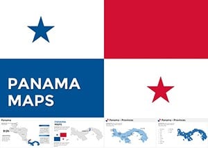 (655)
(655) Panama Keynote Maps: Customizable EssentialsID: #KM00199$50.00
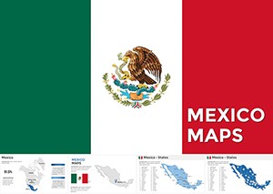 (648)
Mexico Keynote Map Template: Illuminate Regional StoriesID: #KM00195$58.00
(648)
Mexico Keynote Map Template: Illuminate Regional StoriesID: #KM00195$58.00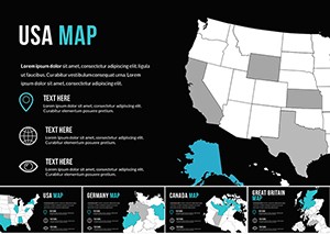 (756)
(756) USA Keynote Map Template: 15 State Slides - Instant Download | ImagineLayoutID: #KM00172$25.00
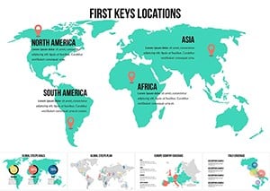 (699)
(699) Interactive World Country Keynote Maps: Elevate Global PresentationsID: #KM00169$26.00
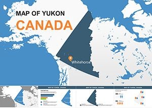 (178)
Navigate Yukon's Arctic Wonders with Our Premium Keynote Maps TemplateID: #KM00156$8.00
(178)
Navigate Yukon's Arctic Wonders with Our Premium Keynote Maps TemplateID: #KM00156$8.00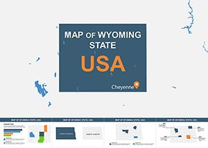 (398)
Discover Wyoming's Vast Horizons Through Customizable Keynote MapsID: #KM00155$13.00
(398)
Discover Wyoming's Vast Horizons Through Customizable Keynote MapsID: #KM00155$13.00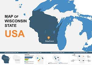 (203)
Editable Wisconsin Keynote Maps: Professional Templates for Regional InsightsID: #KM00154$15.00
(203)
Editable Wisconsin Keynote Maps: Professional Templates for Regional InsightsID: #KM00154$15.00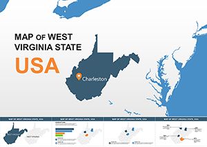 (1006)
West Virginia USA Keynote Maps: Editable for Engaging StoriesID: #KM00153$15.00
(1006)
West Virginia USA Keynote Maps: Editable for Engaging StoriesID: #KM00153$15.00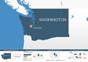 (808)
(808) Washington Keynote Maps: Editable Template for Business and StudyID: #KM00152$15.00
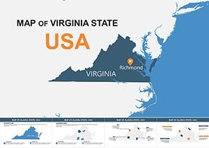 (1010)
High-Quality Virginia Keynote Maps: Customize for Impactful PresentationsID: #KM00151$15.00
(1010)
High-Quality Virginia Keynote Maps: Customize for Impactful PresentationsID: #KM00151$15.00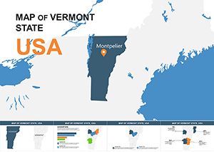 (614)
Vermont Map Keynote Template - Fully Editable | Instant Download | ImagineLayoutID: #KM00150$15.00
(614)
Vermont Map Keynote Template - Fully Editable | Instant Download | ImagineLayoutID: #KM00150$15.00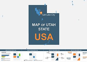 (285)
Editable Utah Keynote Maps: Professional Template for Dynamic PresentationsID: #KM00149$15.00
(285)
Editable Utah Keynote Maps: Professional Template for Dynamic PresentationsID: #KM00149$15.00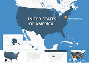 (270)
USA Counties Keynote Maps: Dynamic Editable Presentation TemplateID: #KM00148$20.00
(270)
USA Counties Keynote Maps: Dynamic Editable Presentation TemplateID: #KM00148$20.00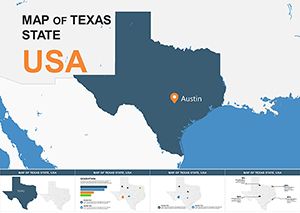 (1155)
Texas Keynote Maps: High-Quality Editable Templates for ProsID: #KM00147$15.00
(1155)
Texas Keynote Maps: High-Quality Editable Templates for ProsID: #KM00147$15.00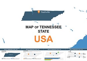 (634)
Tennessee Keynote Map Template: Customizable US State SlidesID: #KM00146$15.00
(634)
Tennessee Keynote Map Template: Customizable US State SlidesID: #KM00146$15.00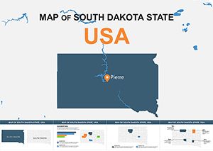 (1071)
South Dakota Keynote Maps: Editable Slides for Impactful PresentationsID: #KM00145$14.00
(1071)
South Dakota Keynote Maps: Editable Slides for Impactful PresentationsID: #KM00145$14.00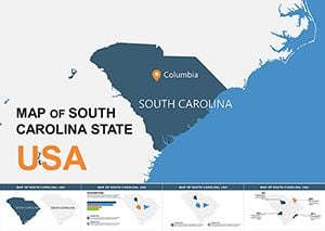 (1173)
South Carolina USA Keynote Maps: Interactive Designs for Southern StoriesID: #KM00144$15.00
(1173)
South Carolina USA Keynote Maps: Interactive Designs for Southern StoriesID: #KM00144$15.00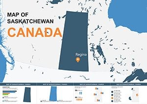 (797)
Saskatchewan Canada Keynote Maps: Versatile Tools for Prairie PresentationsID: #KM00143$8.00
(797)
Saskatchewan Canada Keynote Maps: Versatile Tools for Prairie PresentationsID: #KM00143$8.00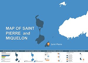 (537)
Saint Pierre Miquelon Keynote Map - Instant Download | ImagineLayoutID: #KM00142$6.00
(537)
Saint Pierre Miquelon Keynote Map - Instant Download | ImagineLayoutID: #KM00142$6.00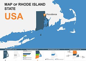 (629)
Rhode Island USA Keynote Map Template: Unlock Detailed State InsightsID: #KM00141$8.00
(629)
Rhode Island USA Keynote Map Template: Unlock Detailed State InsightsID: #KM00141$8.00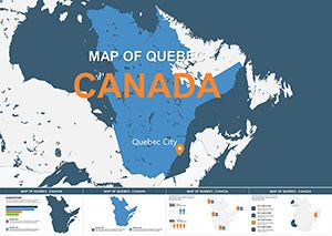 (68)
Quebec Canada Maps for Keynote: Custom Visuals That InspireID: #KM00140$6.00
(68)
Quebec Canada Maps for Keynote: Custom Visuals That InspireID: #KM00140$6.00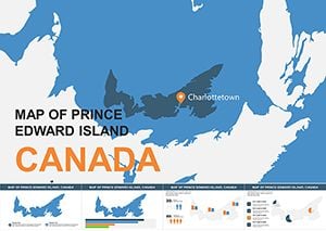 (303)
Prince Edward Island Canada Keynote Maps: Versatile Editable TemplatesID: #KM00139$7.00
(303)
Prince Edward Island Canada Keynote Maps: Versatile Editable TemplatesID: #KM00139$7.00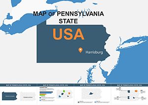 (482)
Pennsylvania USA Keynote Maps: Editable Slides for Dynamic PresentationsID: #KM00138$14.00
(482)
Pennsylvania USA Keynote Maps: Editable Slides for Dynamic PresentationsID: #KM00138$14.00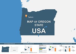 (701)
Oregon USA Keynote Maps: 28 Editable SlidesID: #KM00137$15.00
(701)
Oregon USA Keynote Maps: 28 Editable SlidesID: #KM00137$15.00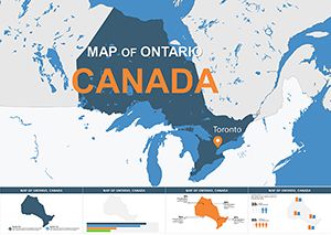 (1007)
Ontario Canada Professional Keynote Maps TemplateID: #KM00136$12.00
(1007)
Ontario Canada Professional Keynote Maps TemplateID: #KM00136$12.00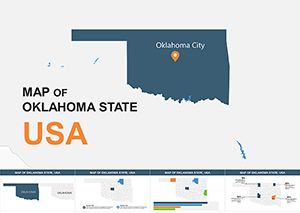 (645)
Oklahoma USA Keynote Maps: Business Geography UnlockedID: #KM00135$15.00
(645)
Oklahoma USA Keynote Maps: Business Geography UnlockedID: #KM00135$15.00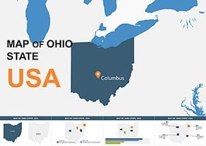 (1138)
Ohio State Map Keynote Template: Economic Insights VisualizedID: #KM00134$15.00
(1138)
Ohio State Map Keynote Template: Economic Insights VisualizedID: #KM00134$15.00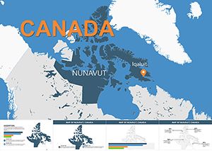 (881)
Nunavut Maps Keynote: Explore Arctic Landscapes InteractivelyID: #KM00133$12.00
(881)
Nunavut Maps Keynote: Explore Arctic Landscapes InteractivelyID: #KM00133$12.00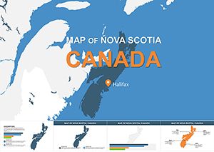 (289)
Nova Scotia Keynote Maps: Editable Presentation ToolID: #KM00132$10.00
(289)
Nova Scotia Keynote Maps: Editable Presentation ToolID: #KM00132$10.00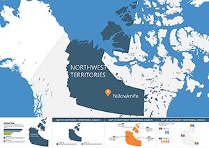 (987)
Northwest Territories Keynote Maps: Illuminating the Northern FrontierID: #KM00131$12.00
(987)
Northwest Territories Keynote Maps: Illuminating the Northern FrontierID: #KM00131$12.00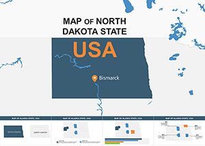 (1148)
North Dakota Keynote Map Template: Precision Mapping for the Peace Garden StateID: #KM00130$15.00
(1148)
North Dakota Keynote Map Template: Precision Mapping for the Peace Garden StateID: #KM00130$15.00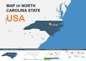 (783)
North Carolina Keynote Maps Template: Charting Success in the Tar Heel StateID: #KM00129$15.00
(783)
North Carolina Keynote Maps Template: Charting Success in the Tar Heel StateID: #KM00129$15.00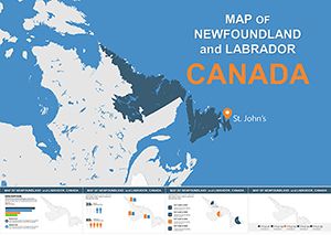 (522)
Editable Newfoundland and Labrador Keynote Maps TemplateID: #KM00128$10.00
(522)
Editable Newfoundland and Labrador Keynote Maps TemplateID: #KM00128$10.00
Why Use Dedicated North America Maps in Keynote?
Default Keynote shapes and generic map images create more problems than they solve. Trying to draw state boundaries manually wastes hours and produces amateur results. Importing static map images from search engines means you can't edit regions or update data when numbers change. Our North America Keynote maps solve both problems by combining professional cartography with complete editability.
Every map in this collection features individual editable regions. Click California to highlight your West Coast performance. Select Ontario to show Canadian expansion. Color-code Mexico's states to visualize distribution networks. The flexibility means one map template adapts to dozens of different presentation scenarios rather than forcing you to search for new images every time your data changes.
Who Benefits from These Keynote Map Templates
Sales and Marketing Teams
Sales directors presenting quarterly results use these maps to visualize territory performance at a glance. Color-coding states by revenue growth immediately shows which regions exceeded targets and which need attention. Marketing teams planning campaign rollouts map media markets and demographic concentrations helping executives understand geographic strategy without wading through data tables. Regional managers presenting at national meetings use focused state or province maps to deep-dive into local market conditions.
Business Development and Strategy
Companies exploring expansion opportunities map current locations alongside potential new markets. Highlighting states with existing infrastructure in one color and target expansion states in another creates instant visual clarity around growth strategy. Due diligence presentations for acquisitions use maps to show how target companies' geographic footprint complements or competes with existing operations. Franchise development teams map territory availability and existing franchise locations for prospective franchisees.
Supply Chain and Logistics
Distribution center managers present coverage areas using radius overlays on state maps. Logistics teams planning route optimization visualize transportation corridors and identify gaps in delivery networks. Supply chain directors discussing nearshoring strategies map Mexican manufacturing hubs relative to US distribution centers demonstrating cost and time advantages. Warehouse location studies overlay customer density data with existing facility locations to justify new investments.
Government and Public Policy
Government agencies presenting program rollouts map participating states and funding allocations. Policy analysts visualize legislative trends by color-coding states based on regulatory environments. Economic development organizations showcase industry clusters and workforce data across regions to attract corporate relocations. Emergency management teams use maps during briefings to show affected areas resource deployment and evacuation zones.
Real Estate and Construction
Commercial real estate firms present portfolio distribution and acquisition targets geographically. Developers pitching projects to investors map competitive properties demographic growth patterns and infrastructure development. Construction companies bidding on regional contracts highlight past project locations and demonstrate geographic capability. Property management companies visualize portfolio performance across different metro areas and states.
Map Types and Formats in This Collection
Different presentations require different geographic perspectives. Our collection includes multiple map formats ensuring you find the right visual for your specific content.
- Full Continent Maps - Show all of North America including the United States Canada Mexico and Central American countries for broad regional perspectives
- United States Maps - Individual state boundaries with editable regions perfect for US-focused business analysis
- Canada Province Maps - Provincial and territorial boundaries for Canadian market presentations
- Mexico State Maps - All 32 Mexican states as editable regions for nearshoring manufacturing and market expansion presentations
- Regional Focus Maps - Zoomed views of specific areas like the Northeast Midwest Southwest or Pacific regions when continental scale isn't needed
- Major Metro Maps - City-level maps for urban market analysis including New York Los Angeles Toronto Vancouver and Mexico City
- Time Zone Maps - Visualize scheduling coverage or operational hours across different time zones
Design Tips for Maximum Impact
Use Color Strategically
Avoid rainbow color schemes that distract rather than inform. Stick to 3-4 colors maximum with each representing a specific data category or performance level. Green-yellow-red gradients work well for performance metrics with green indicating strong performance and red flagging areas needing attention. For categorical data like territory assignments use distinctly different colors that remain easy to distinguish even when projected in bright conference rooms.
Add Data Labels Selectively
Labeling every state or province clutters maps and reduces readability. Instead label only the regions you're discussing in that particular slide. If presenting California results label California prominently and leave other states unlabeled. For broader overviews use a legend rather than individual labels. This keeps maps clean and directs audience attention exactly where you want it.
Combine Maps with Supporting Data
Maps excel at showing geographic patterns but audiences often need specific numbers too. Place a simple data table next to your map showing key metrics for highlighted regions. Alternatively use callout boxes with arrows pointing to specific states displaying critical figures. This combination gives audiences both the big picture geographic perspective and the detailed data they need for decision-making.
Animate Thoughtfully
Keynote's animation features can enhance map presentations when used purposefully. Instead of showing all regions at once animate the map to reveal areas progressively as you discuss them. Build effect animations that highlight one region then another as you walk through your narrative keep audiences engaged and make complex multi-region stories easier to follow. Avoid flashy transitions that add entertainment value but distract from your message.
Maintain Consistent Geography
If your presentation includes multiple slides with maps use the same base map and scale throughout. Switching between different map projections or zoom levels between slides disorients audiences and makes comparisons difficult. Consistency in map style helps audiences build geographic literacy with your specific business context as the presentation progresses.
Editing Your Maps Is Effortless
Each North America map template opens directly in Keynote as a standard presentation file. Every state province and country is a separate editable shape. Click any region to select it then use Keynote's inspector panel to change fill colors adjust borders or add shadows. Text boxes overlay on maps allowing you to add city names data labels or notes exactly where needed.
Need to show only certain states? Simply select and delete regions you don't need leaving a focused view of your specific geography. Want to emphasize particular areas? Increase border thickness or add glow effects to make regions stand out. The editing flexibility means you're not locked into predefined layouts or color schemes. Adapt every map to your exact requirements without learning complex design software or paying for custom cartography.
Maps also work seamlessly with Keynote's slide layouts and themes. Insert a map into your existing presentation and it adopts your slide background and overall design aesthetic. Match map colors to your corporate palette using the eyedropper tool. The integration ensures maps feel like natural components of your presentation rather than awkwardly inserted images that clash with your brand.
Ready to Transform Your Geographic Presentations?
Stop settling for generic map images or wasting time trying to build geographic visuals from scratch. Our North America Keynote map collection gives you professional cartography that's completely customizable in minutes. Whether you're presenting to executives investors clients or internal teams these maps help you communicate location-based insights with clarity and confidence.
Browse the collection now and discover how the right map transforms data-heavy presentations into clear compelling visual stories. Your next regional sales review strategic planning session or market analysis presentation deserves better than spreadsheets and bullet points. Download your first map template today and see the difference professional geographic visuals make.
Frequently Asked Questions
- Can I use these maps in Keynote on both Mac and iPad?
- Yes these maps work perfectly in Keynote across all Apple devices including Mac computers iPads and iPhones. The files sync through iCloud so you can start editing on your Mac and finish on your iPad. All editing features remain available on mobile devices though some users find detailed work easier on larger Mac screens.
- Are individual US states Canadian provinces and Mexican states all separately editable?
- Absolutely. Every state province territory and country appears as an individual shape in Keynote. Click any region to select it independently. Change its color add borders apply effects or delete it entirely. This granular control lets you highlight exactly the geographic areas relevant to your presentation while leaving others neutral or removed.
- Can I add my own data labels and legends to these maps?
- Yes completely. Maps are delivered as standard Keynote files where you have full editing control. Add text boxes anywhere on the slide to create labels. Insert shapes to build custom legends. Use Keynote's drawing tools to add arrows markers or highlight areas. The maps provide the geographic foundation while you add your specific data and context.
- Do these templates work if I need to present on a Windows computer?
- These templates are designed specifically for Apple Keynote. If you need to present on Windows you can export your finished Keynote presentation as PowerPoint format through Keynote's export function. Most formatting and colors transfer successfully though some advanced Keynote effects may require adjustment in PowerPoint. For Windows-primary users we recommend checking our PowerPoint map collection instead.
- How current is the geographic data in these maps?
- Maps reflect current political boundaries and geographic divisions for the United States Canada and Mexico. We update templates regularly to reflect any boundary changes or new territorial designations. For business presentations these maps provide appropriate accuracy for regional analysis sales territories and market segmentation without the excessive detail of topographic or physical geography maps.