Middle East Keynote Maps
These Middle East Keynote map templates give you clean, vector-based slides of individual countries and the full region, built specifically for Apple Keynote. Whether you`re mapping oil routes, investment zones, or political relationships, the outlines, labels, and layers are already grouped so you can start editing instead of drawing borders from scratch.
Last month I watched a client in Dubai pull together a board update on regional supply chains the night before the meeting. He needed to highlight the Strait of Hormuz and key ports without the map looking like a generic Google screenshot. Opening one of these country slides let him recolor territories, add data callouts, and keep everything aligned in under twenty minutes.
Pick the country or regional layout that matches your next presentation and download it now.
 (1141)
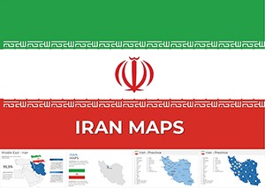
 Map Iran: Keynote Maps of Iran TemplatesID: #KM00214$56.00
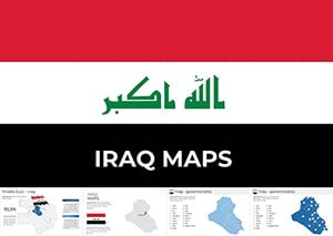 (1085)
 Iraq Maps Template for Keynote PresentationsID: #KM00213$50.00
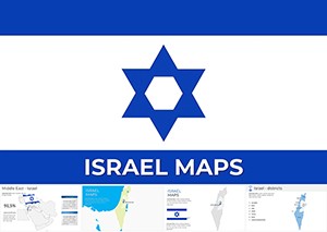 (1027)
Professional Israel Keynote Maps Templates for Stunning Custom PresentationsID: #KM00212$50.00
(1027)
Professional Israel Keynote Maps Templates for Stunning Custom PresentationsID: #KM00212$50.00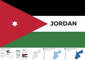 (149)
(149) Jordan Keynote Map Template: Editable for Impactful SlidesID: #KM00211$56.00
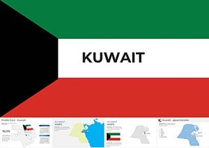 (705)
Kuwait Map Keynote Template: Professional Editable SlidesID: #KM00210$50.00
(705)
Kuwait Map Keynote Template: Professional Editable SlidesID: #KM00210$50.00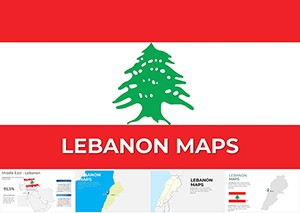 (325)
(325) Editable Lebanon Keynote Maps for Stunning PresentationsID: #KM00209$50.00
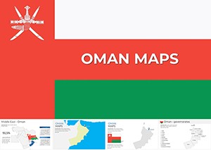 (1106)
Oman Keynote Map Template - Fully Editable | ImagineLayoutID: #KM00208$50.00
(1106)
Oman Keynote Map Template - Fully Editable | ImagineLayoutID: #KM00208$50.00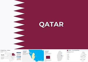 (134)
Editable Qatar Map Keynote Template for Professional PresentationsID: #KM00207$50.00
(134)
Editable Qatar Map Keynote Template for Professional PresentationsID: #KM00207$50.00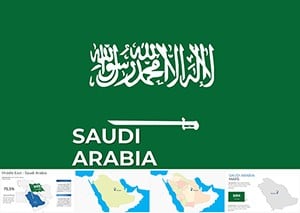 (655)
Saudi Arabia Keynote Maps Template: Professional Cartography at Your FingertipsID: #KM00206$56.00
(655)
Saudi Arabia Keynote Maps Template: Professional Cartography at Your FingertipsID: #KM00206$56.00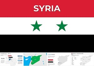 (646)
Syria Keynote Maps Template: Visualize Geography with EaseID: #KM00205$56.00
(646)
Syria Keynote Maps Template: Visualize Geography with EaseID: #KM00205$56.00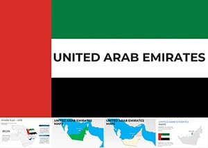 (506)
Navigate Success: UAE Keynote Map Template for ProsID: #KM00204$56.00
(506)
Navigate Success: UAE Keynote Map Template for ProsID: #KM00204$56.00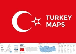 (541)
Editable Turkey Keynote Maps for Engaging TalksID: #KM00202$50.00
(541)
Editable Turkey Keynote Maps for Engaging TalksID: #KM00202$50.00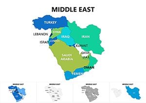 (160)
Middle East Maps Keynote Template: Navigate Geopolitical NarrativesID: #KM00080$25.00
(160)
Middle East Maps Keynote Template: Navigate Geopolitical NarrativesID: #KM00080$25.00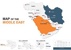 (49)
Customizable Middle East Maps Keynote Template: Charting Regional DynamicsID: #KM00049$45.00
(49)
Customizable Middle East Maps Keynote Template: Charting Regional DynamicsID: #KM00049$45.00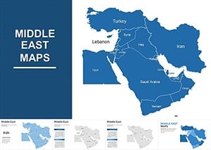 (321)
Middle East Keynote Maps Template: Navigate Complex Regions with EaseID: #KM00014$45.00
(321)
Middle East Keynote Maps Template: Navigate Complex Regions with EaseID: #KM00014$45.00
What These Middle East Keynote Maps Actually Deliver
Each template contains multiple slide variations: political outlines, simplified silhouettes for heavy data overlays, and versions with major cities or infrastructure already marked. The shapes stay fully editable - you can change fill colors, stroke weights, and transparency without breaking connections between neighboring countries. Because they are native Keynote objects rather than embedded images, labels stay crisp even when you scale the slide for different aspect ratios.
The collection covers the core countries: Iran, Iraq, Israel, Jordan, Kuwait, Lebanon, Oman, Qatar, Saudi Arabia, Syria, Turkey, UAE, plus broader Middle East regional views. This saves the usual headache of stitching pieces together from different sources and ending up with mismatched projections.
Real Use Cases That Actually Happen
A strategy director at an international energy firm prepares the quarterly review for investors. She drops production figures onto the Saudi Arabia slide, highlights new exploration blocks in the Empty Quarter, and uses subtle transparency on neighboring countries to keep focus where it belongs. The map communicates scale and relationships instantly - something bullet points alone never achieve.
An analyst in a Washington think-tank builds a briefing on regional stability. Using the Israel and Jordan templates side-by-side, she marks border crossings and key infrastructure with simple lines and icons. When the director asks for one more comparison during rehearsal, she adjusts the colors live without the whole slide falling apart.
A university lecturer teaching modern Middle East history swaps in current event data onto the regional map each semester. Students immediately see the geographic logic behind trade agreements or conflict zones because the map is accurate enough to trust but clean enough not to overwhelm.
When I used the UAE slide for a client pitch about diversification away from oil, being able to highlight free zones and logistics corridors with consistent styling made the growth story feel concrete instead of abstract.
Political, Economic, or Resource Maps - Choosing What Fits
Political versions work best when the argument is about borders, alliances, or influence zones. Economic slides shine when you need to show GDP distribution, trade corridors, or investment hotspots. Resource-focused maps (oil fields, water, minerals) make the most sense for energy and environmental discussions.
The difference is practical: on a resource map you often want lower label density so data bubbles or icons stand out. On political maps the country names and capitals need to remain readable even when projected in a large conference room.
Editing Tips That Save Real Time in Keynote
Most slides come with grouped shapes for each country. Ungroup carefully - Keynote sometimes shifts connectors when you move individual pieces. Keep a duplicate slide as backup before heavy editing.
For multi-country comparisons, copy the relevant country groups onto one slide and use the Align tools. The templates use consistent stroke weights so neighboring borders match when placed together. When adding data, use text boxes with the same font style already set in the slide master to keep everything looking intentional.
Watch label overlap when you zoom in on smaller countries like Lebanon or Qatar. The templates leave breathing room, but heavy data layers may require shortening some city names or moving labels slightly.
When to Use These Instead of Broader Maps
Use the full Keynote maps templates when you need global or continental context. Switch to these Middle East focused slides when the story lives inside the region and you need accurate local borders and city placements. For neighboring regions that often connect in trade discussions, the Asia Keynote maps templates follow the same editing style and can sit comfortably next to these.
If your deck is mostly charts and frameworks rather than geography, you`ll probably be happier in the general Keynote templates collection and can pull in a map slide only where needed.
Technical Notes from Actual Use
These maps export cleanly to PDF with sharp lines even at high zoom. When presenting on stage, test the colors under the actual projector lighting - deep greens and blues that look great on a MacBook can sometimes need slight saturation boosts. The vector nature means you can enlarge any country group dramatically without pixelation if you need a dramatic full-screen view.
One detail I appreciate: disputed or sensitive border areas are handled neutrally so you can adjust them according to your organization`s guidelines without fighting locked artwork.
Why This Collection Works for Professional Work
The layouts avoid decorative clutter that often appears in generic map packs. You get space for your own titles, legends, and data without fighting the design. The maps are detailed enough to look credible to regional experts but not so crowded that they become useless for executive audiences.
Limitations exist - these are not GIS-level precision tools. They excel at communication slides, not technical boundary demarcation. For most boardroom, investor, and policy presentations, that balance is exactly what you need.
Select the country or regional template that fits your next deadline and start editing.
Can I add new cities or infrastructure to these Middle East Keynote maps?
Yes, the maps use native vector shapes so you can add text labels, icons, or lines anywhere. Match the existing font from the slide master for consistency. I always duplicate the original slide first as a safety net before making big changes. Grouping new elements with the country shape makes them easier to move together later.
What happens to the map when I ungroup the country shapes?
Keynote can shift small connector lines or labels slightly when you ungroup. The templates keep most countries as single grouped objects to avoid this. If you need to edit individual borders, work on a duplicate slide and use the Align and Distribute tools afterward to restore clean edges with neighboring countries.
Are these maps suitable for both political and resource data presentations?
They work well for both. Political versions have clearer country labels and borders, while resource-focused slides have more open space for data overlays like oil fields or pipelines. You can recolor territories quickly to show different layers without starting from scratch.
How do these Middle East maps compare to the general Keynote maps collection?
The general collection gives you world or continent views, but these provide much higher detail for individual Middle East countries and accurate local infrastructure. Use the broader maps for global context and switch here when your story focuses inside the region.
Do the maps maintain quality when exporting to PDF or presenting on stage?
They export with sharp vector lines even at high zoom levels. For stage presentations, I recommend testing colors under actual projector conditions - some deep blues may need a small saturation increase. The shapes scale cleanly if you need a full-screen country view.
Can I use these templates for multi-country comparison slides?
Absolutely. Copy country groups from different templates onto one slide and use Keynote`s alignment tools. The consistent stroke weights across the collection help neighboring borders look clean when placed side by side.