Medicine - Pharma PowerPoint templates
These medicine and pharma PowerPoint templates contain ready diagrams, timelines, and infographics in PPTX format. They are built for researchers, medical affairs leads, and regulatory teams presenting trial results or pipeline updates.
A clinical project manager at a biotech firm had two days to prepare the phase III results for the scientific advisory board. Manual diagram creation meant rebuilding every timeline and icon set. The template provided aligned phases and data callouts; updating numbers and adding trial outcomes took under an hour.
Download the slide set that fits your study phase and keep the focus on the science.
 (8)
(8) Pharmaceutical Industry PowerPoint Presentation Template with DiagramsID: #PP03983$9.00
 (15)
(15) Brain Potential PowerPoint Template: Igniting Neuroscience NarrativesID: #PP03950$10.00
 (157)
Chemical Structure PowerPoint Template: Reacting with RelevanceID: #PP03902free
(157)
Chemical Structure PowerPoint Template: Reacting with RelevanceID: #PP03902free (234)
Lab Innovations PowerPoint TemplateID: #PP03899$8.00
(234)
Lab Innovations PowerPoint TemplateID: #PP03899$8.00 (382)
Global Digital Health Solutions PowerPoint TemplateID: #PP03897free
(382)
Global Digital Health Solutions PowerPoint TemplateID: #PP03897free (8)
Vision and Clarity PowerPoint TemplateID: #PP03896$8.00
(8)
Vision and Clarity PowerPoint TemplateID: #PP03896$8.00 (86)
(86) Advancing Medical Research PowerPoint TemplateID: #PP03895$10.00
 (304)
Visualize Health: Human Anatomy PowerPoint TemplateID: #PP03894free
(304)
Visualize Health: Human Anatomy PowerPoint TemplateID: #PP03894free (231)
Pharmaceutical Industry PowerPoint Template: Precision in Every SlideID: #PP03891$8.00
(231)
Pharmaceutical Industry PowerPoint Template: Precision in Every SlideID: #PP03891$8.00 (364)
Healthcare Innovation PowerPoint Template for Medical ProsID: #PP03865$10.00
(364)
Healthcare Innovation PowerPoint Template for Medical ProsID: #PP03865$10.00 (20)
Modern Medicine Minimalist PowerPoint Template for ClarityID: #PP03863$10.00
(20)
Modern Medicine Minimalist PowerPoint Template for ClarityID: #PP03863$10.00 (572)
Cardiology Healthcare PowerPoint Template: 59 SlidesID: #PP03791$12.00
(572)
Cardiology Healthcare PowerPoint Template: 59 SlidesID: #PP03791$12.00 (776)
3D DNA Helix PowerPoint TemplateID: #PP03783$12.00
(776)
3D DNA Helix PowerPoint TemplateID: #PP03783$12.00 (5)
Chemical Engineering PowerPoint TemplateID: #PP03777$12.00
(5)
Chemical Engineering PowerPoint TemplateID: #PP03777$12.00 (312)
Medical Health PowerPoint TemplateID: #PP03775$12.00
(312)
Medical Health PowerPoint TemplateID: #PP03775$12.00 (537)
Microbiology Microscope PowerPoint TemplateID: #PP03774$12.00
(537)
Microbiology Microscope PowerPoint TemplateID: #PP03774$12.00 (121)
Chemical and Biochemical Engineering PowerPoint TemplateID: #PP03771$12.00
(121)
Chemical and Biochemical Engineering PowerPoint TemplateID: #PP03771$12.00 (1110)
Medical Science PowerPoint Template for Presentation DownloadID: #PP03770$12.00
(1110)
Medical Science PowerPoint Template for Presentation DownloadID: #PP03770$12.00 (1009)
Nanoscience and Nanotechnology PowerPoint Template: Scale Up Your InsightsID: #PP03769$12.00
(1009)
Nanoscience and Nanotechnology PowerPoint Template: Scale Up Your InsightsID: #PP03769$12.00 (232)
Dentistry Healthy Teeth PowerPoint Template: Smile-Worthy SlidesID: #PP03764$12.00
(232)
Dentistry Healthy Teeth PowerPoint Template: Smile-Worthy SlidesID: #PP03764$12.00 (842)
Dental Implant PowerPoint Template: PresentationID: #PP03755$12.00
(842)
Dental Implant PowerPoint Template: PresentationID: #PP03755$12.00 (471)
Create Stunning DNA Genome Presentations with Our PowerPoint TemplateID: #PP03746$12.00
(471)
Create Stunning DNA Genome Presentations with Our PowerPoint TemplateID: #PP03746$12.00 (1120)
Automatic Blood Pressure PowerPoint TemplateID: #PP03708$10.00
(1120)
Automatic Blood Pressure PowerPoint TemplateID: #PP03708$10.00 (924)
Pill Pharmaceutical PowerPoint TemplateID: #PP03707$12.00
(924)
Pill Pharmaceutical PowerPoint TemplateID: #PP03707$12.00 (433)
(433) Ambulance PowerPoint TemplateID: #PP03705$10.00
 (868)
Urinary System PowerPoint Template: Filtering Knowledge ClearlyID: #PP03693$12.00
(868)
Urinary System PowerPoint Template: Filtering Knowledge ClearlyID: #PP03693$12.00 (874)
Spleen and Blood Cell PowerPoint Template: Circulating ExcellenceID: #PP03692$12.00
(874)
Spleen and Blood Cell PowerPoint Template: Circulating ExcellenceID: #PP03692$12.00 (367)
Large Intestine PowerPoint Template: Absorbing the EssentialsID: #PP03691$12.00
(367)
Large Intestine PowerPoint Template: Absorbing the EssentialsID: #PP03691$12.00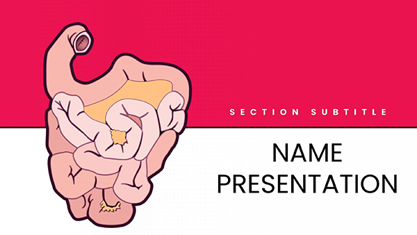 (1120)
Small Intestine Anatomy PowerPoint TemplateID: #PP03690$12.00
(1120)
Small Intestine Anatomy PowerPoint TemplateID: #PP03690$12.00 (802)
Vitamin B Foods PowerPoint TemplateID: #PP03682$10.00
(802)
Vitamin B Foods PowerPoint TemplateID: #PP03682$10.00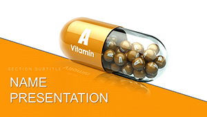 (274)
Vitamin A Supplements PowerPoint Template: Precision for Pharma ProsID: #PP03681$12.00
(274)
Vitamin A Supplements PowerPoint Template: Precision for Pharma ProsID: #PP03681$12.00 (989)
Vitamin A Carotenoids PowerPoint Template: Vitality Through VisualsID: #PP03680$12.00
(989)
Vitamin A Carotenoids PowerPoint Template: Vitality Through VisualsID: #PP03680$12.00 (756)
Nutrition Vitamin A PowerPoint Template: Fueling Informed DialoguesID: #PP03679$12.00
(756)
Nutrition Vitamin A PowerPoint Template: Fueling Informed DialoguesID: #PP03679$12.00
How Diagrams Carry the Evidence When Words Fall Short
One well-structured timeline or mechanism graphic replaces multiple text slides. Reviewers see the sequence or relationship at a glance and questions target the data rather than layout.
Four Clinical Moments These Templates Streamlined
The medical affairs lead presented adverse event trends to the safety committee. The template`s pre-aligned charts let her highlight risk thresholds instantly; committee members approved the monitoring plan without requesting redesign.
A regulatory specialist mapped the drug approval pathway for an investor update. Timeline stages were already spaced and labeled; the team discussion moved to milestone risks instead of slide formatting.
The research director visualized mechanism of action for a journal club. Layered icons showed interaction steps clearly; fellows followed the science without pausing on visual clutter.
A pipeline manager updated portfolio status for the quarterly board pack. Consistent stage boxes across slides kept every compound comparable; leadership focused on go/no-go decisions.
What Manual Slide Building Takes Away From Analysis Time
You lose hours deciding icon consistency, timeline spacing, and color coding for trial phases. Those choices repeat across every study deck and reduce time spent interpreting the actual results.
Maintaining Consistency Across Multi-Study Decks
Copy the master layout for each new trial. Update only the data fields and every presentation carries the same visual language so cross-study comparisons need no extra explanation.
Non-Obvious Tip for Grouping Medical Icons
Group mechanism icons on the slide master before copying slides. Any color or size change then applies globally without re-selecting each element in later decks.
PowerPoint Handling of Embedded Diagrams
All files use native shapes. When linking Excel data for trial metrics, keep the chart object on the slide master so updates propagate without breaking layout. Test PDF export to confirm line weights remain visible at print scale.
Why This Collection Suits Scientific Storytelling
Every layout uses editable vectors and avoids decorative elements that need removal before regulatory review. The focus stays on data accuracy and clear sequence rather than visual polish.
Selecting the Right Adjacent Category
For geographic context in trials, combine with Australia PowerPoint Maps templates. Decision frameworks pair naturally with the tree diagram PowerPoint charts. Keynote users presenting regional studies may prefer the Central America Keynote Maps templates.
Open the file that matches your current study and start updating the evidence.
FAQ
Are these medicine and pharma PowerPoint templates compatible with Google Slides?
Yes. Upload PPTX to Drive and open in Slides. Diagrams and timelines stay editable. Some SmartArt conversions may need regrouping once; the core shapes and charts remain fully functional. PDF export preserves line weights and labels for committee distribution.
Which PowerPoint version supports the full diagram editing?
PowerPoint 2016 and newer, including Microsoft 365. Older versions may simplify complex groupings; native shapes and text boxes still allow recoloring and repositioning. Update the master once after opening to lock brand colors across all slides.
Can I share these files inside my research team?
The license permits internal use and editing. Team members can work on copies of the file. Finished presentations may be shared with external collaborators or regulators without further restrictions.
Do the templates contain locked elements or watermarks?
No. All icons, timelines, and charts are fully unlocked native shapes. You can delete, recolor, or resize anything to match protocol requirements or journal guidelines.
Is there a limit on slides created from one template file?
None. Duplicate any diagram slide as many times as needed inside your deck. Each copy retains the original master layout so visual consistency holds across multi-study presentations.